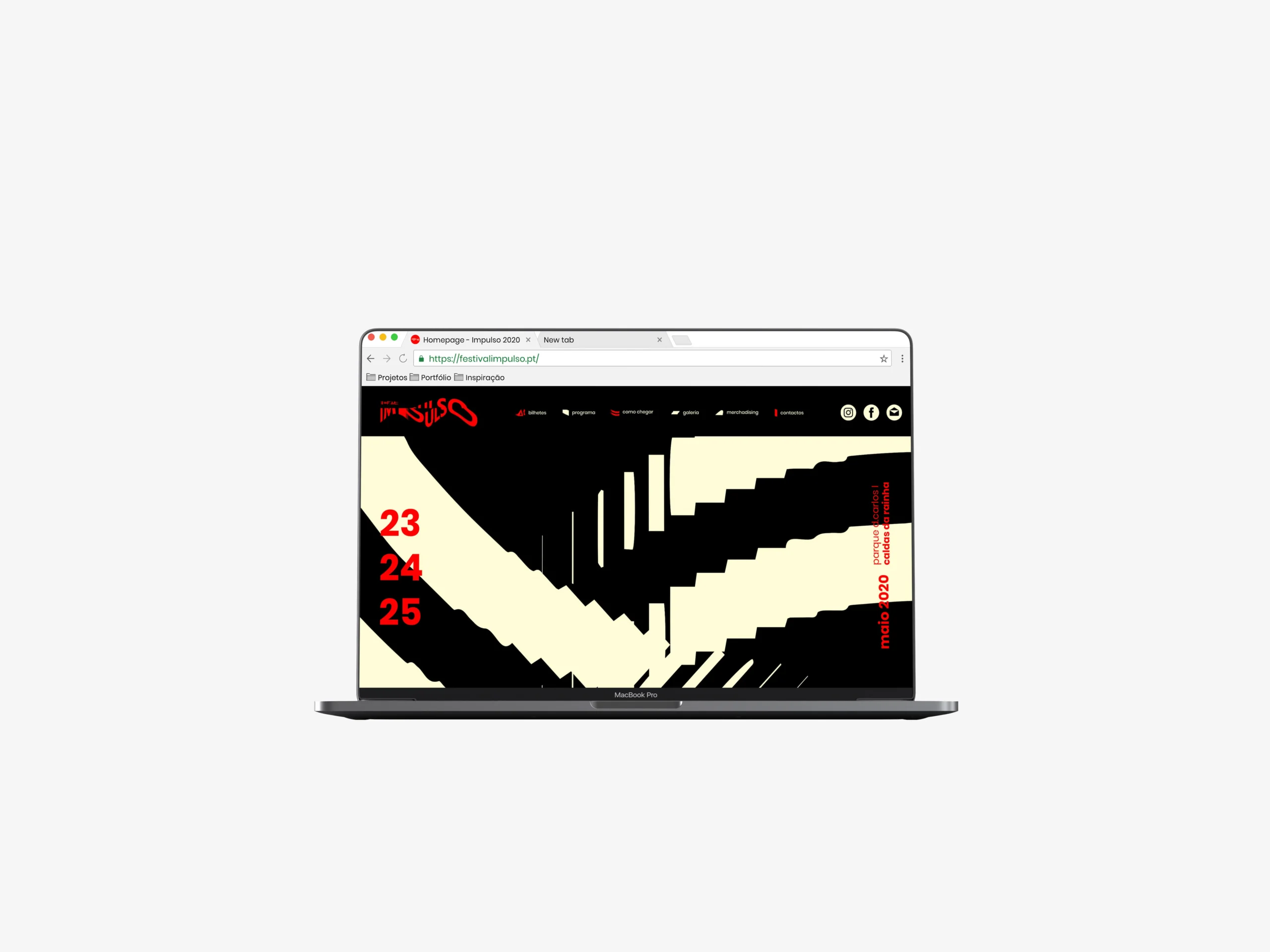
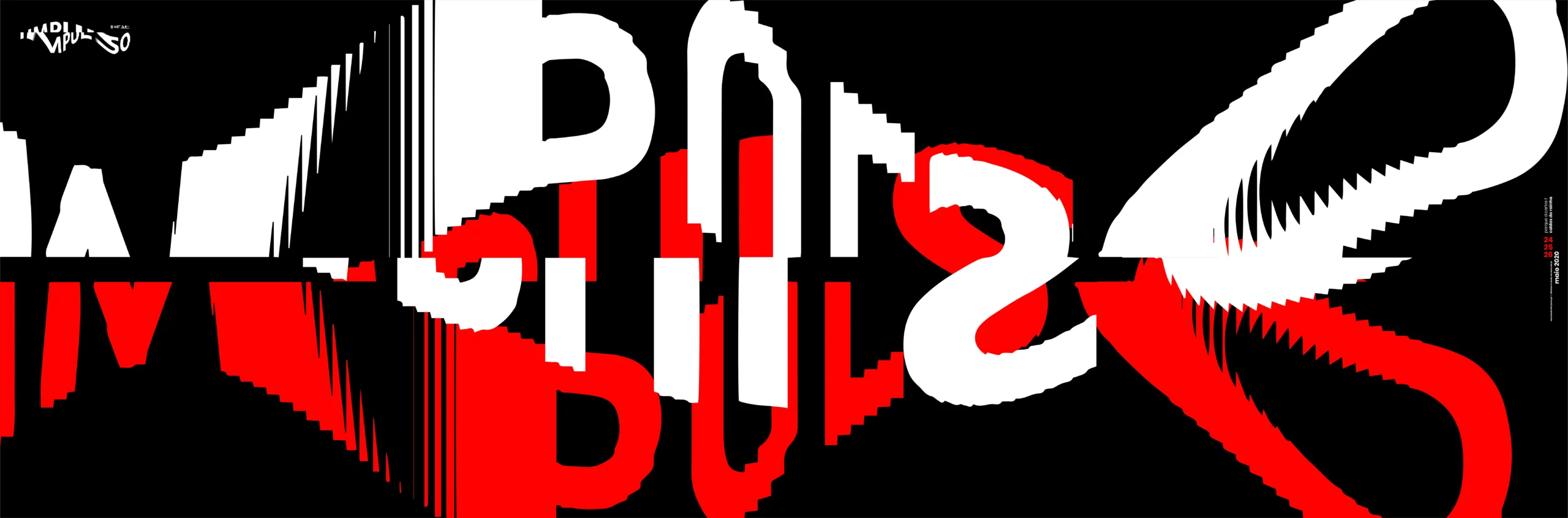
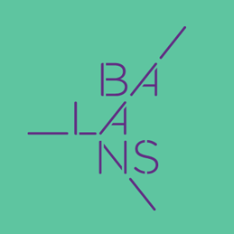
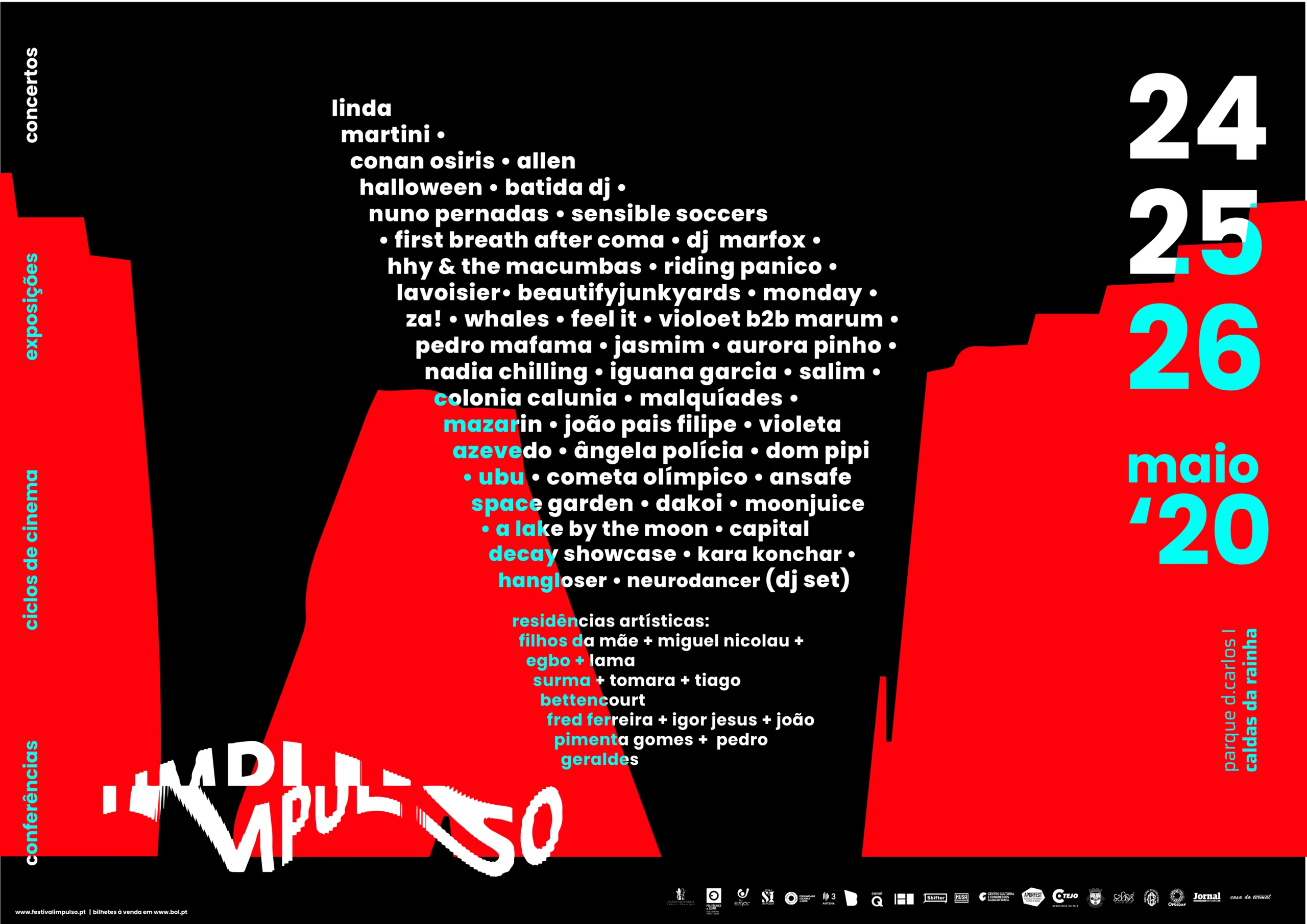
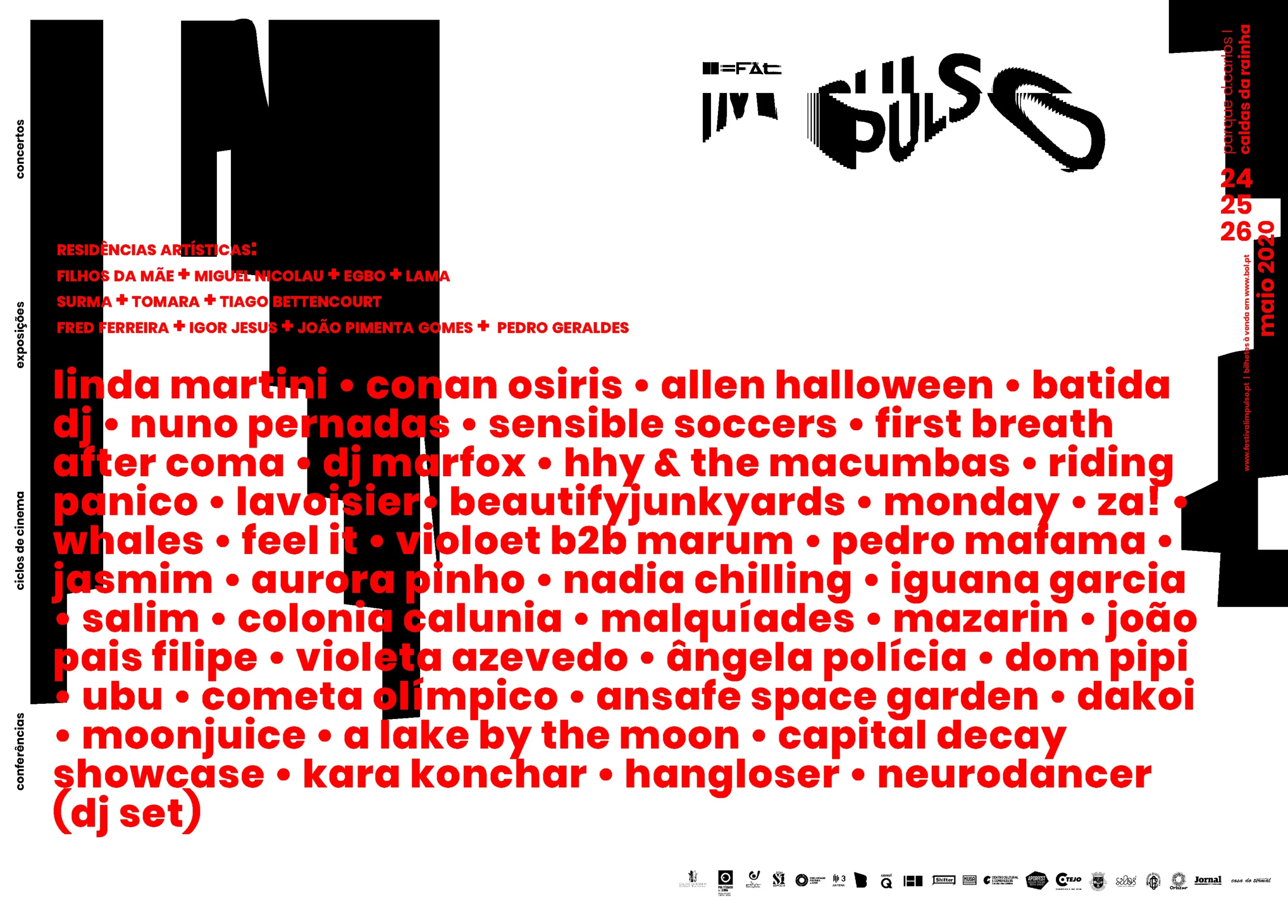
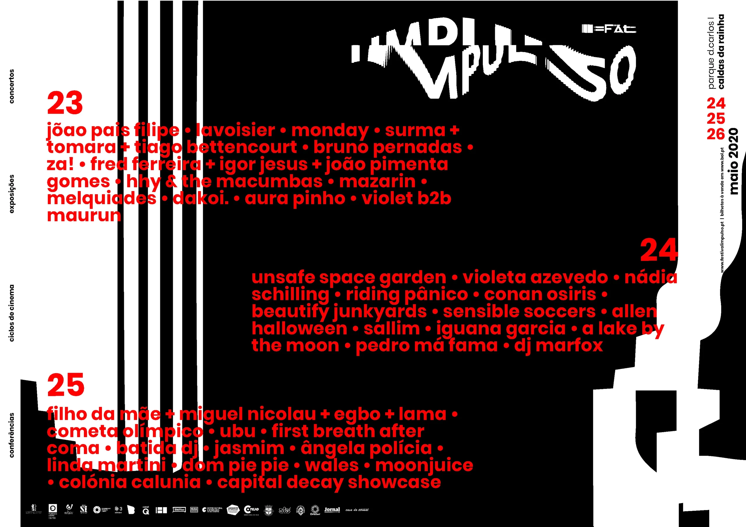
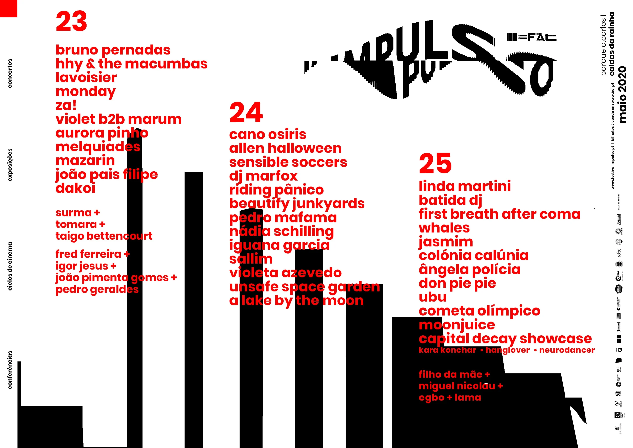
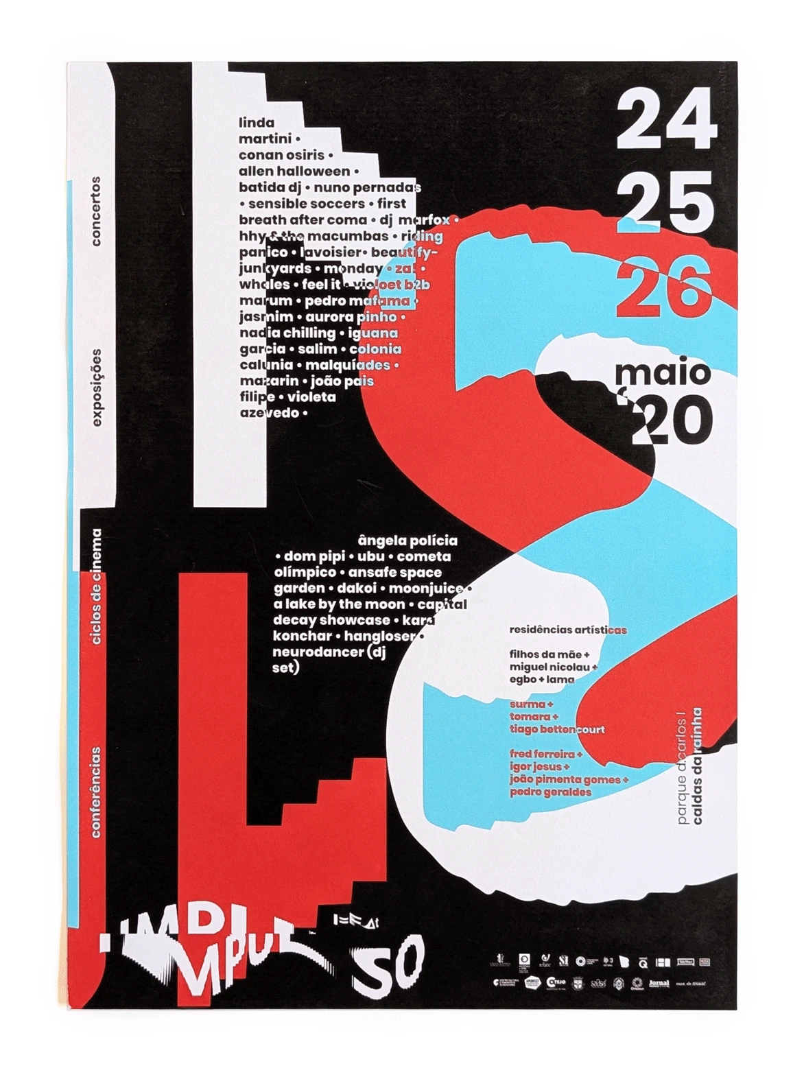
Impulso
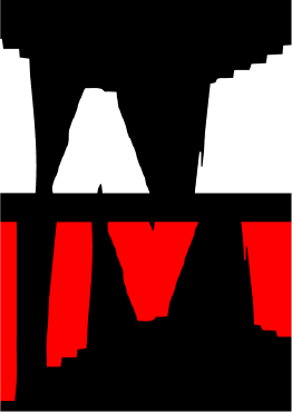
Logo & Visual Identity
Projeto
General description
Process
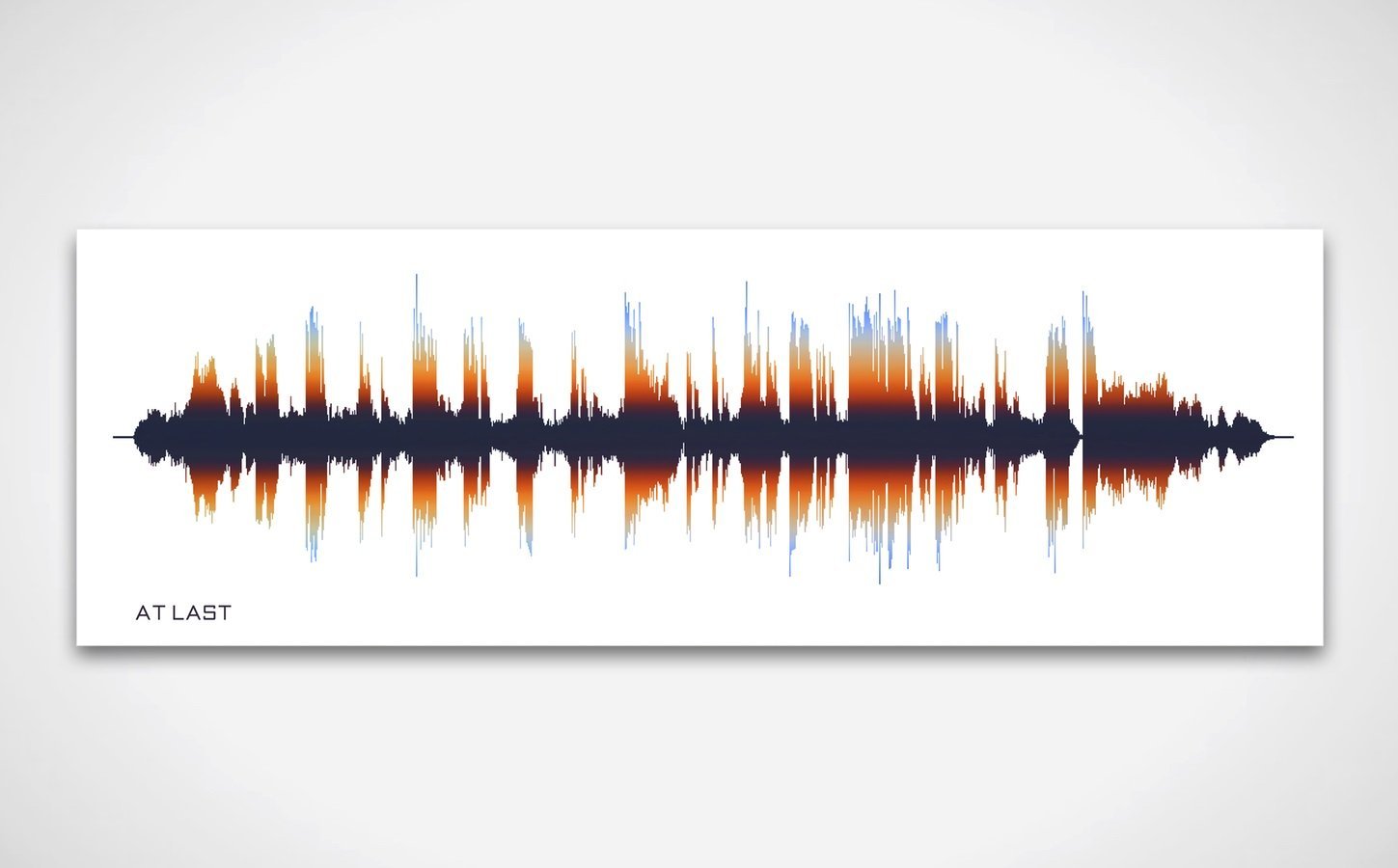
Solution
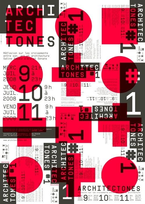
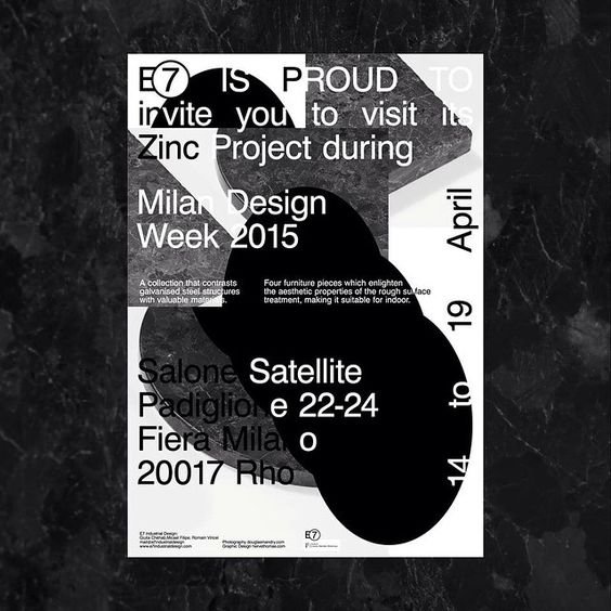
Some references
(there is much more references missing from this section, but I don't want to make it too long)
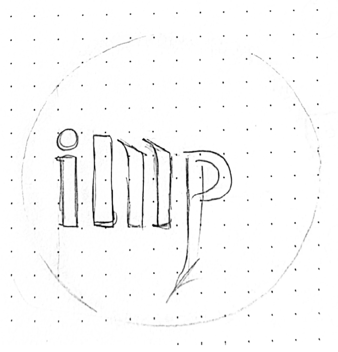
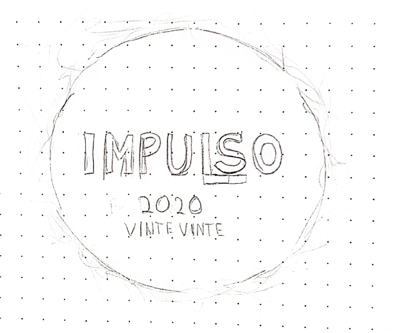
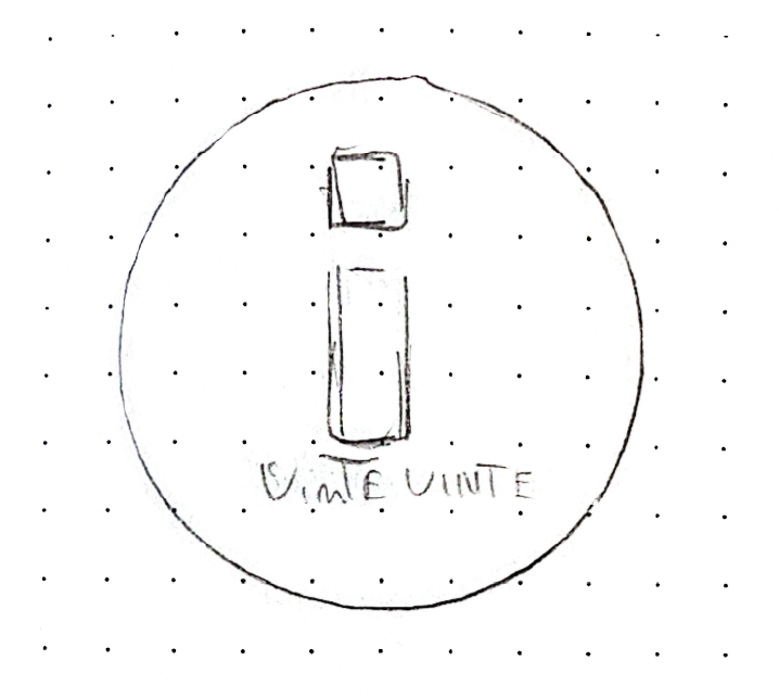
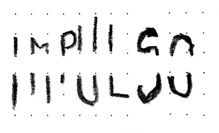
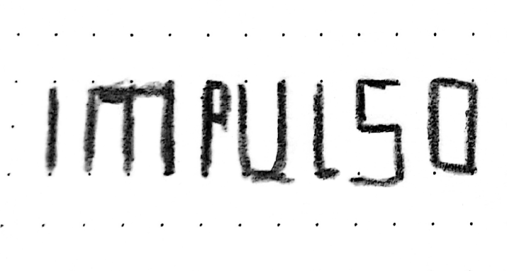
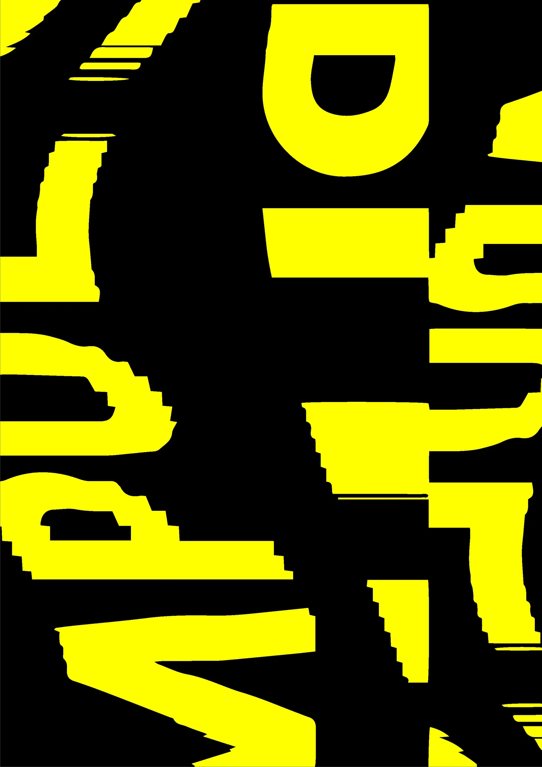
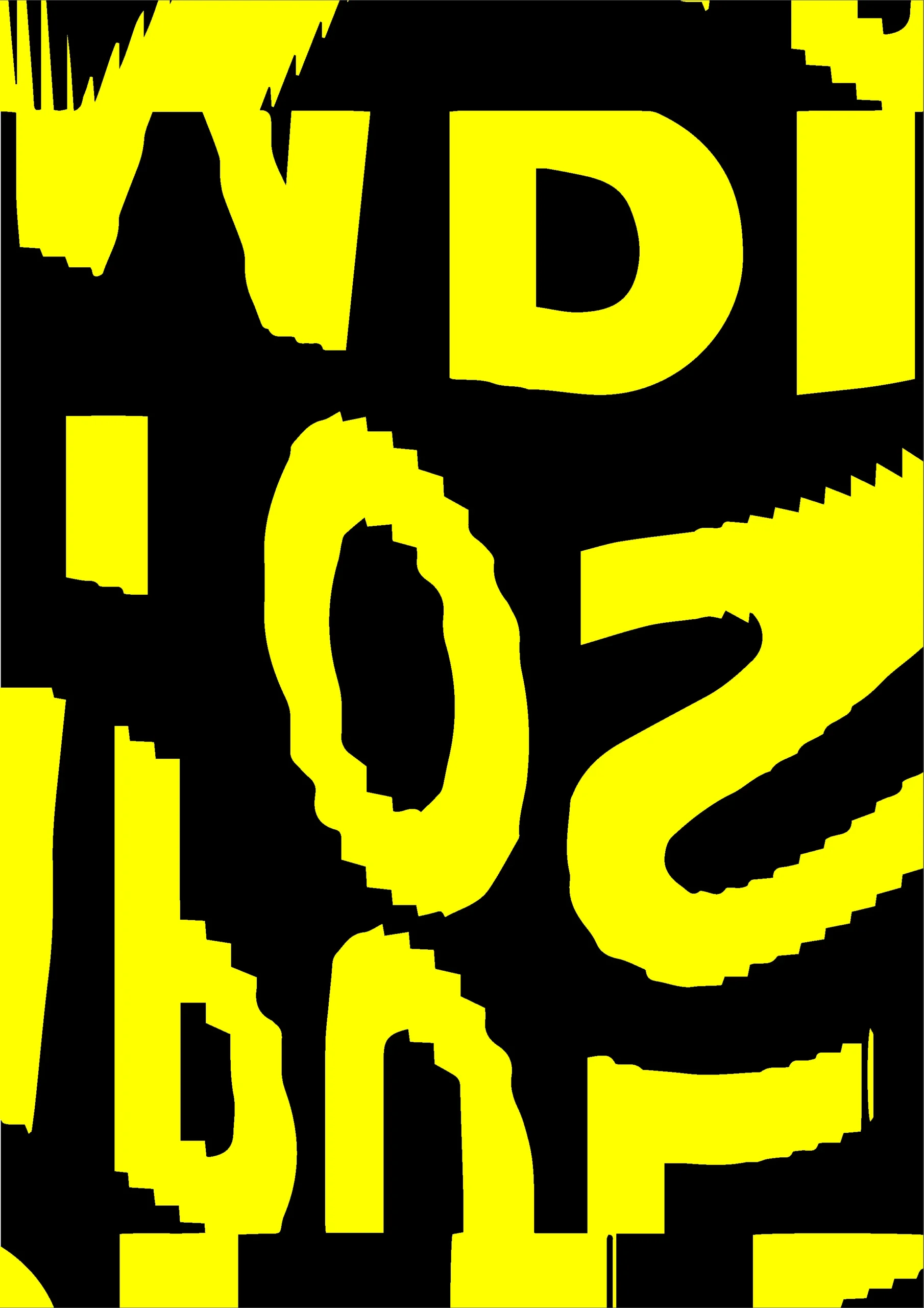
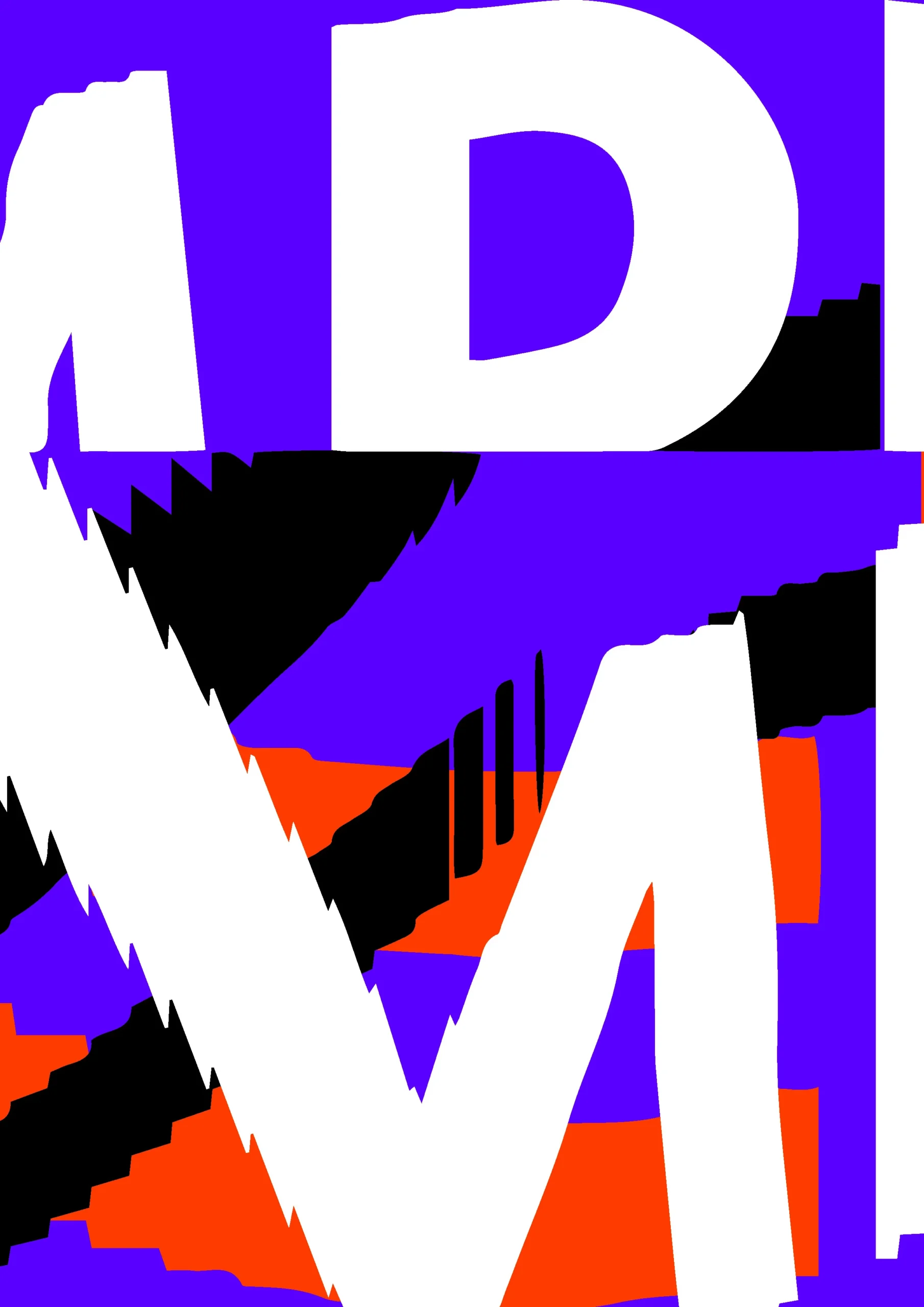
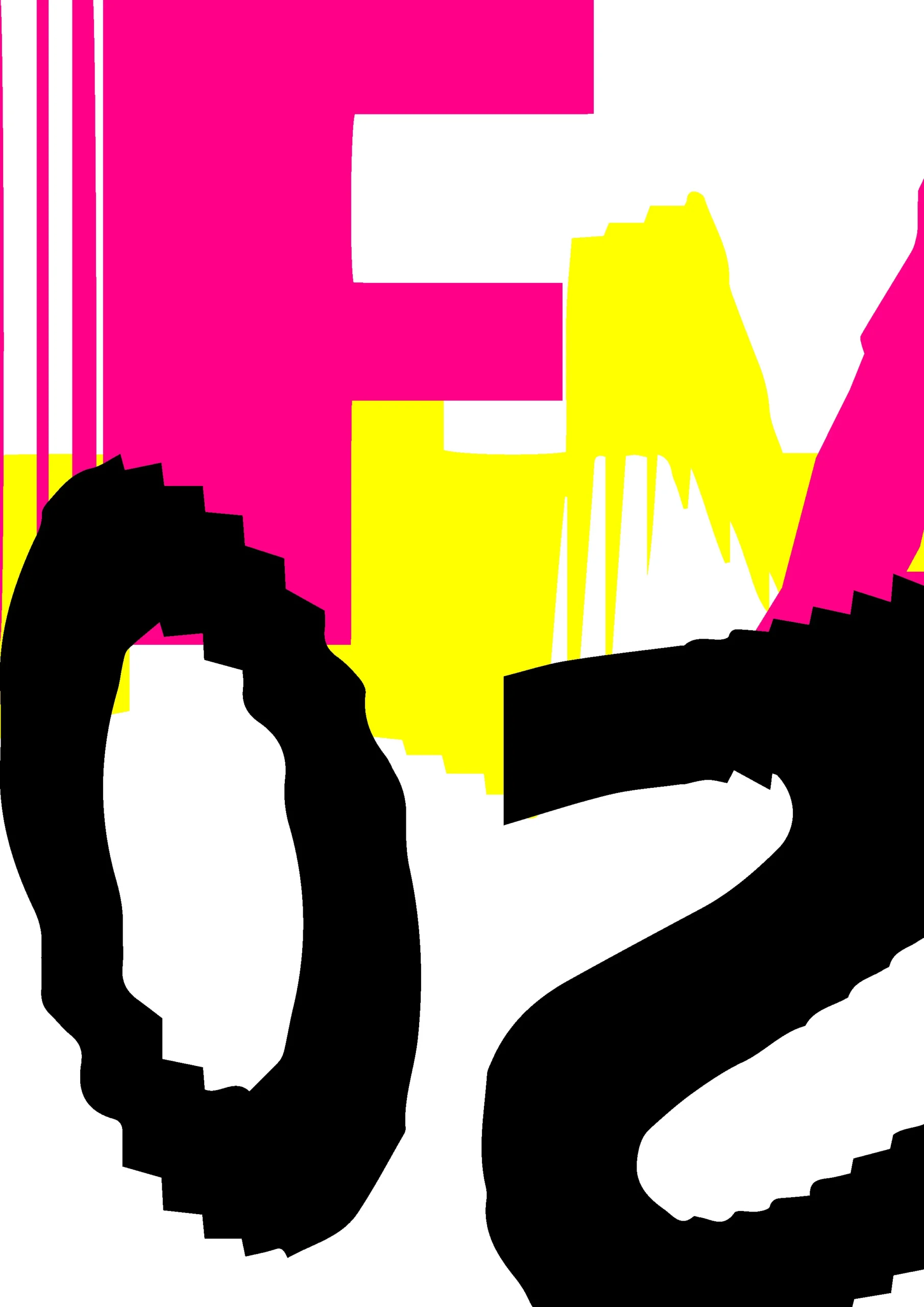
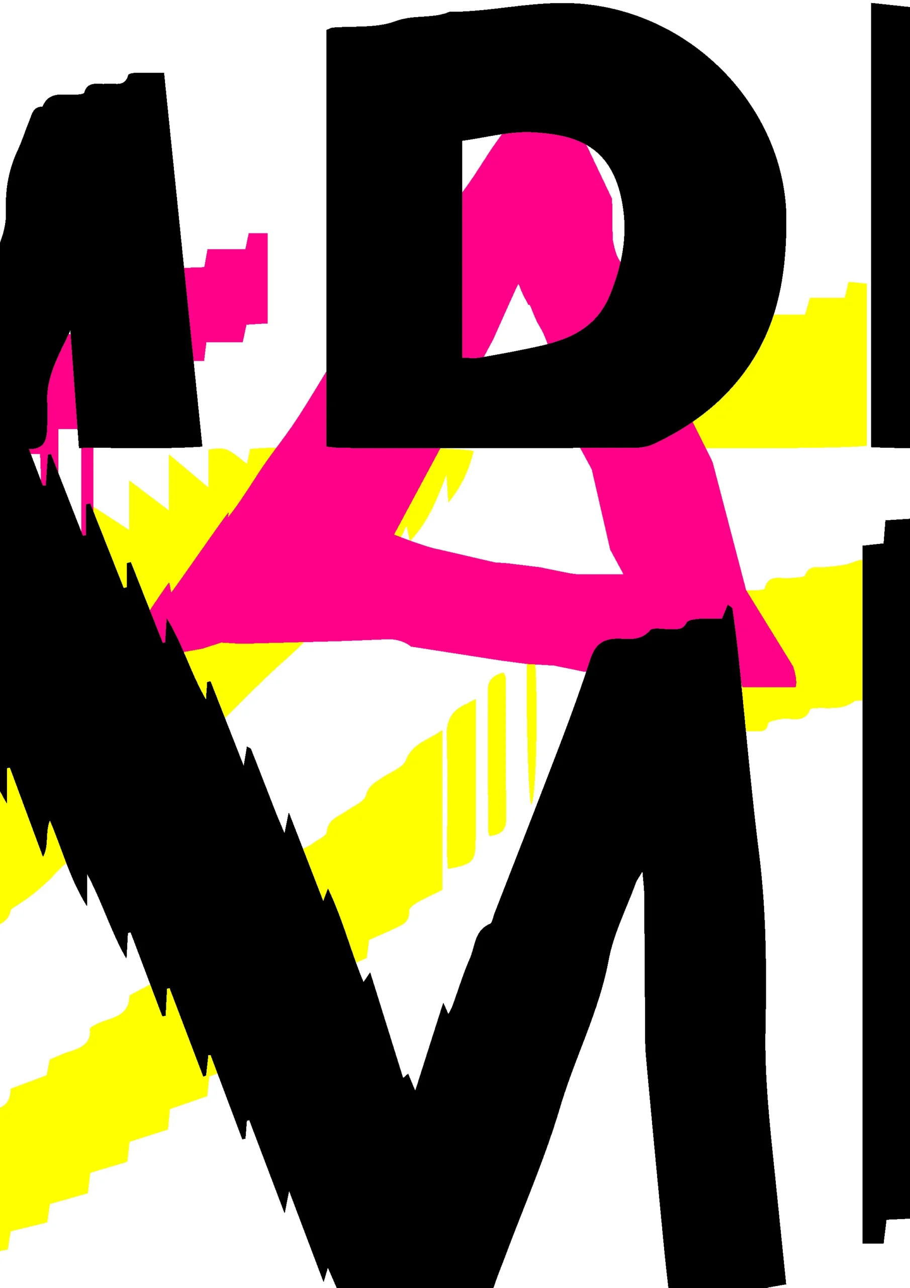
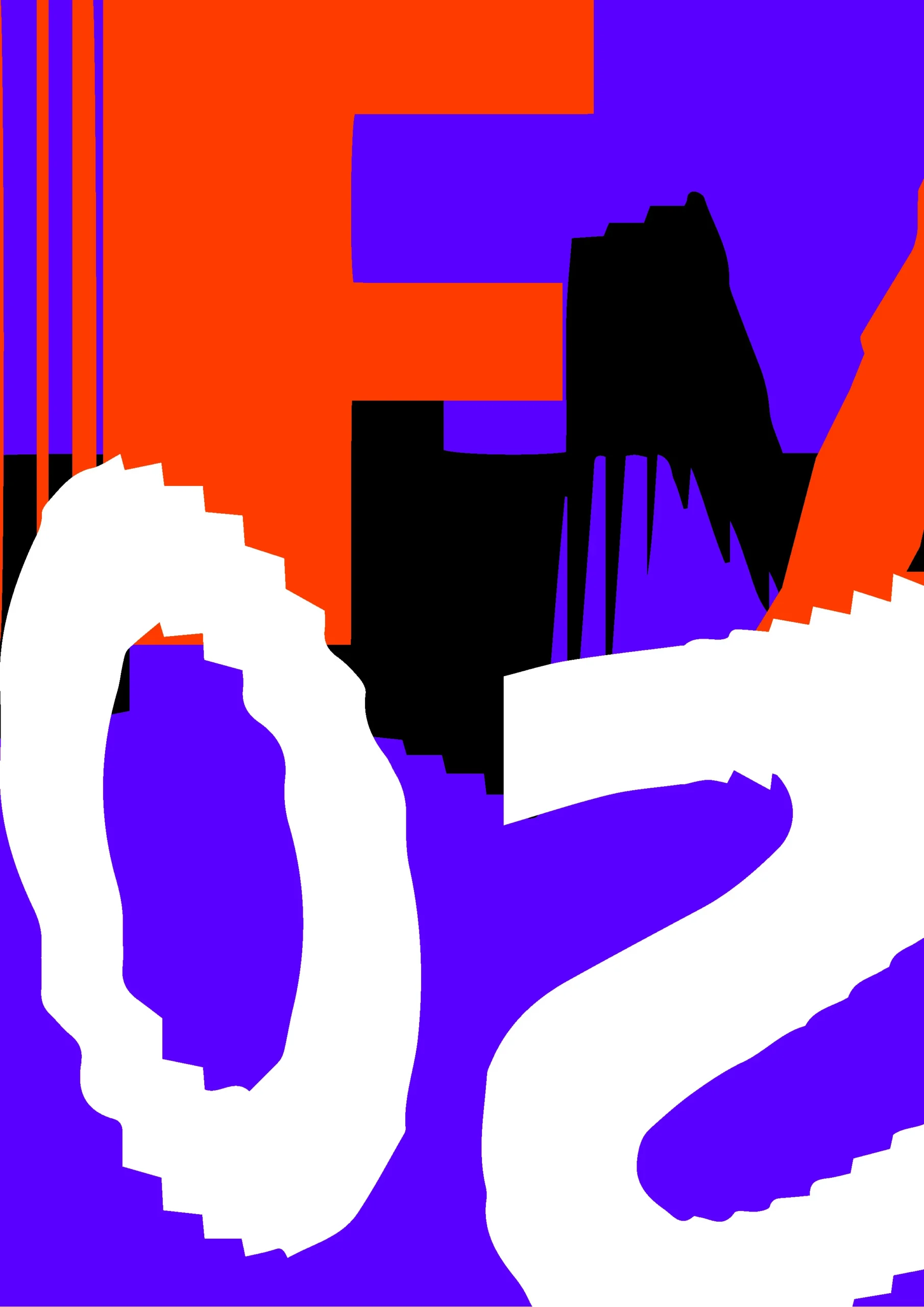
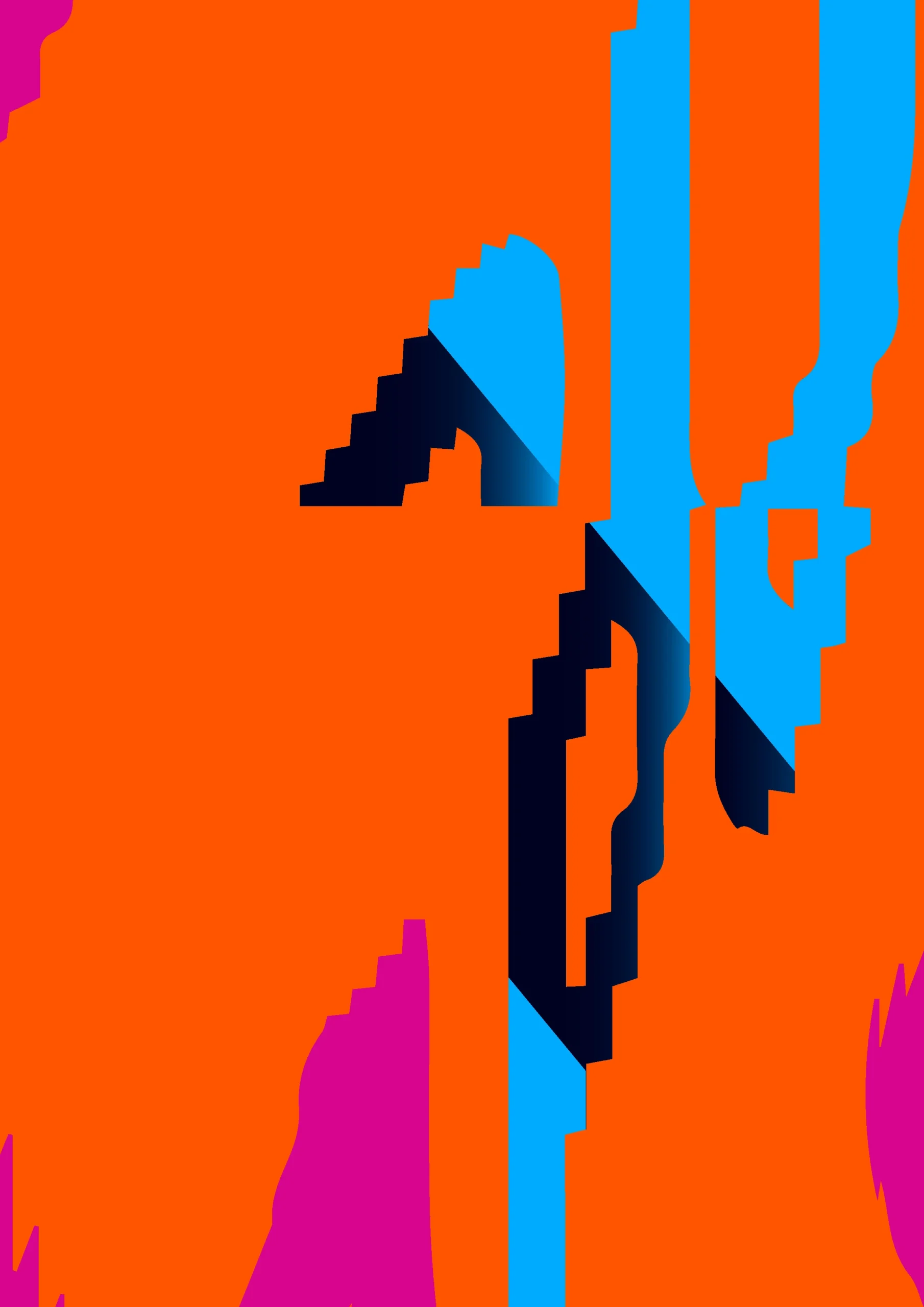
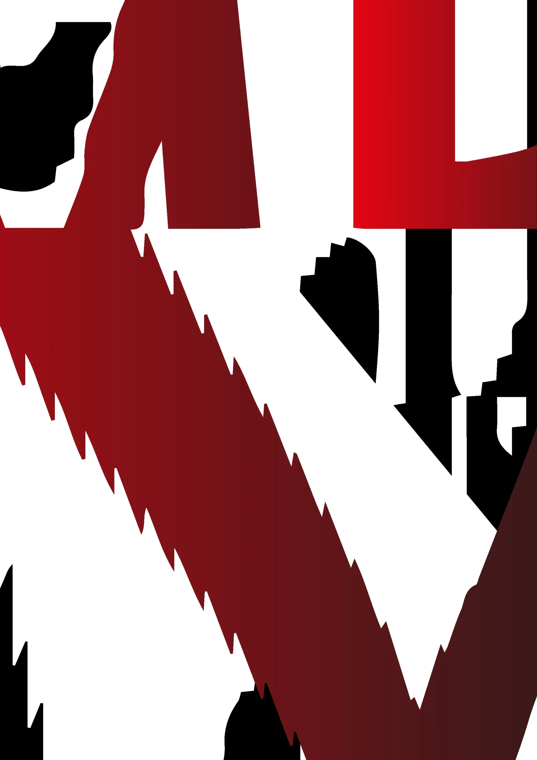
Initial concept
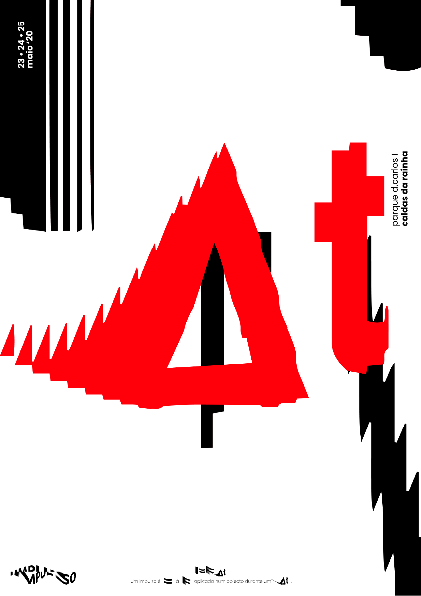
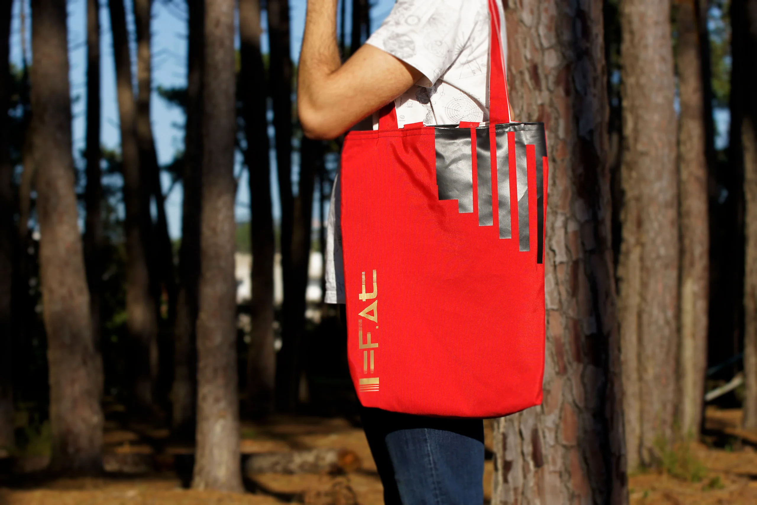
I=F⋅Δt - Where I is the impulse, F is the applied force and Δt is the time interval.

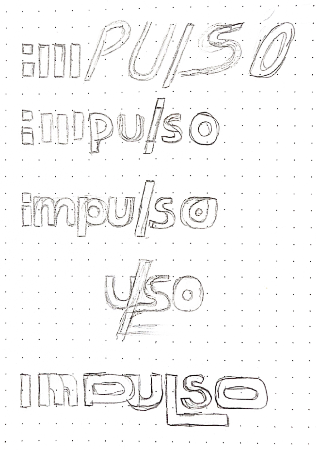
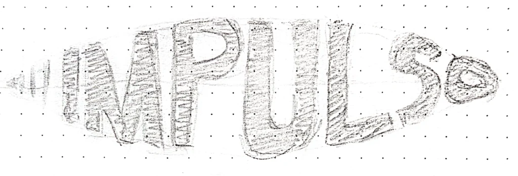
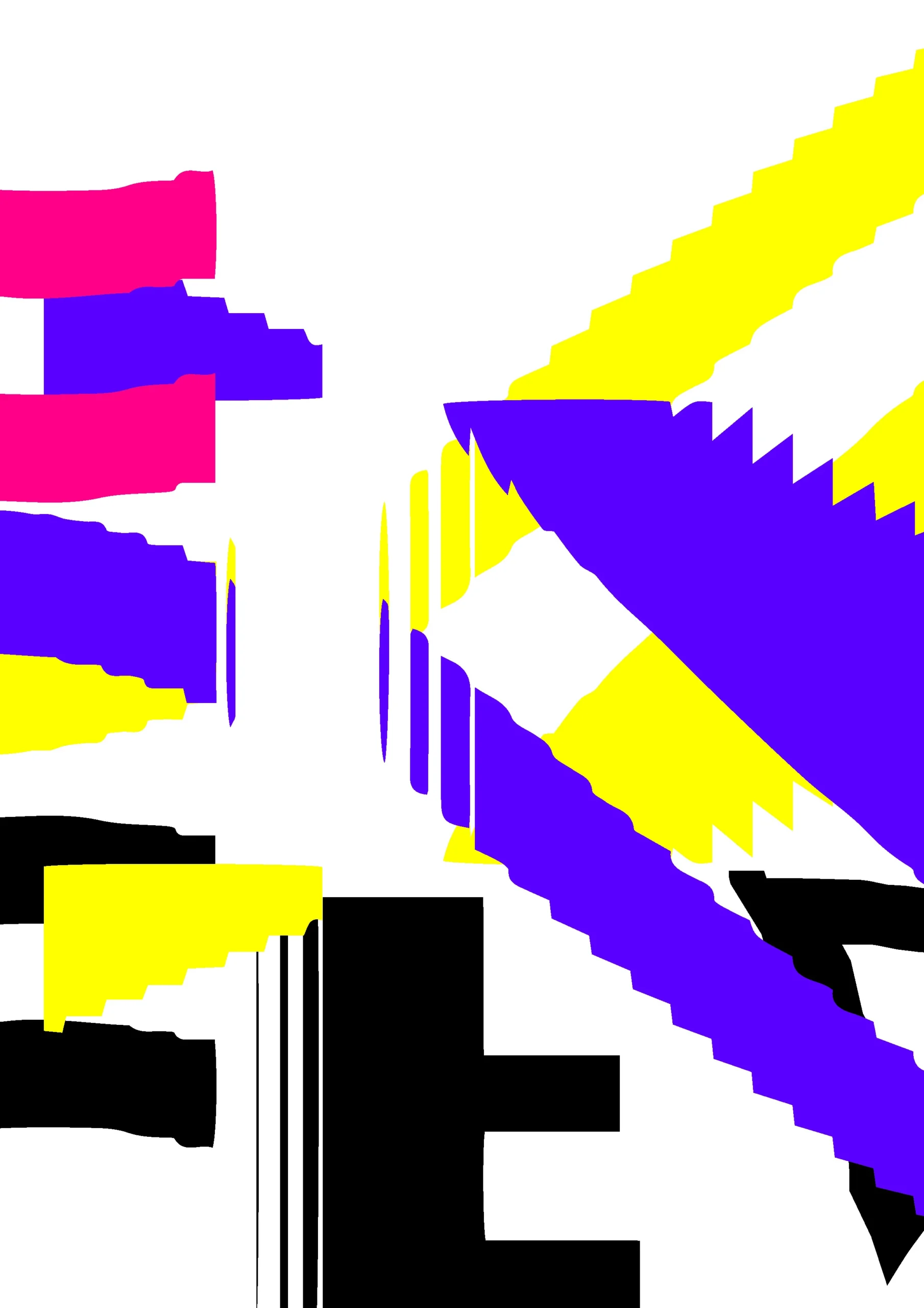
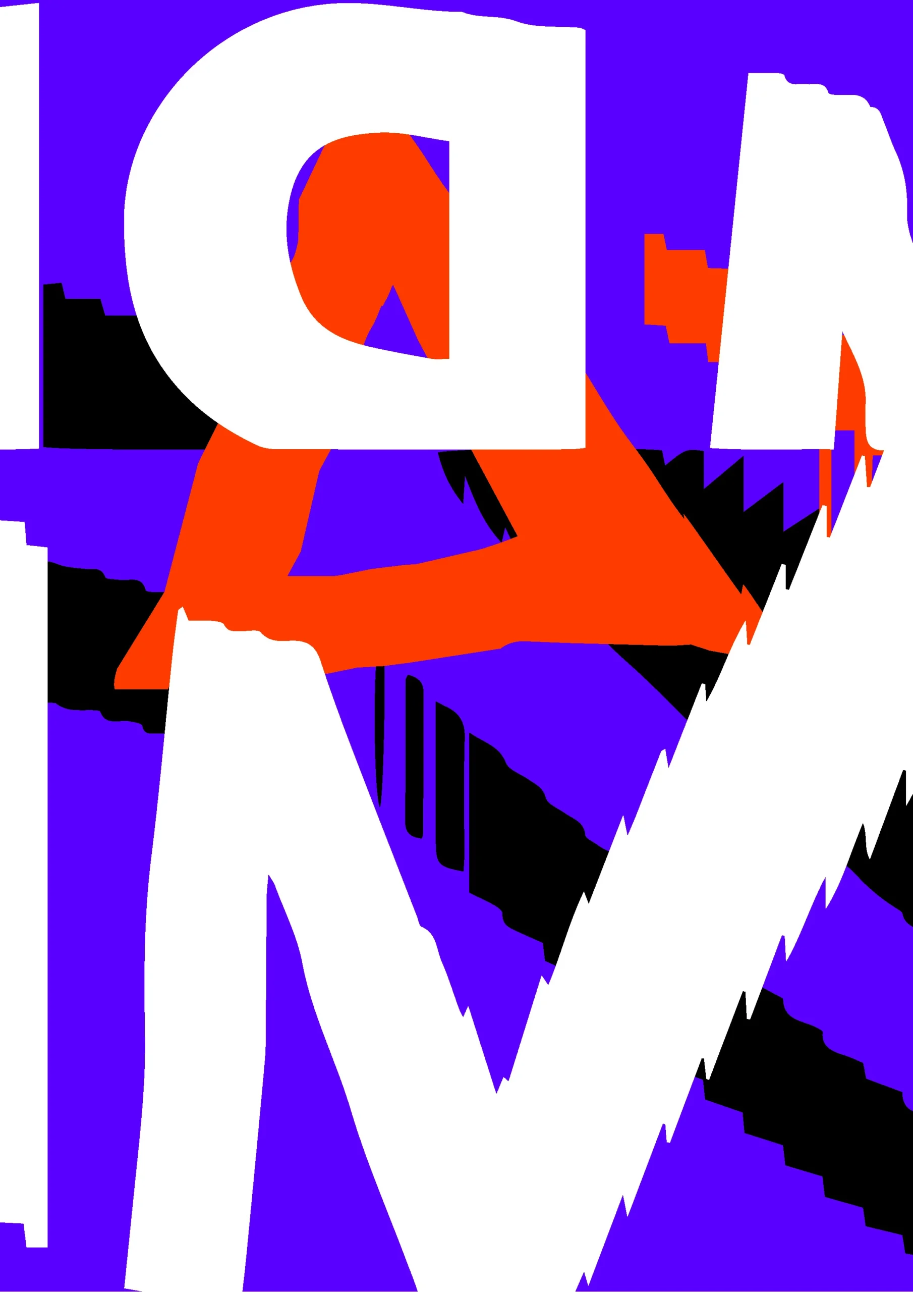
Sketches
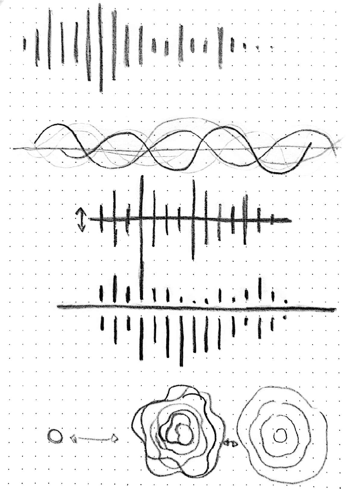
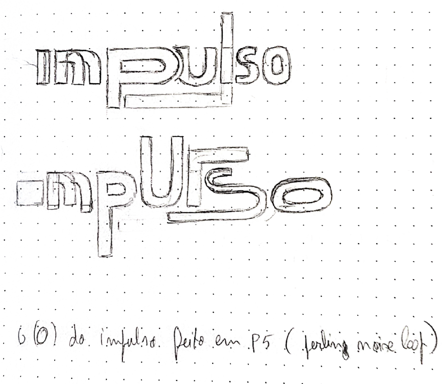
Formula testing

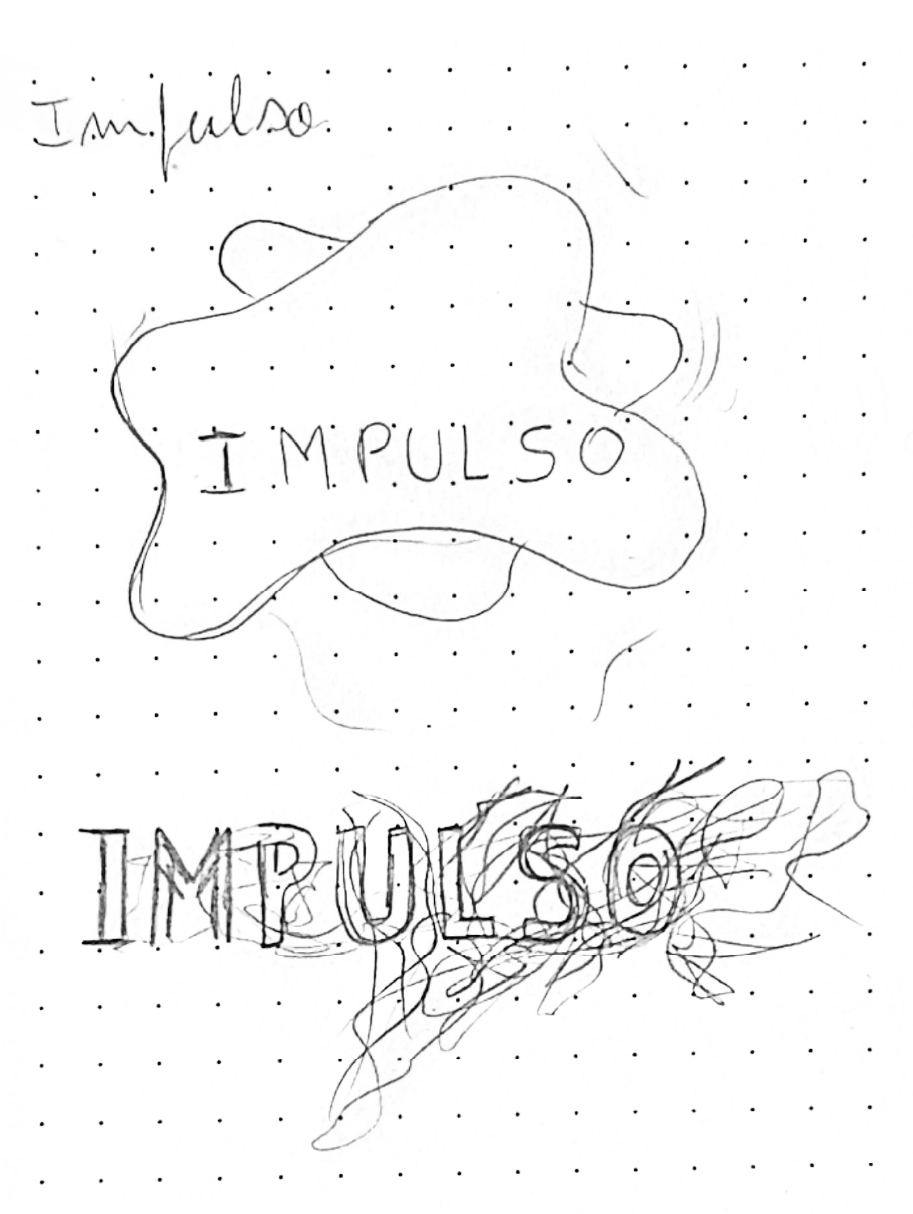
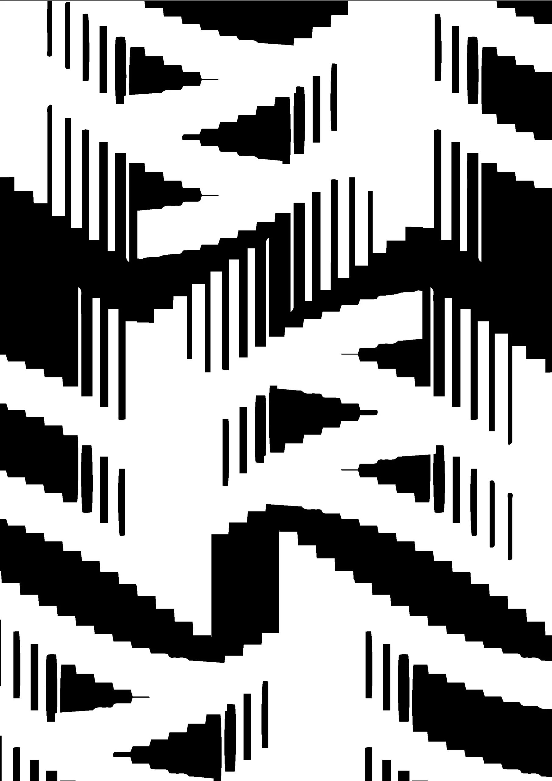
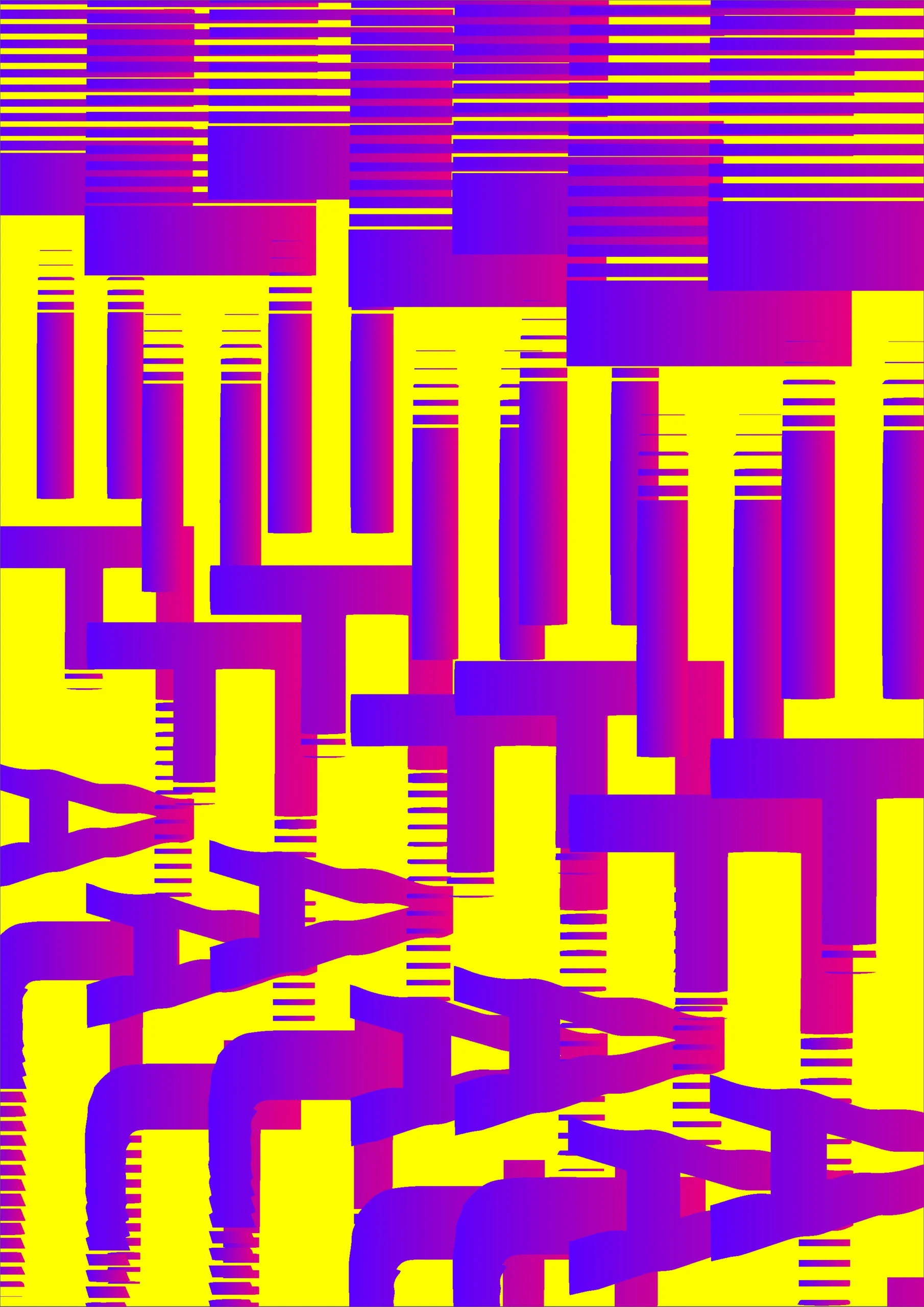
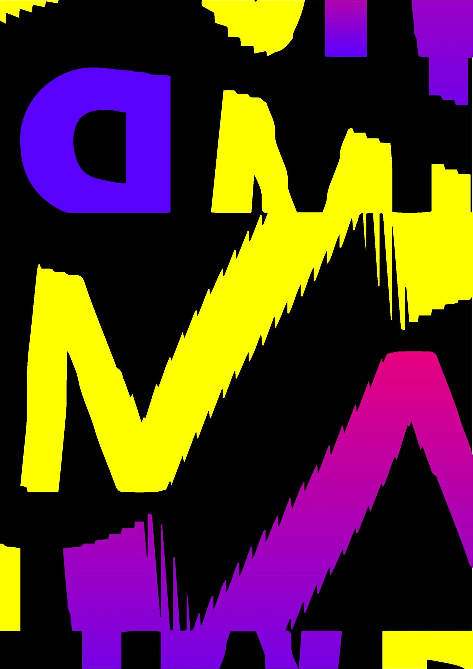
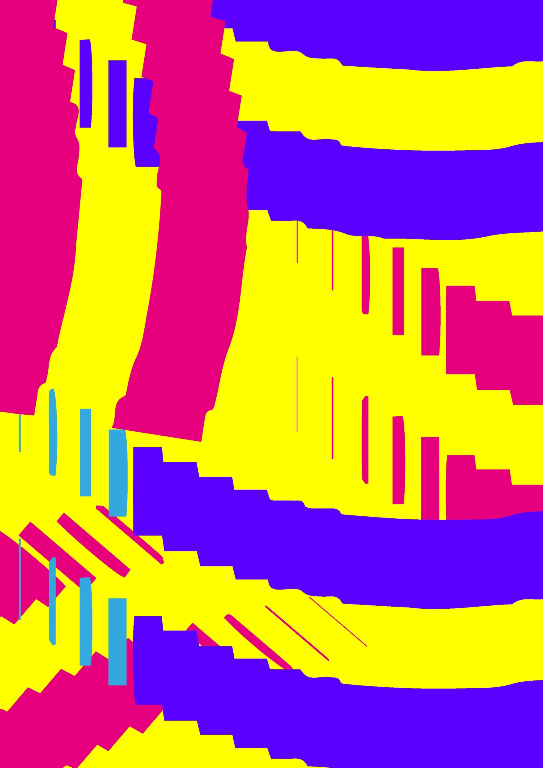
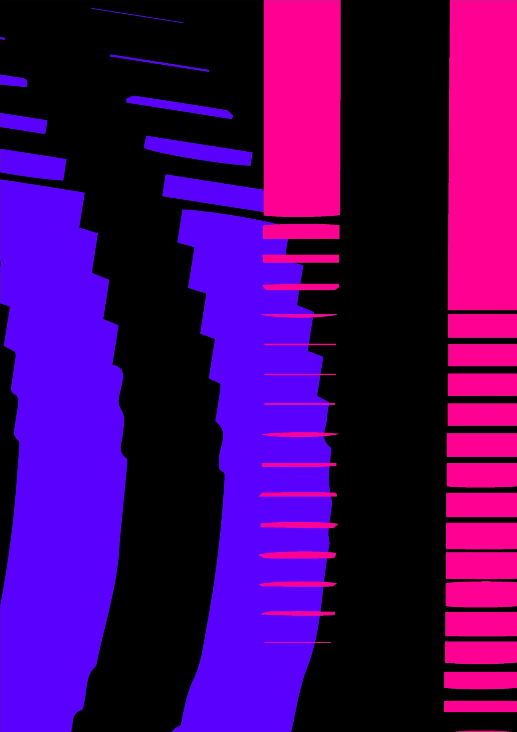
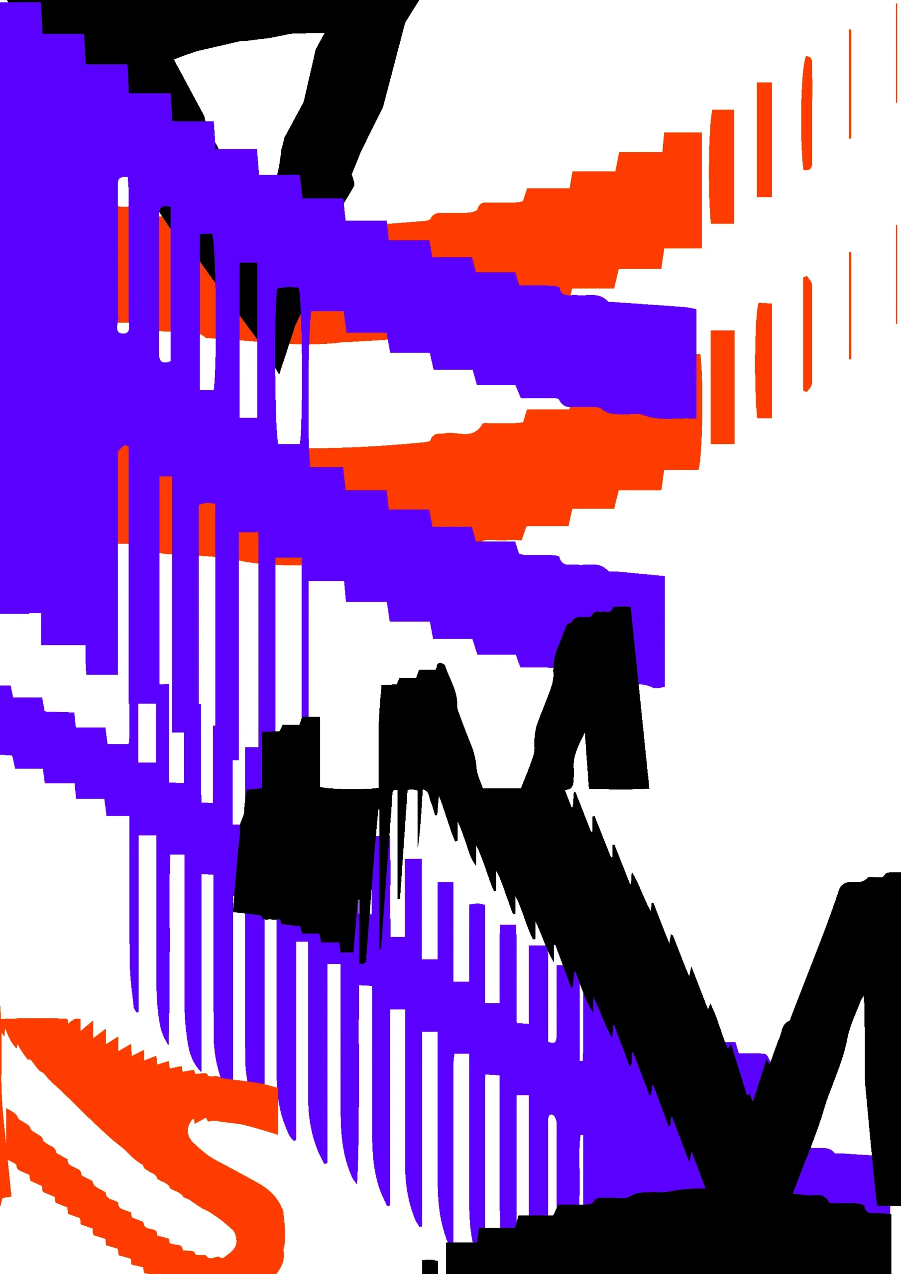
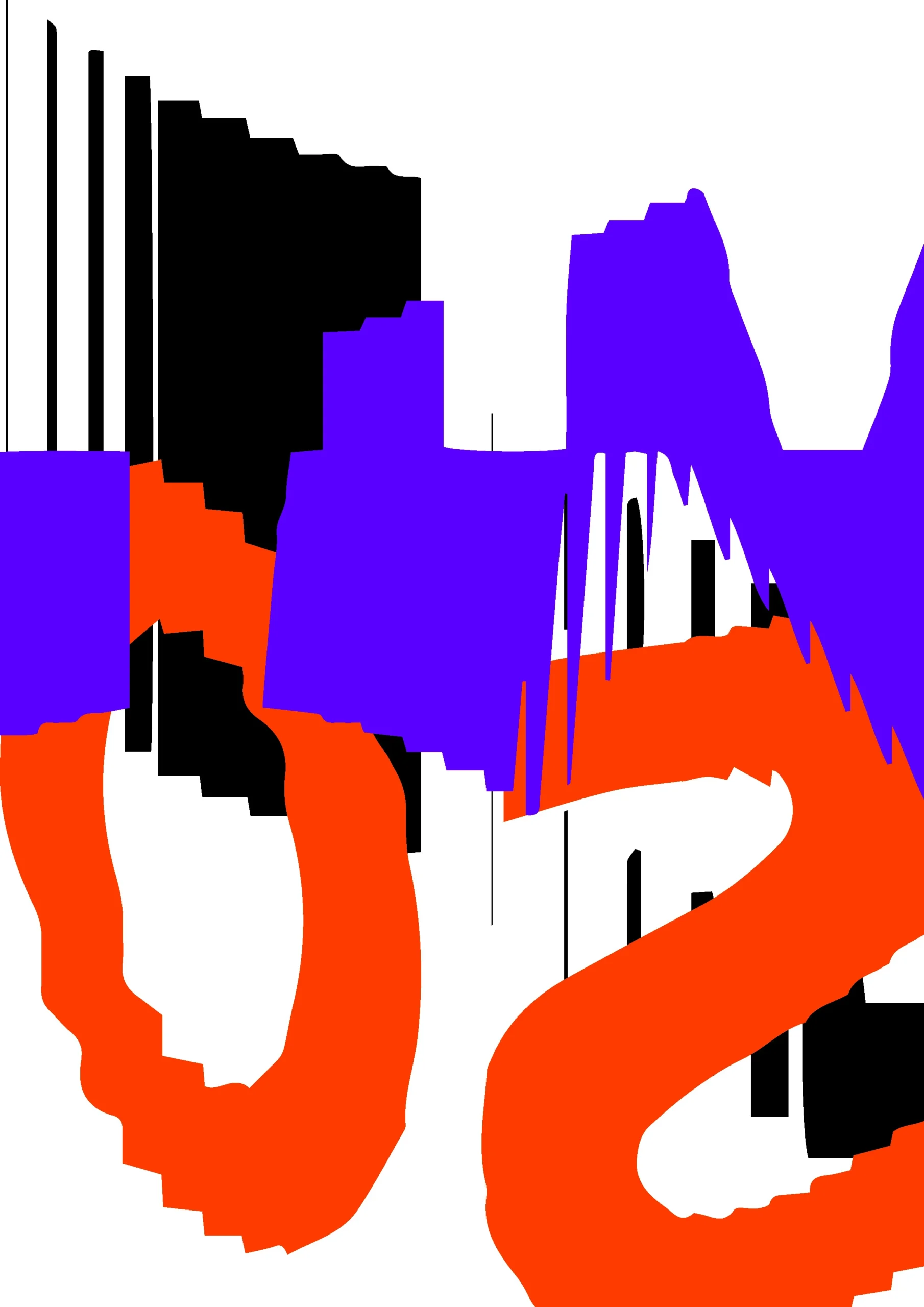
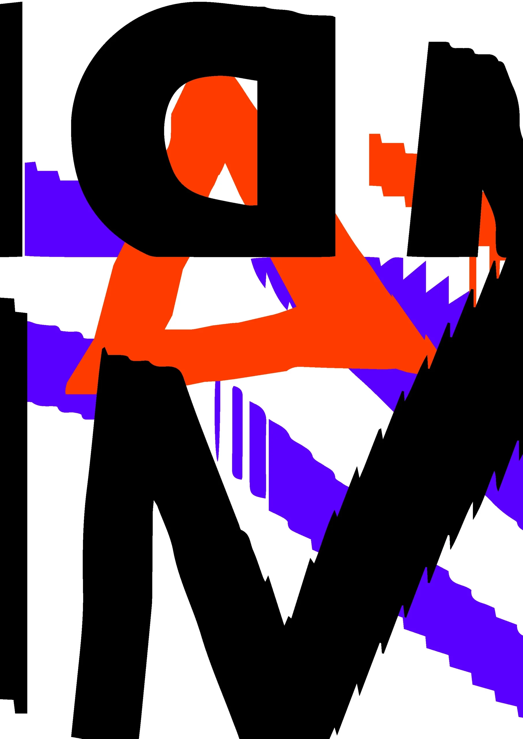
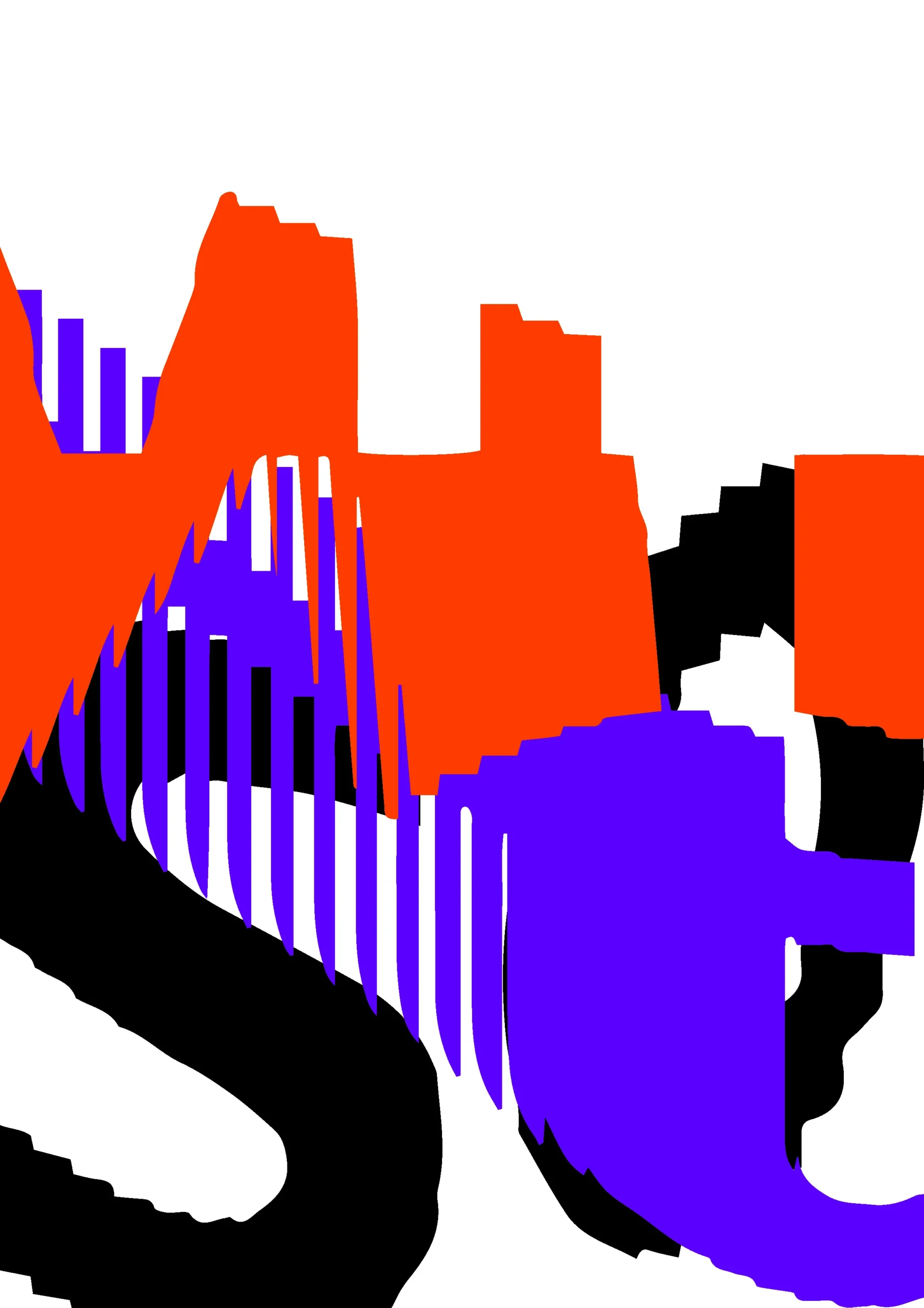
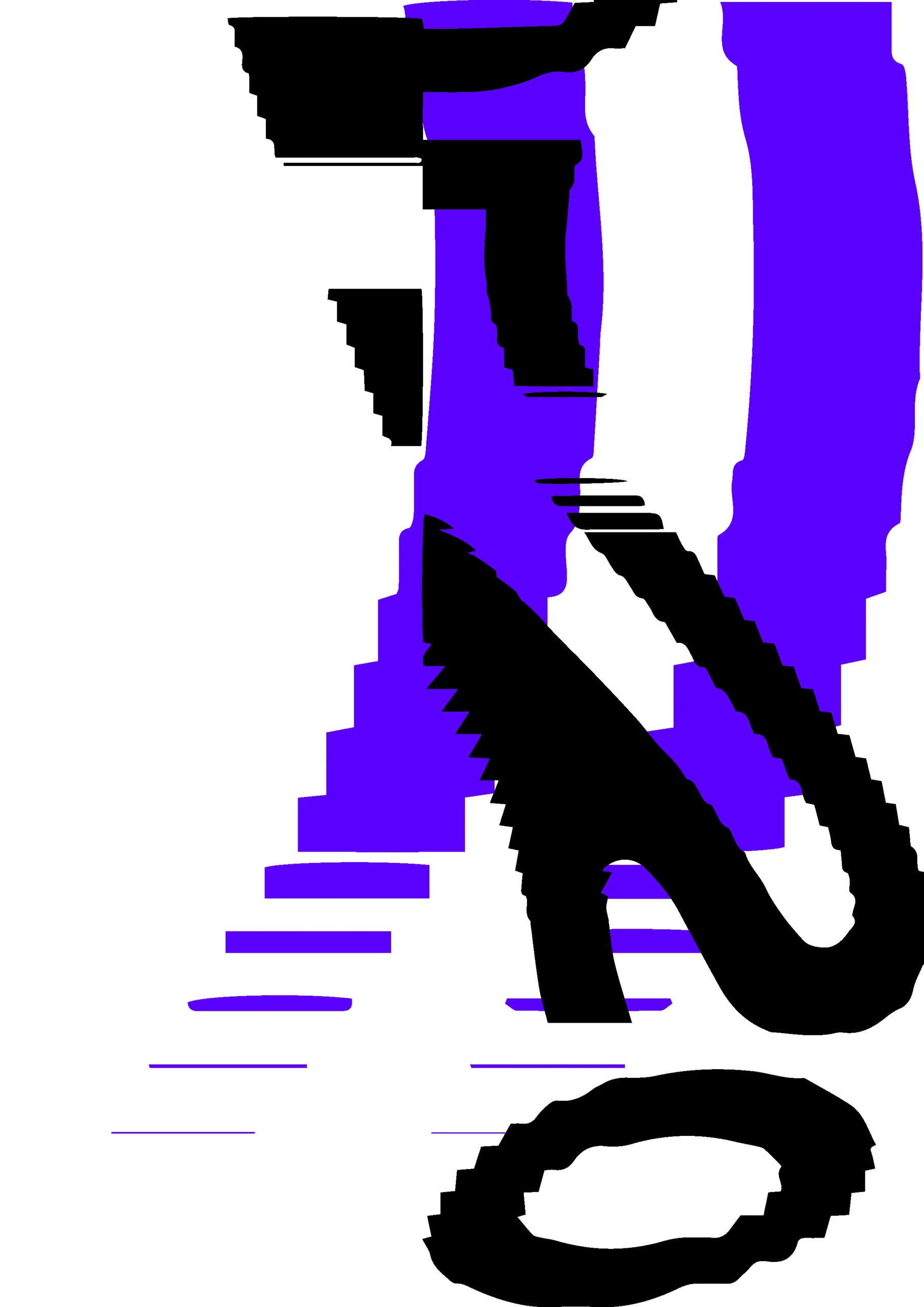
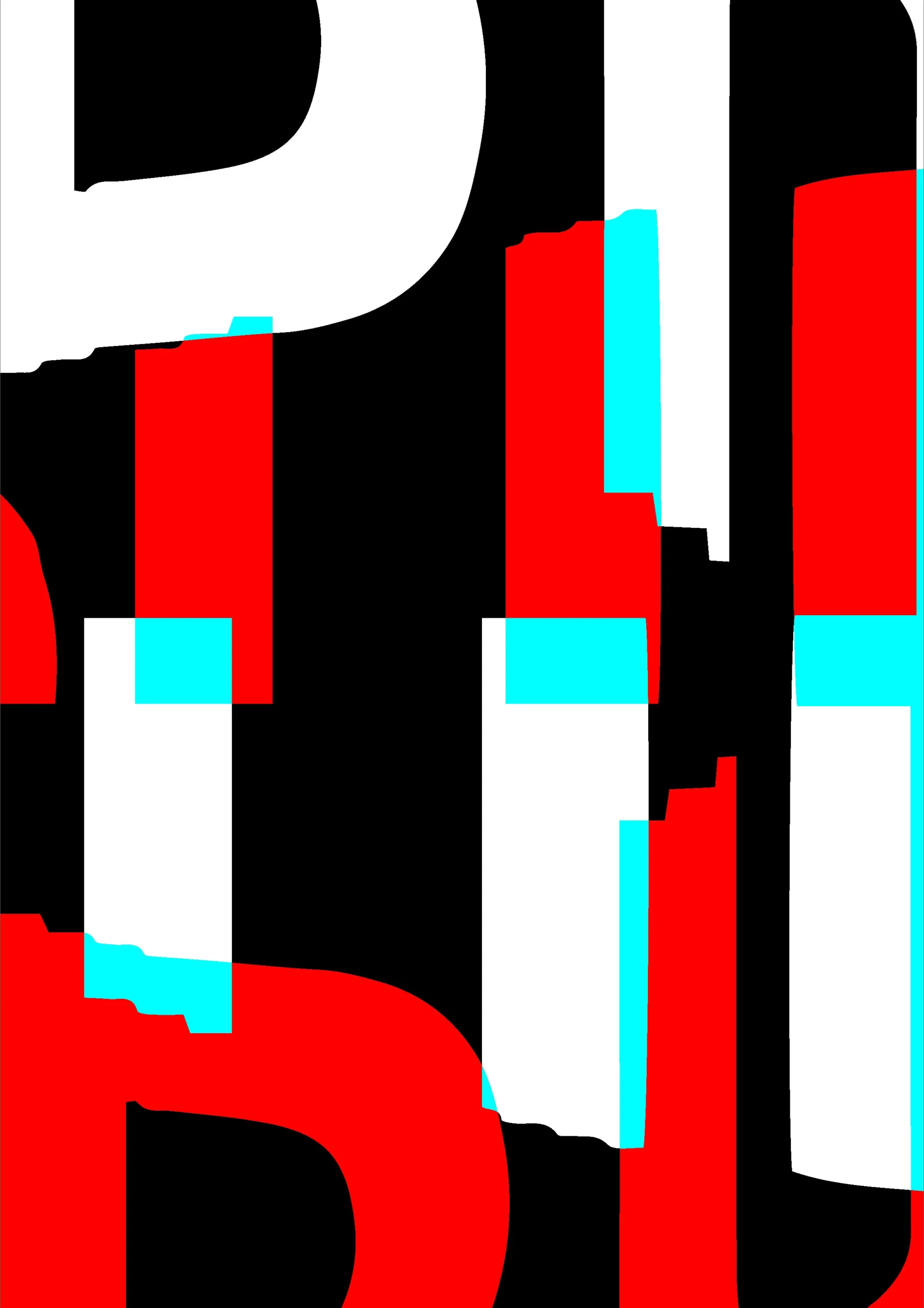
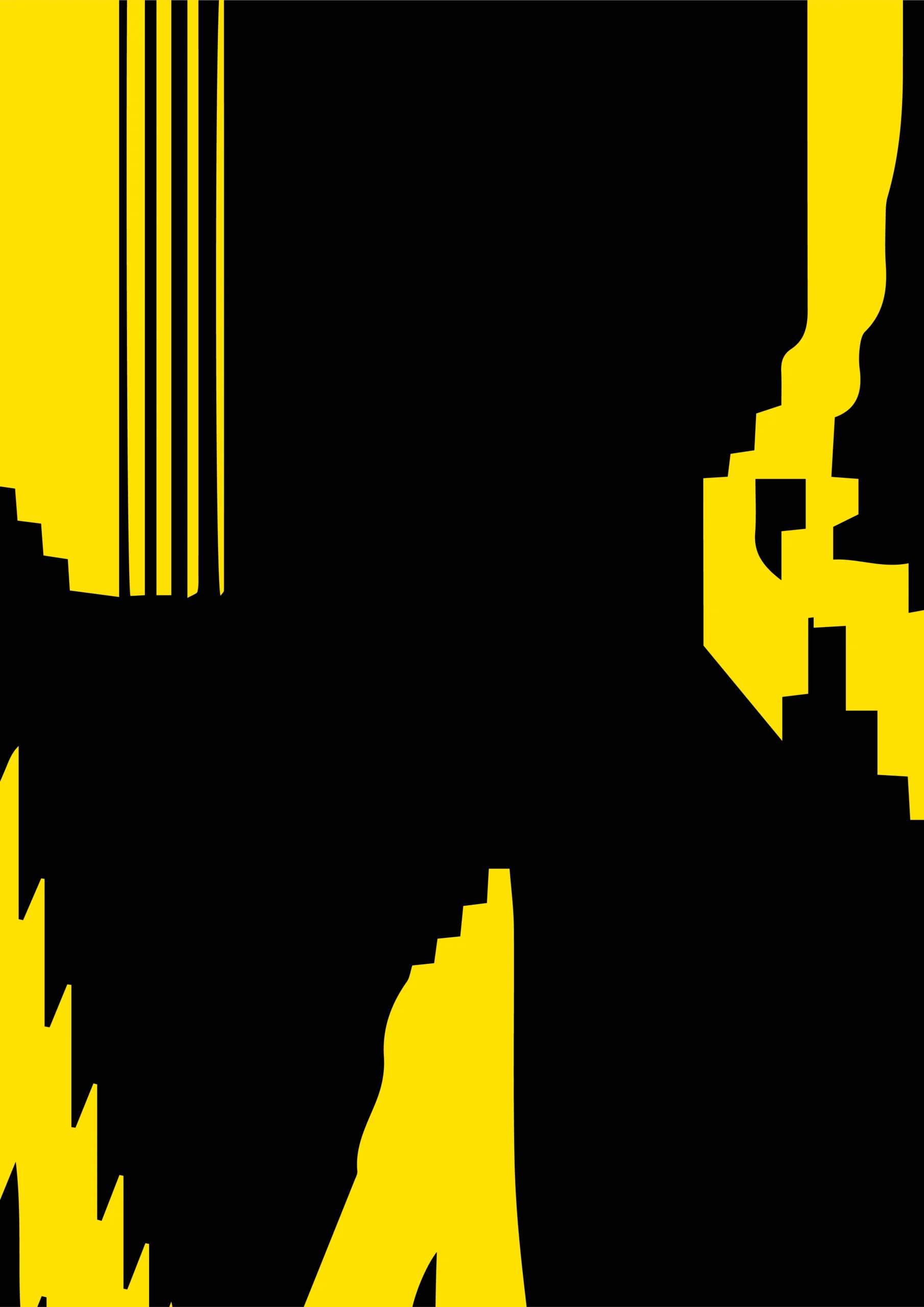
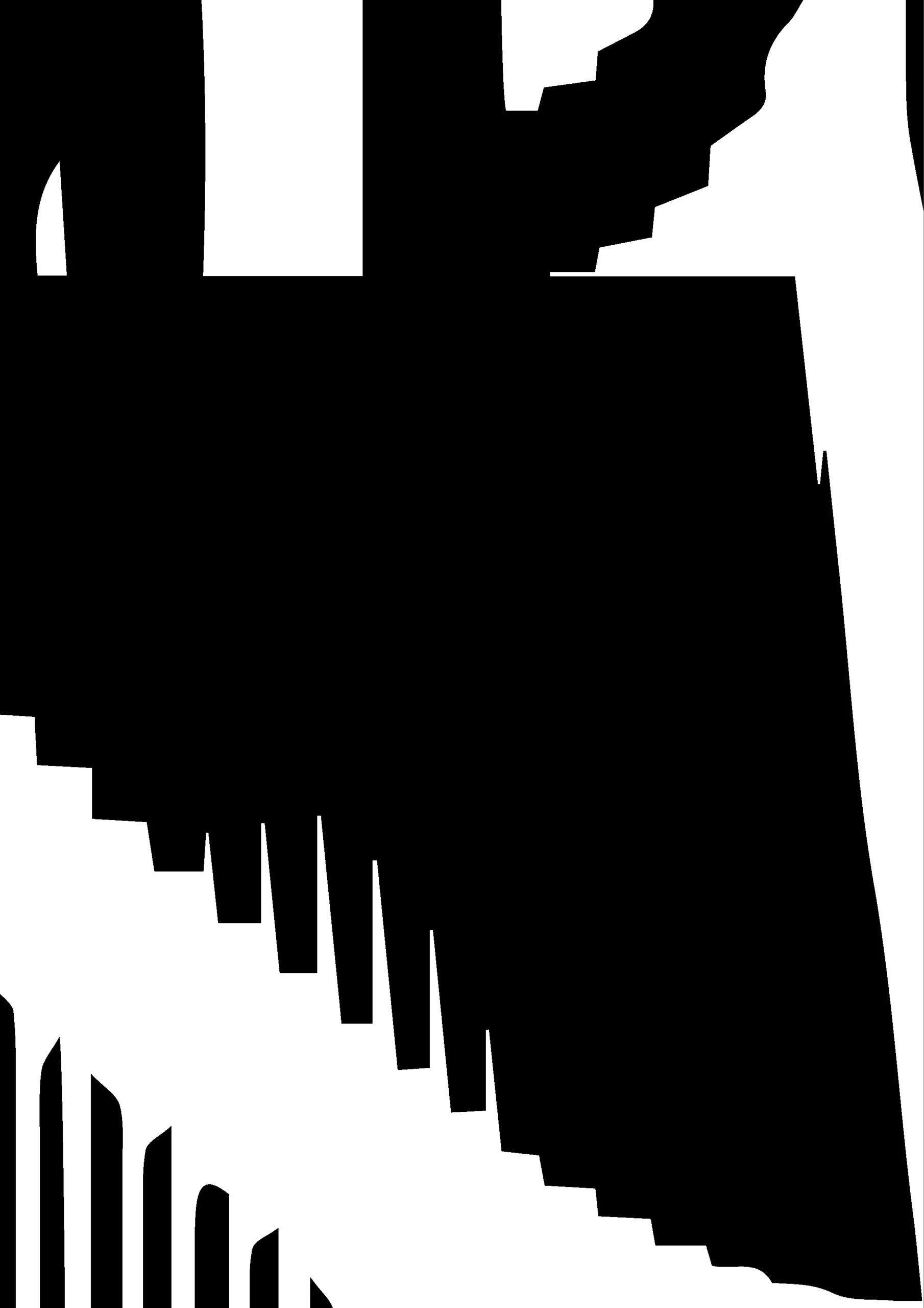
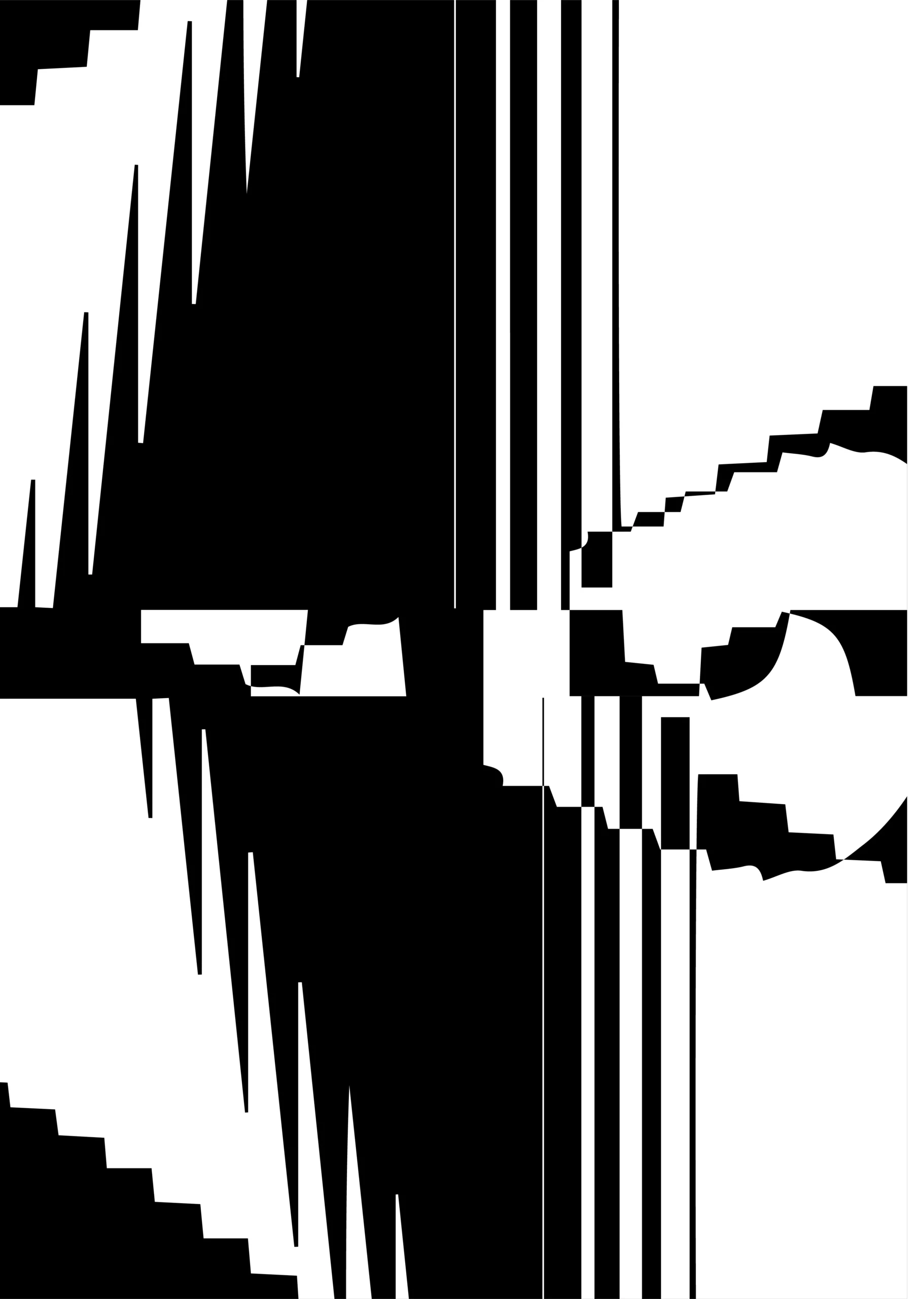
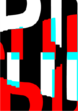
First tests in P5.js


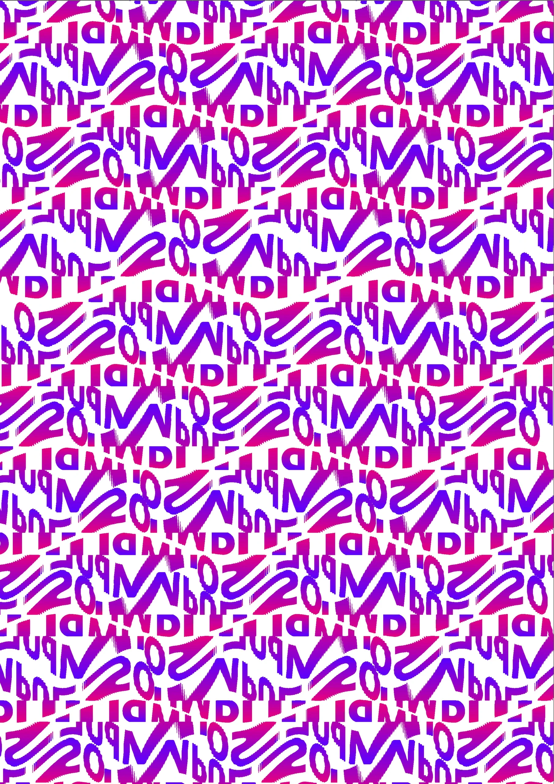
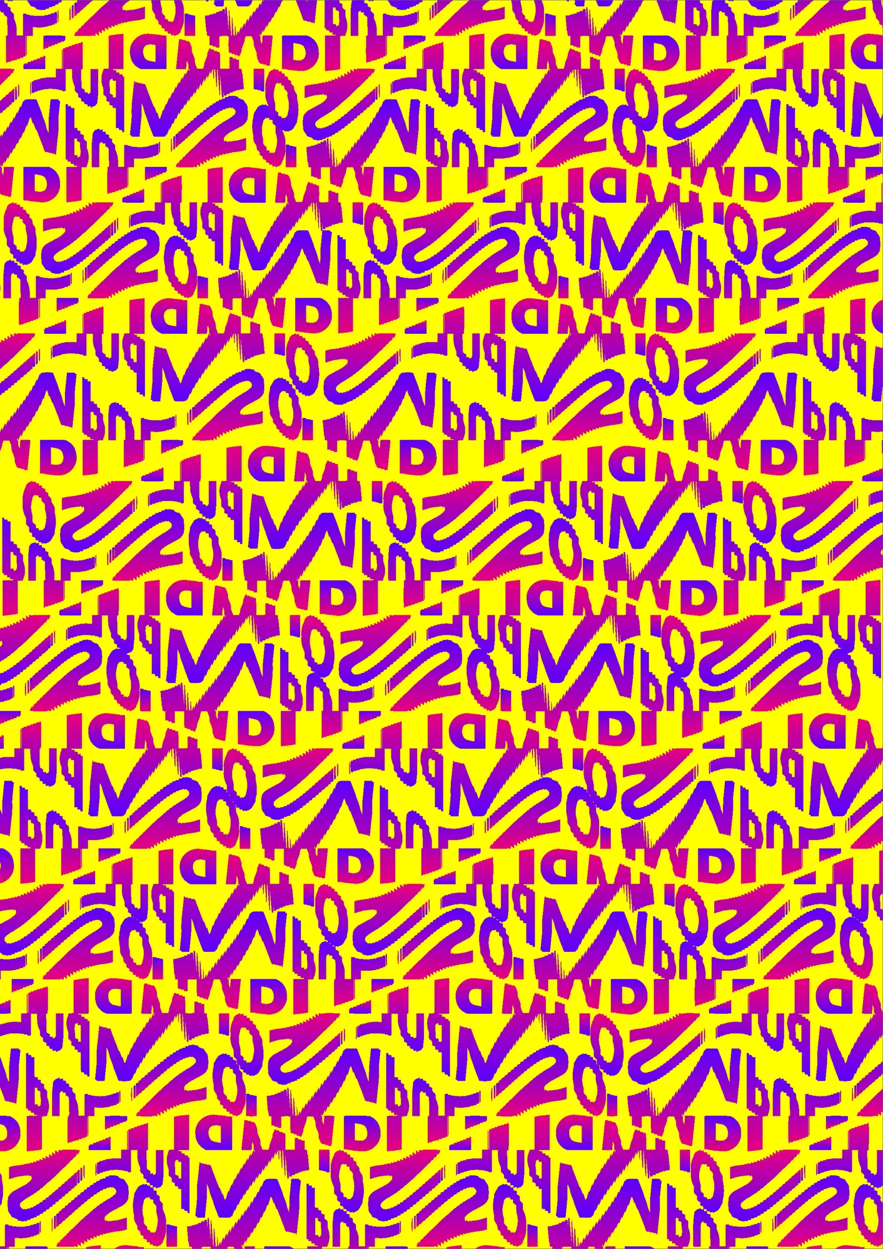
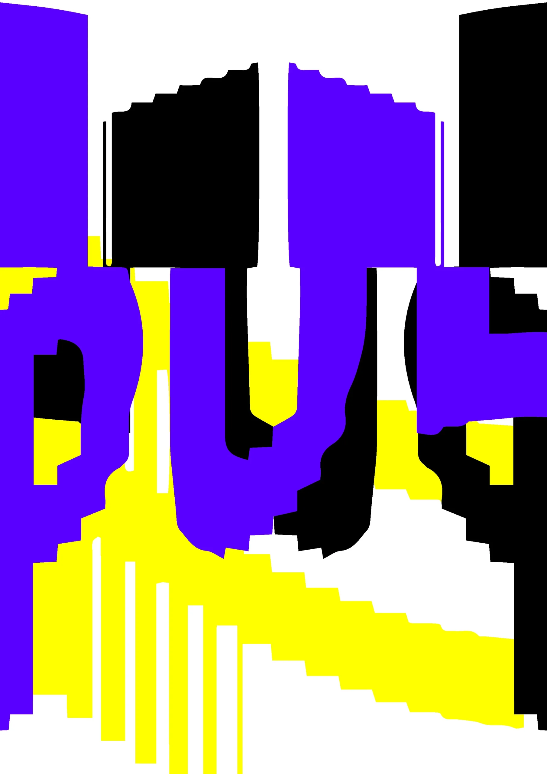
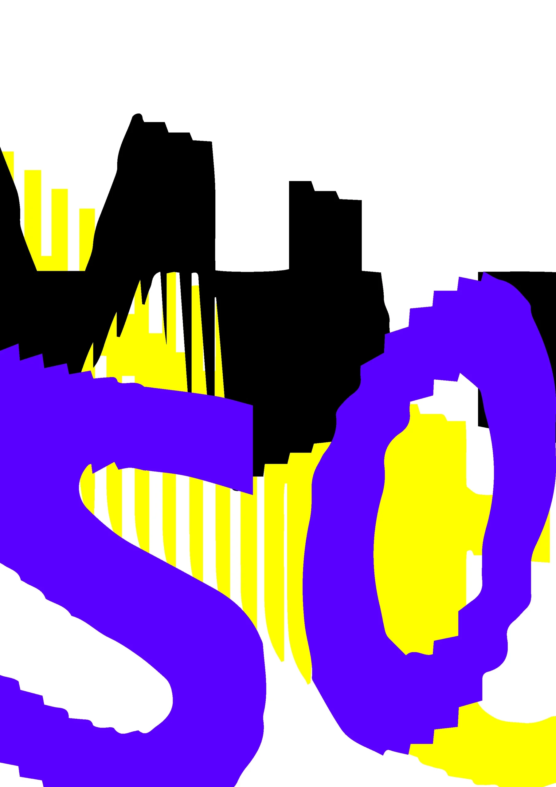
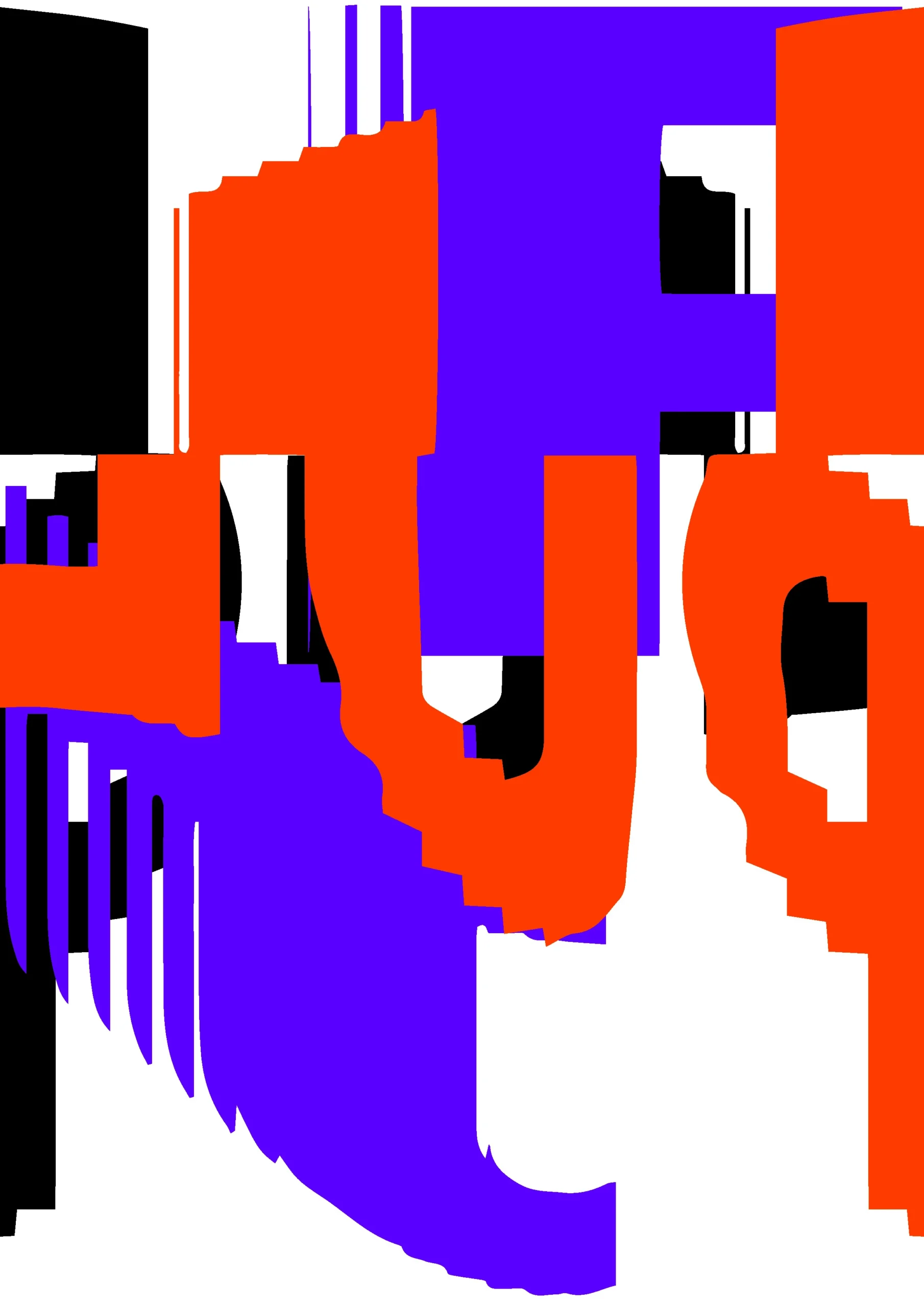
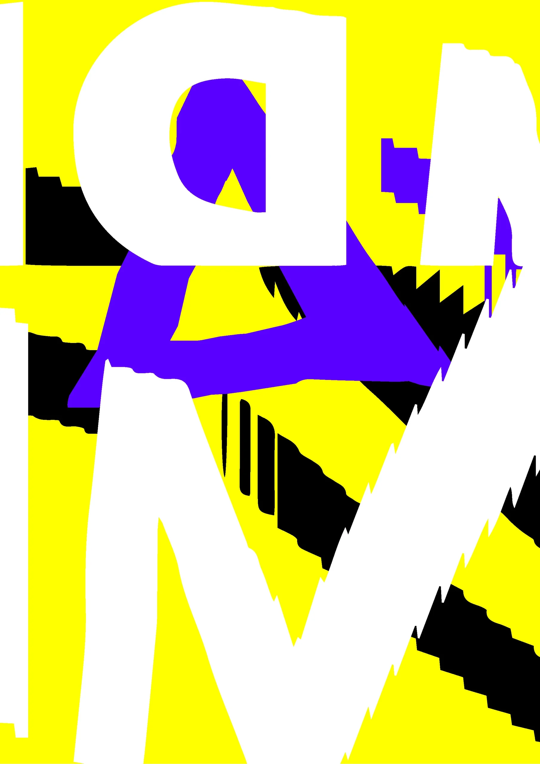
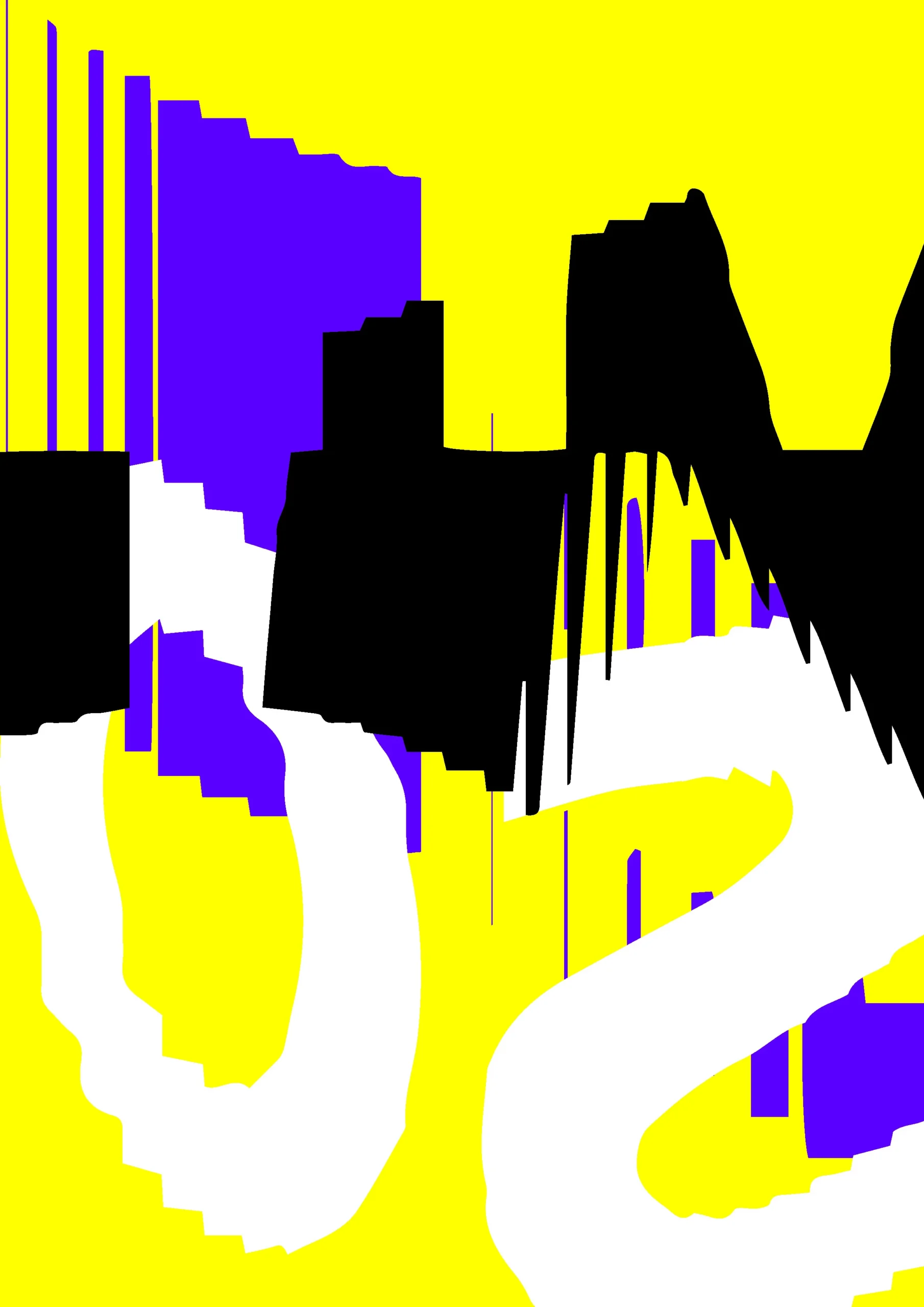
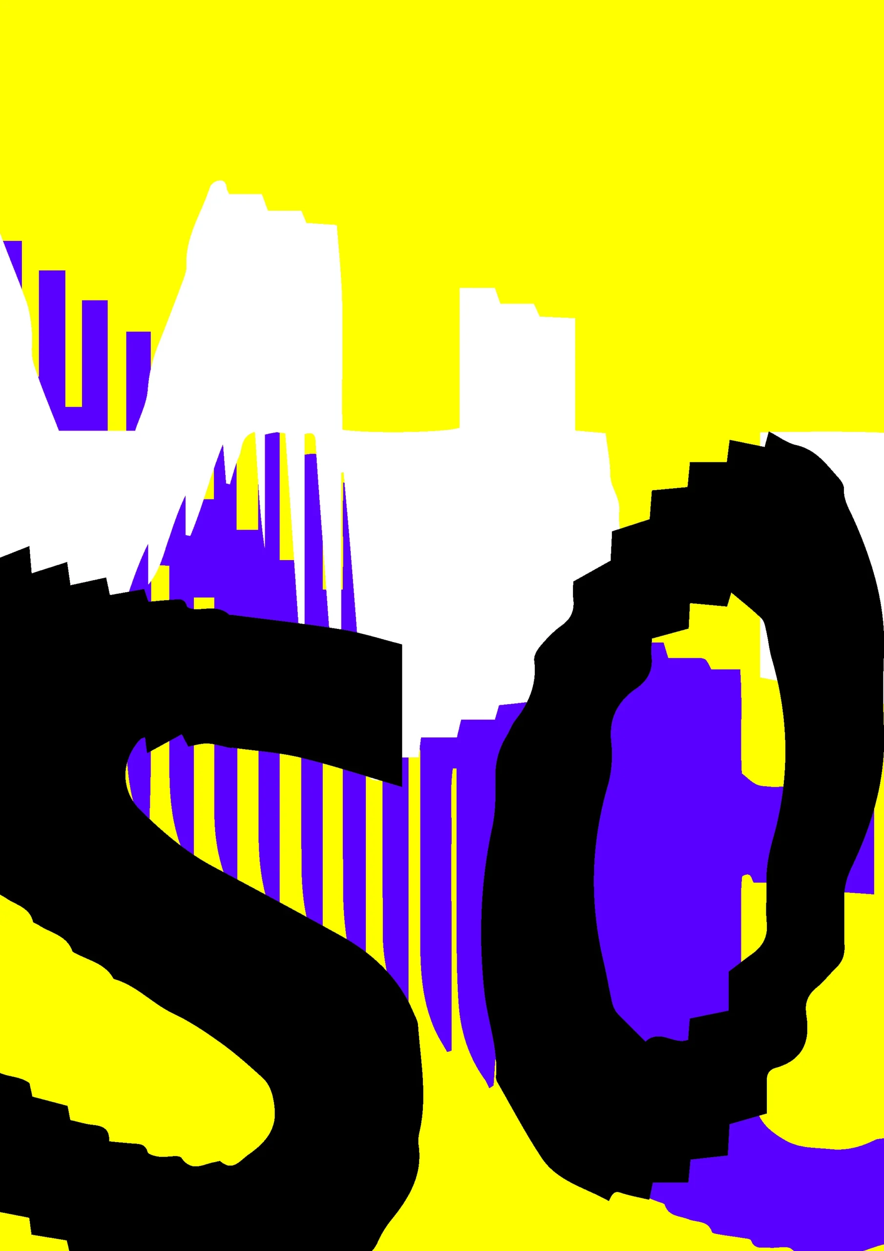
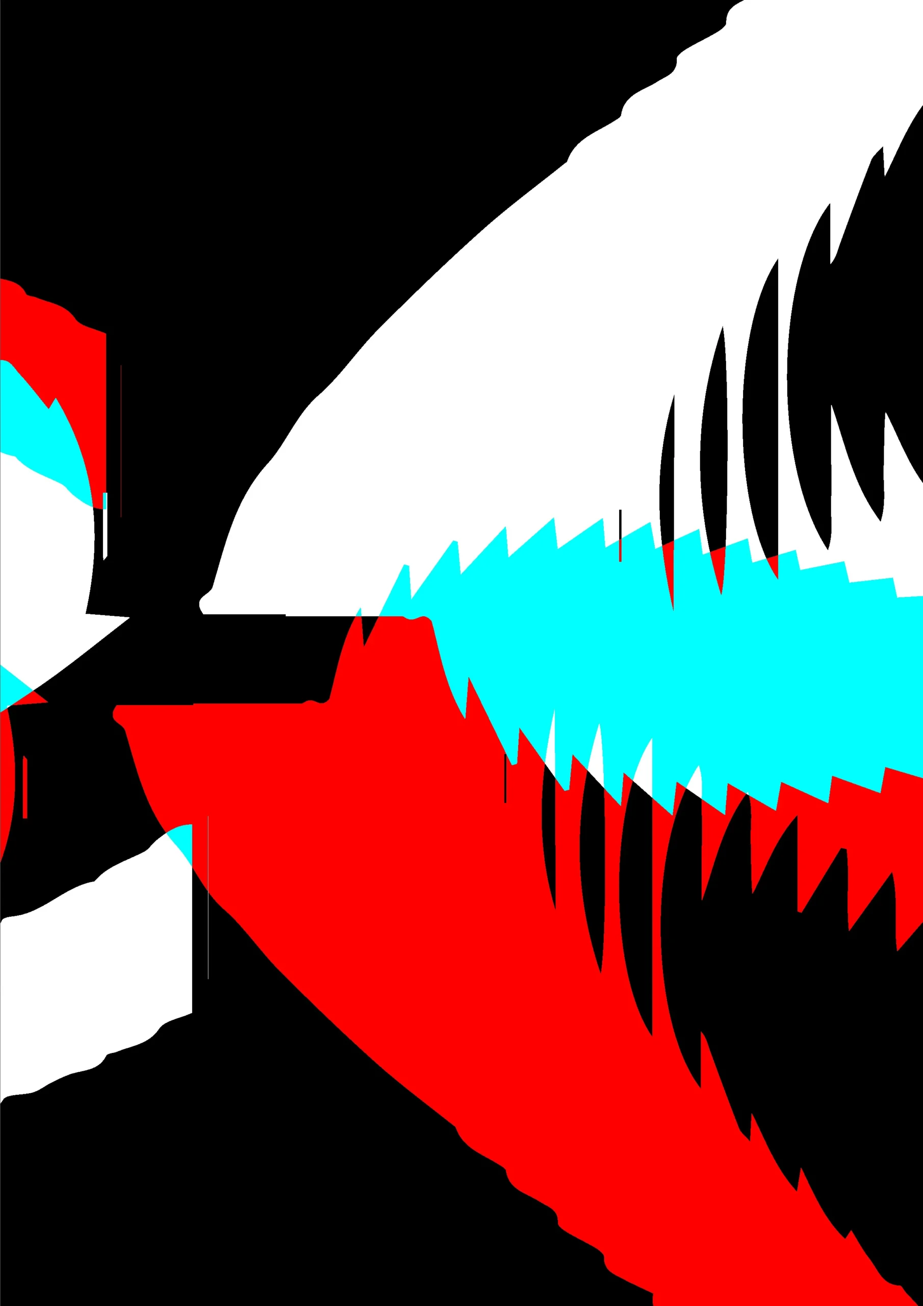
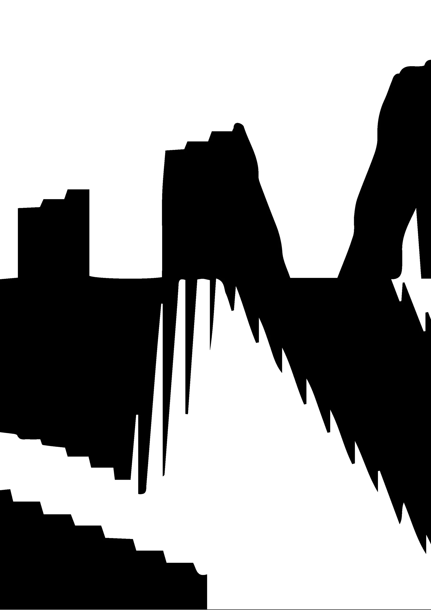
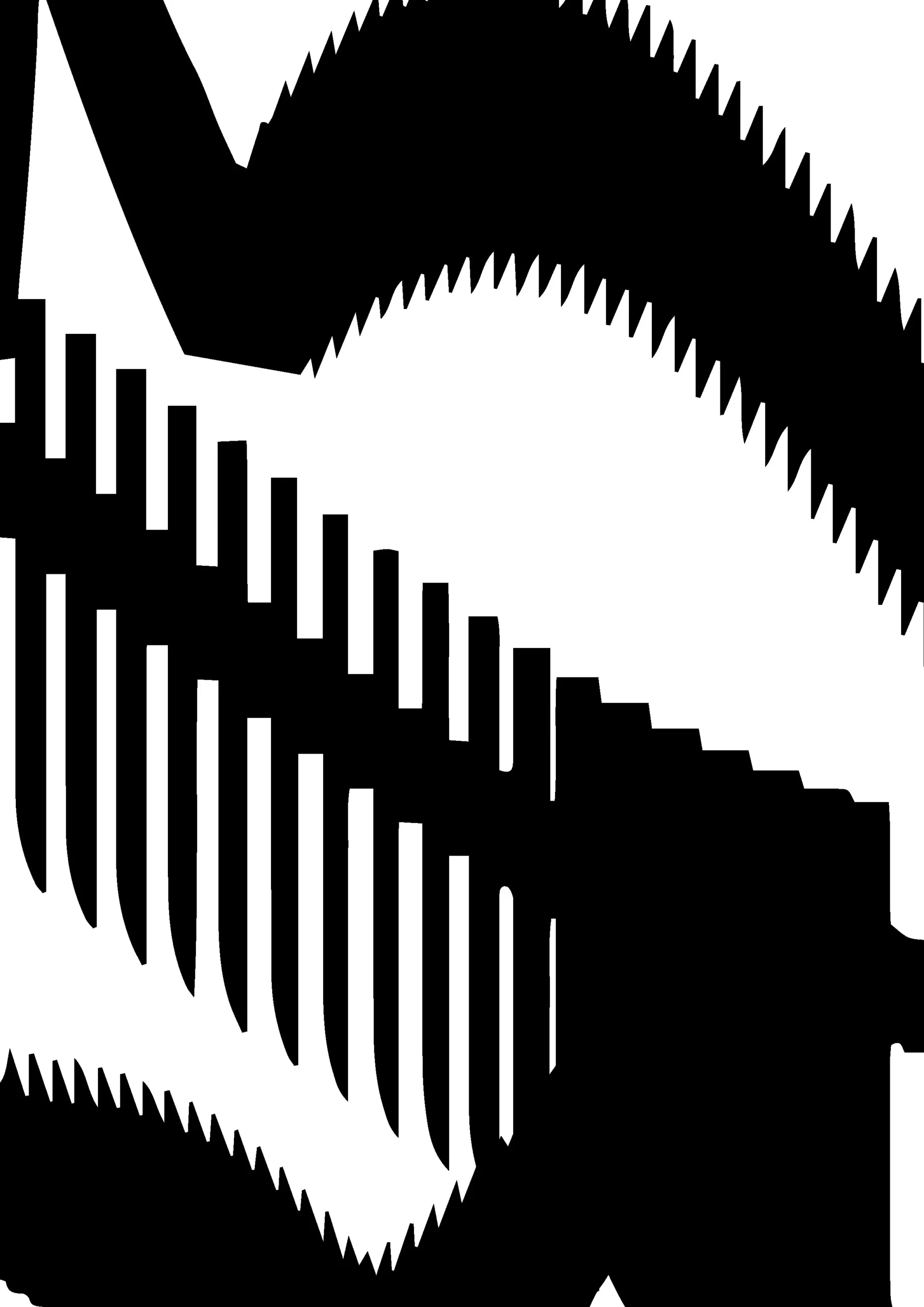
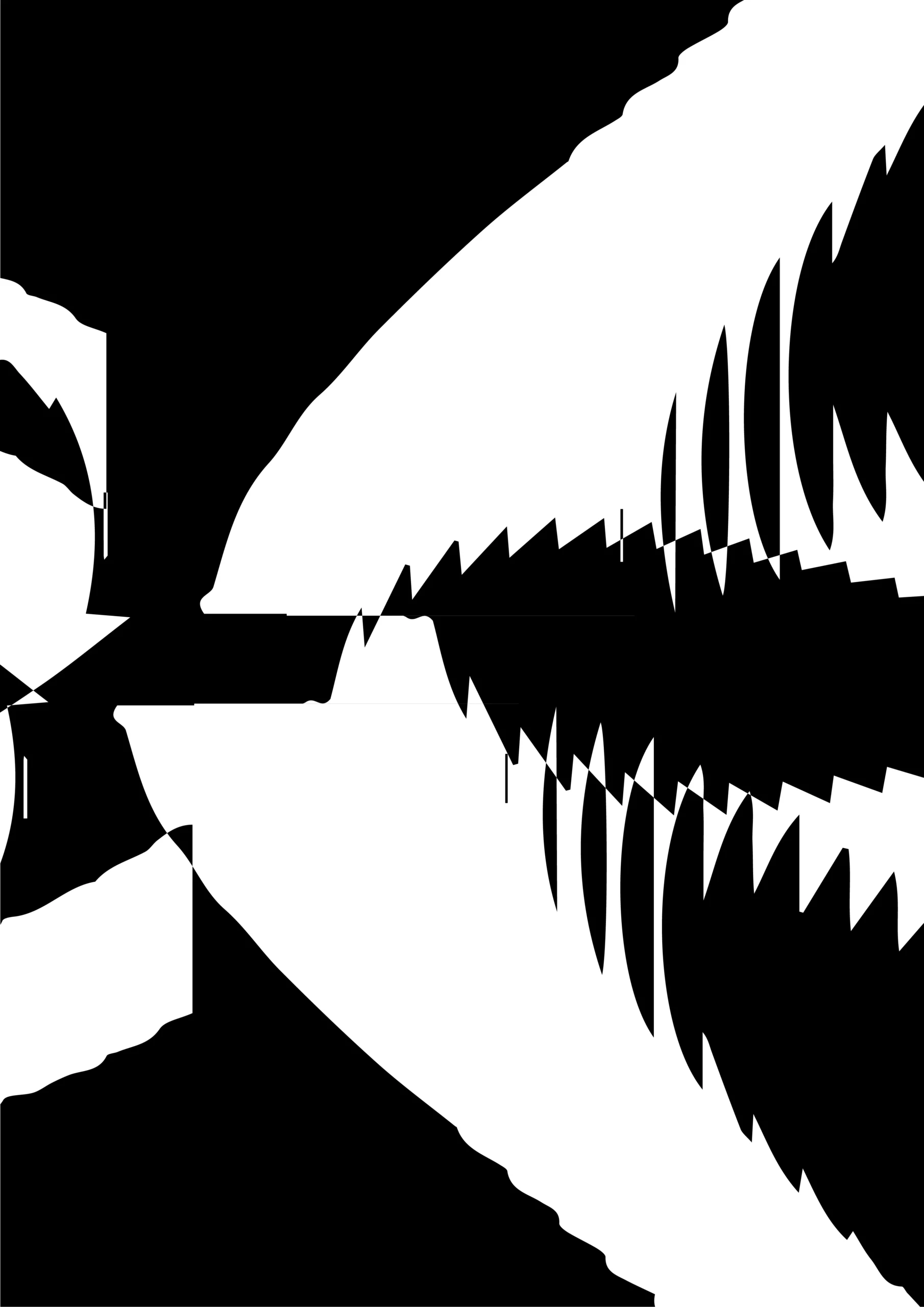
Perlin noise P5.js
(clicar na palavra IMPULSO para ativar o efeito)
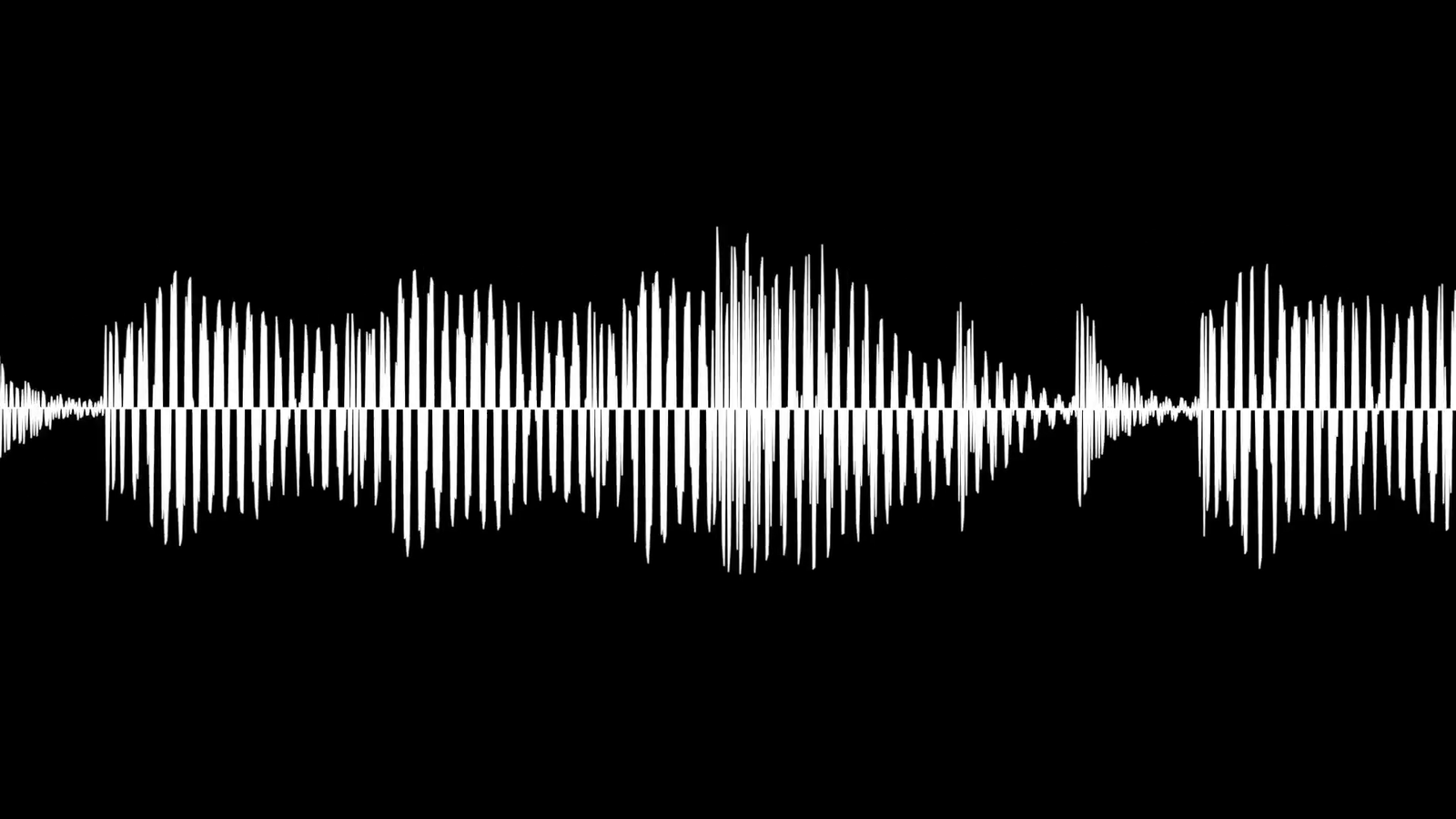
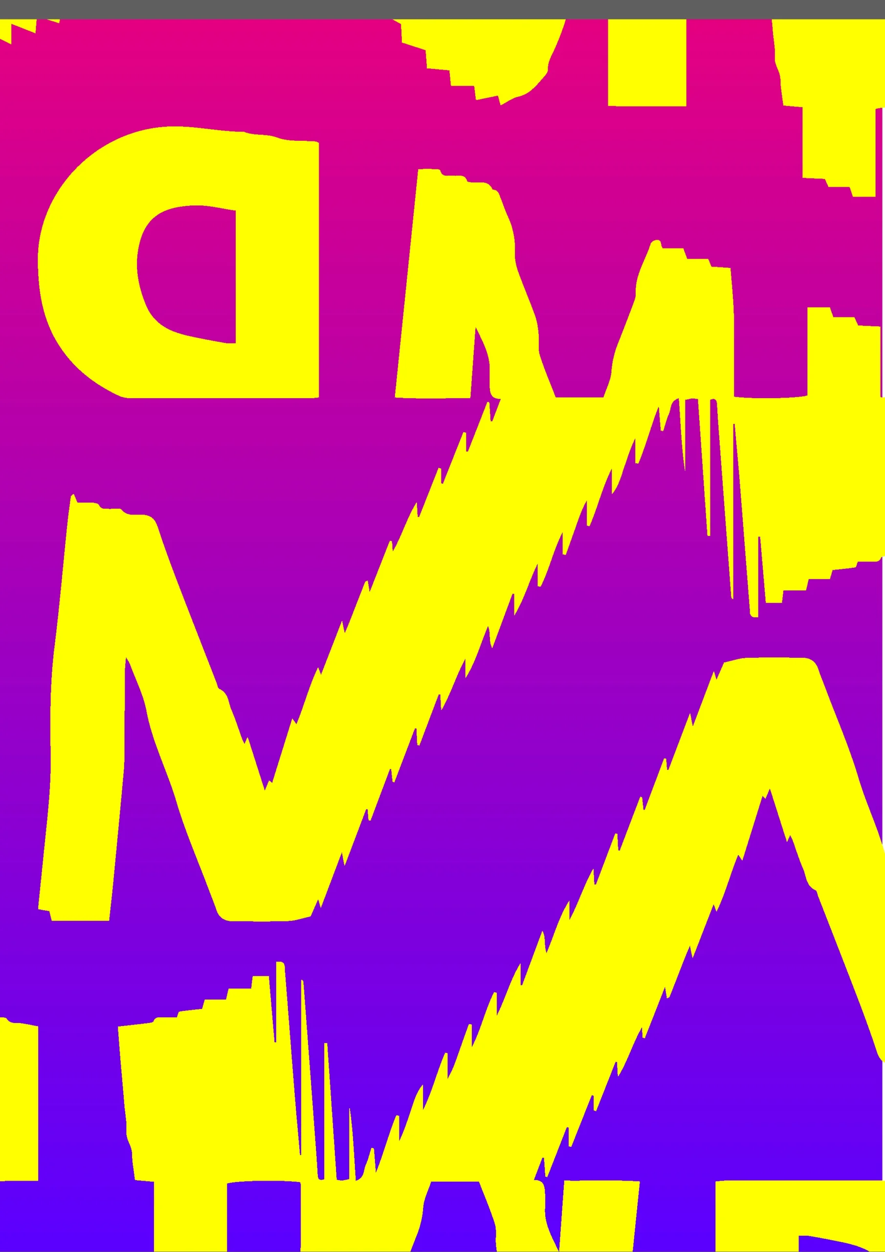
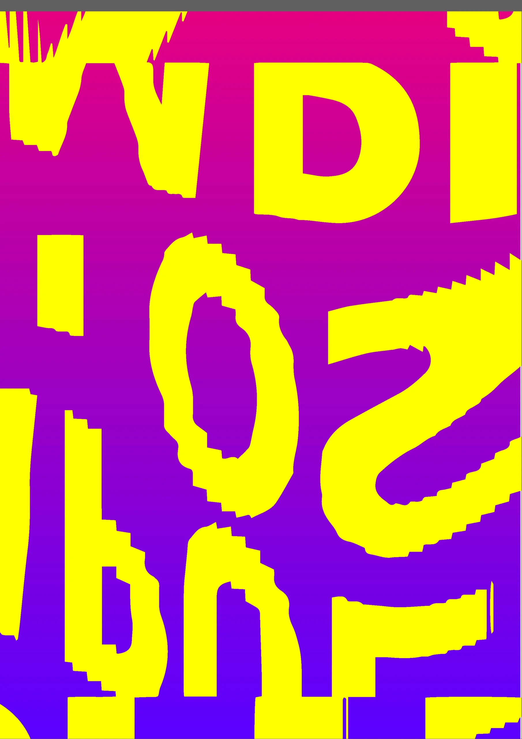
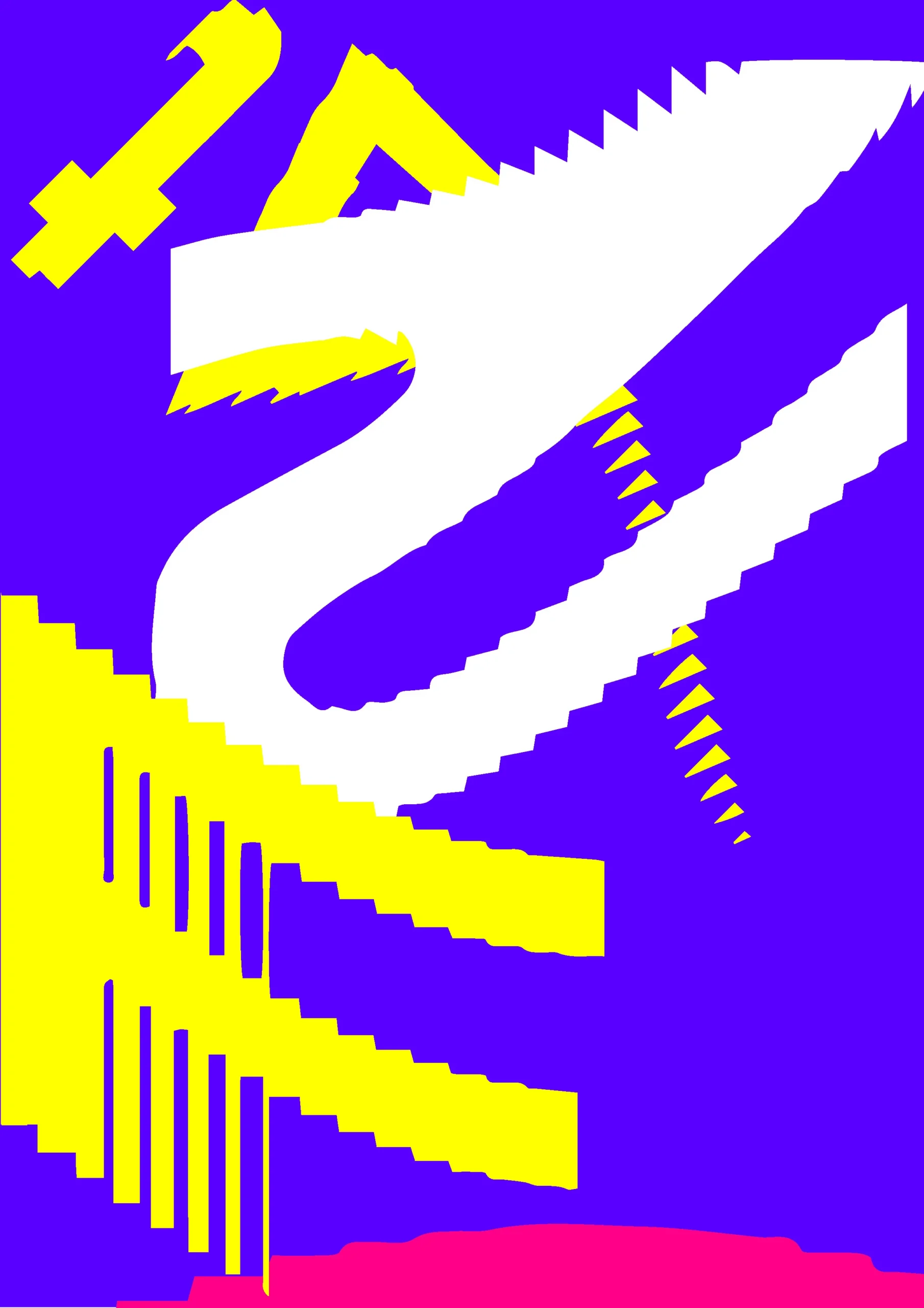
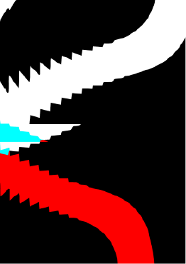
We also explored Perlin noise, an algorithm that generates organic, fluid patterns, as a way to bring a more natural kind of movement to the word. The goal was to move away from something mechanical and get closer to something that felt alive.
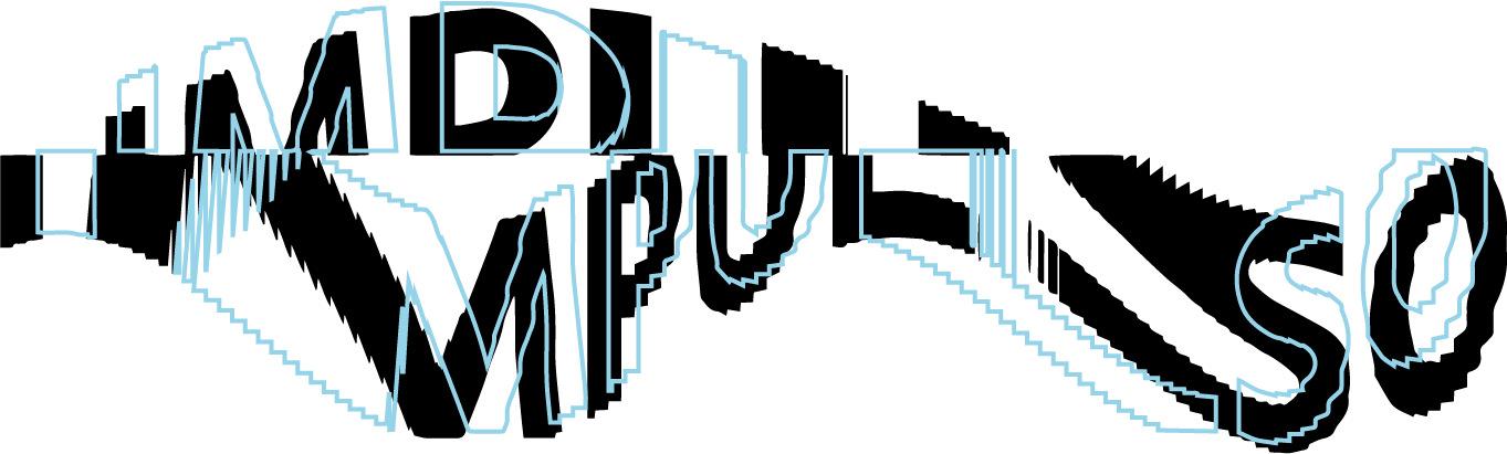
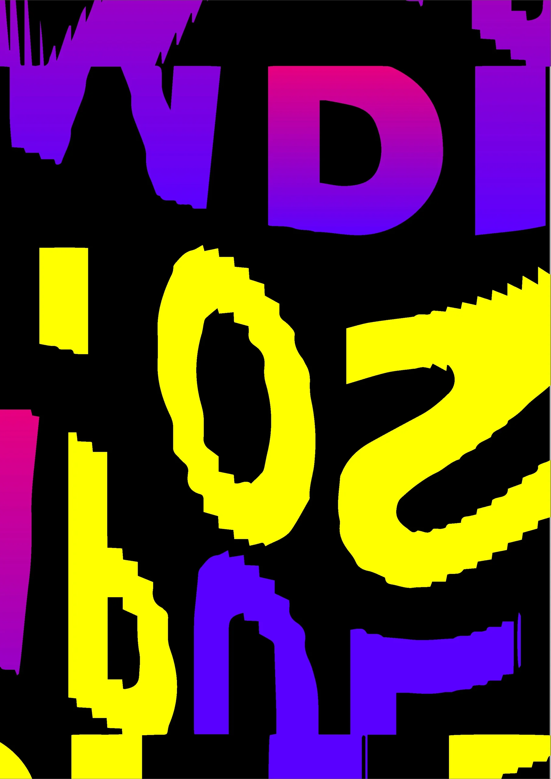
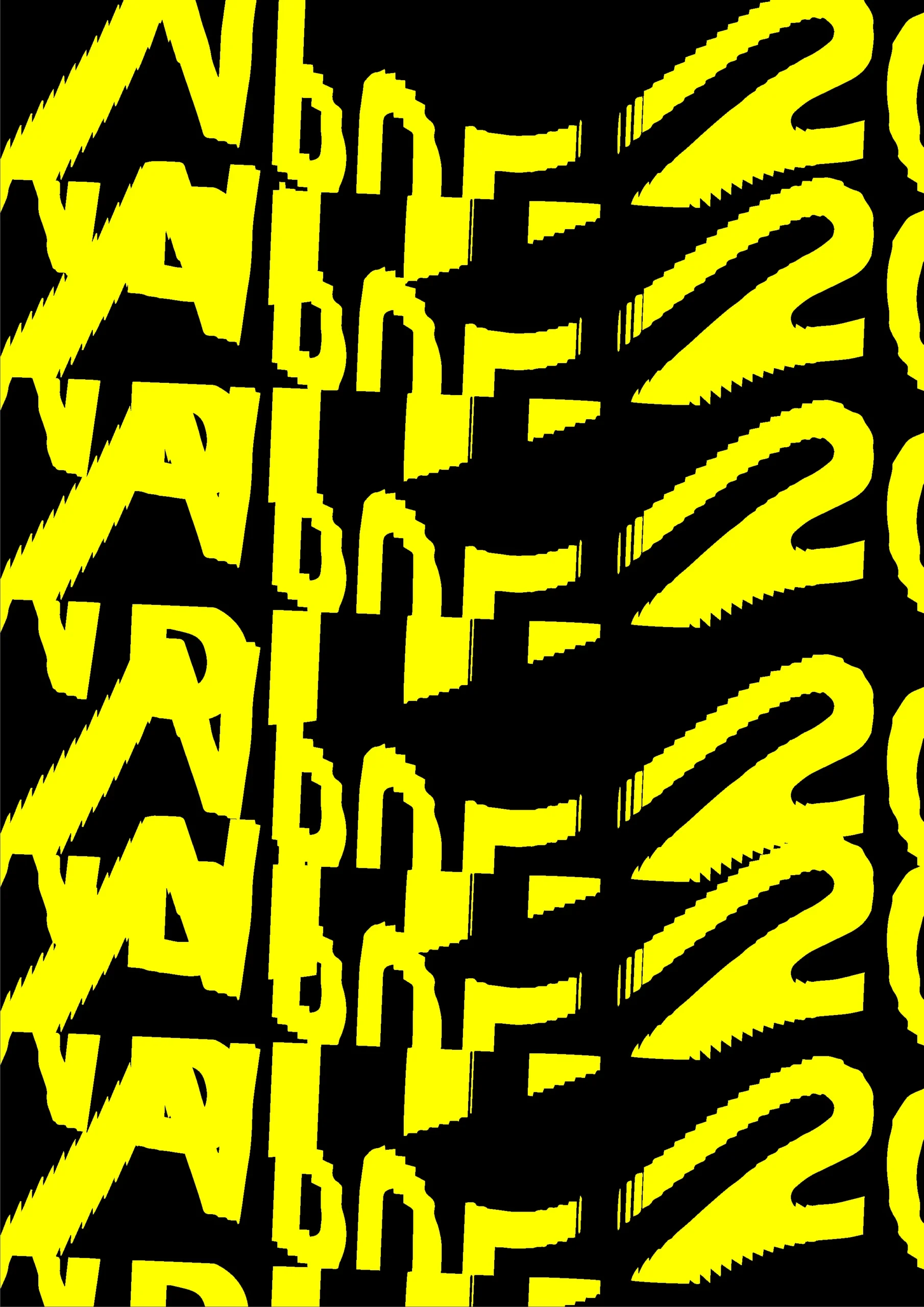
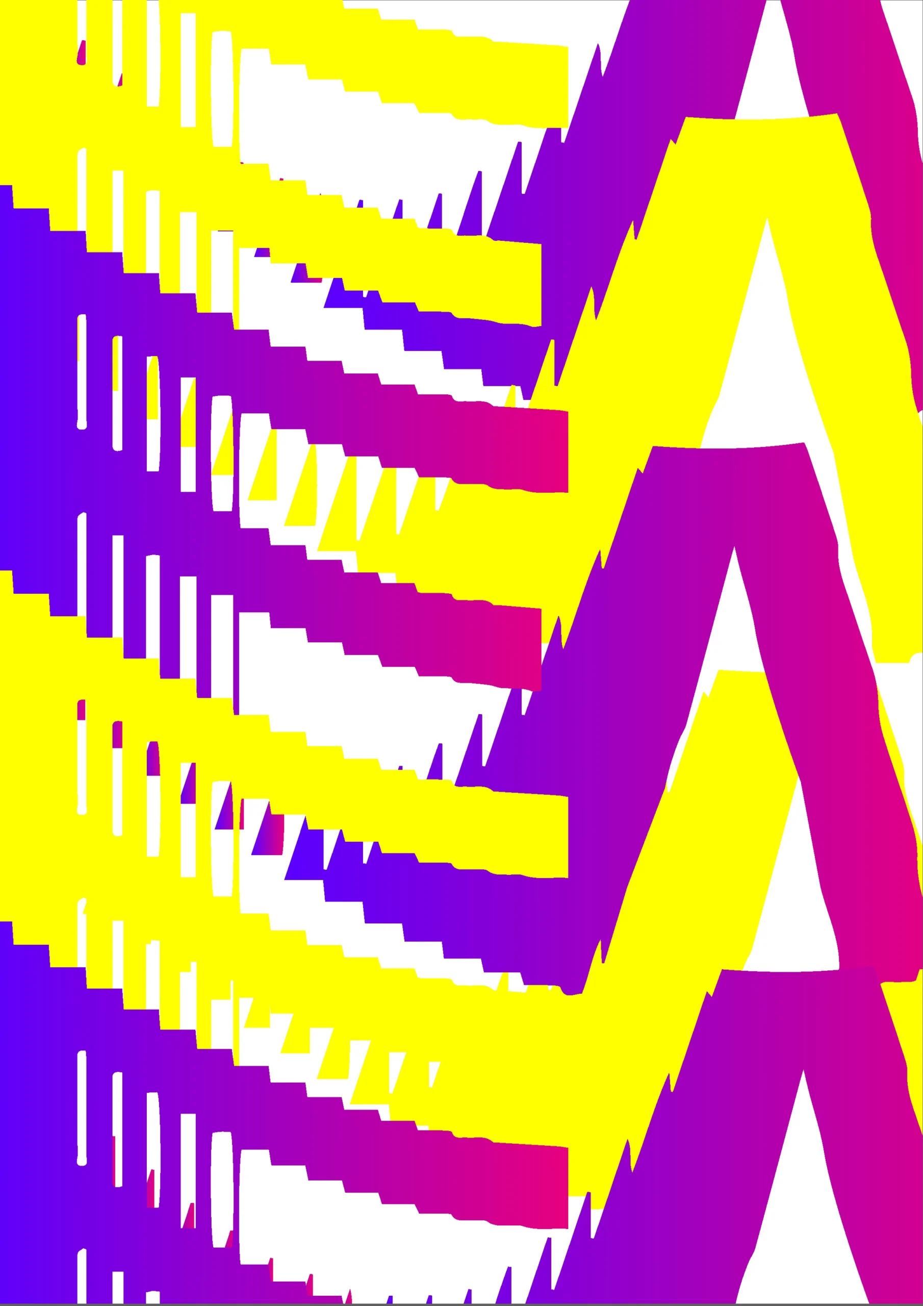
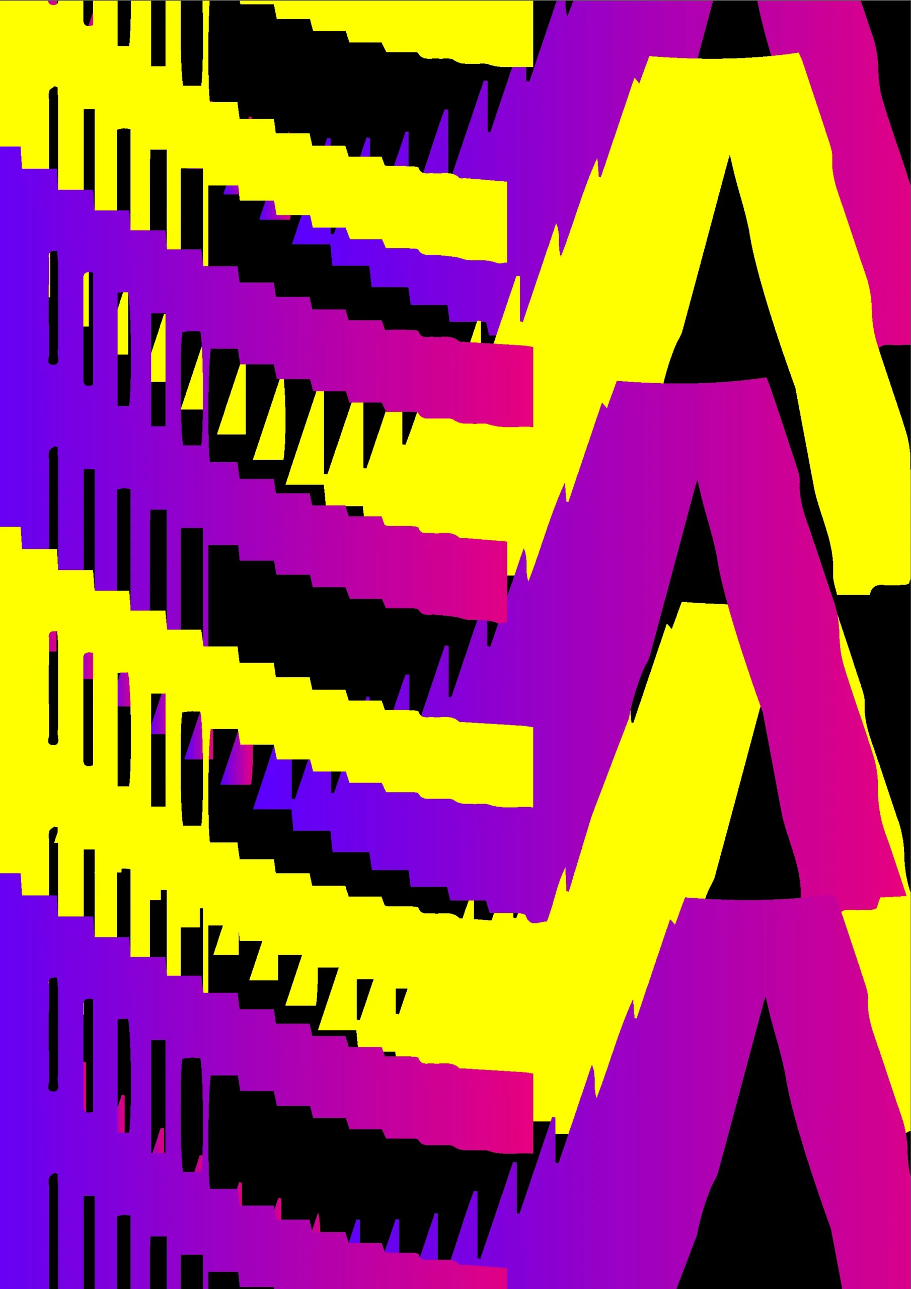
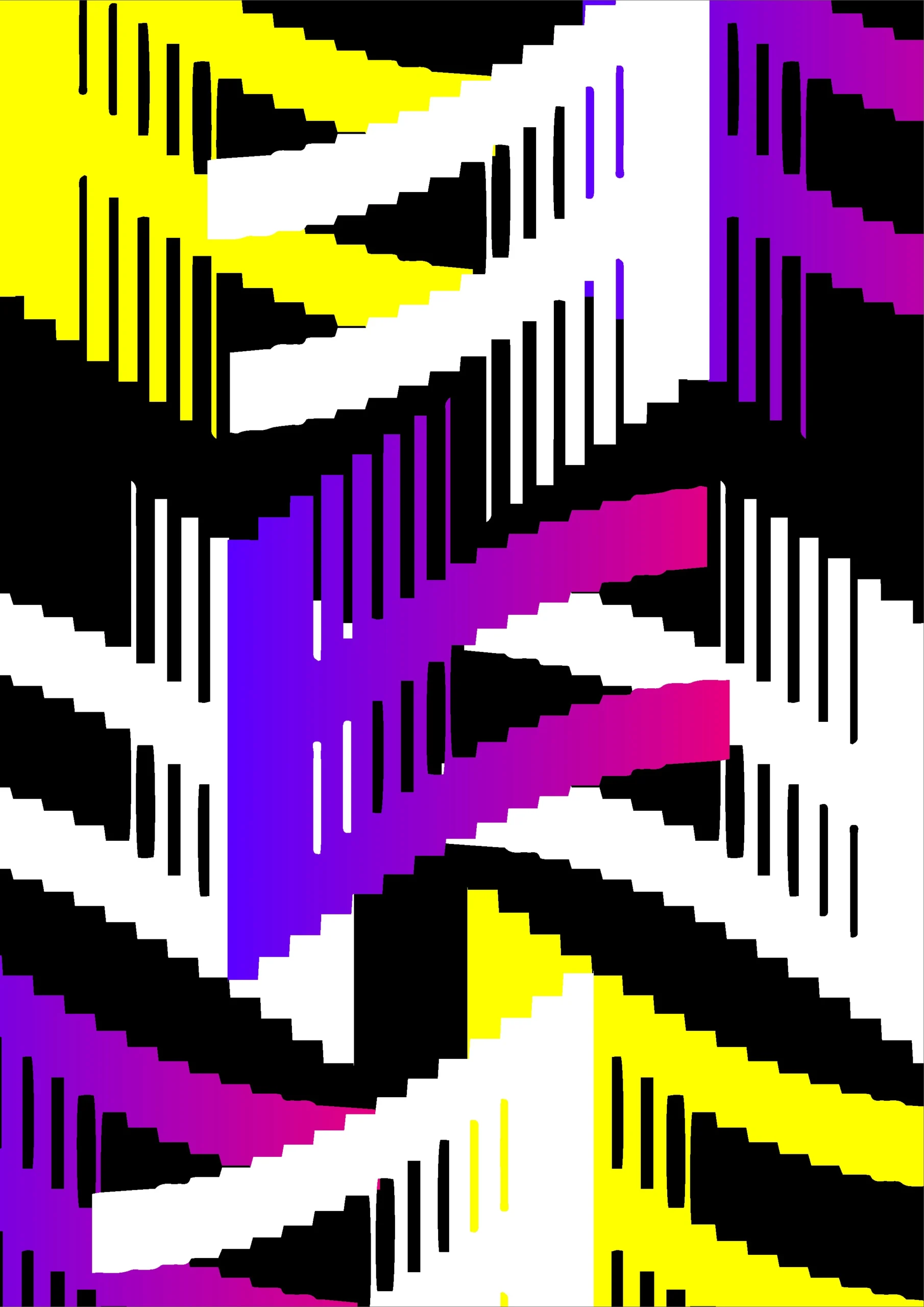
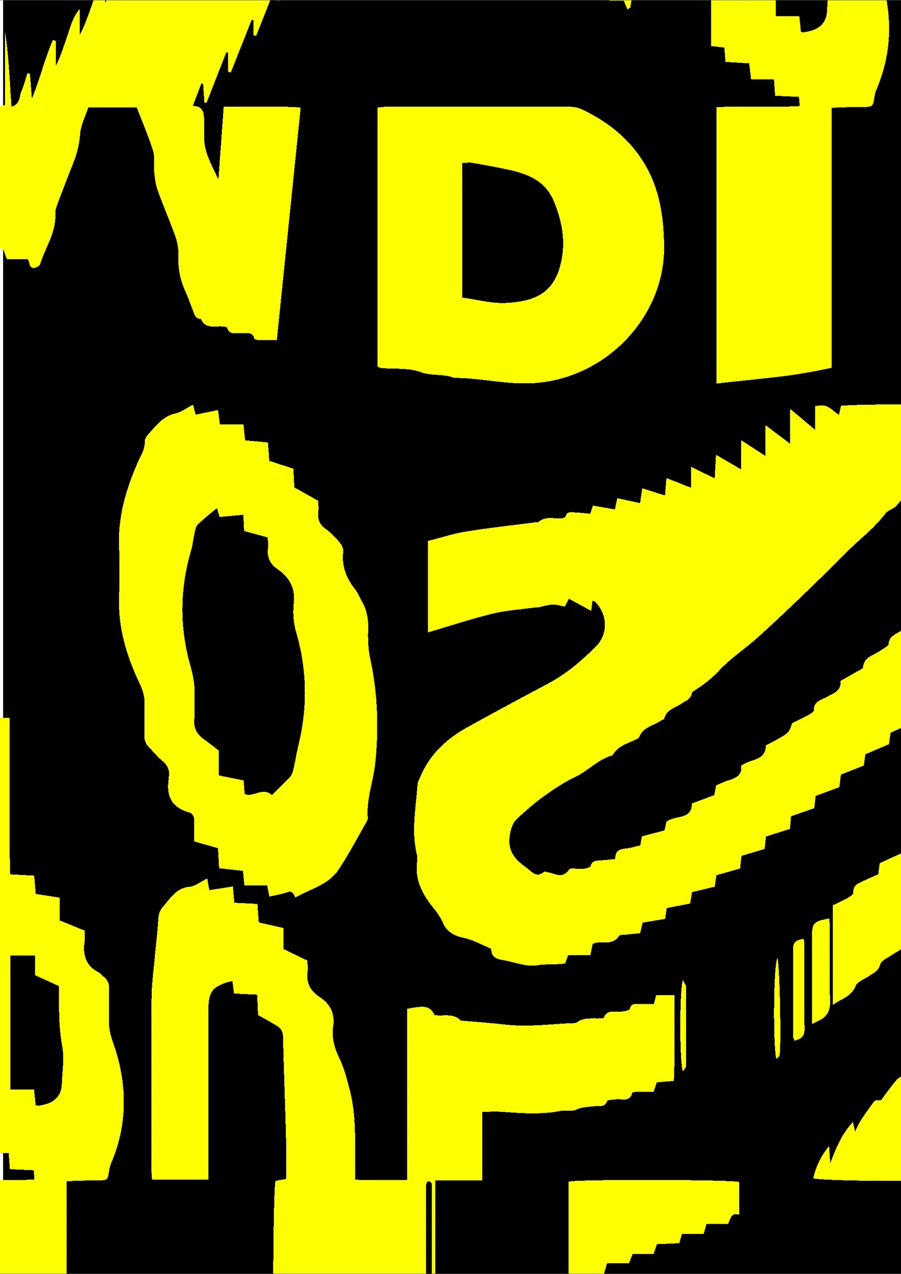
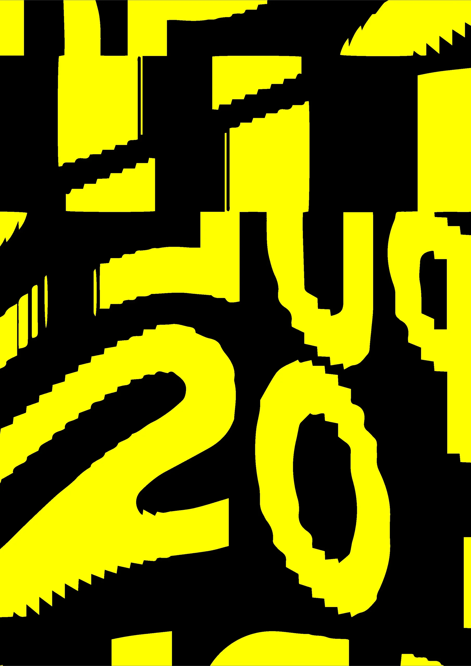
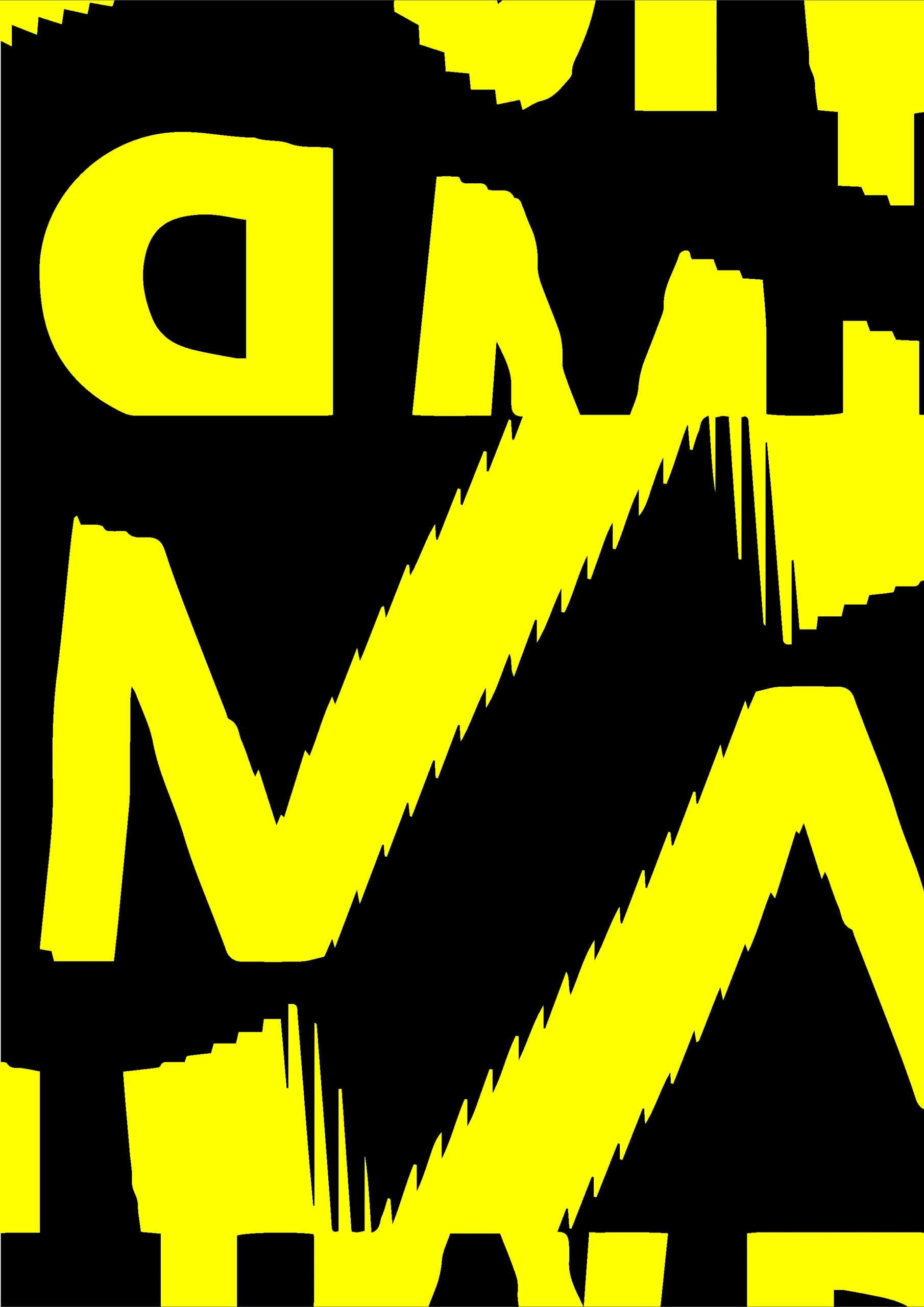
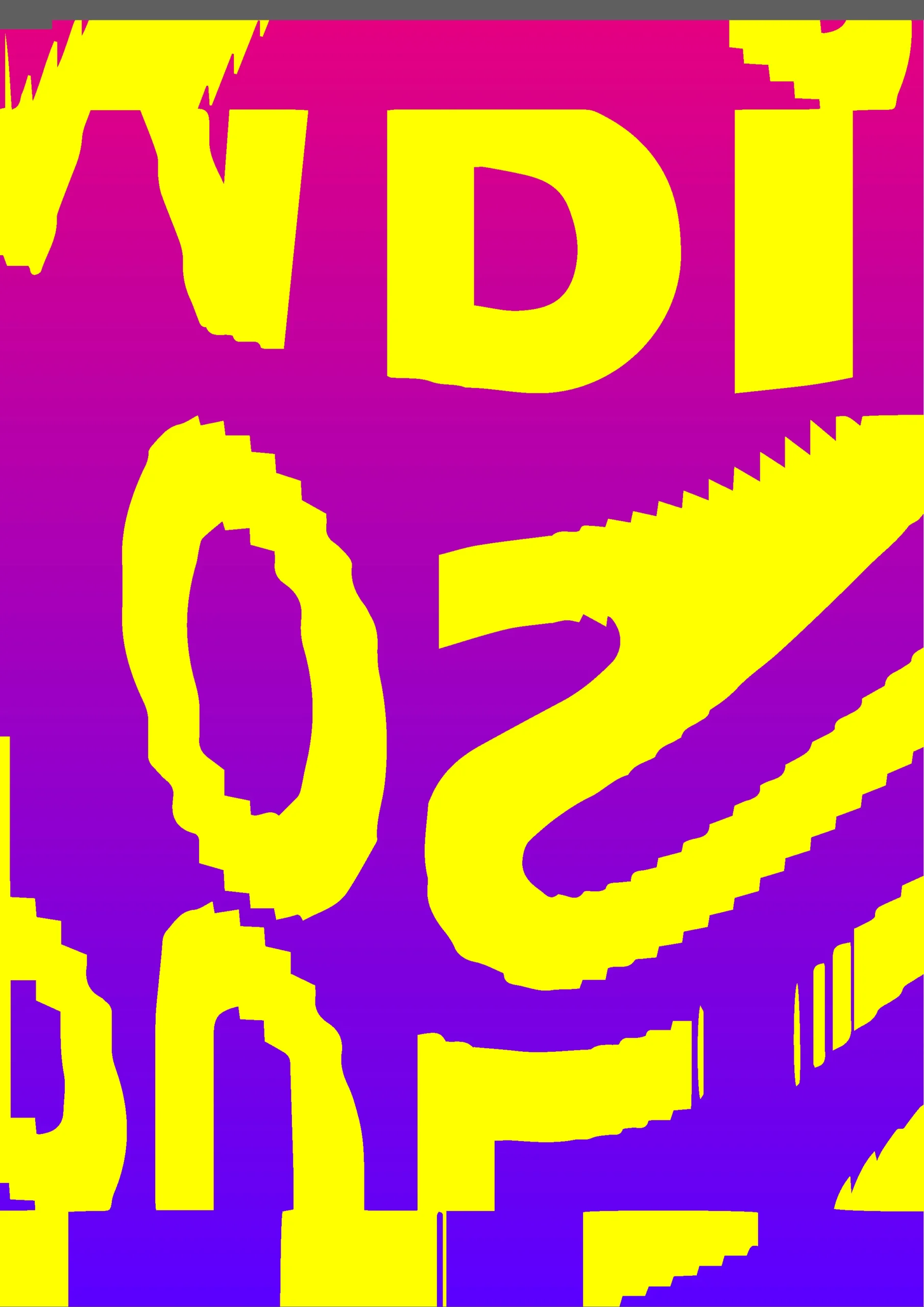
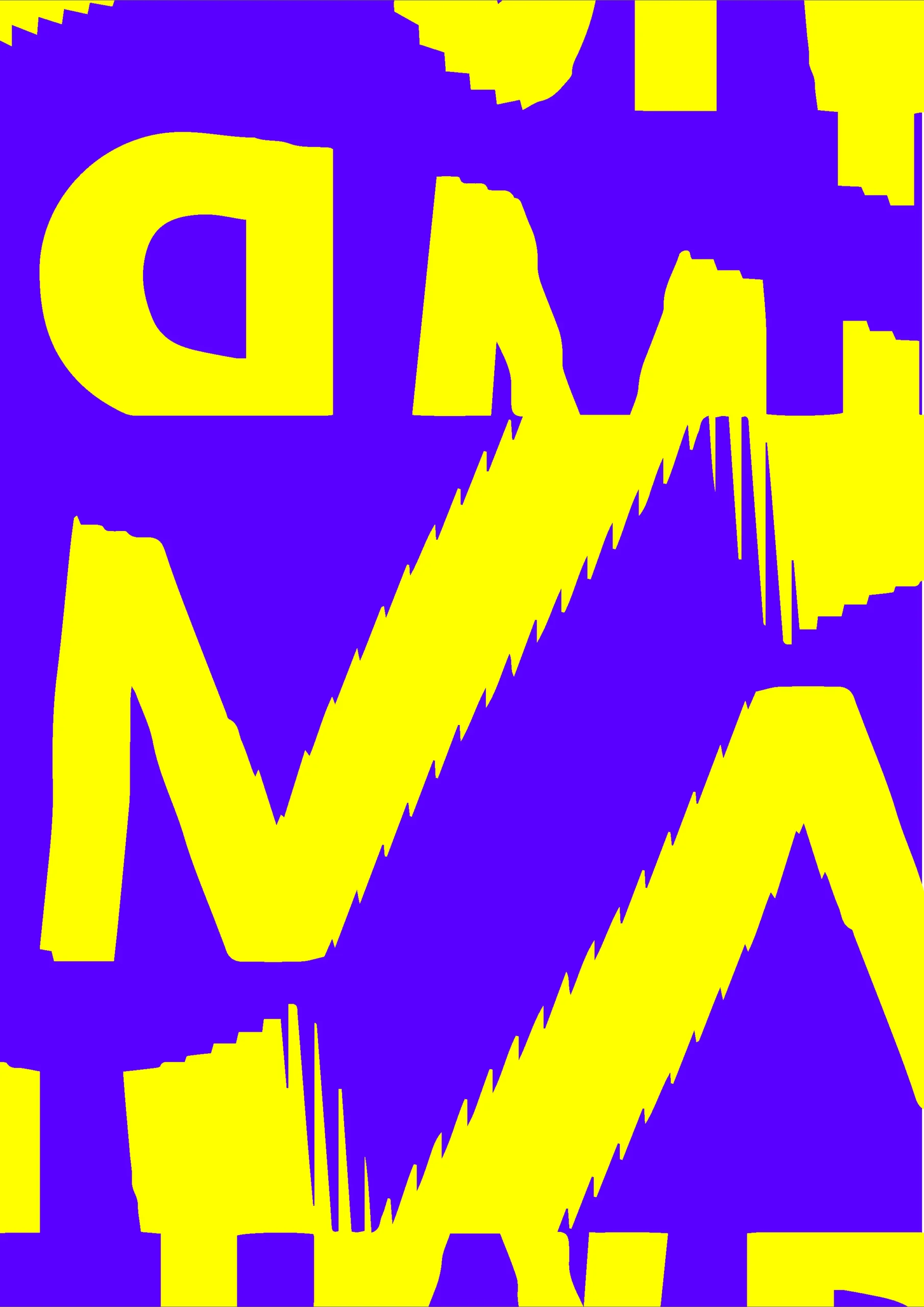
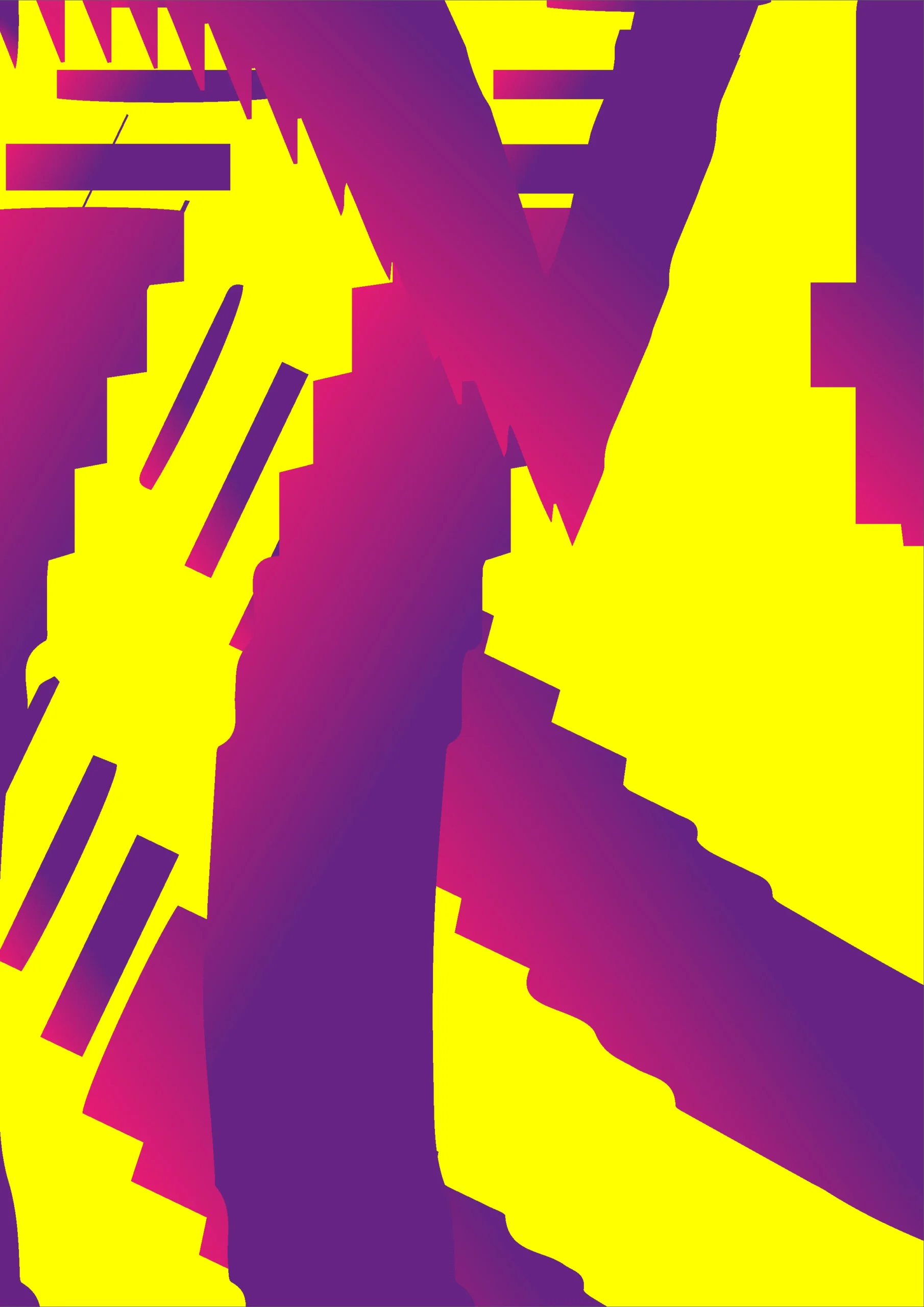
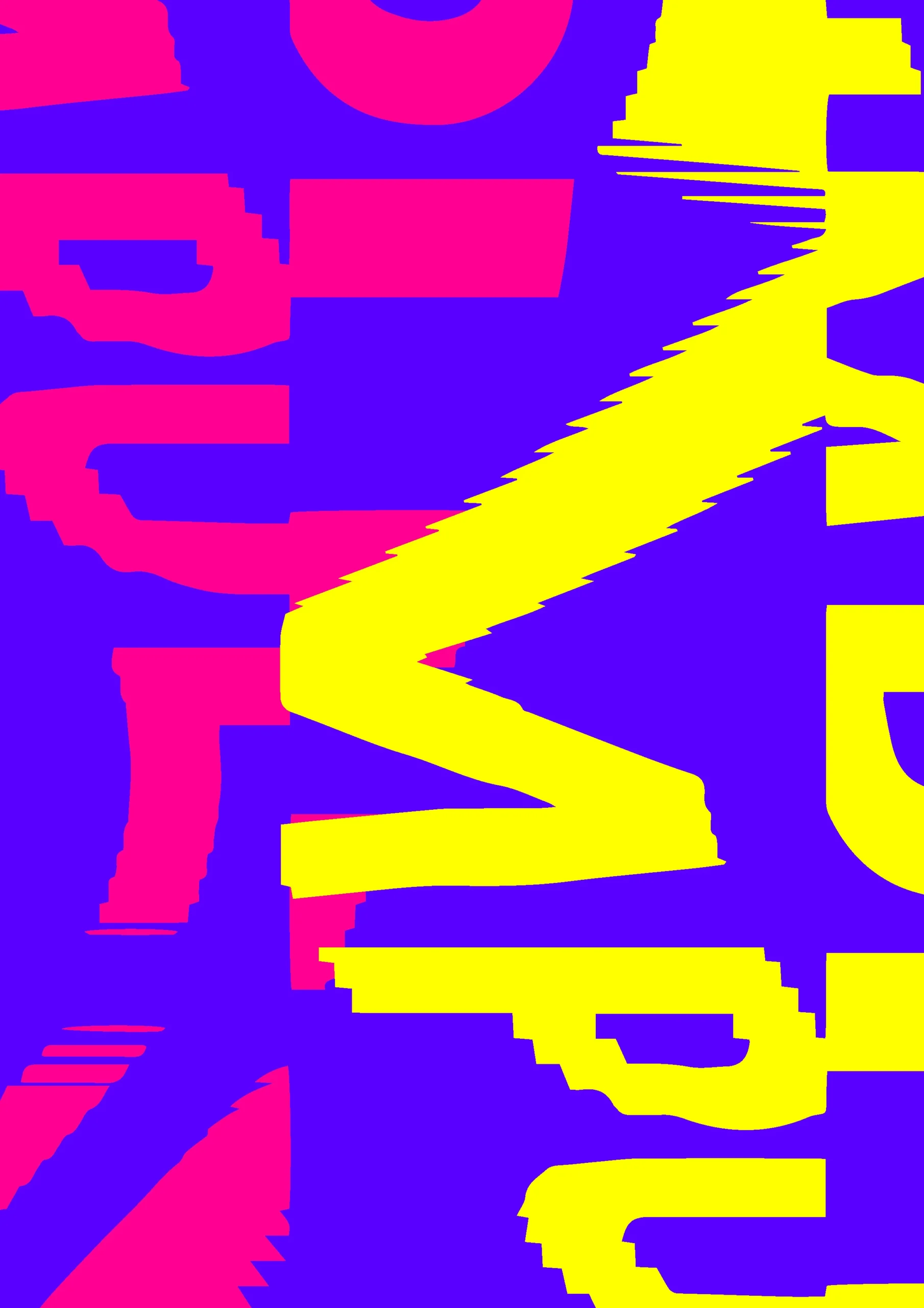
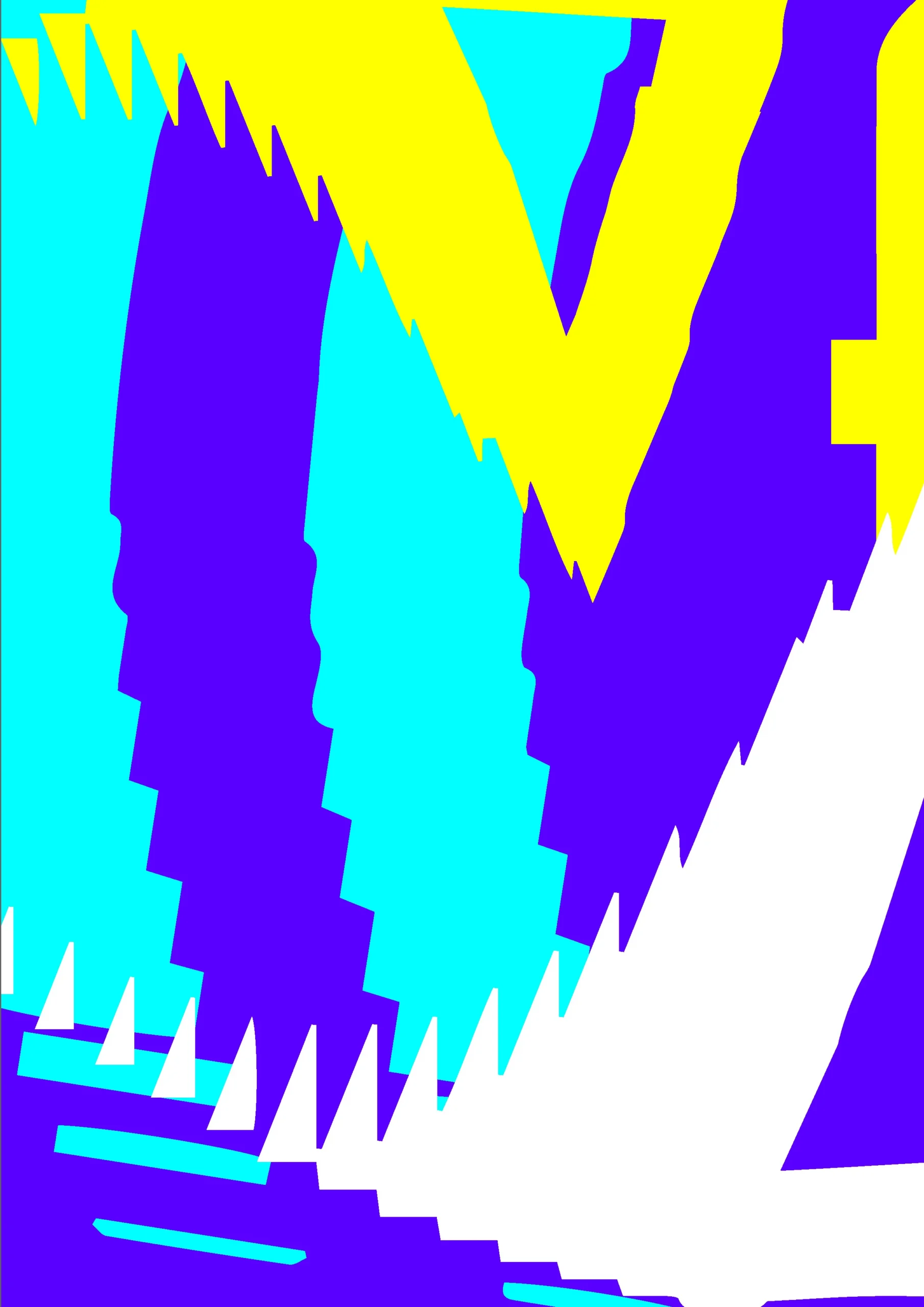
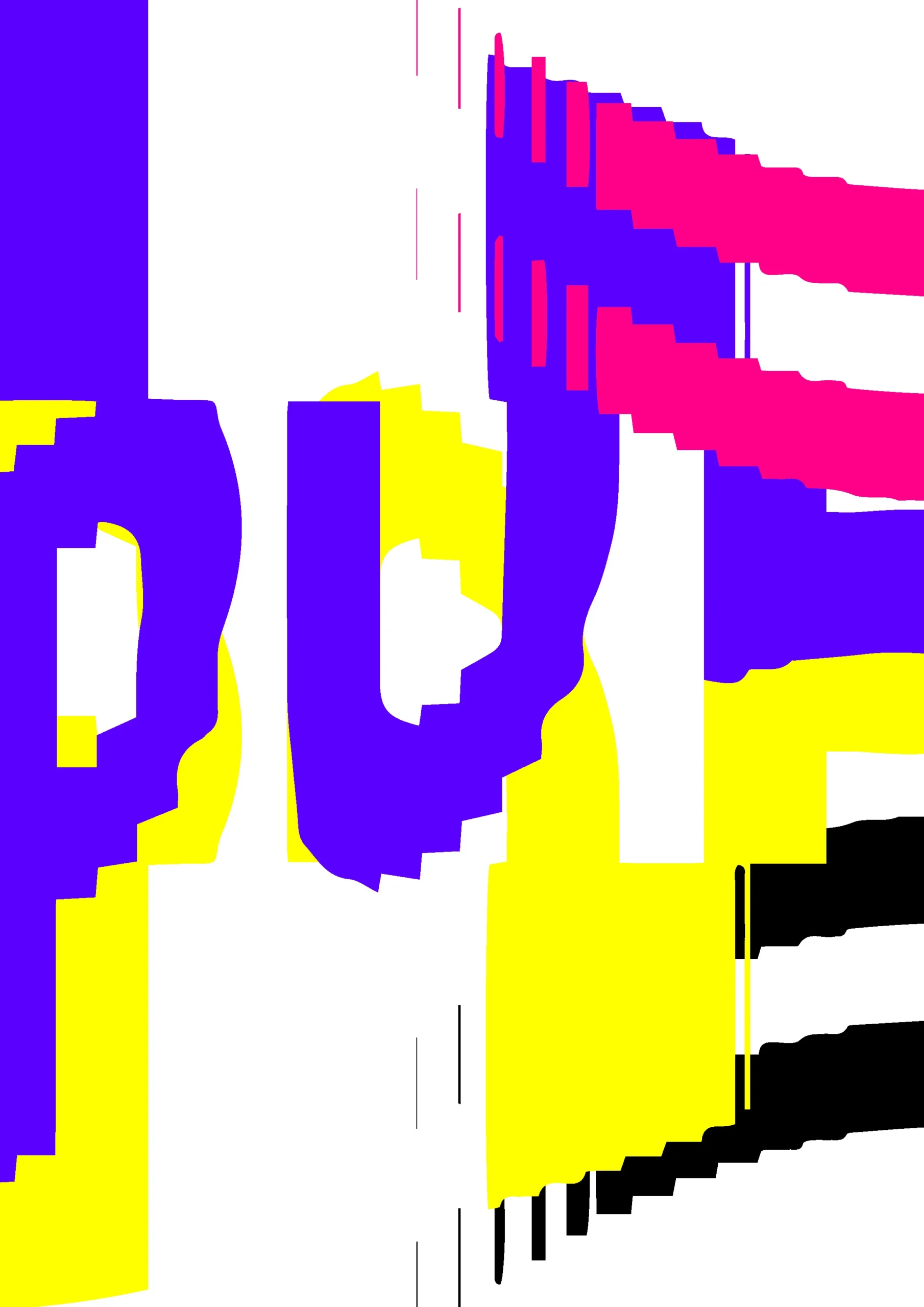
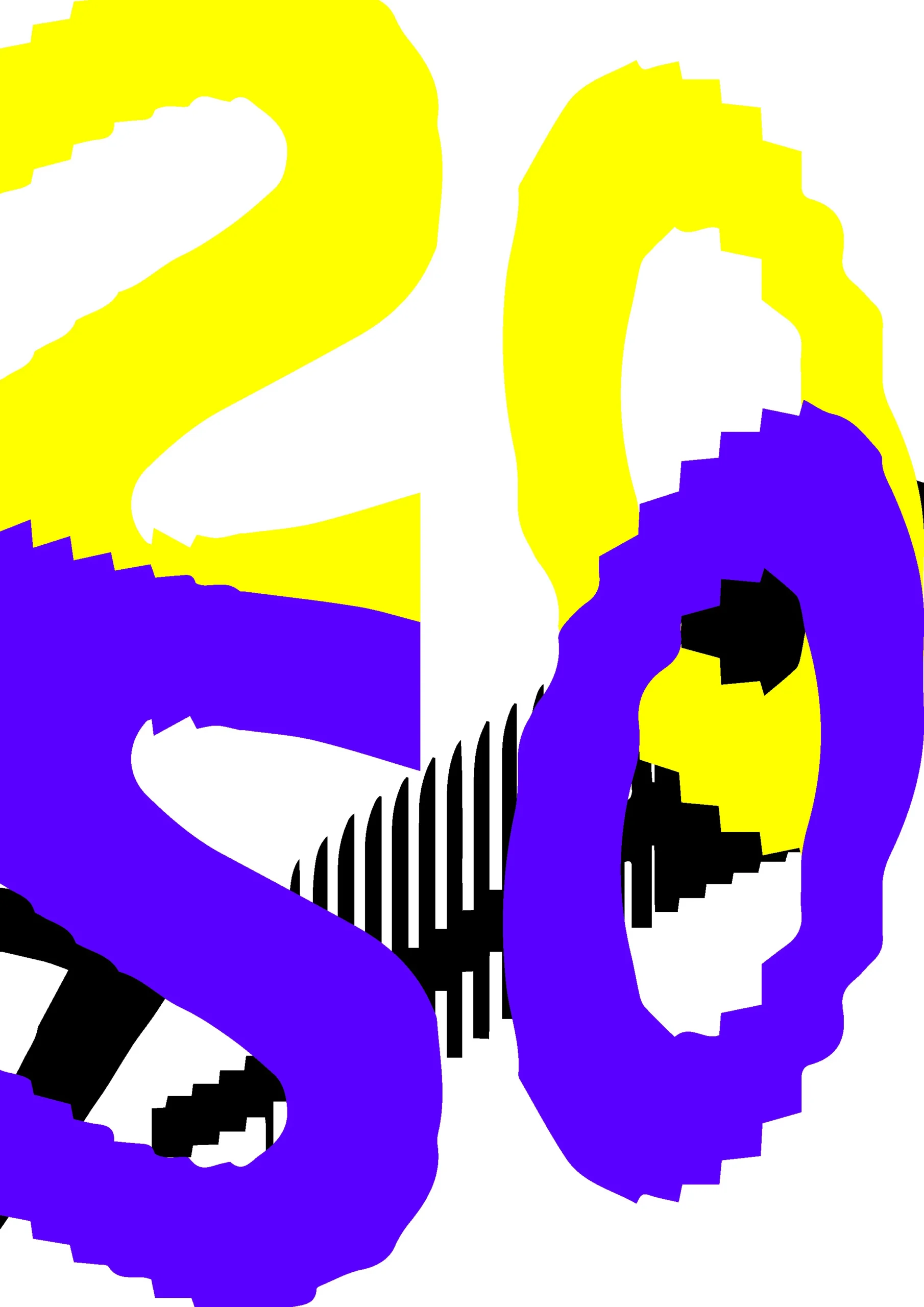
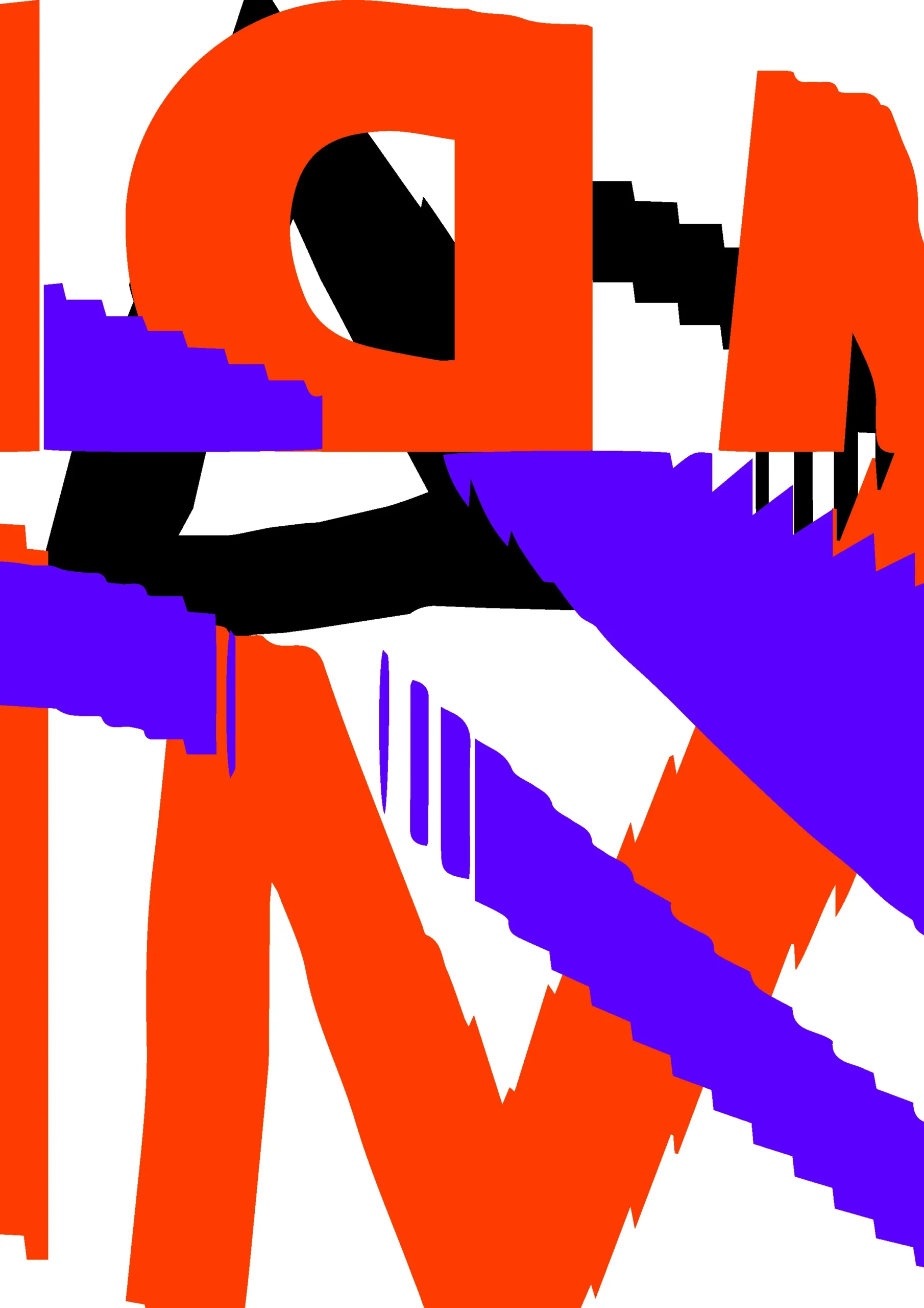
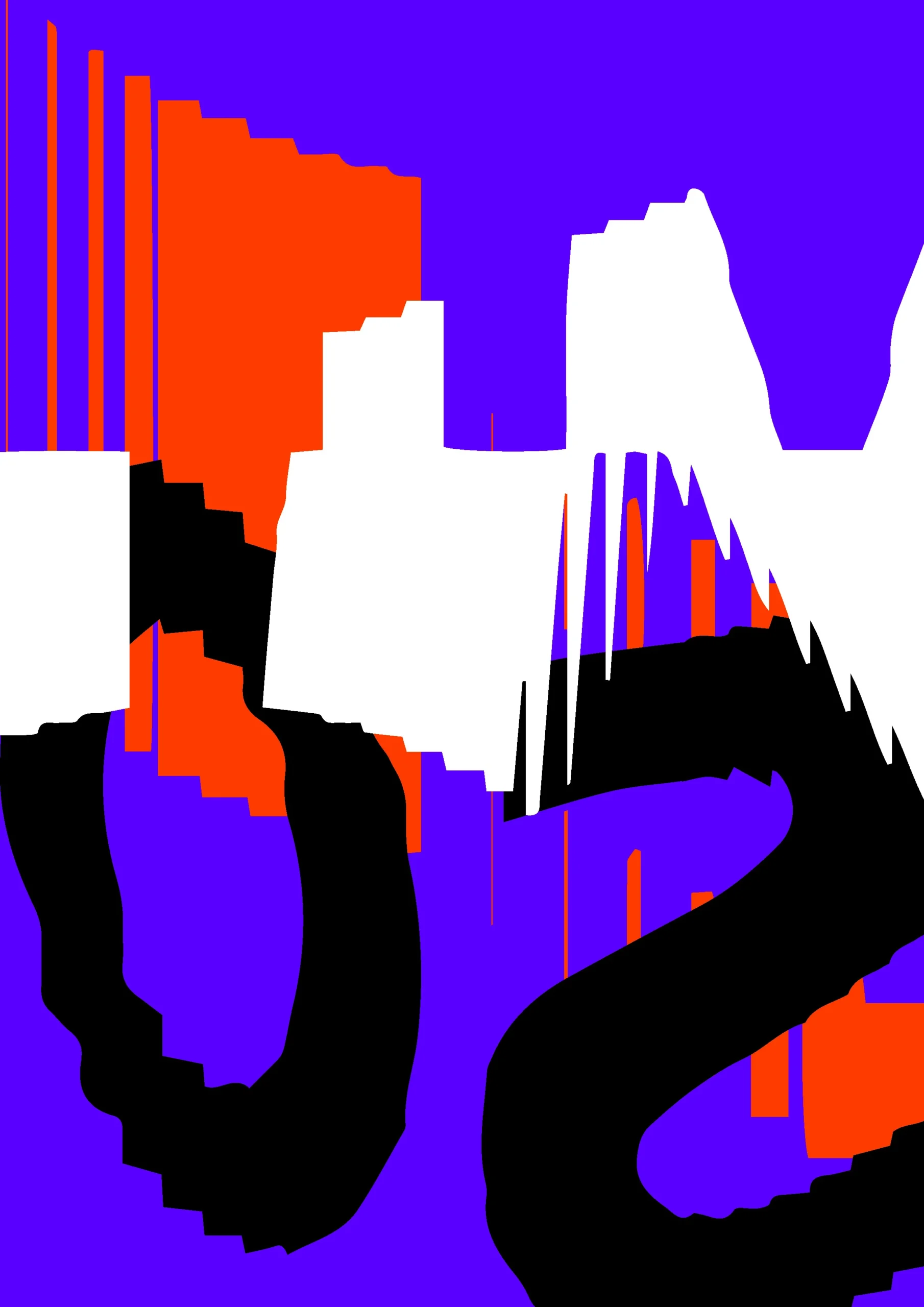
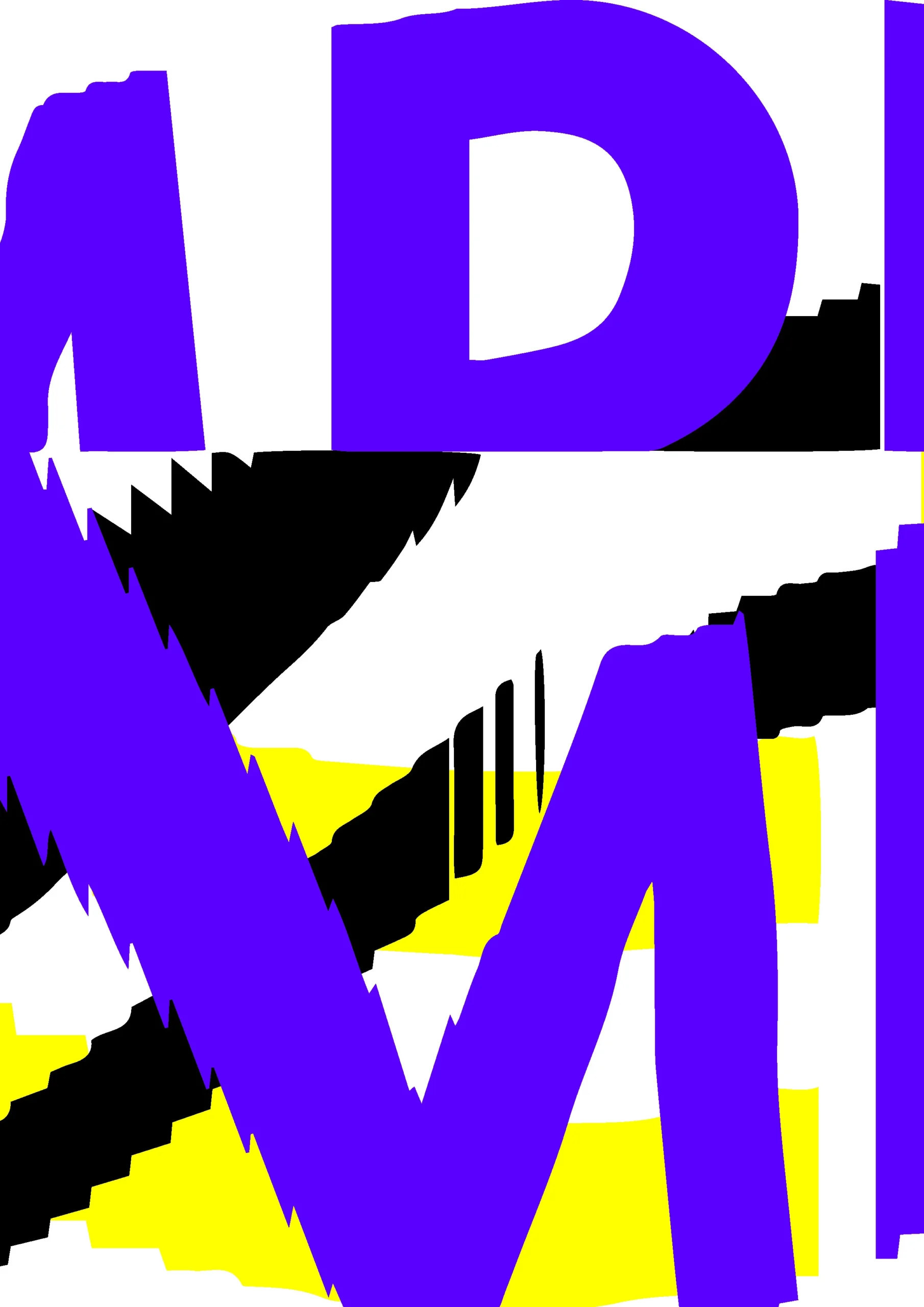
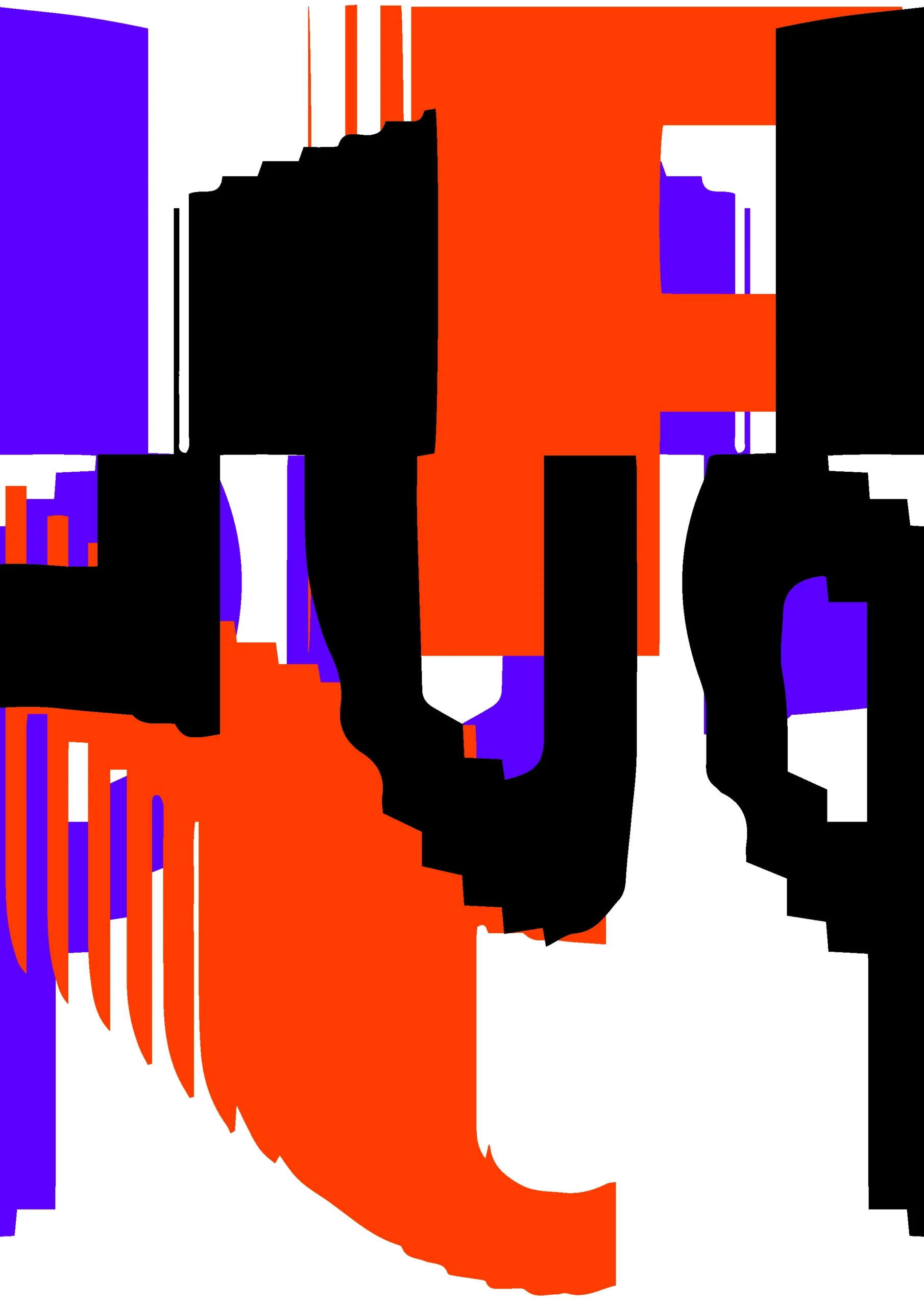
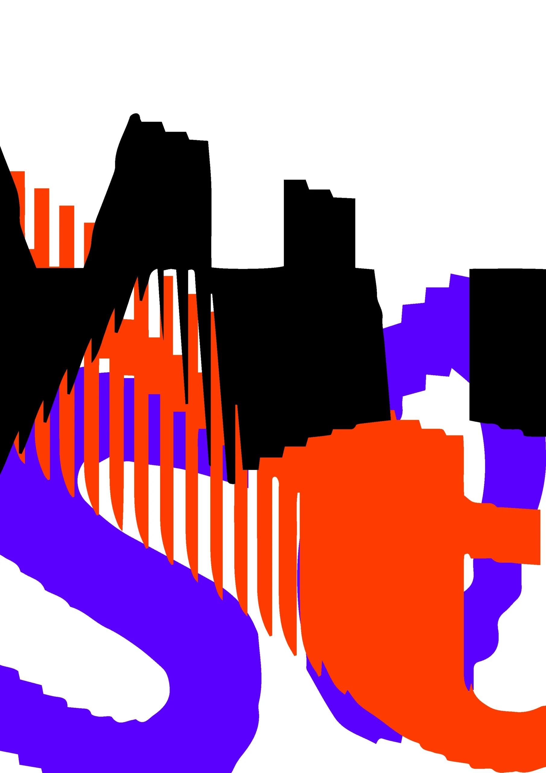
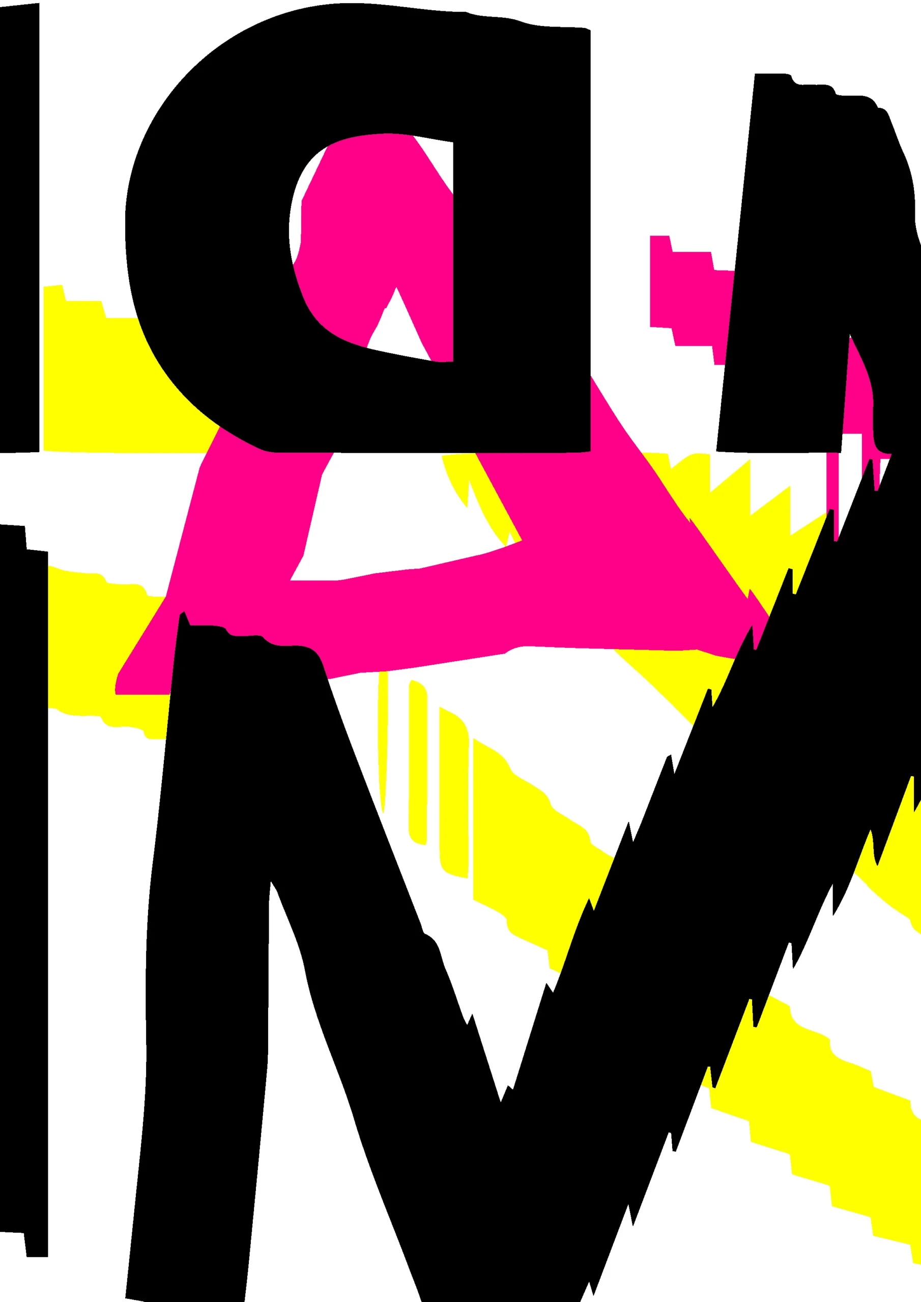
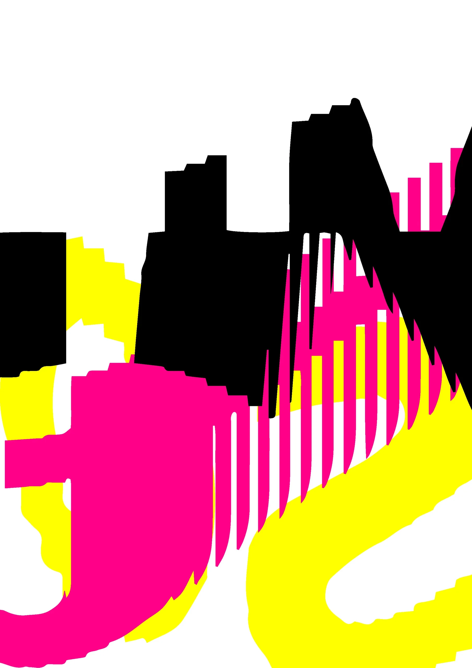
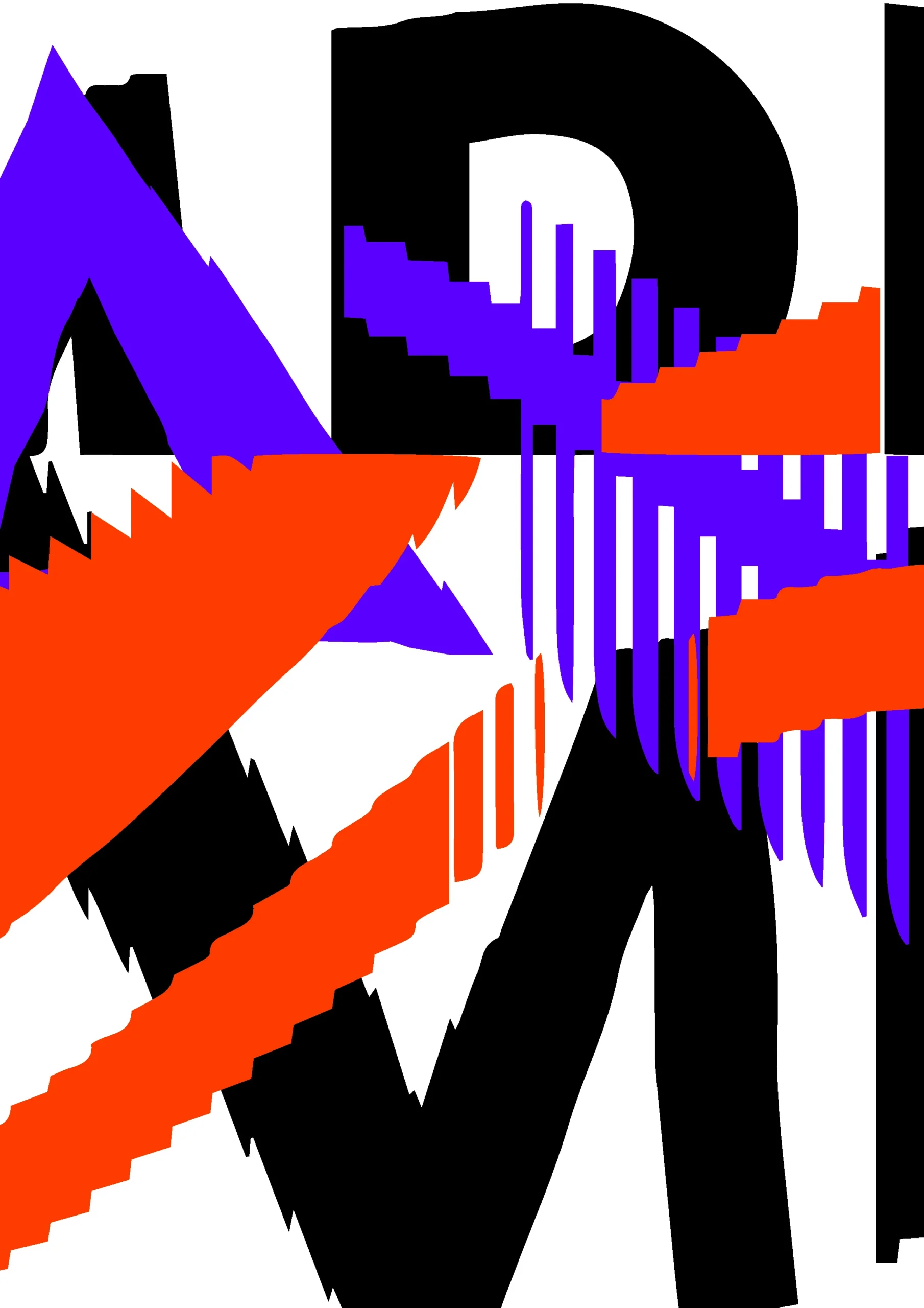
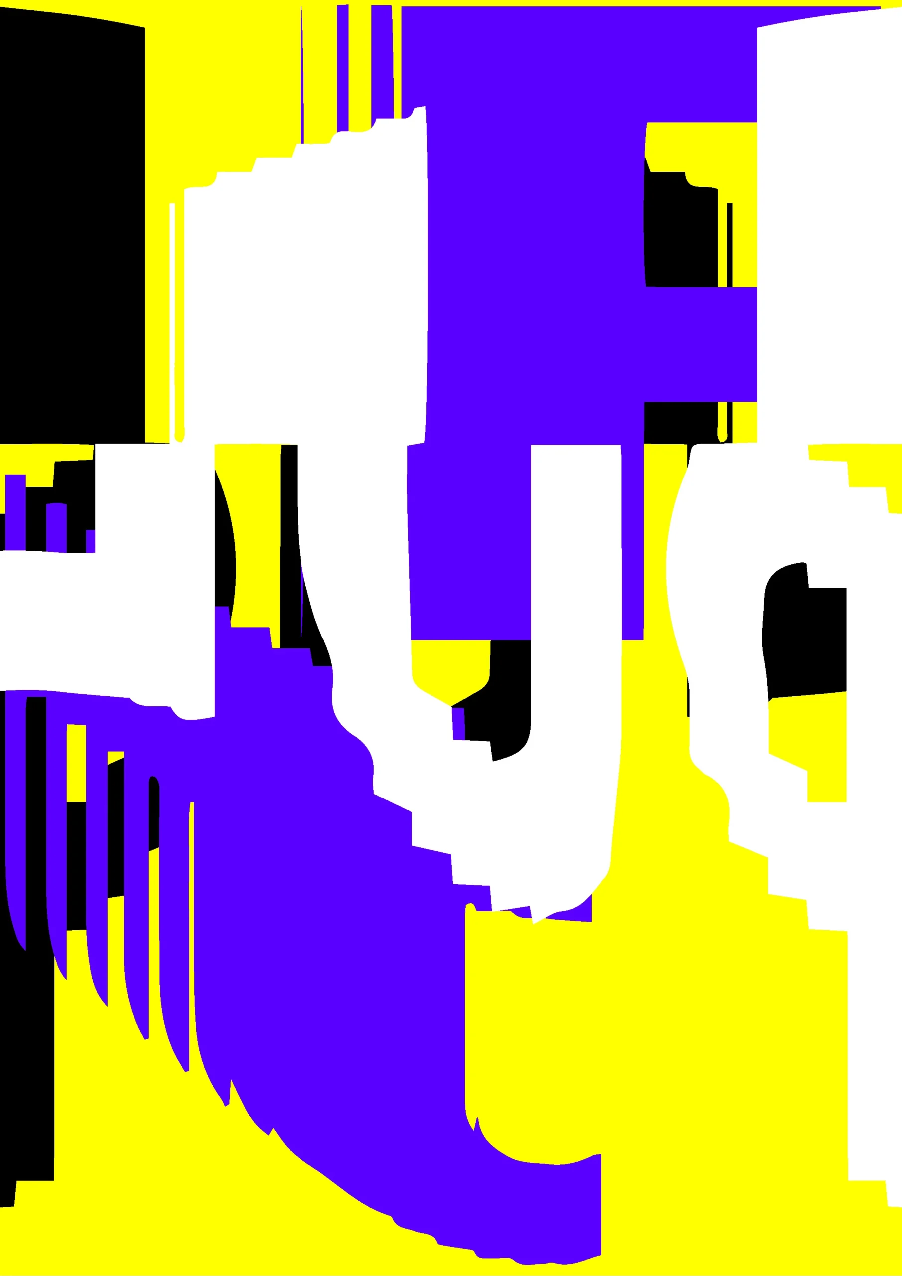
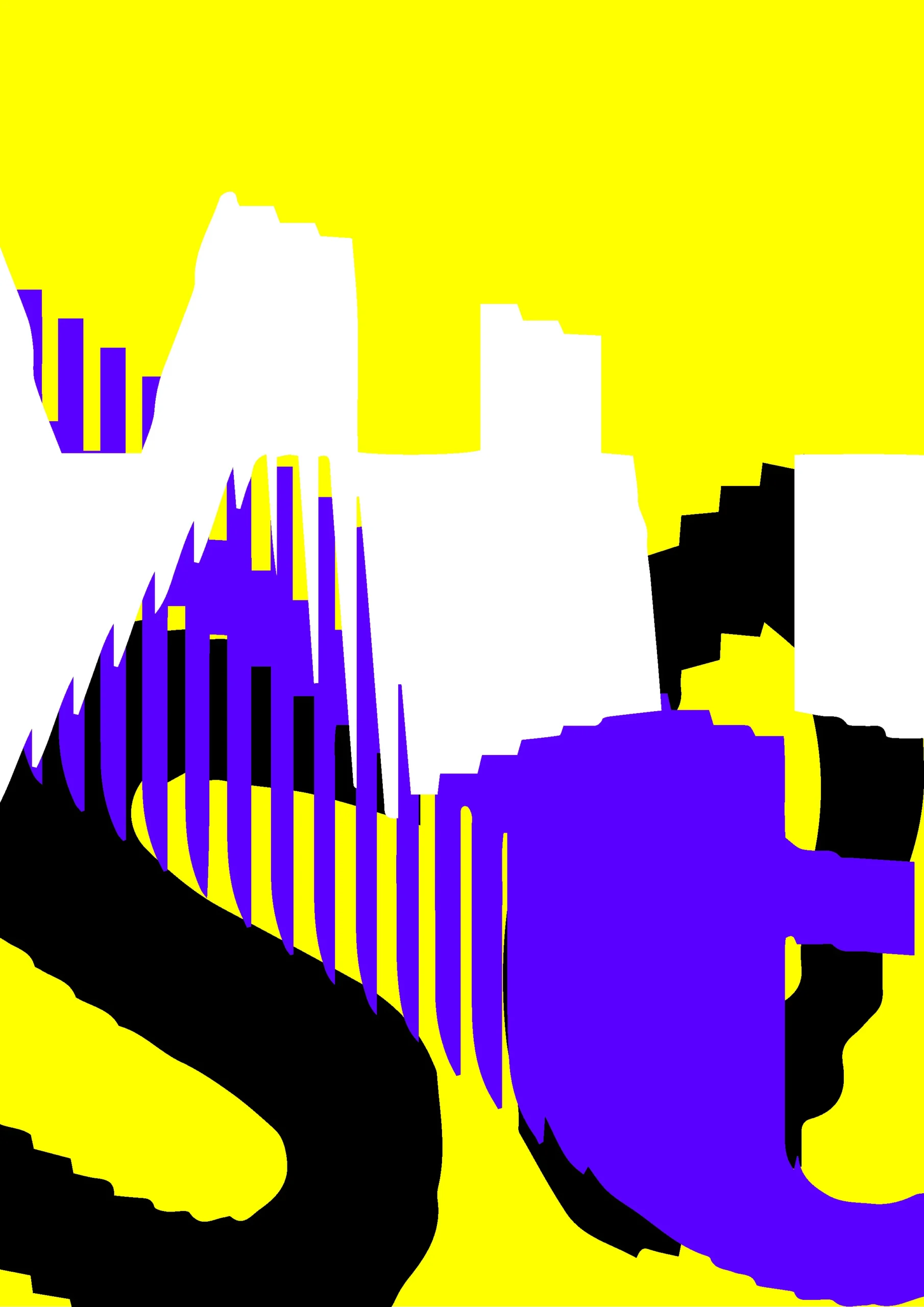
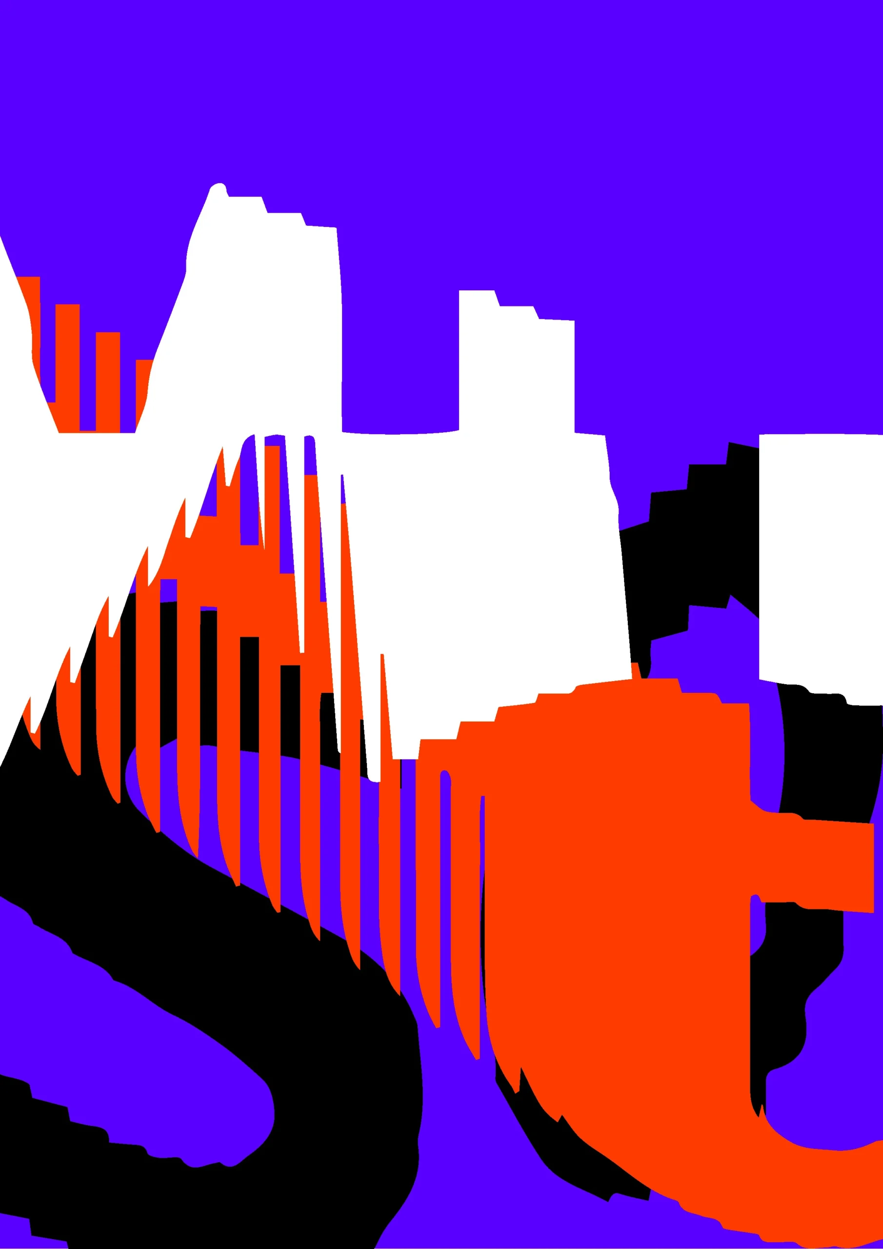
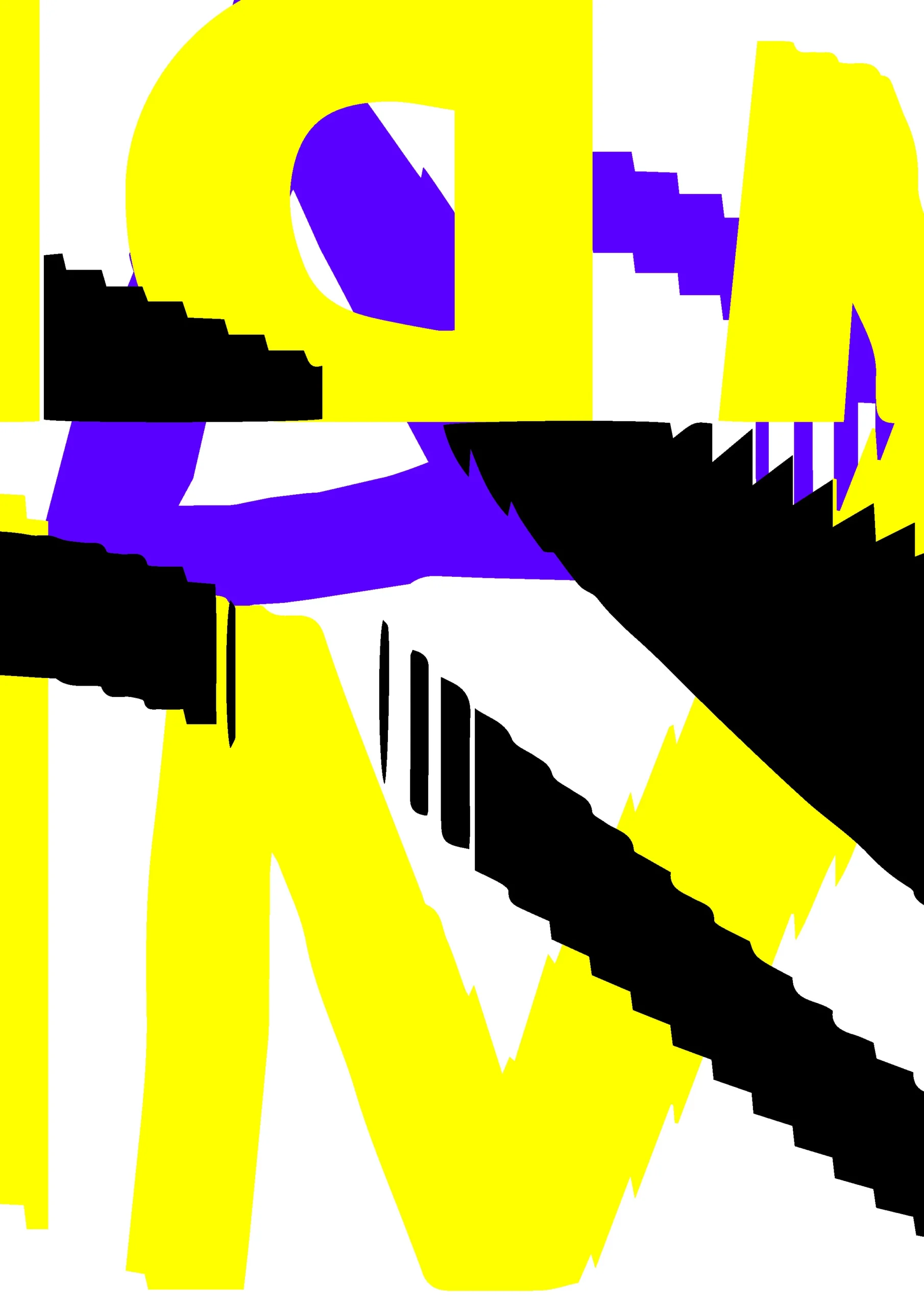
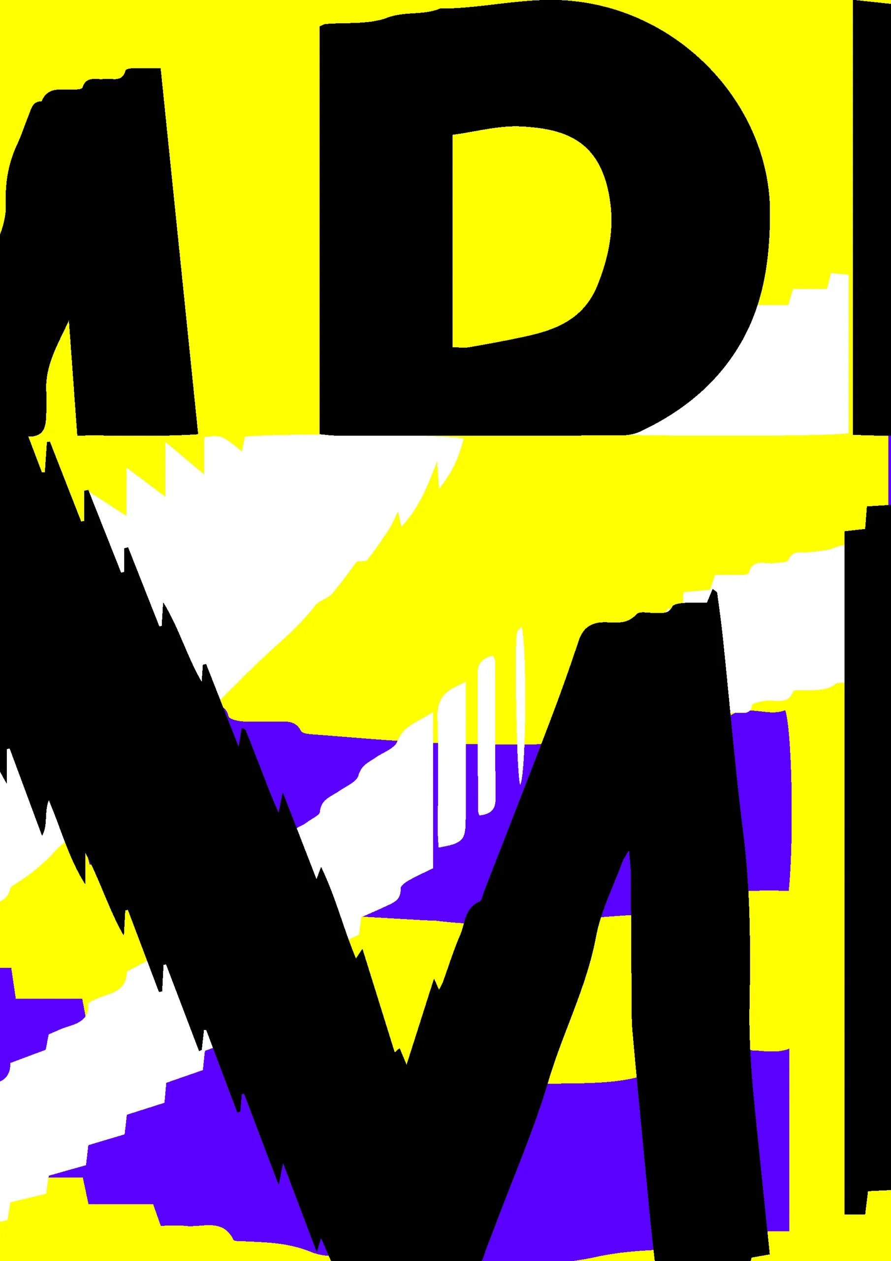
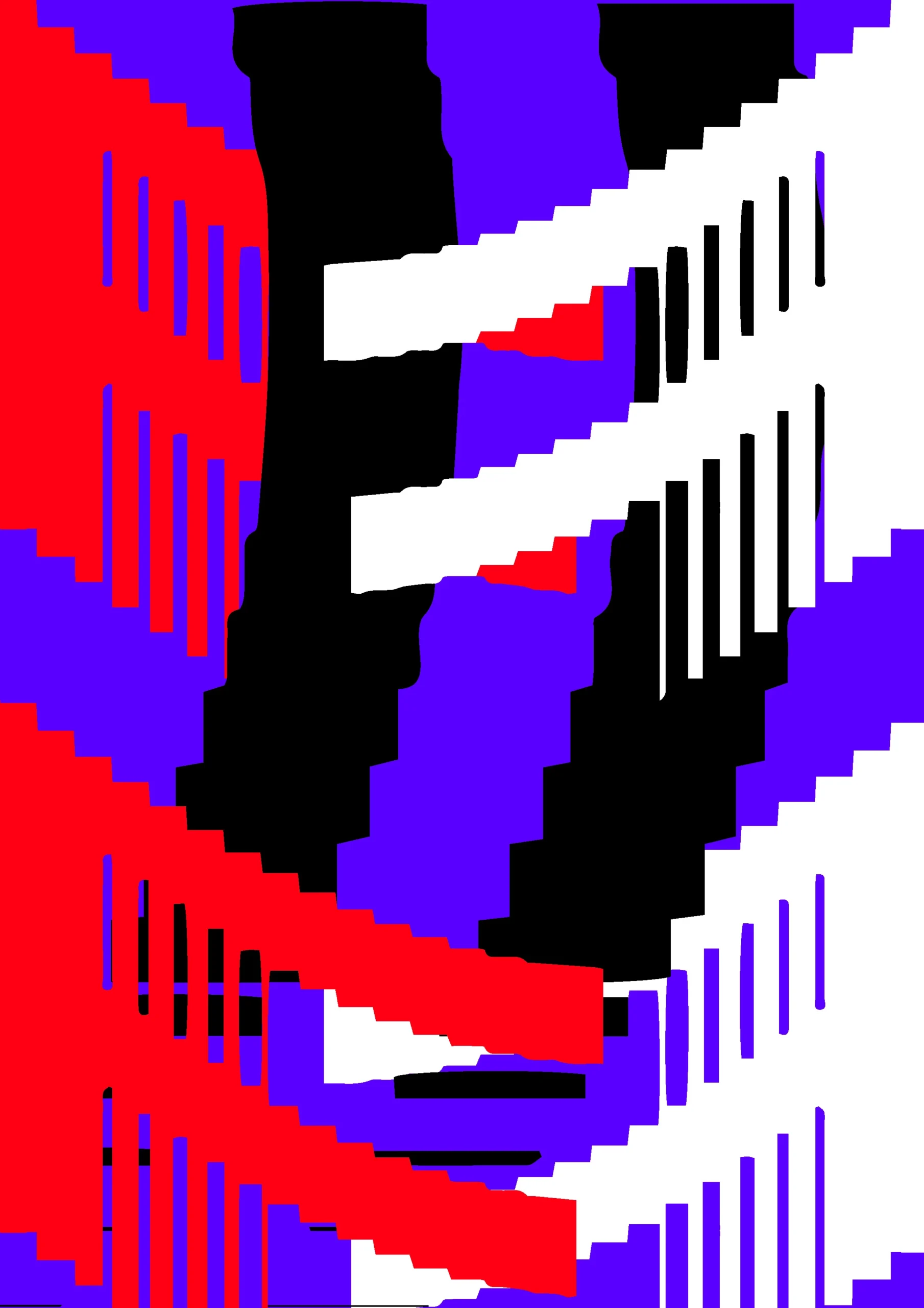
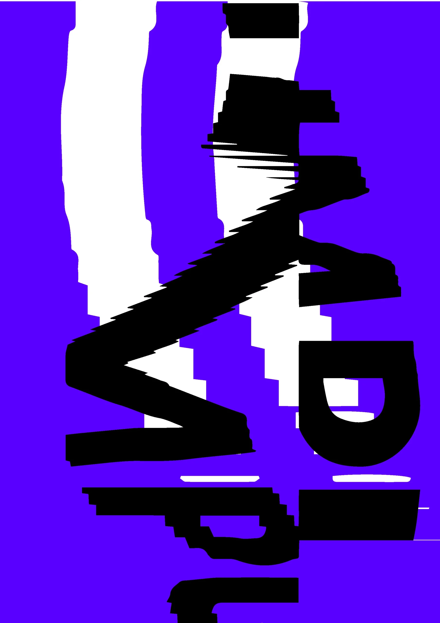
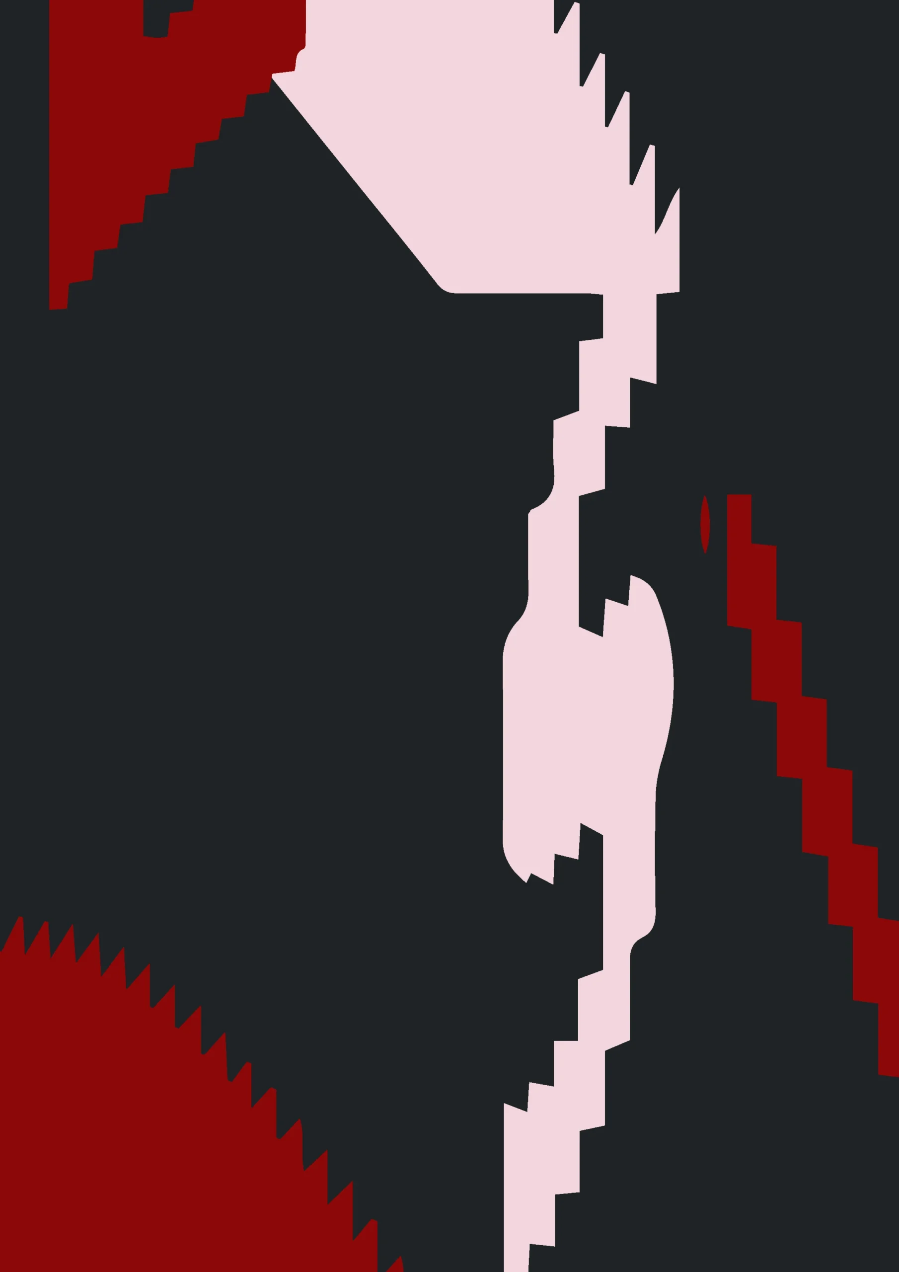
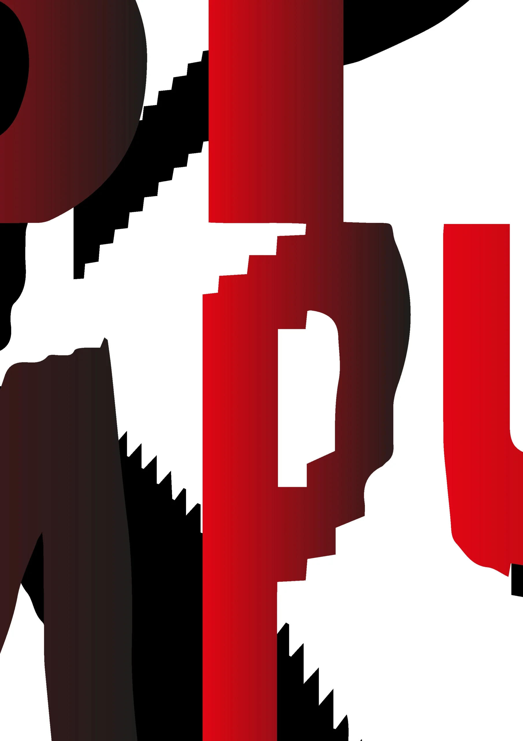
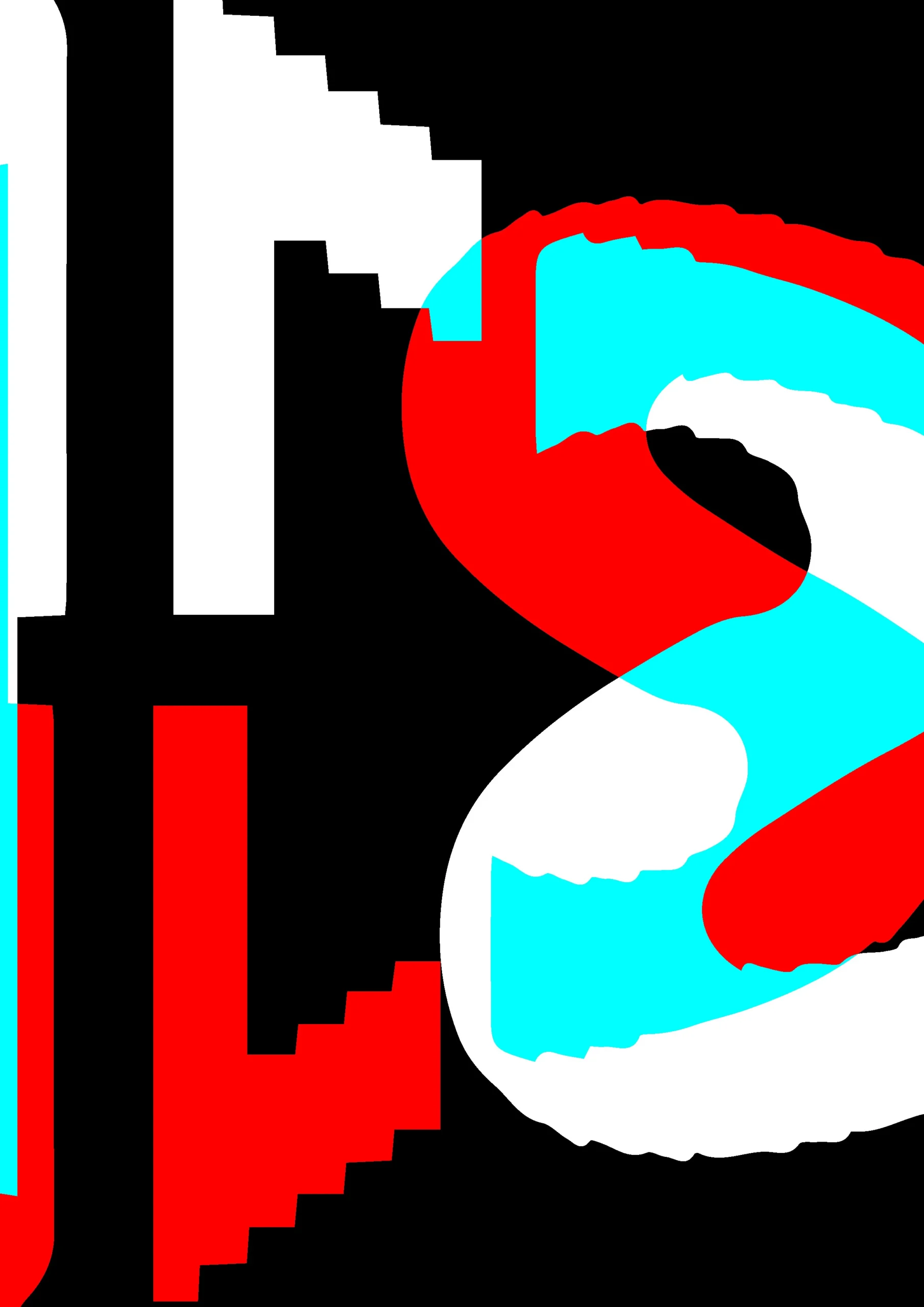
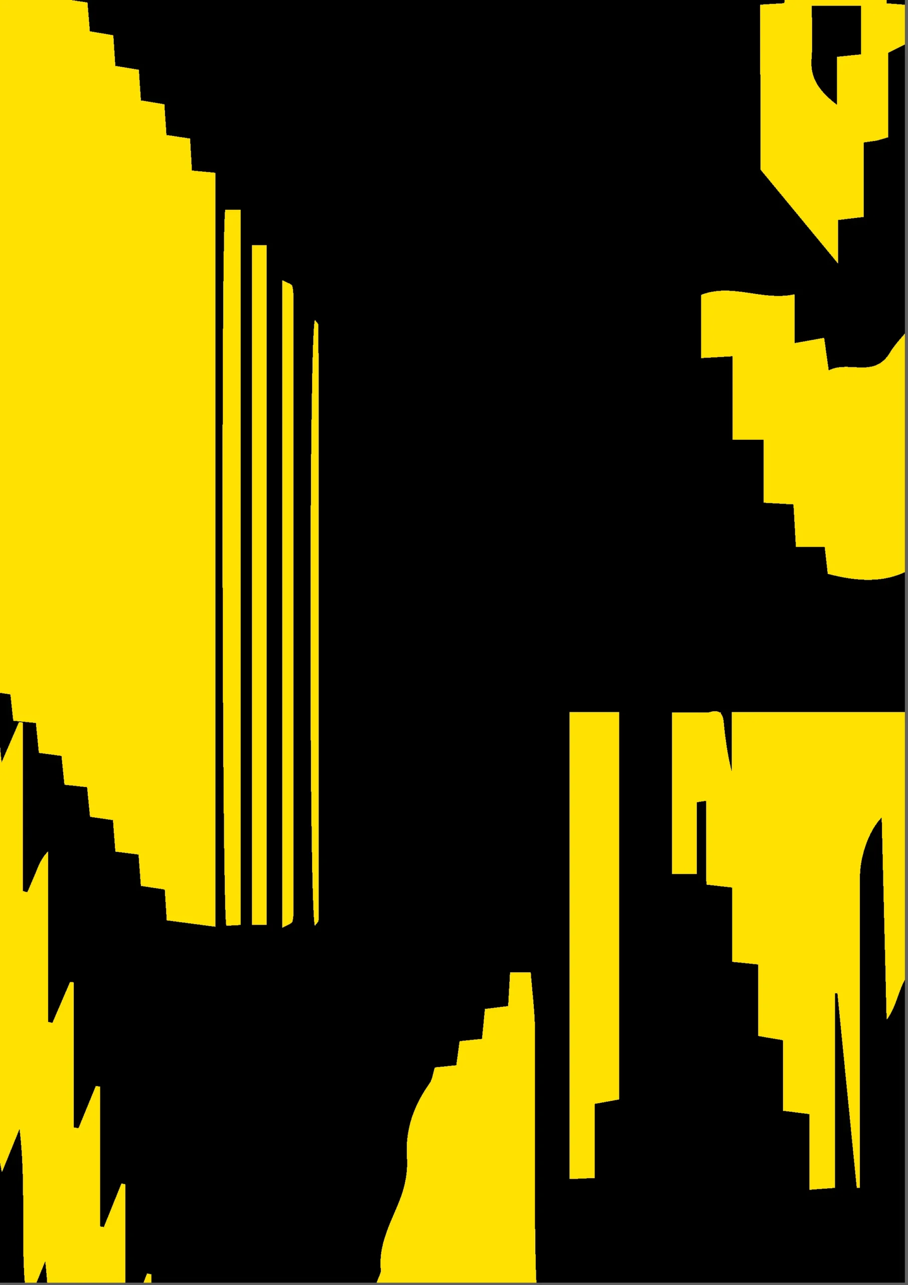
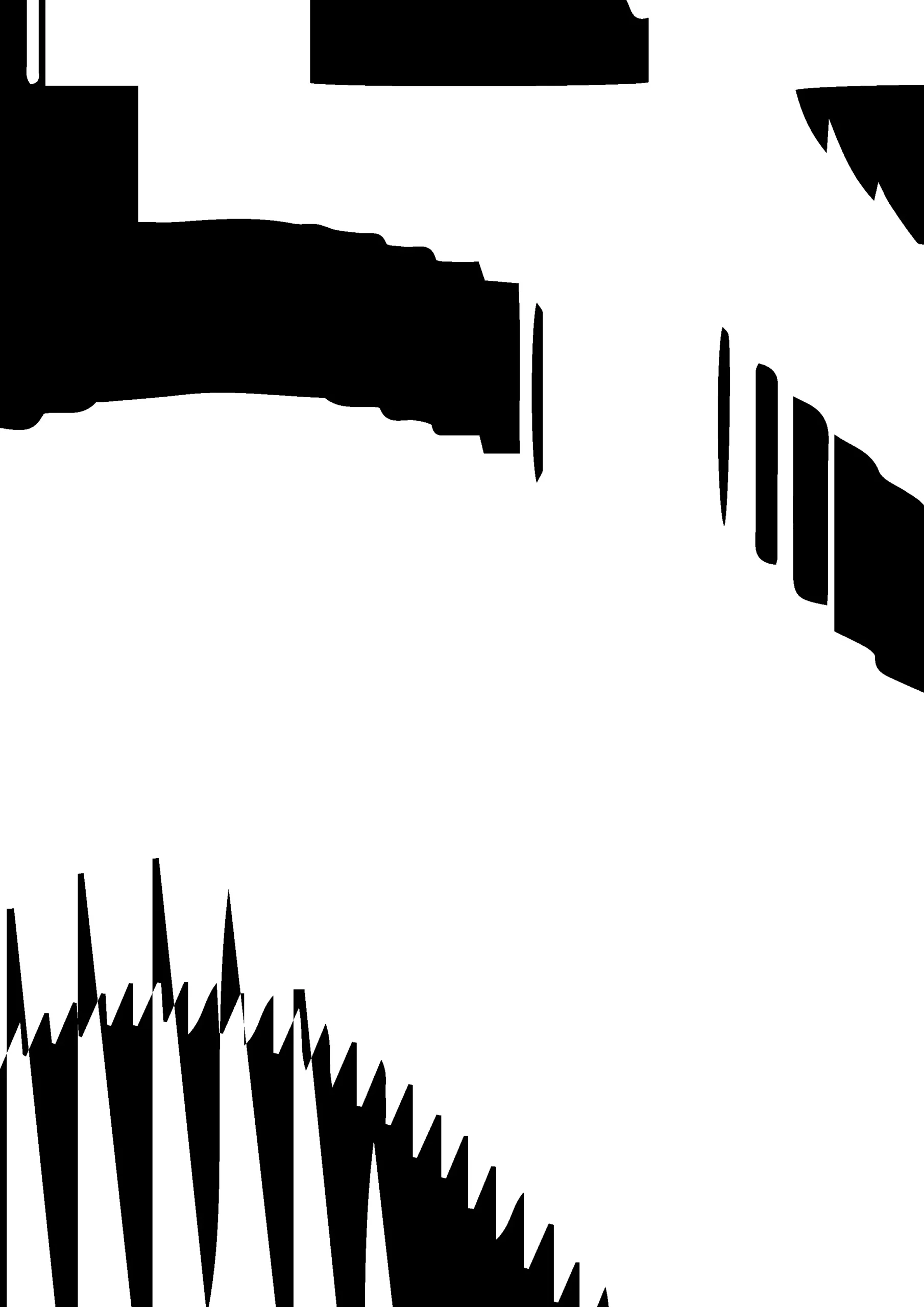
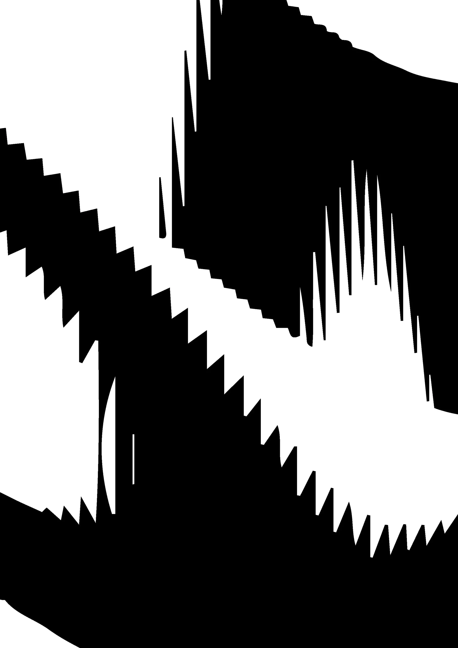
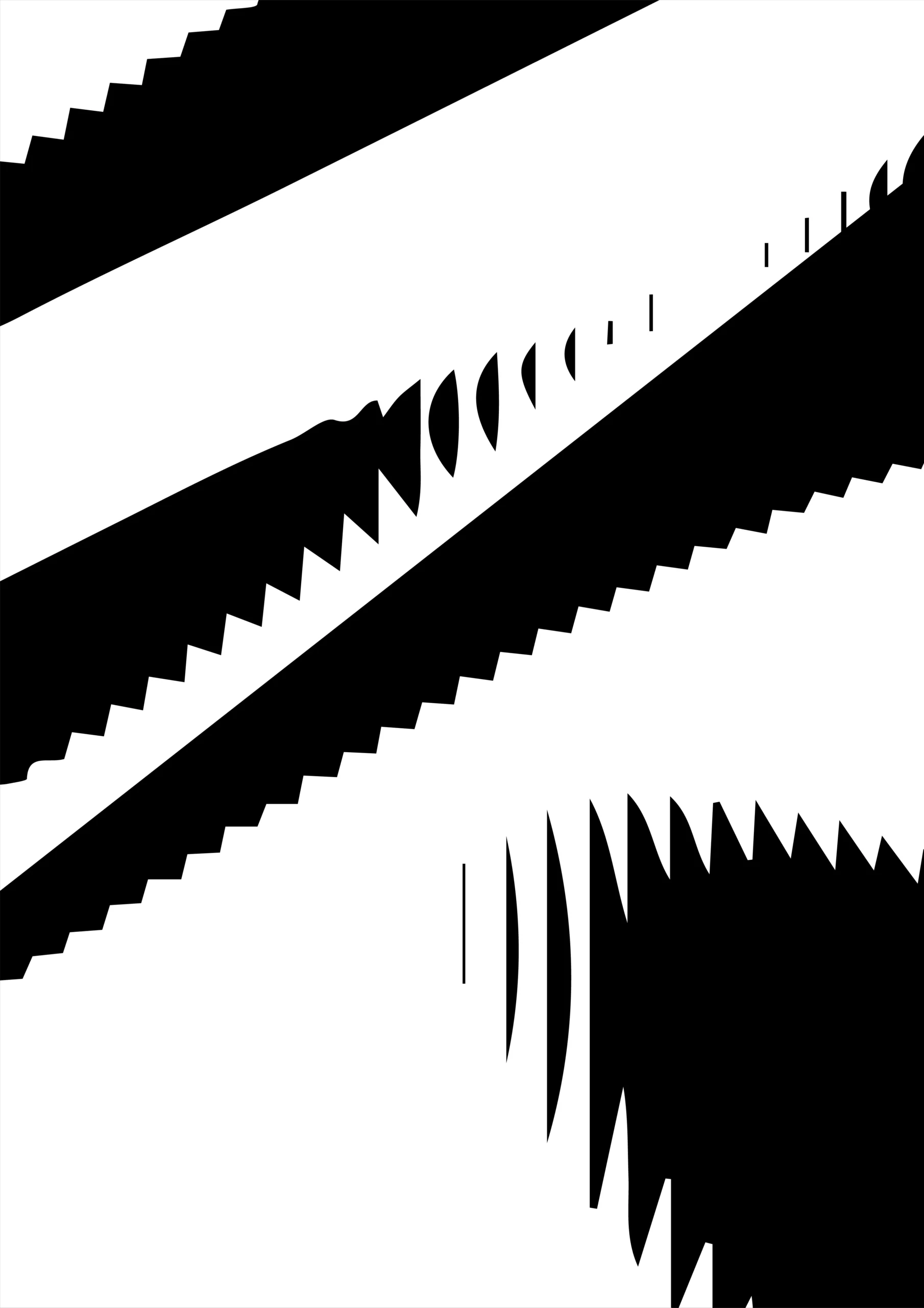
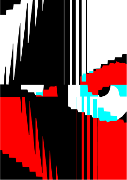
New approach in P5.js

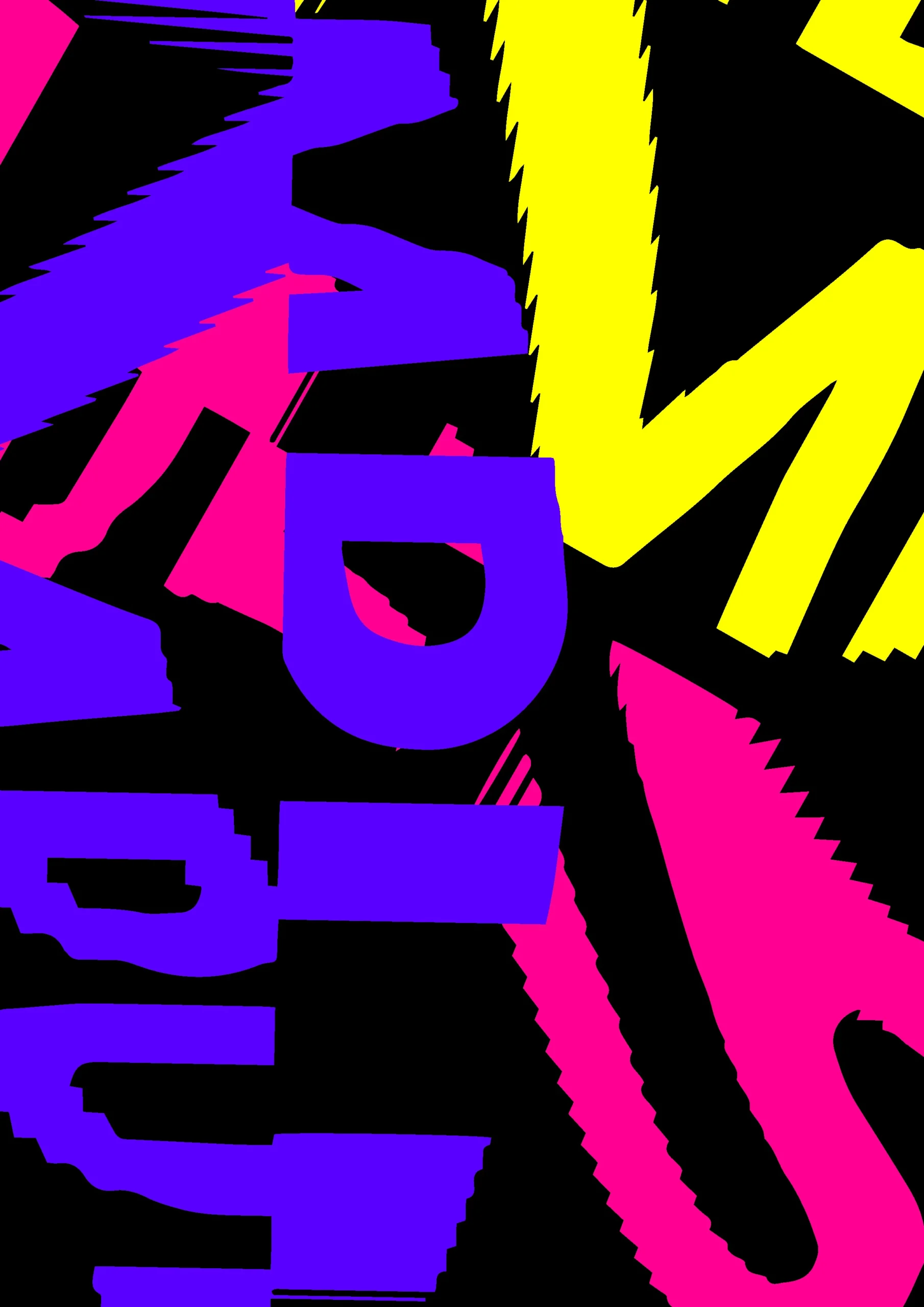
Continuation of previous tests


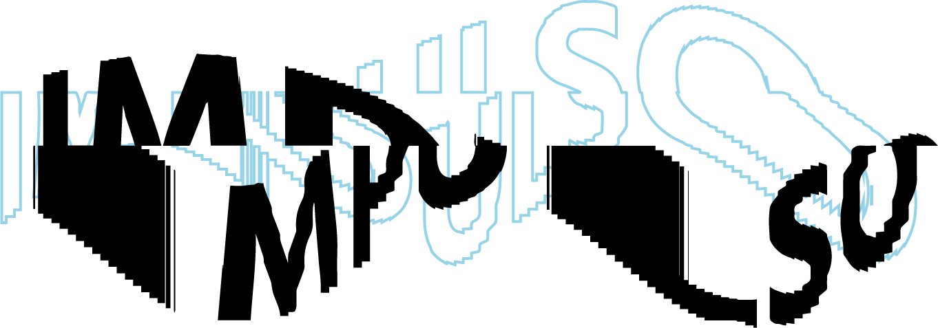
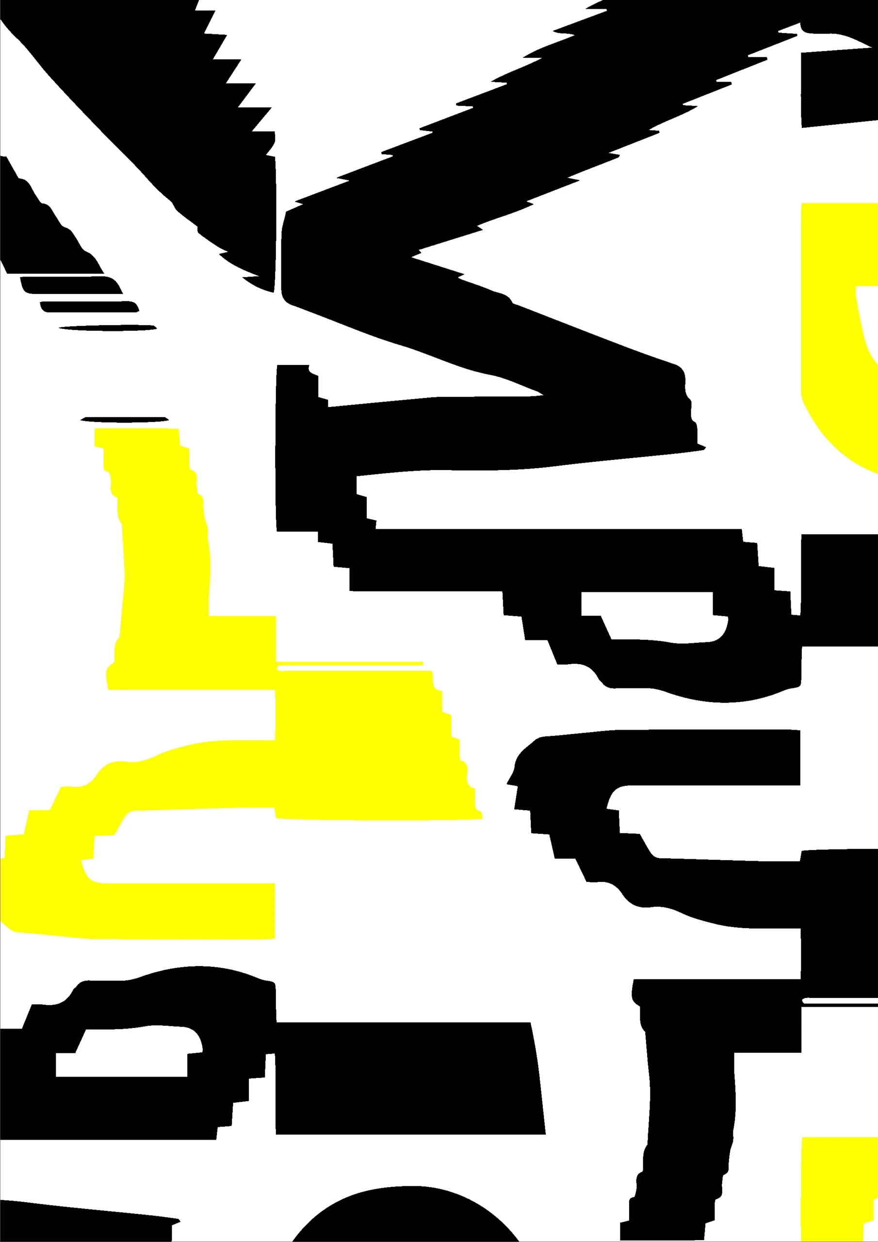
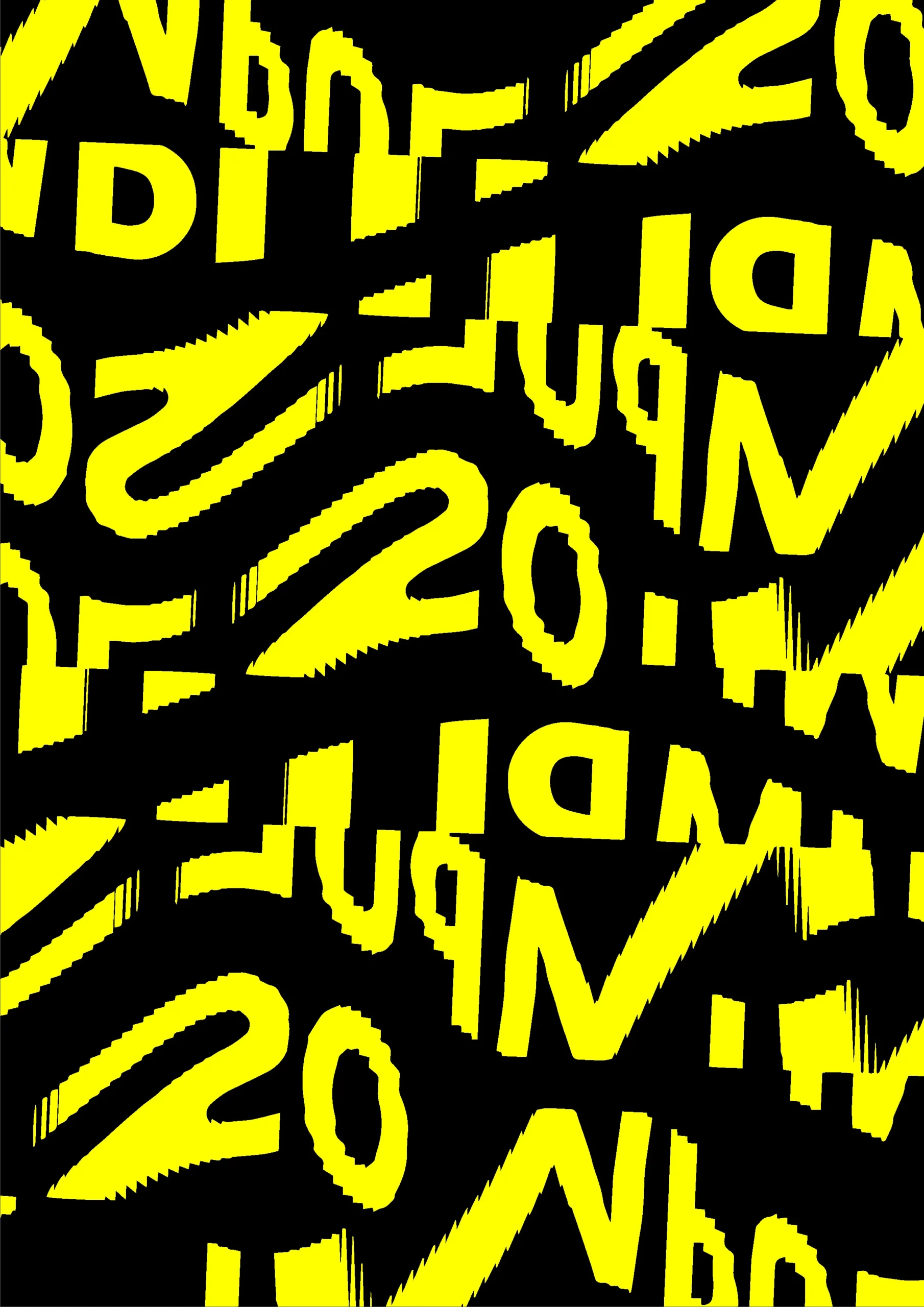
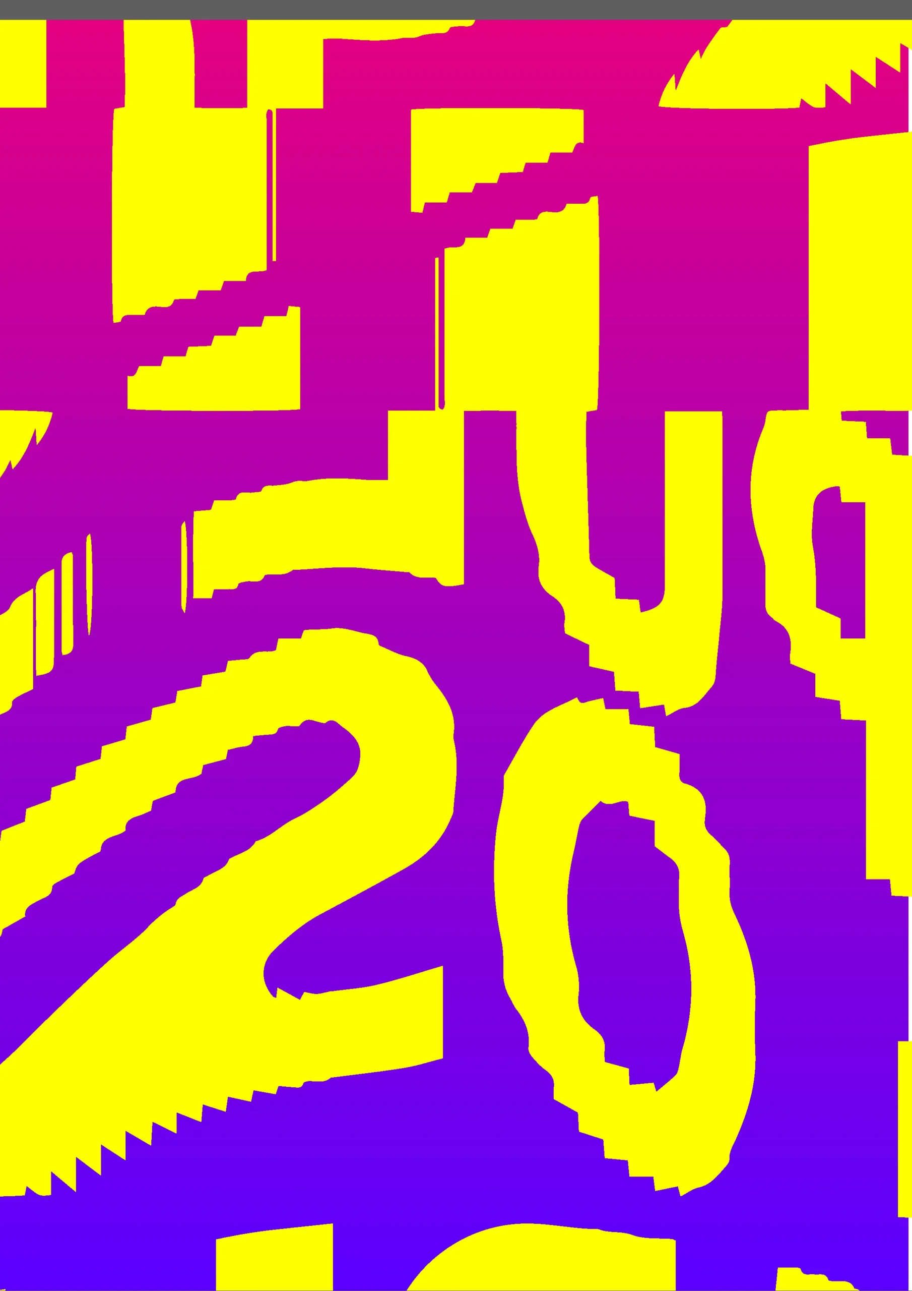
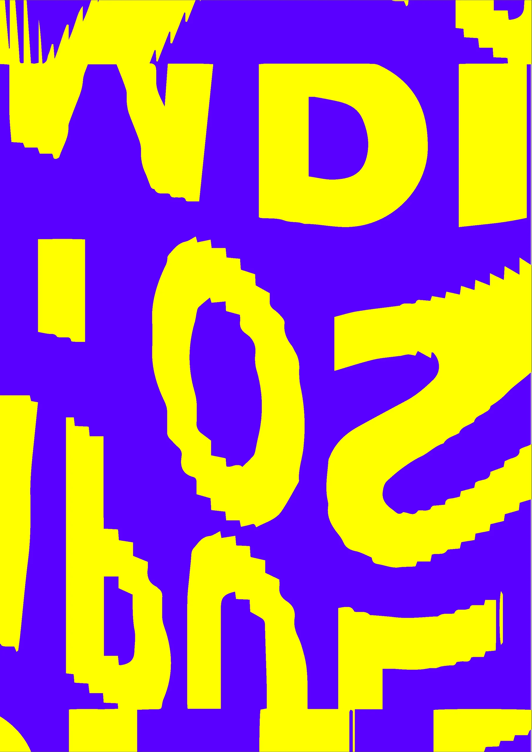
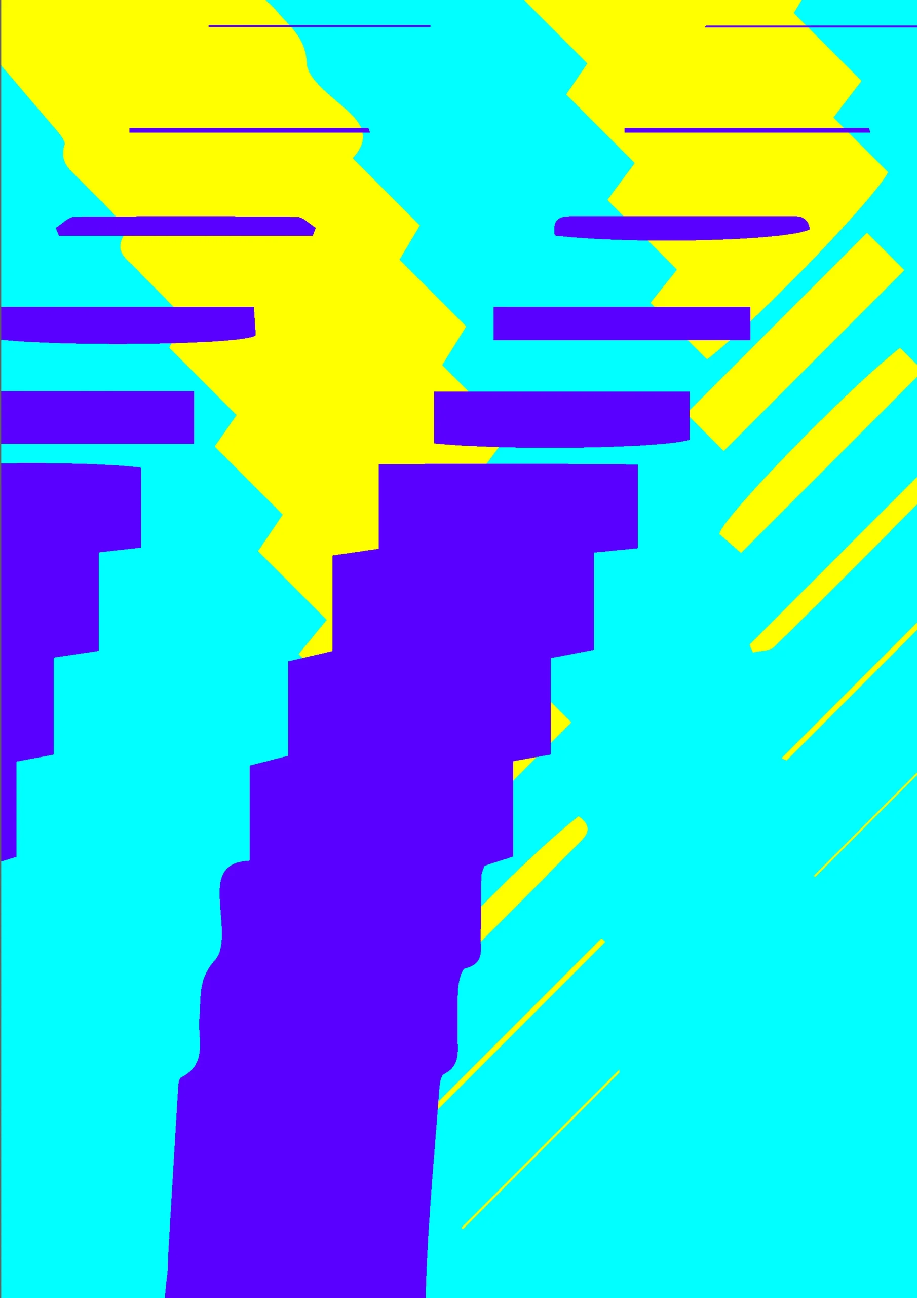
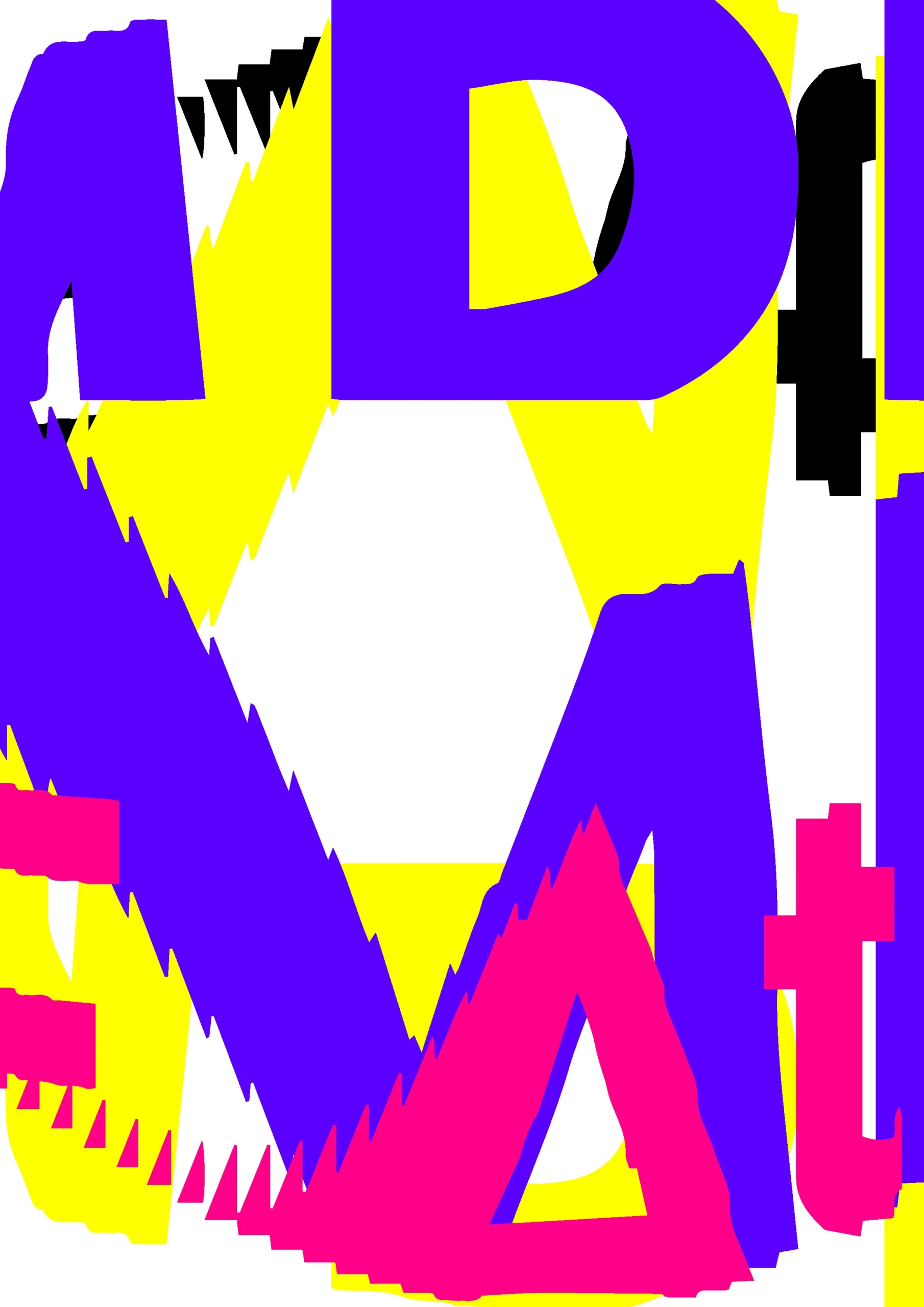
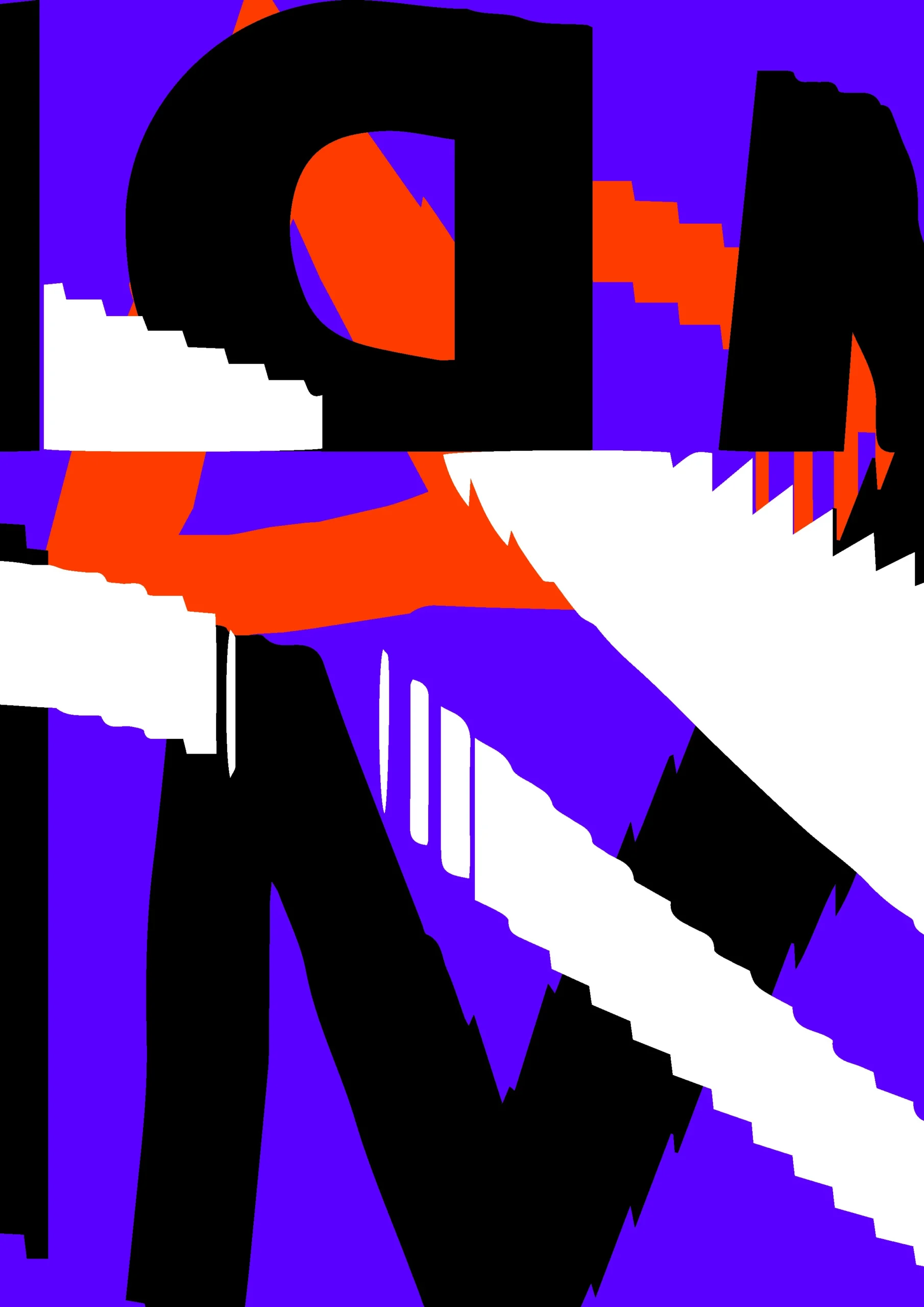
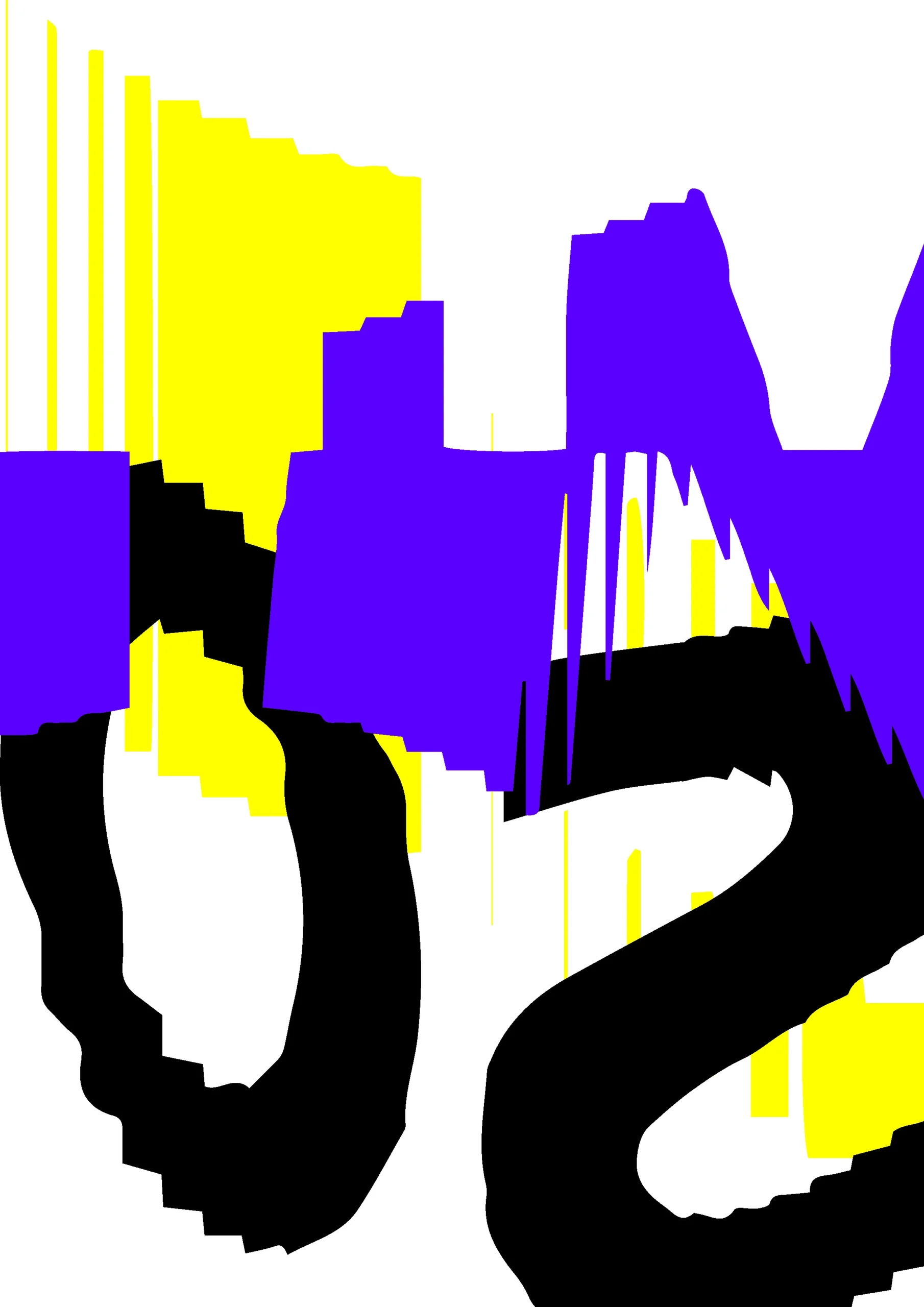
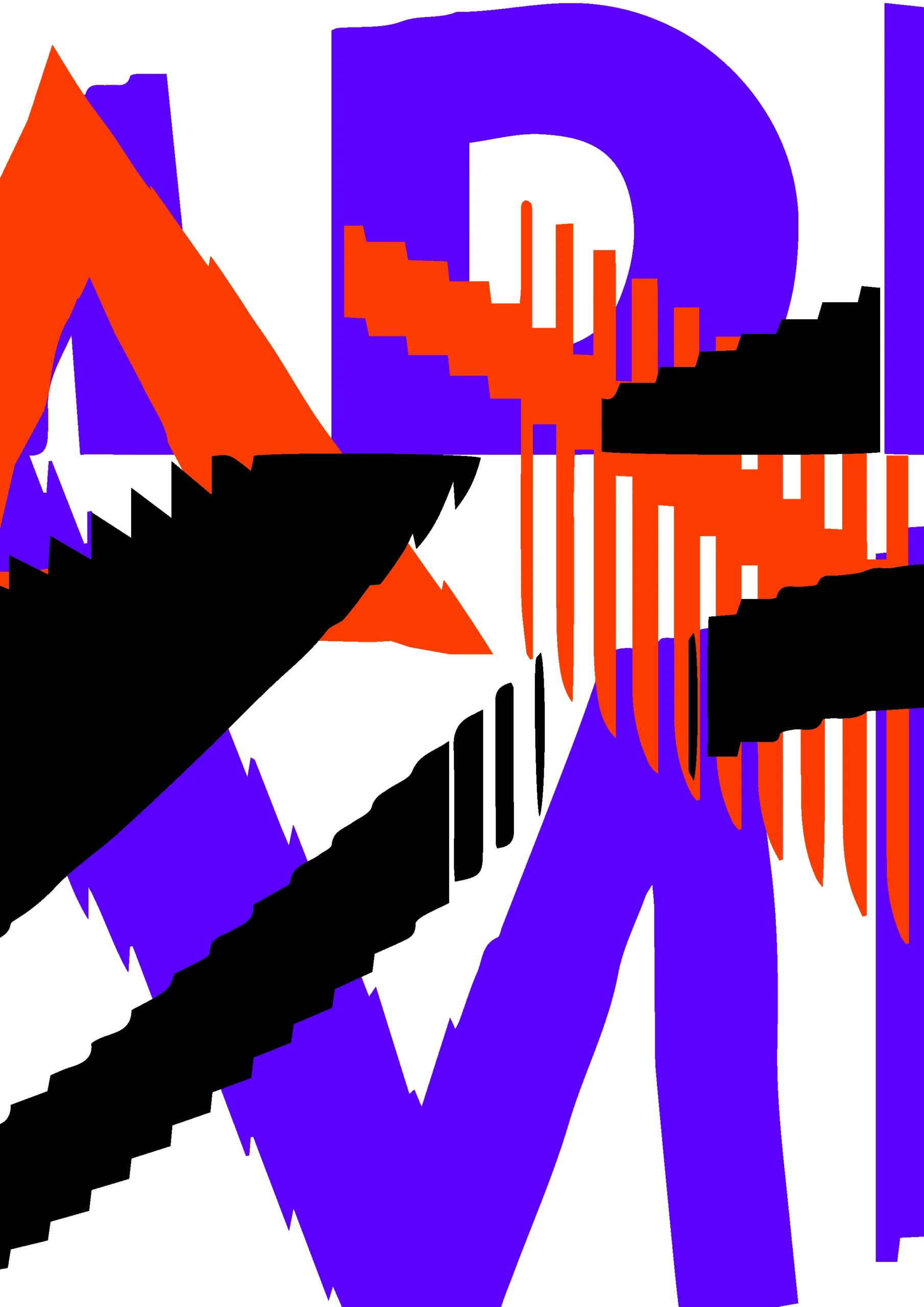
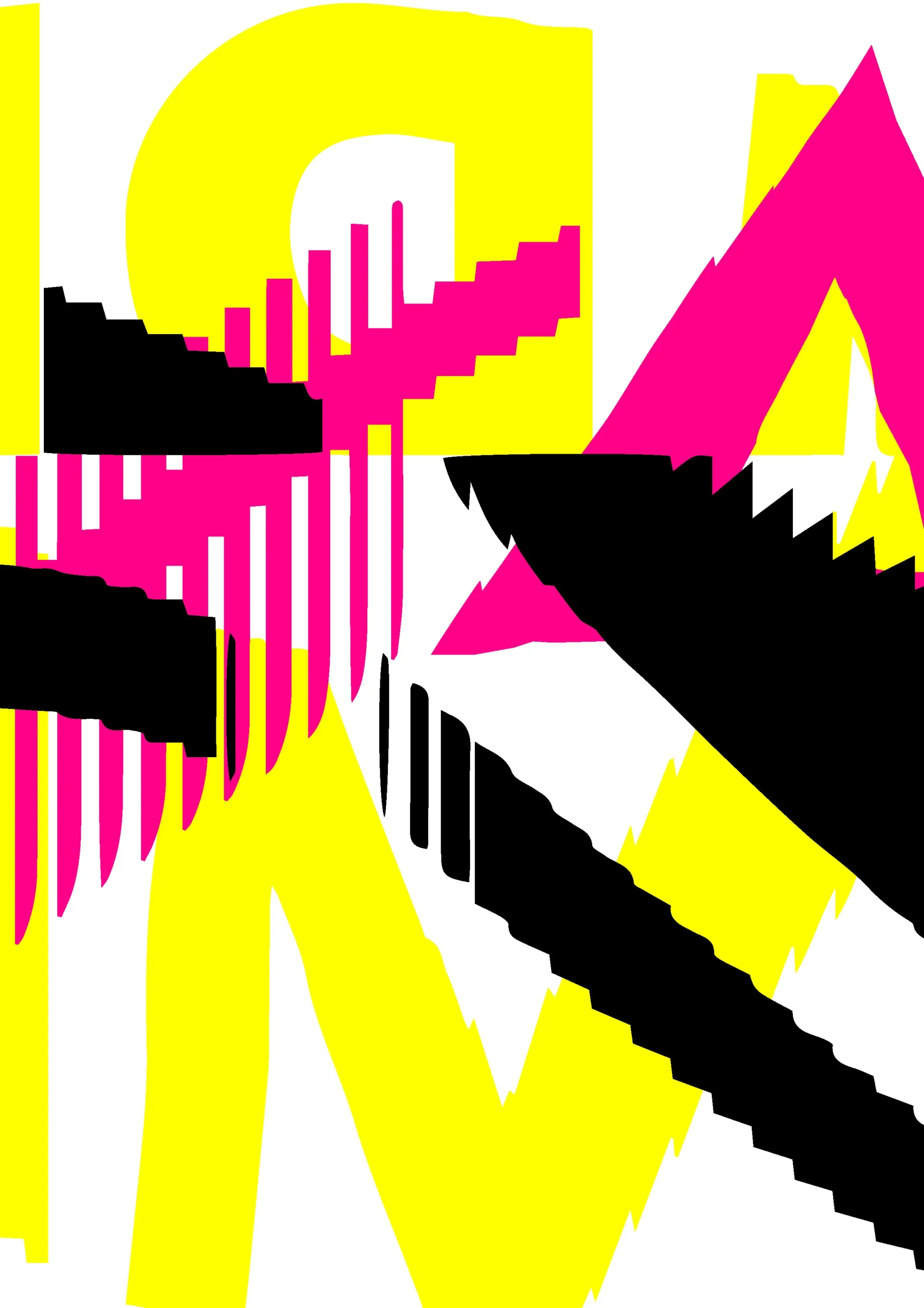
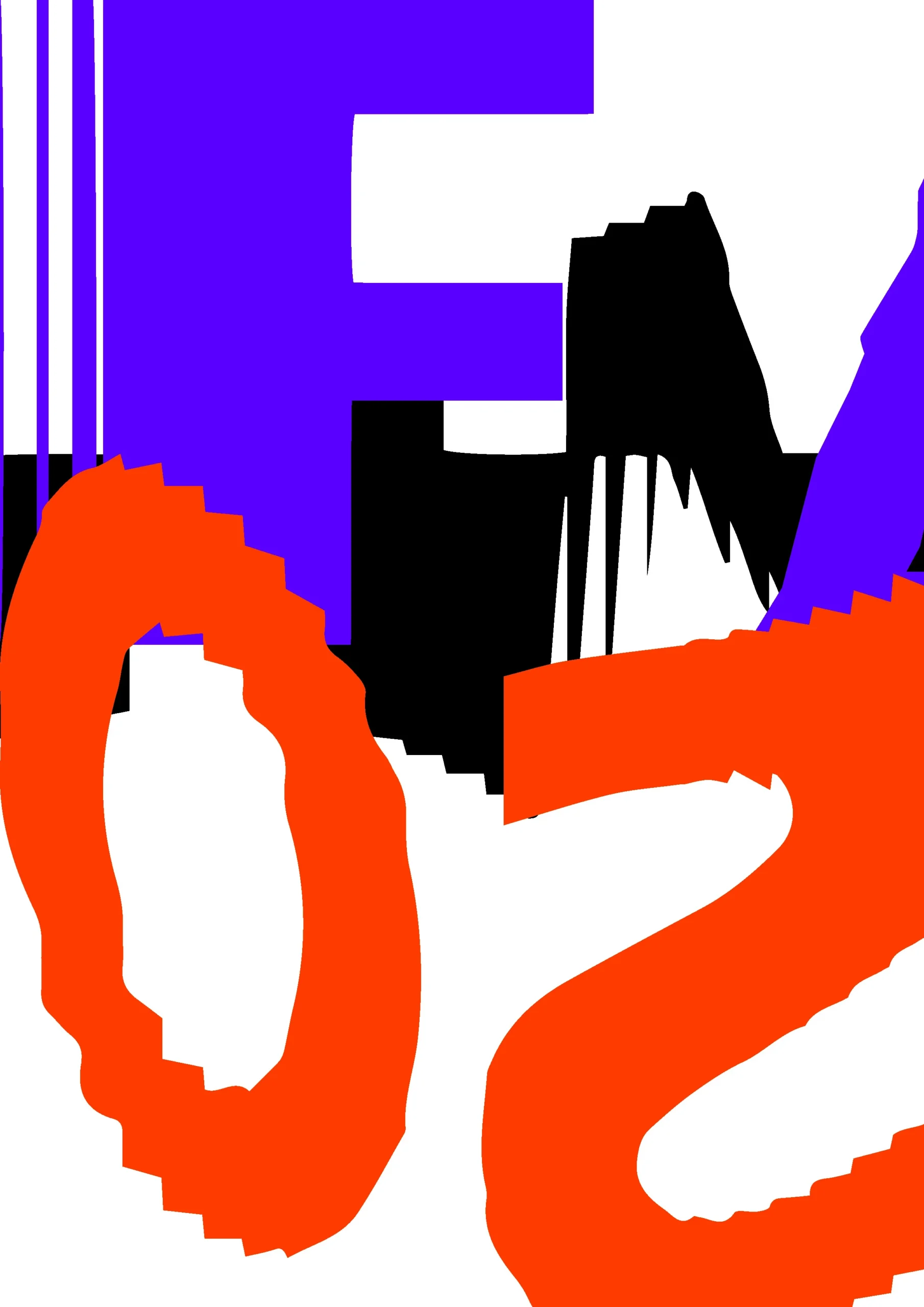
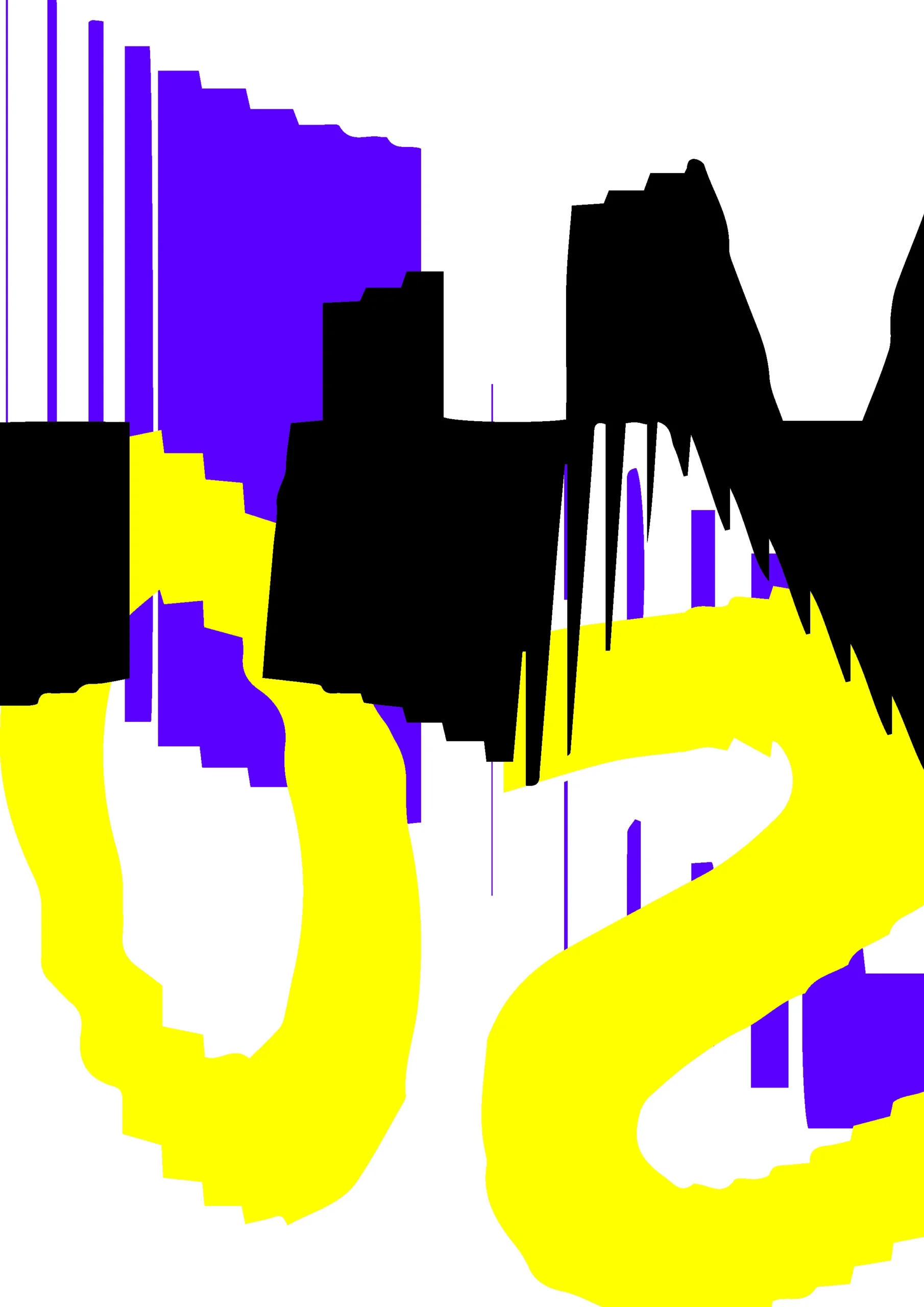
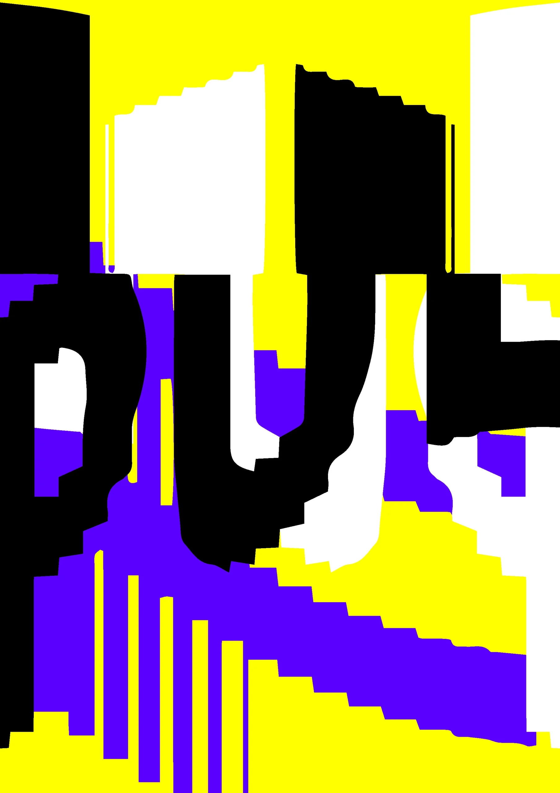
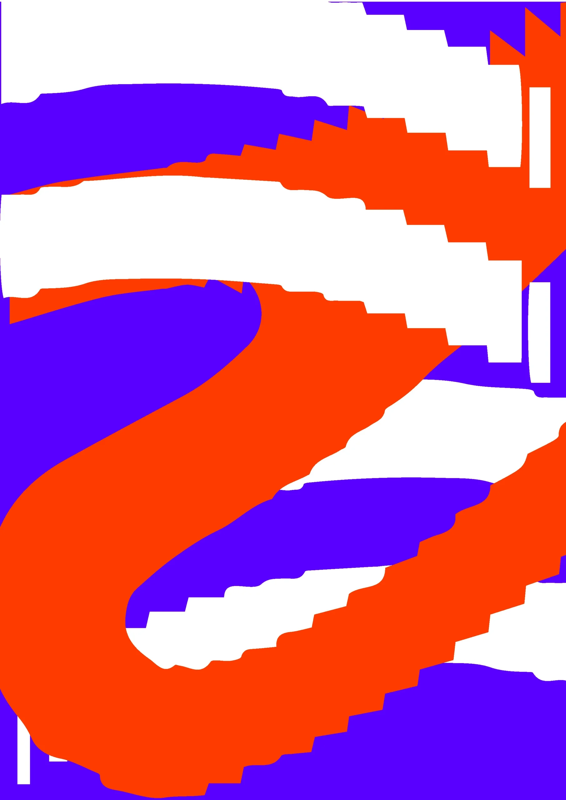
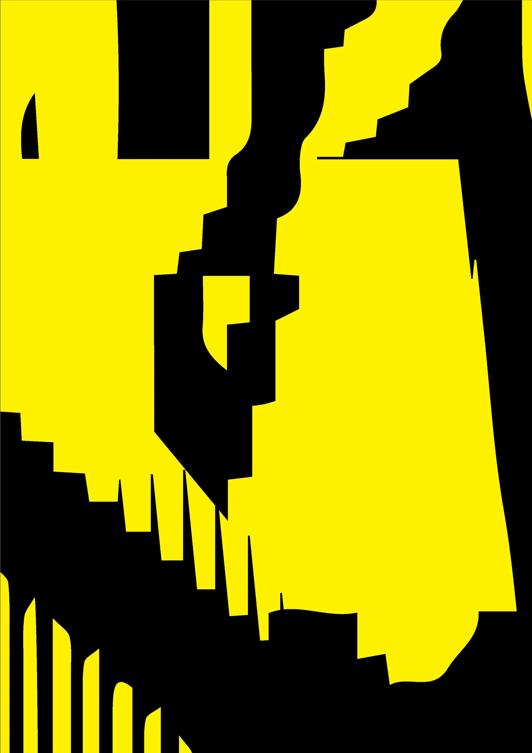
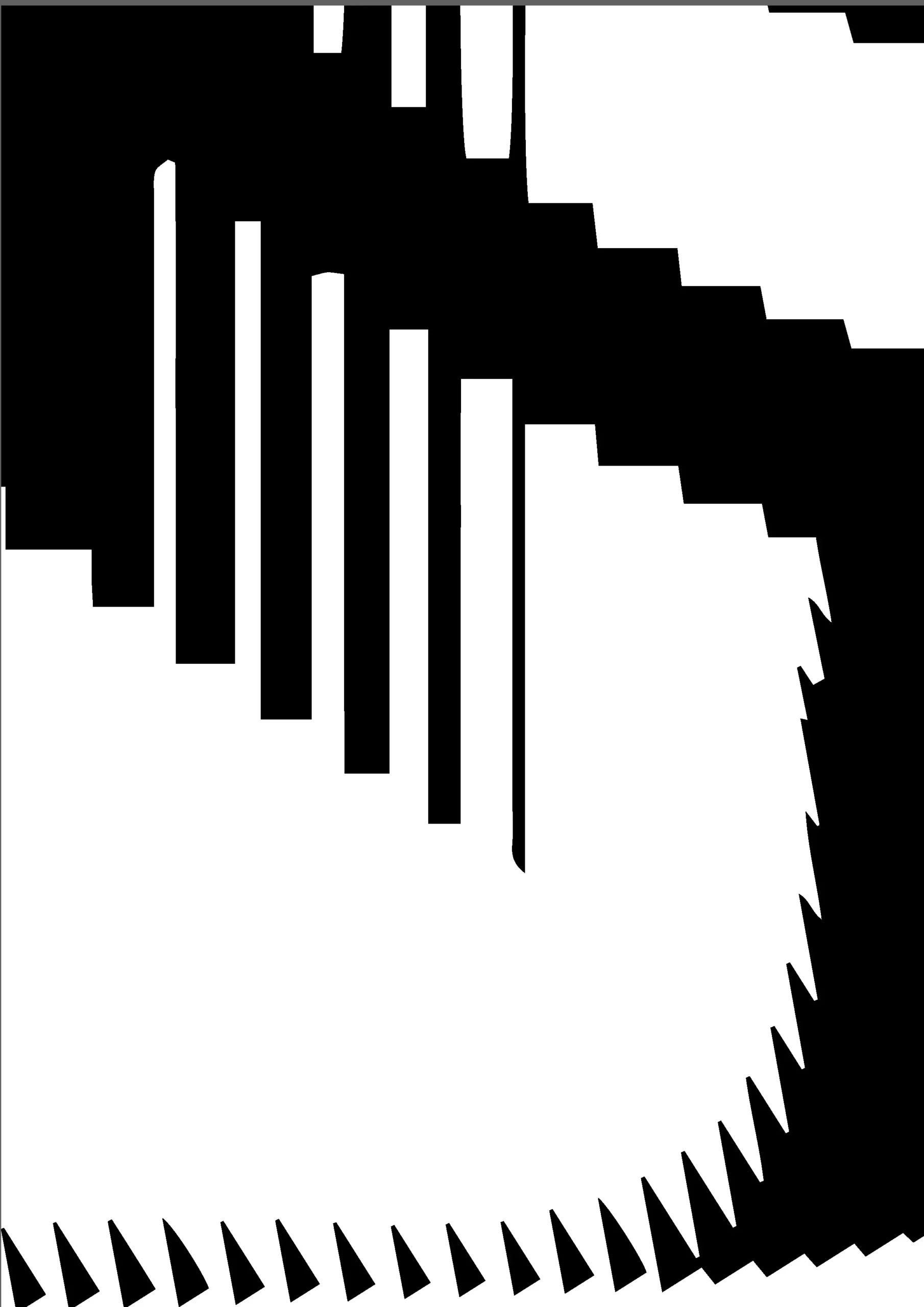
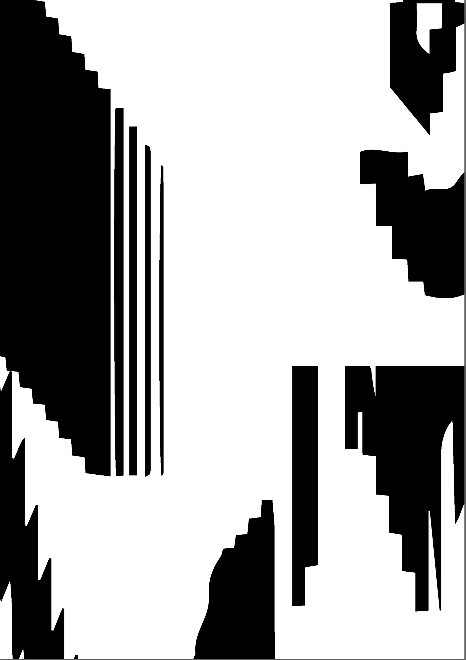
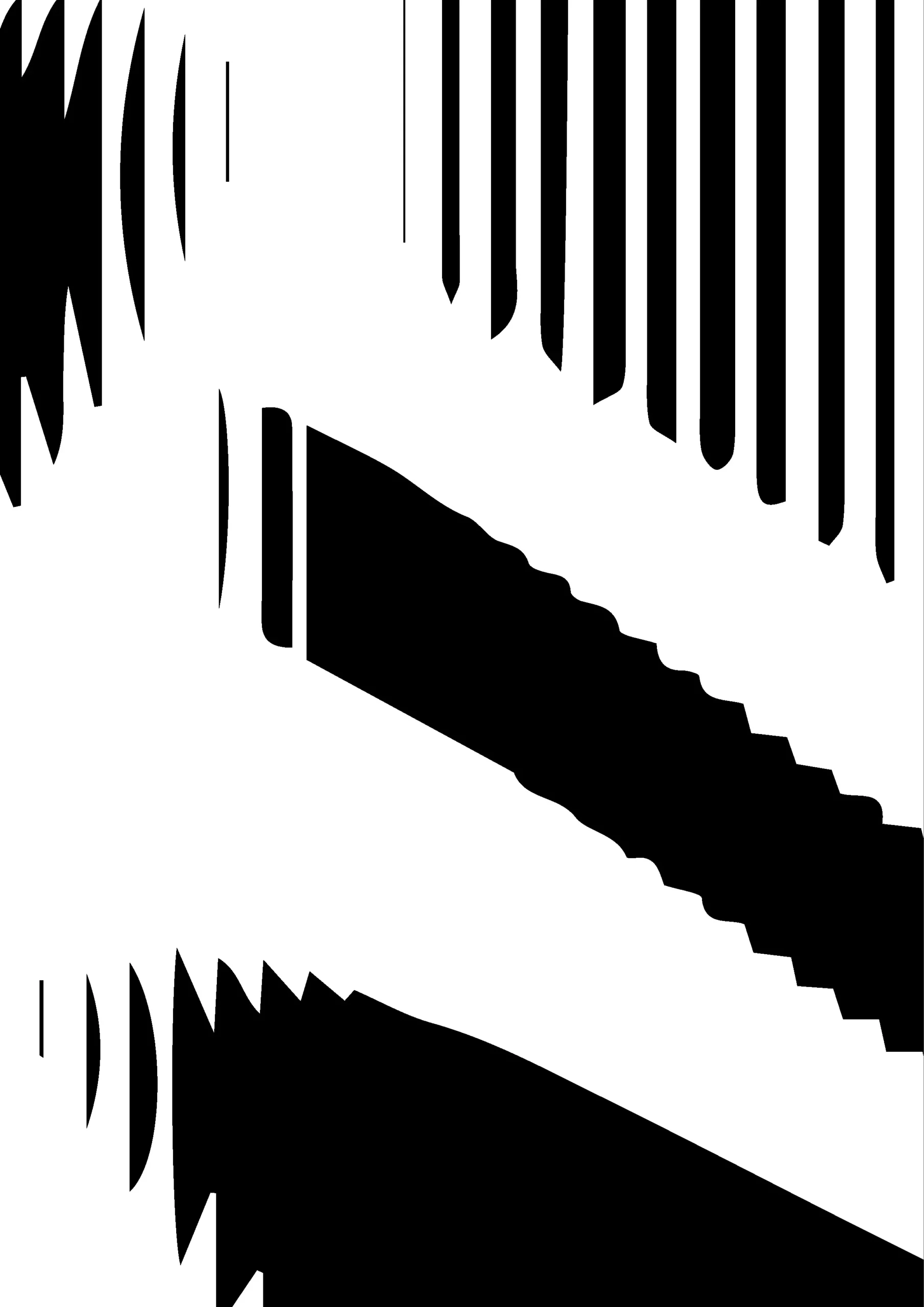
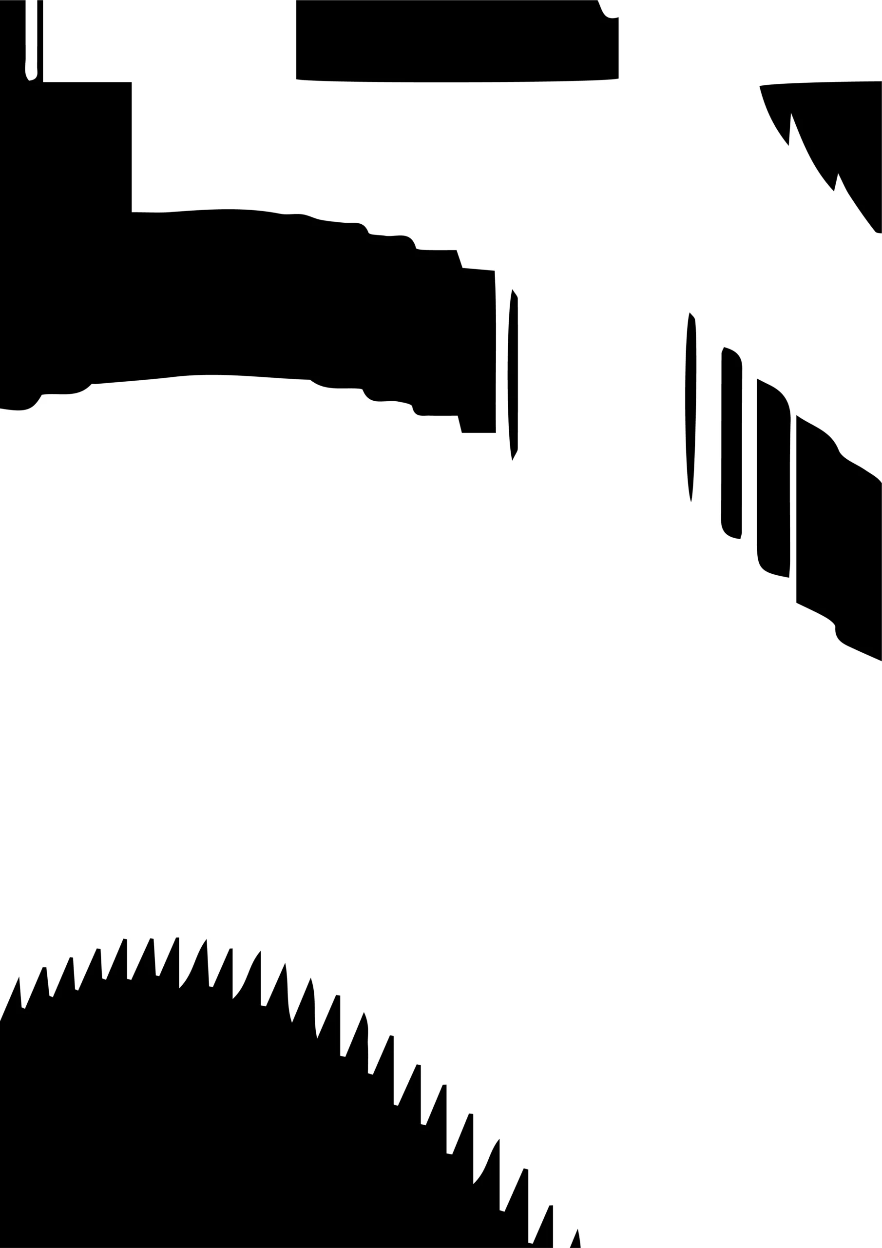
P5.js — Without horizontal cut


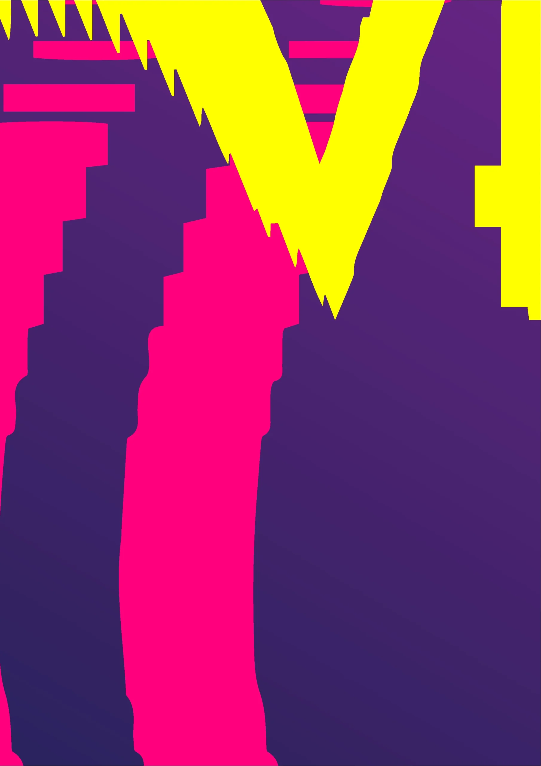
P5.js — Combination of versions


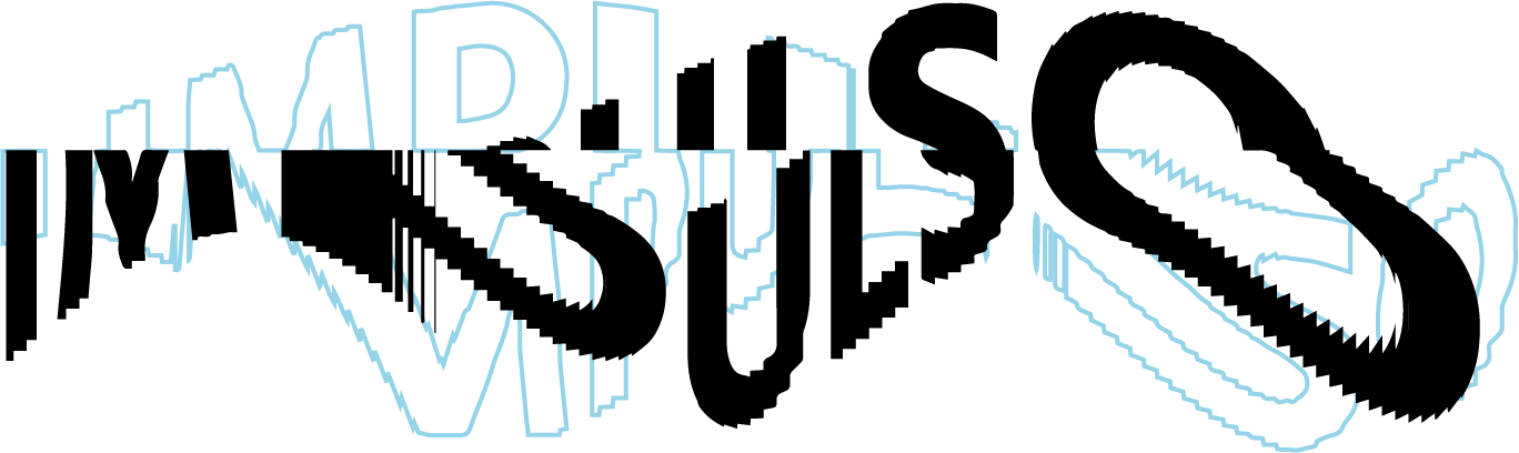
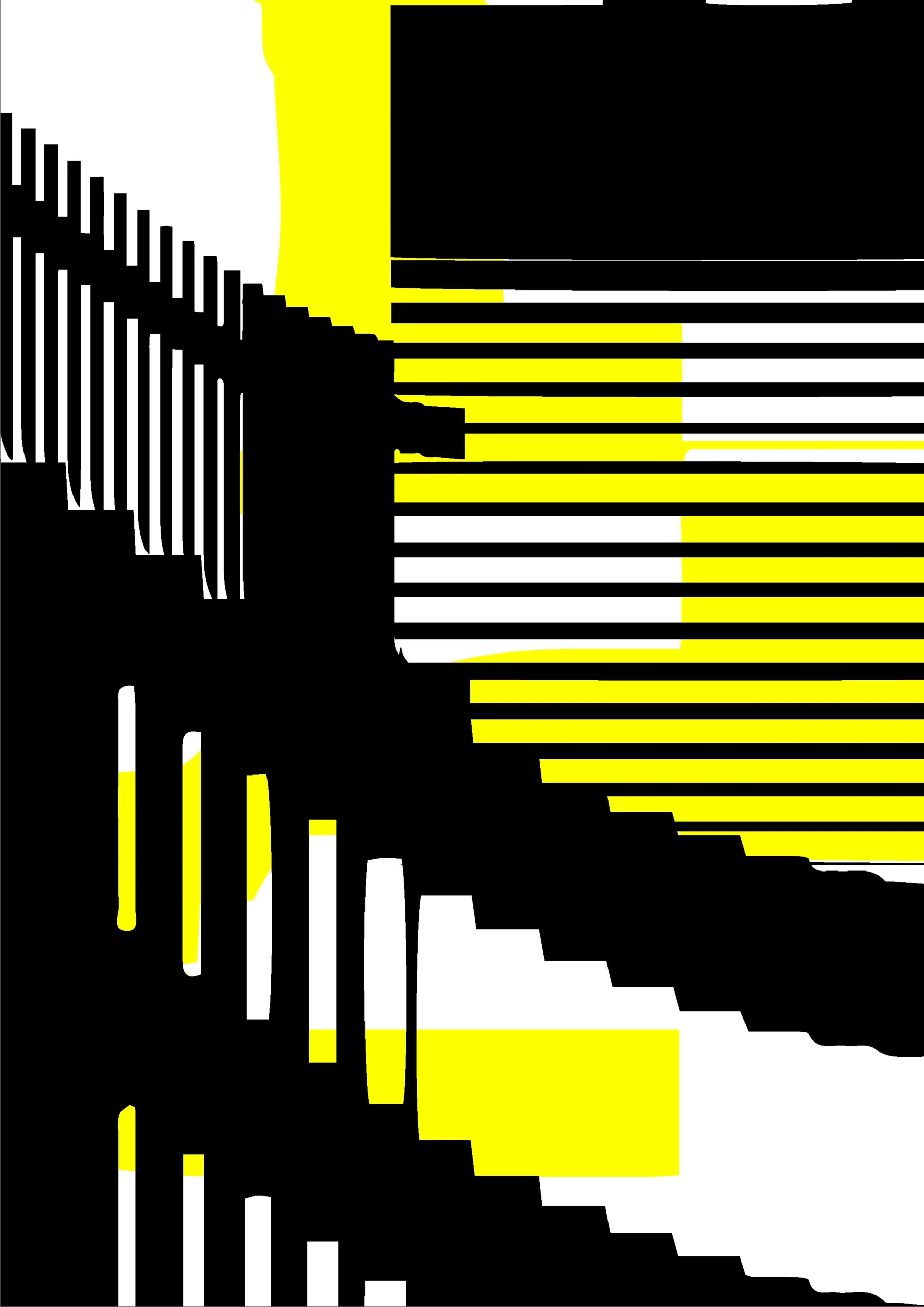
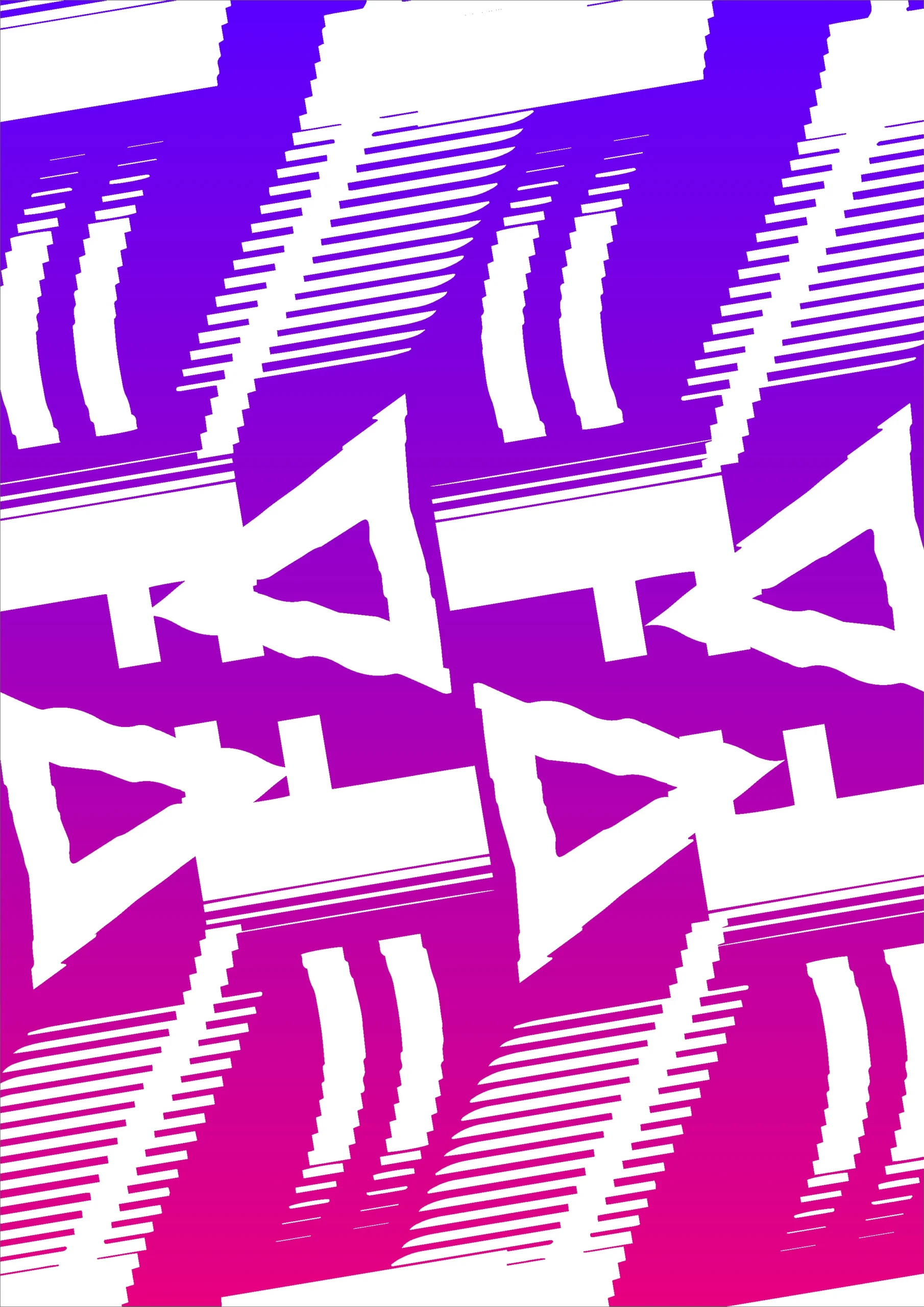
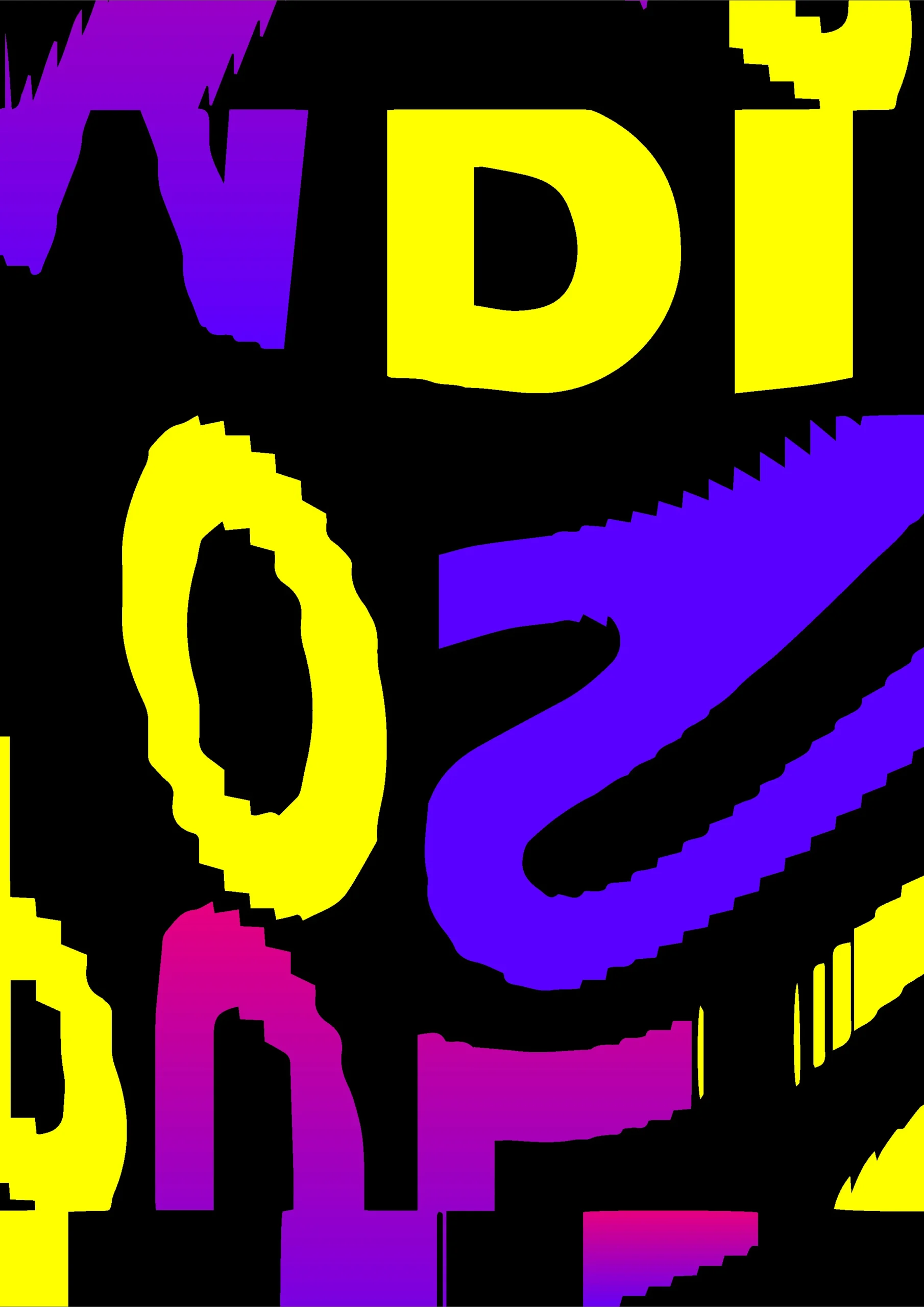
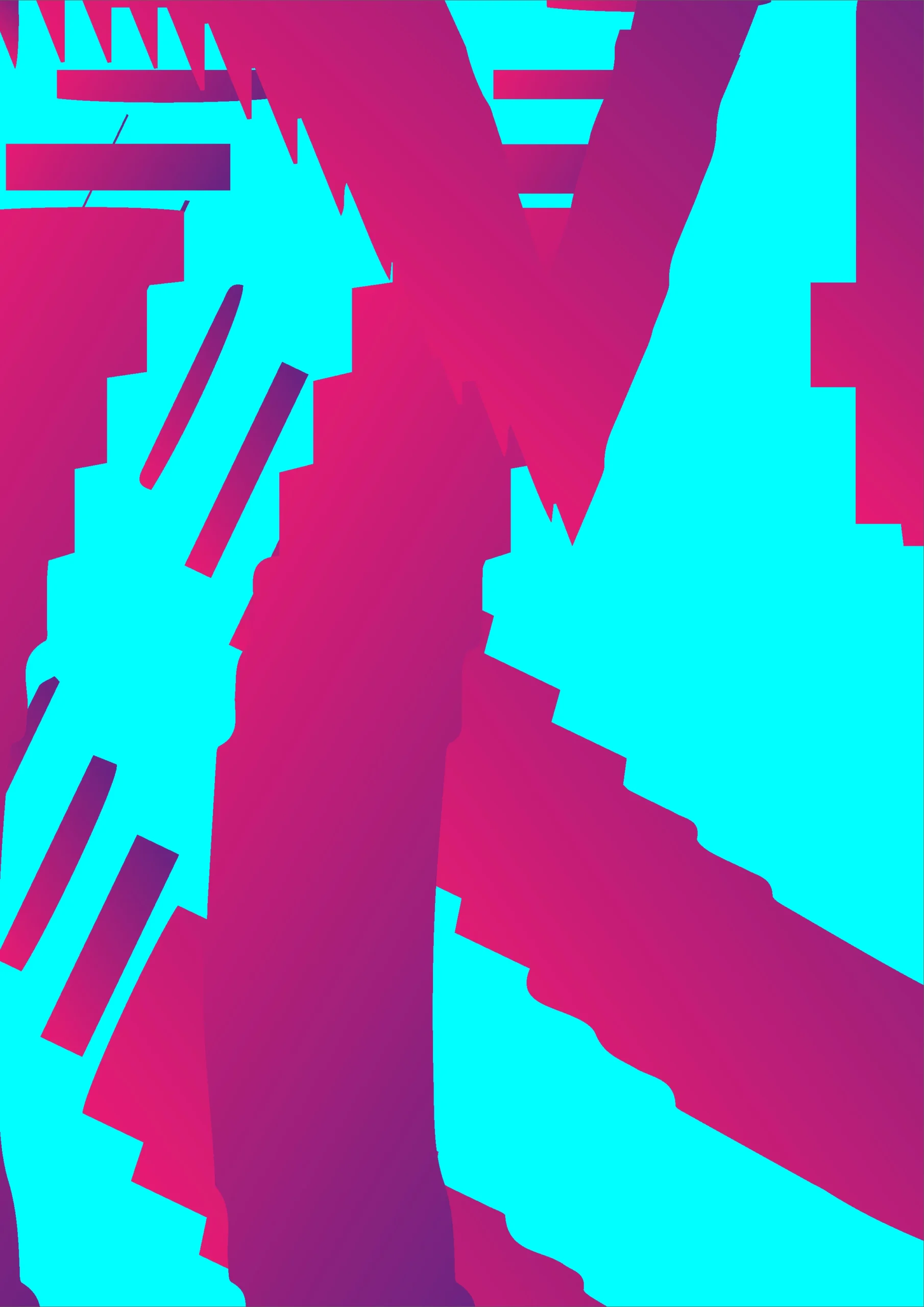
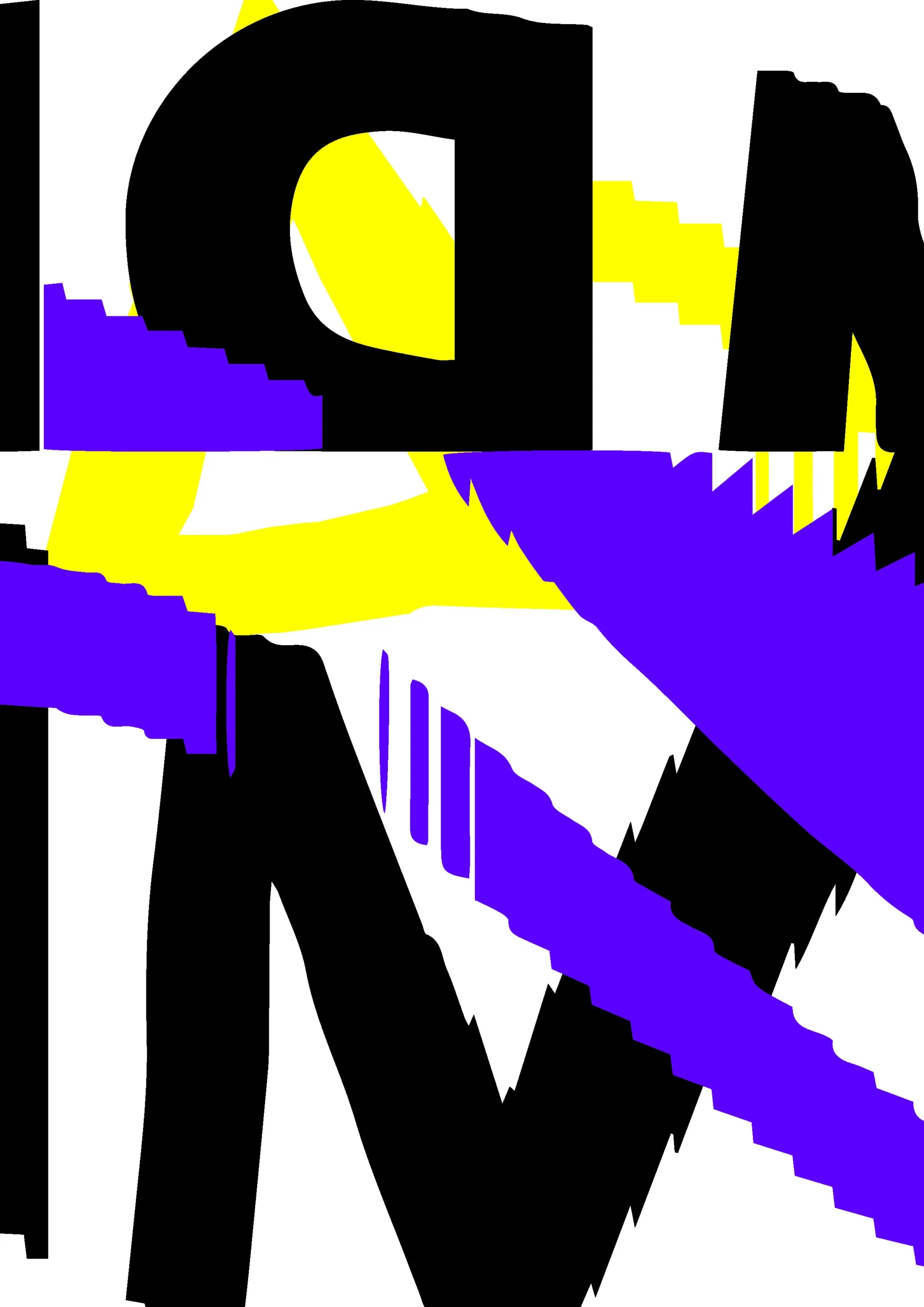
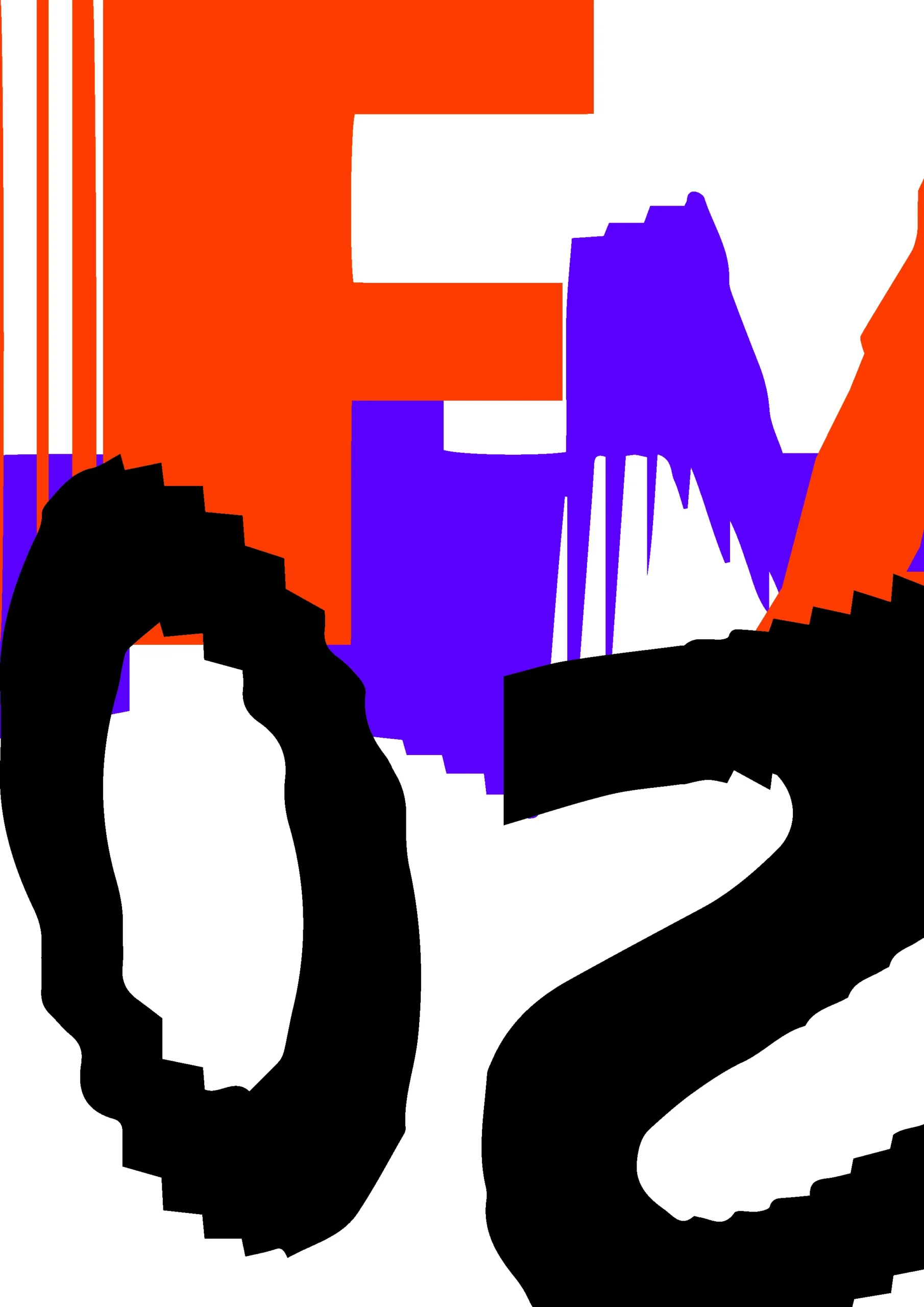
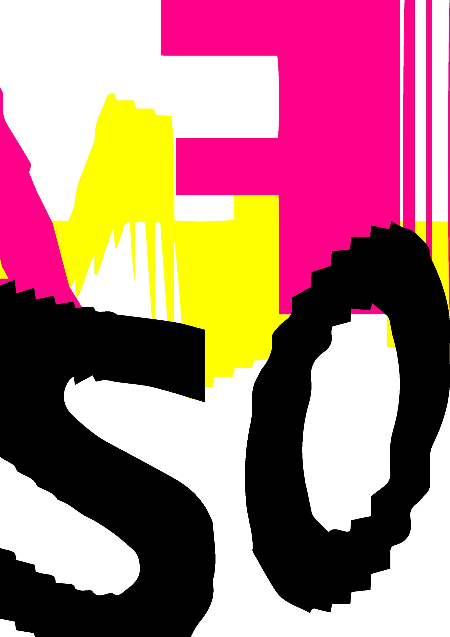
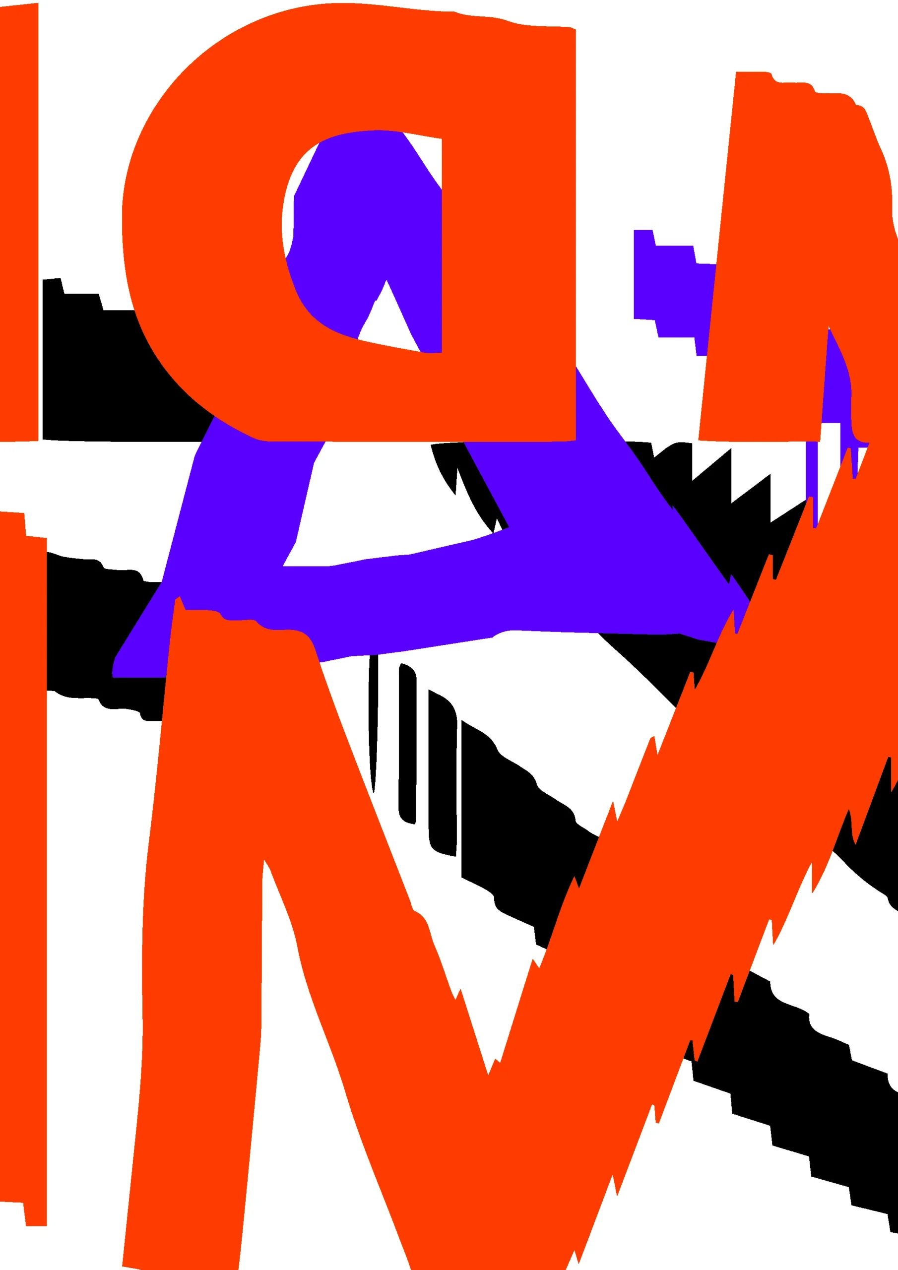
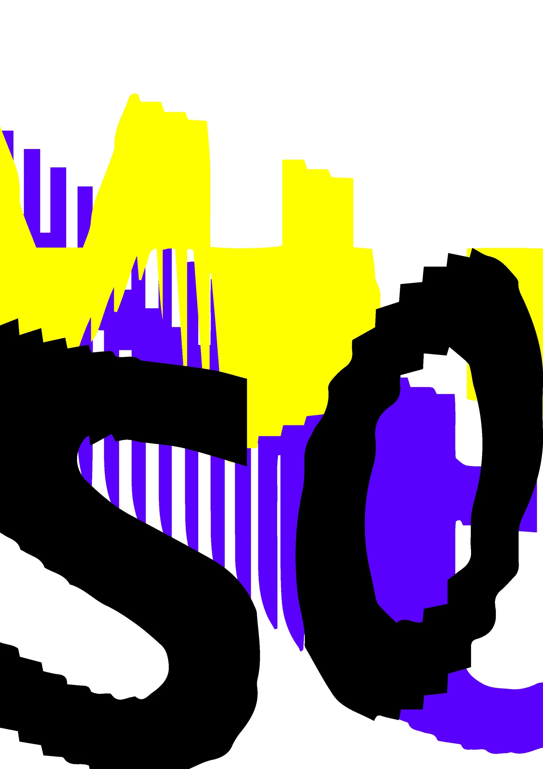
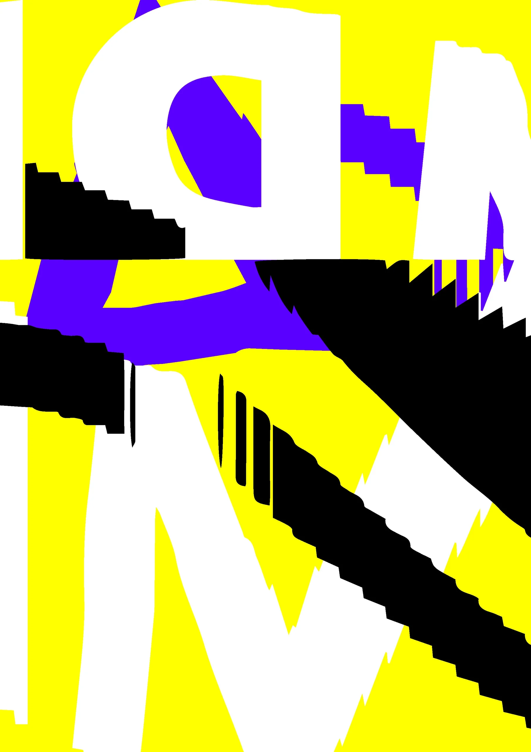
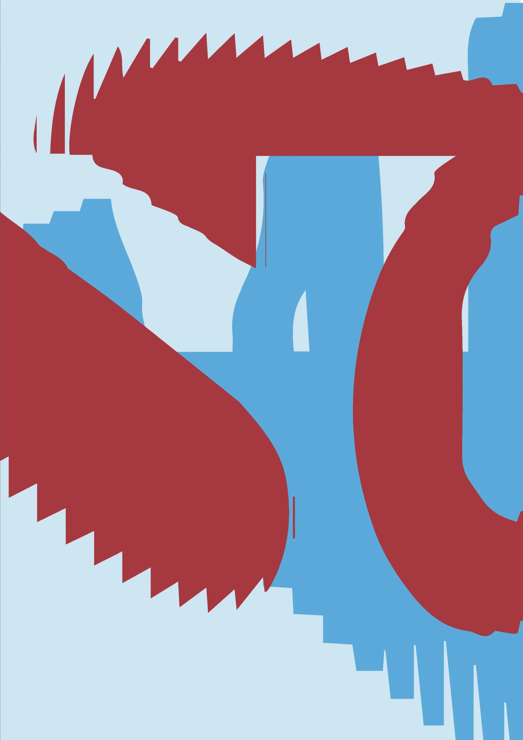
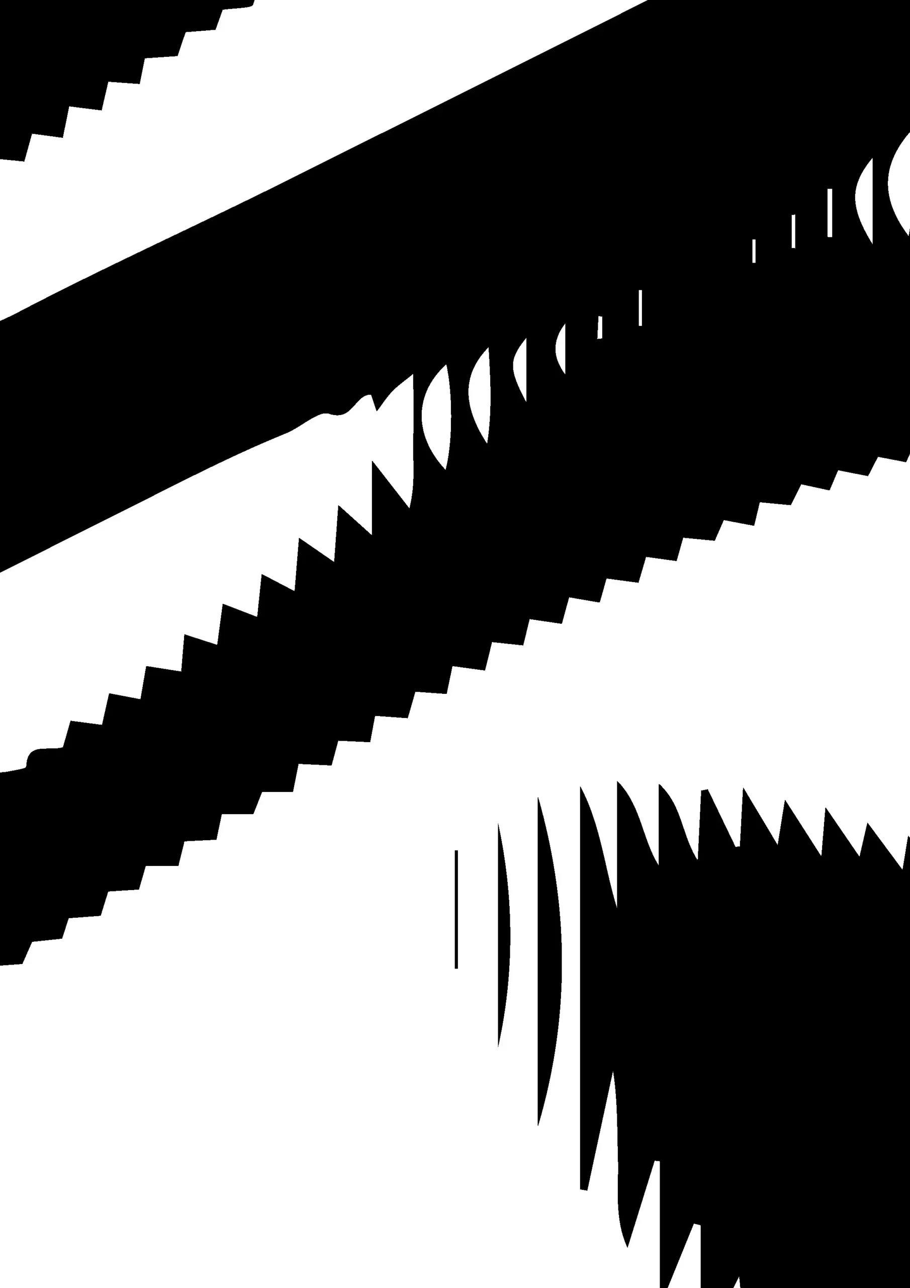
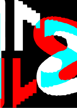
Almost there


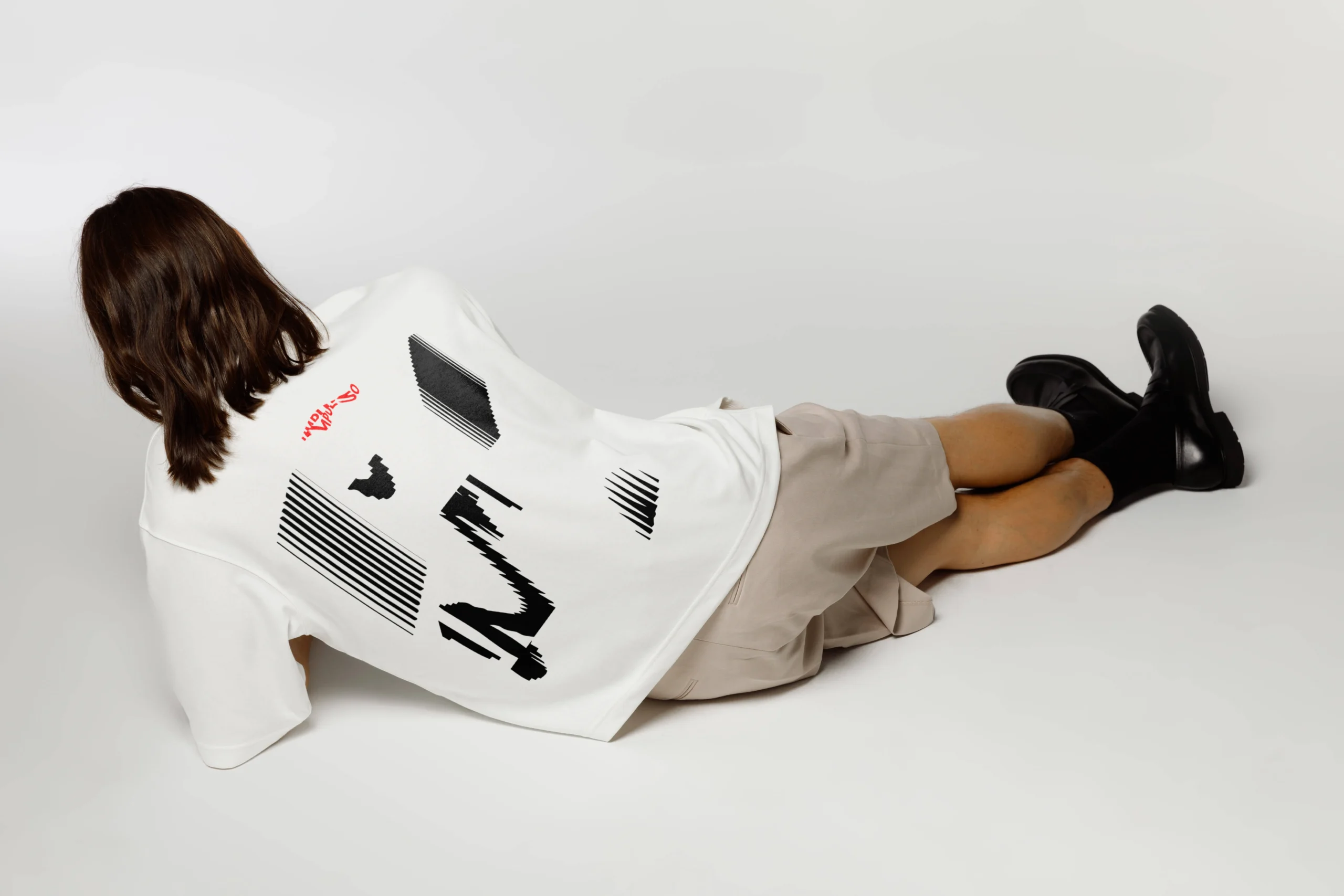
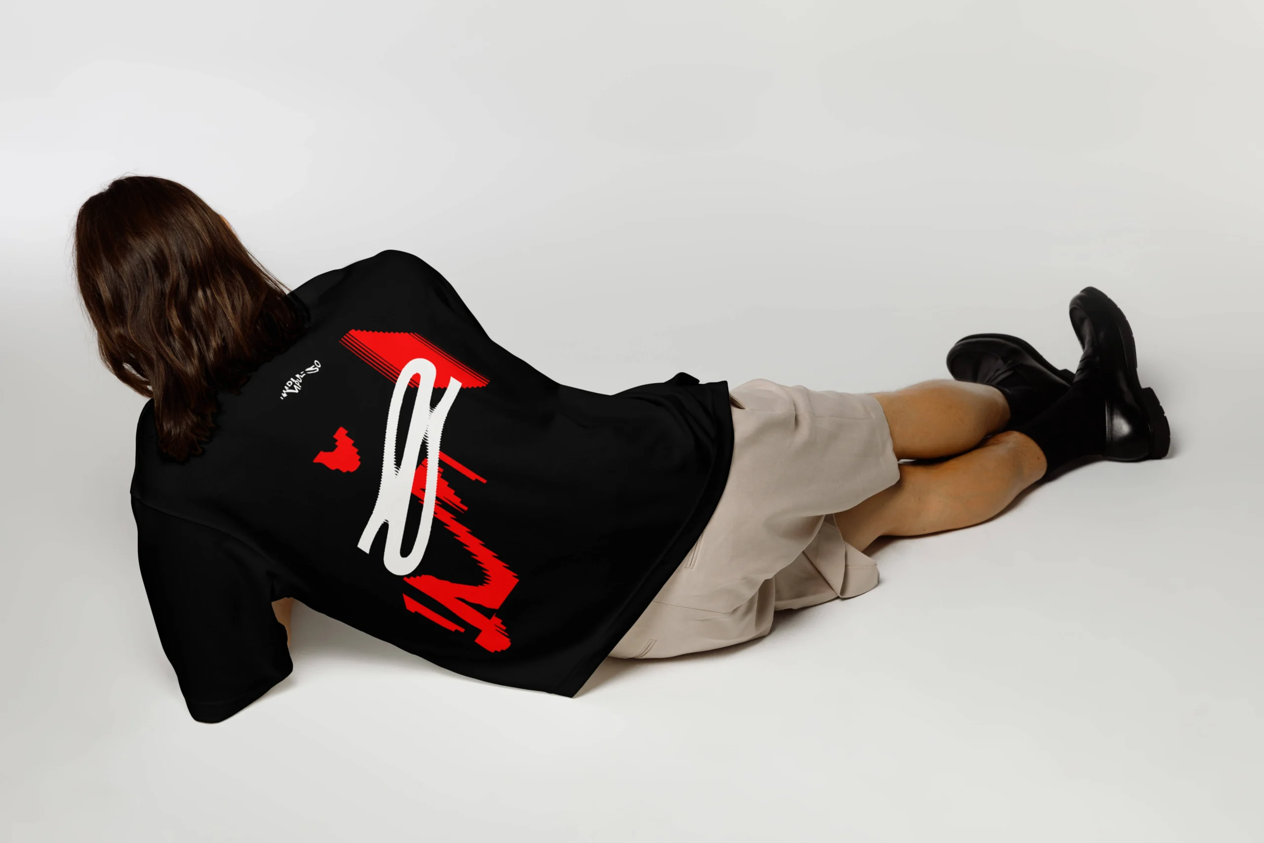
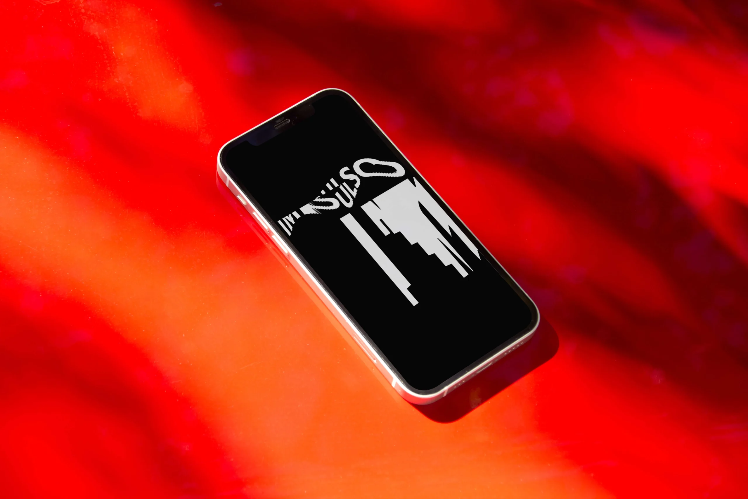
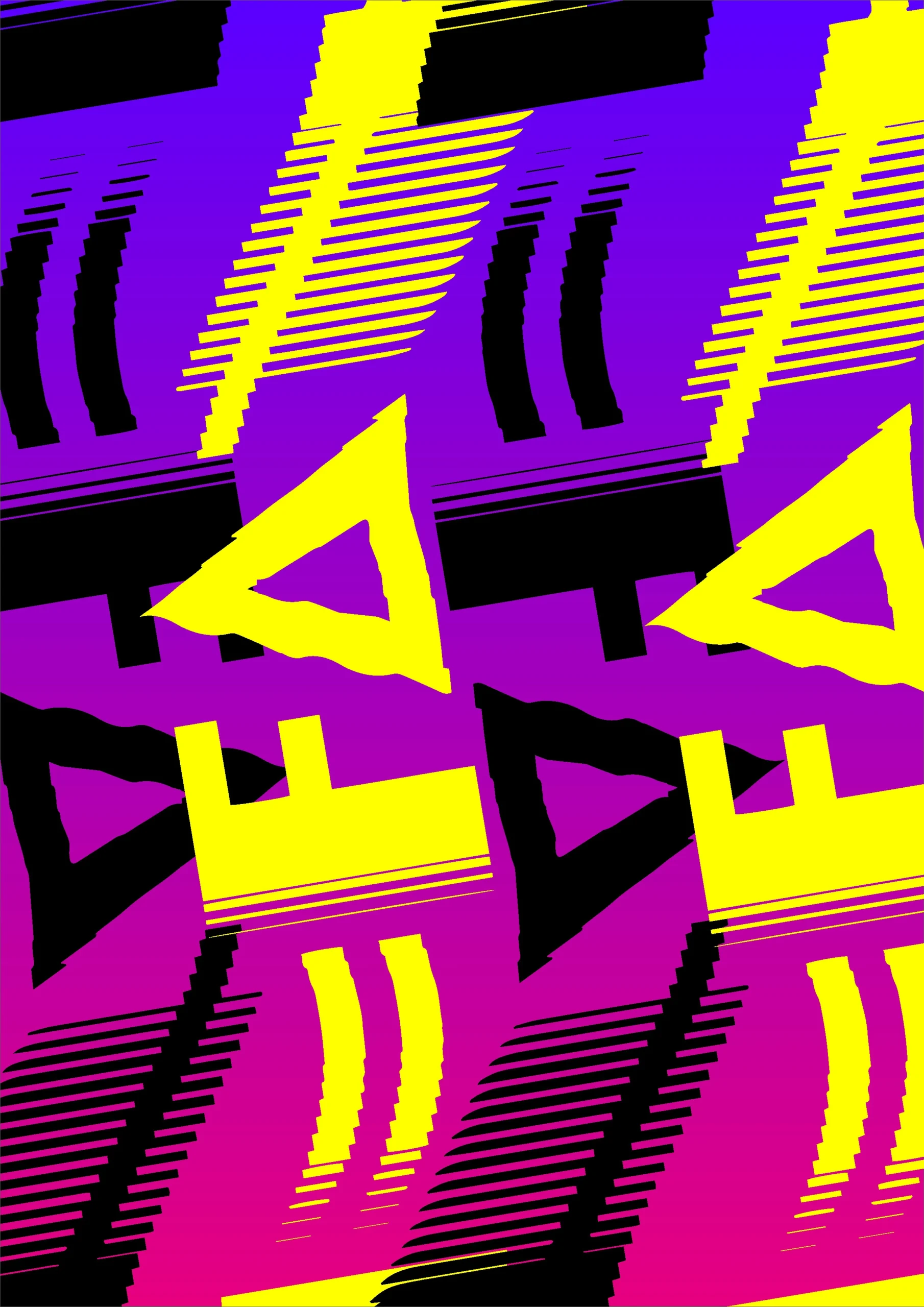
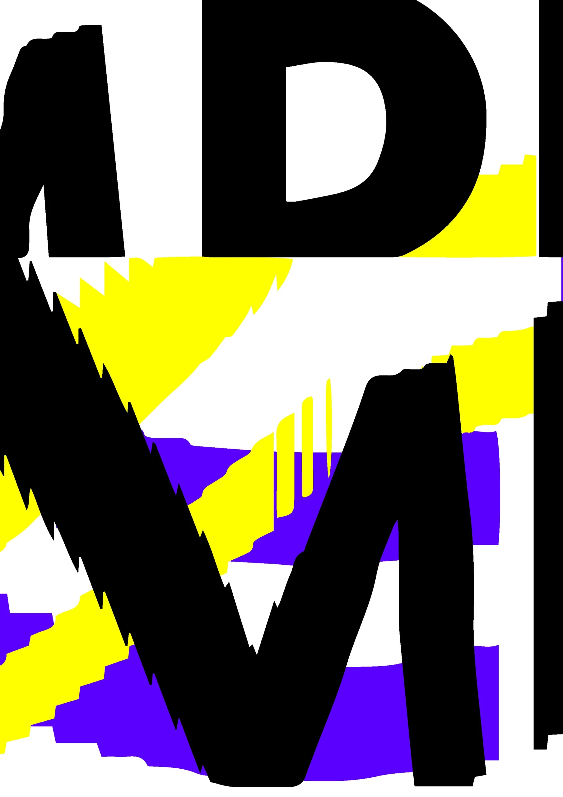
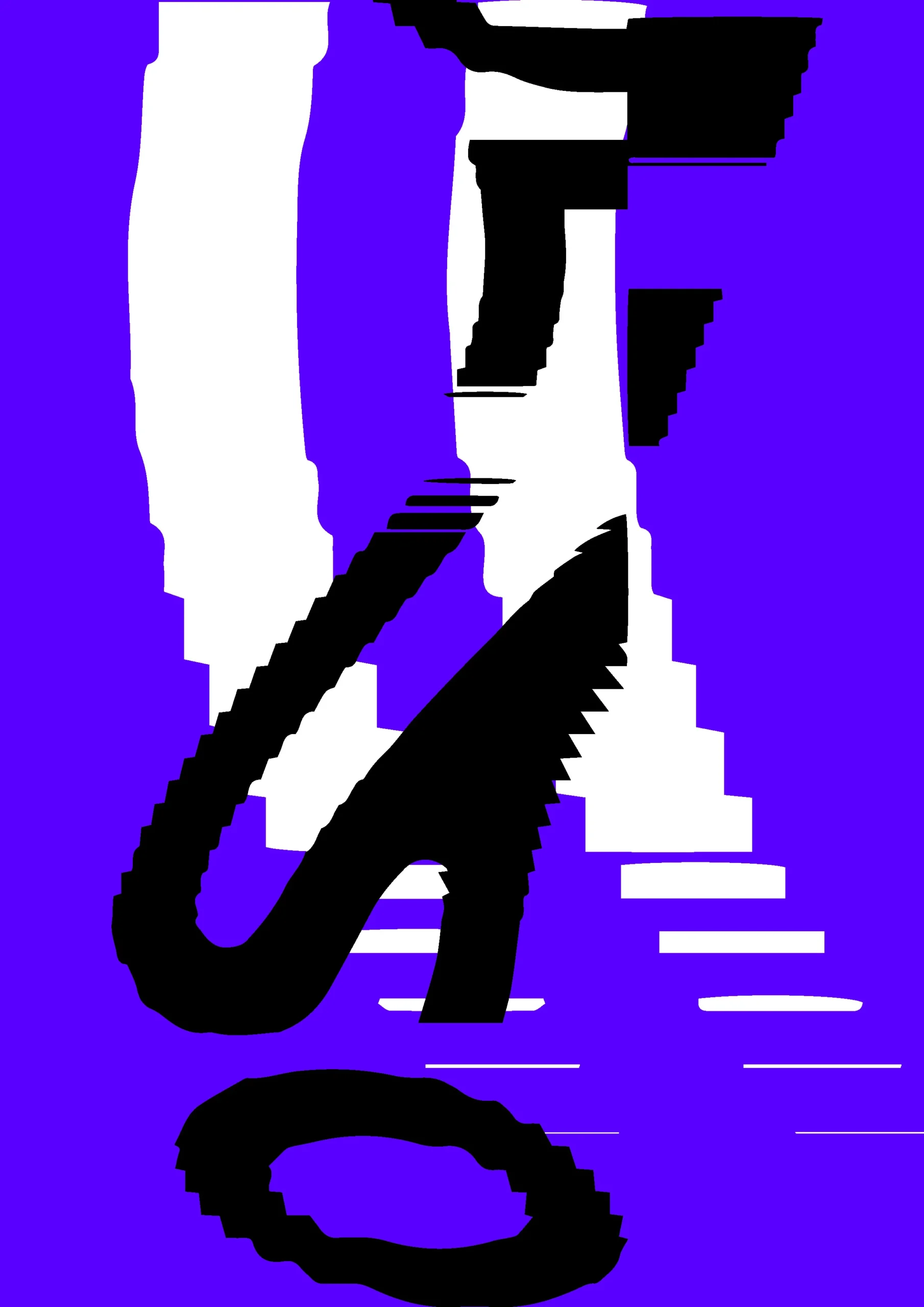
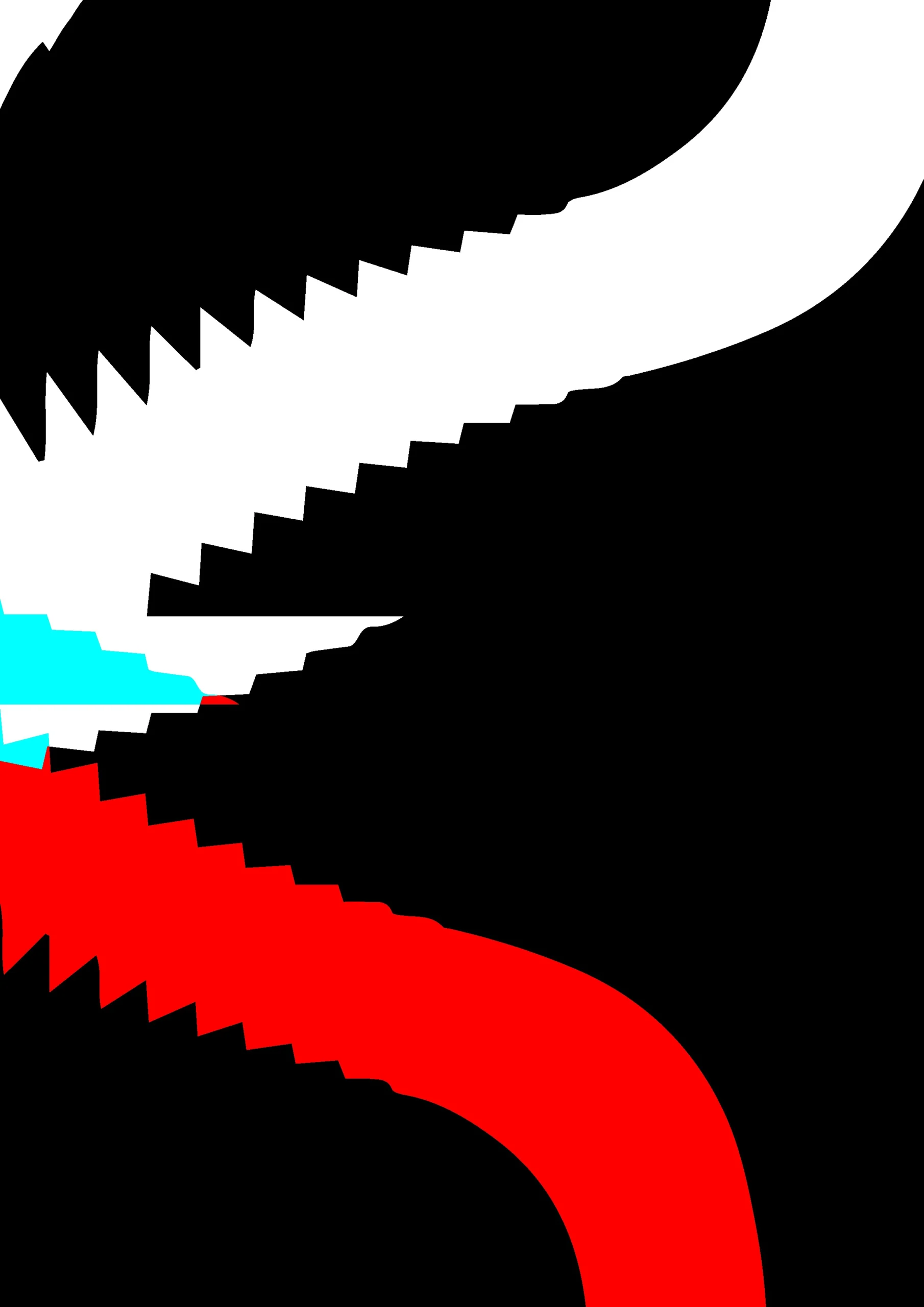
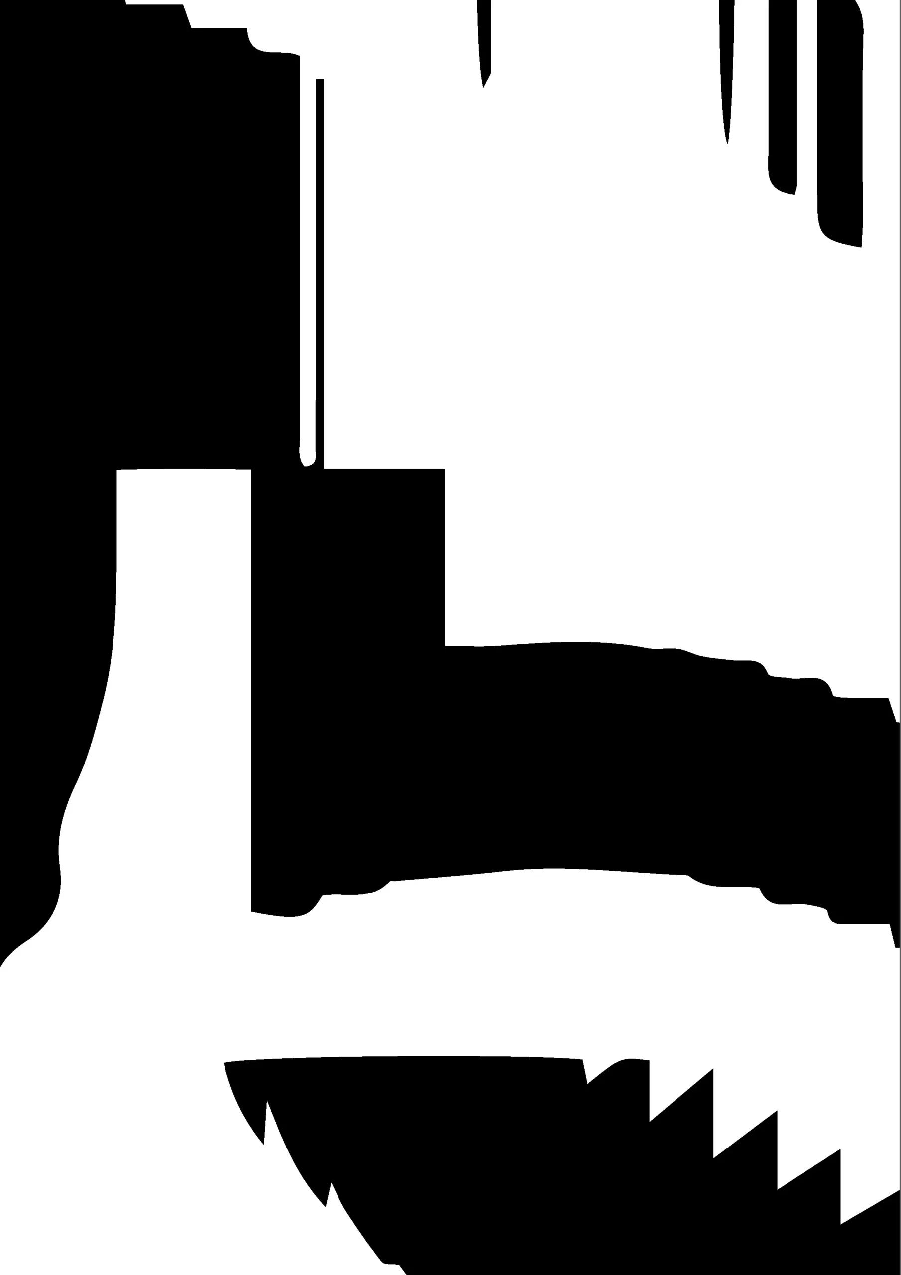
Final logo result


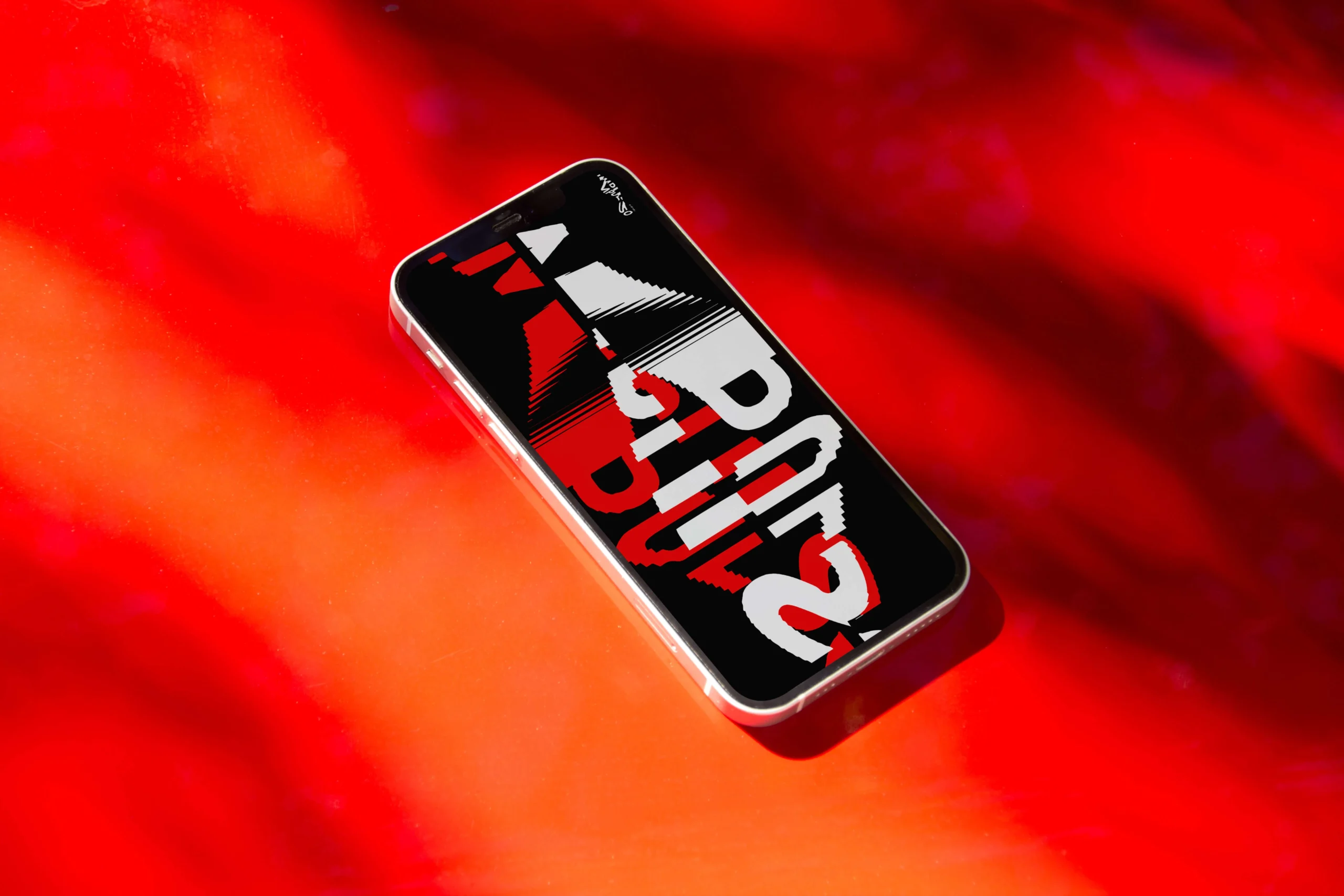
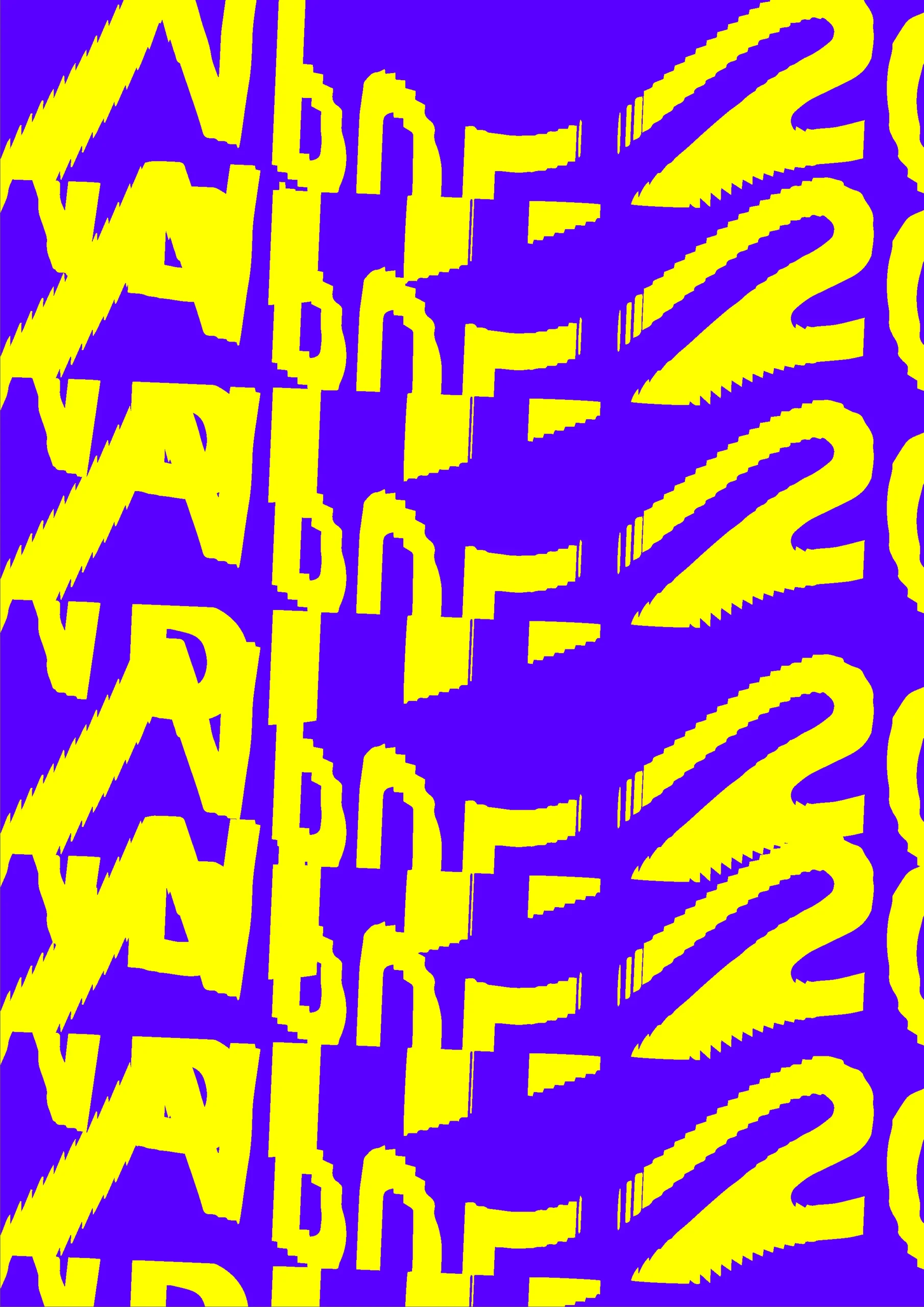
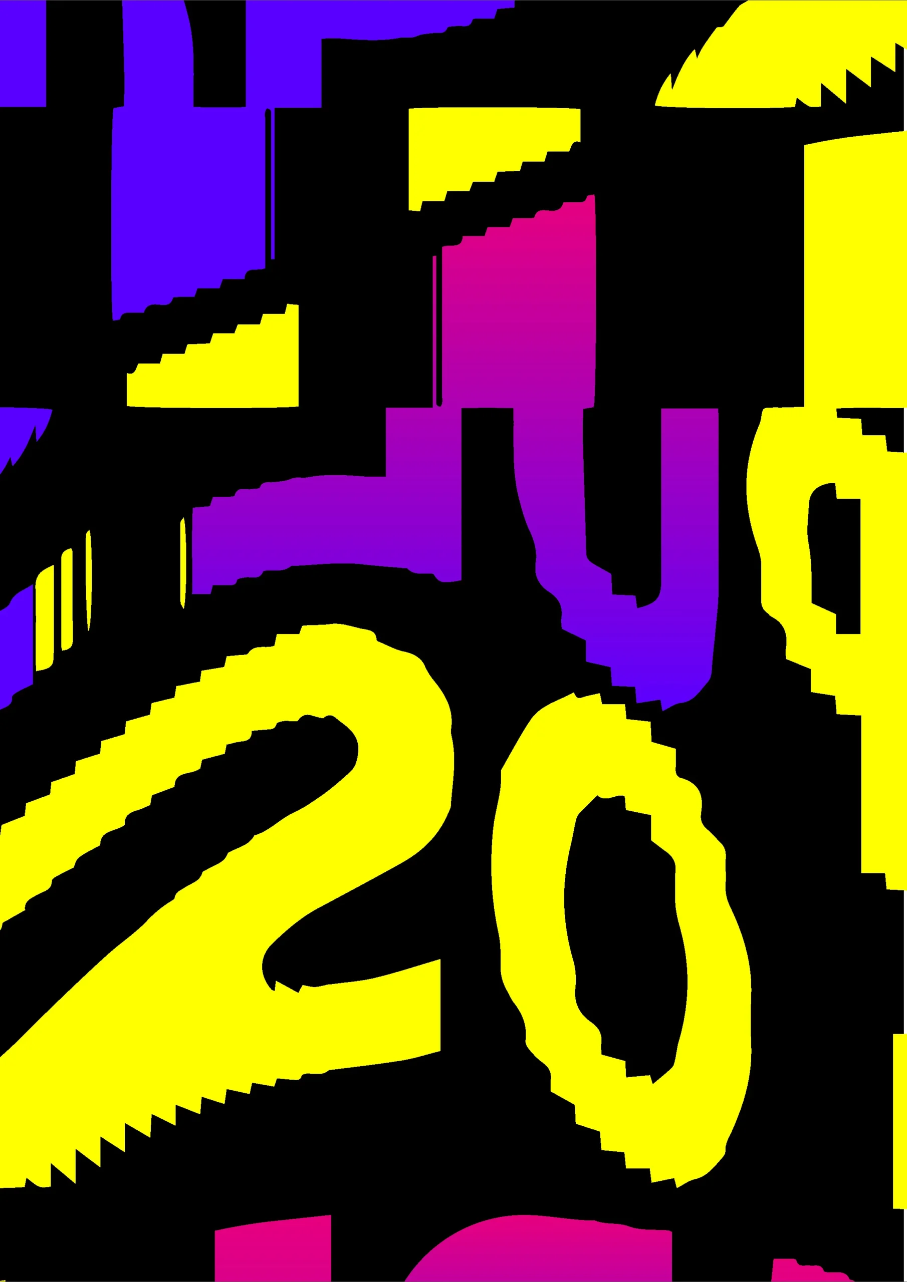
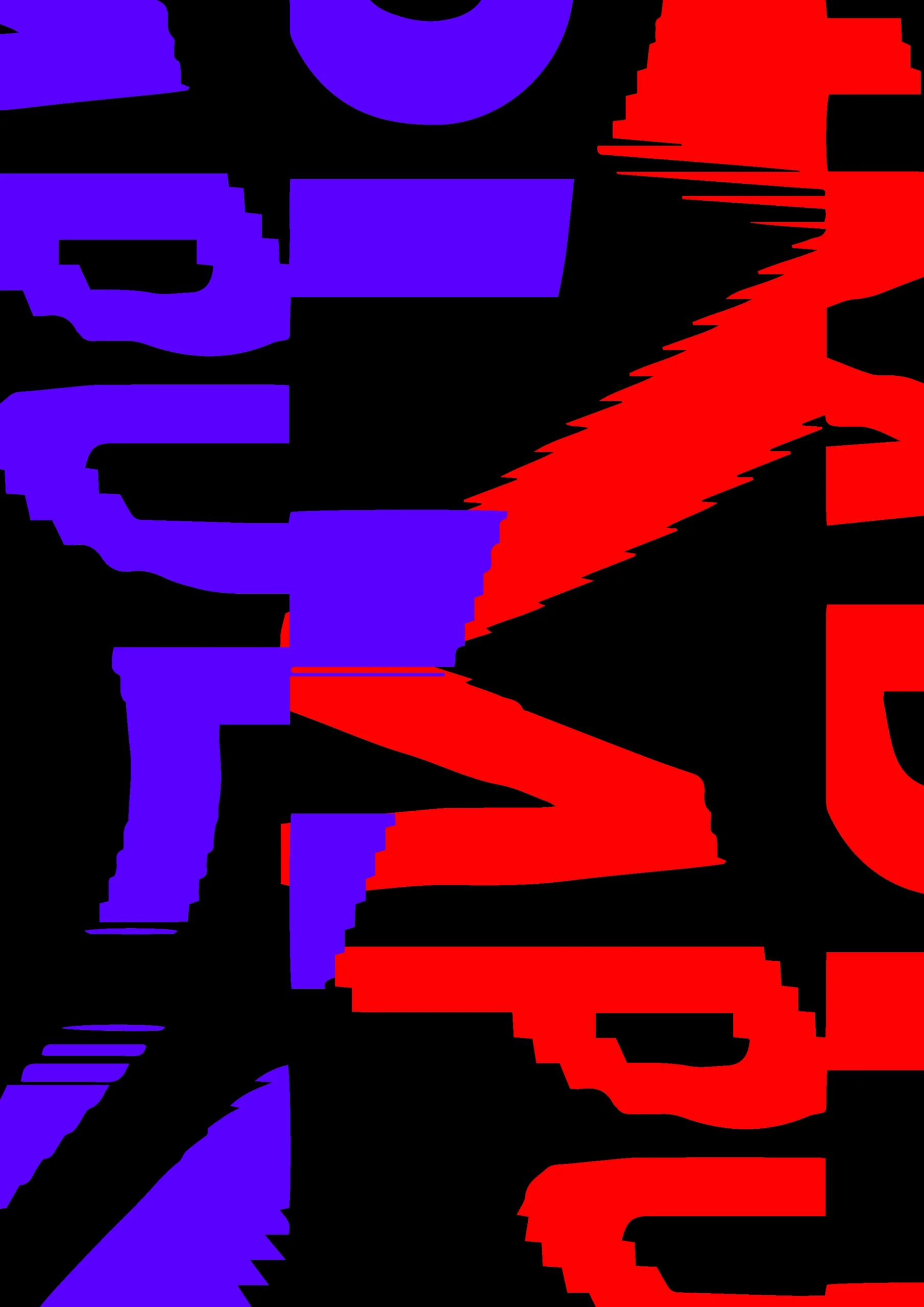
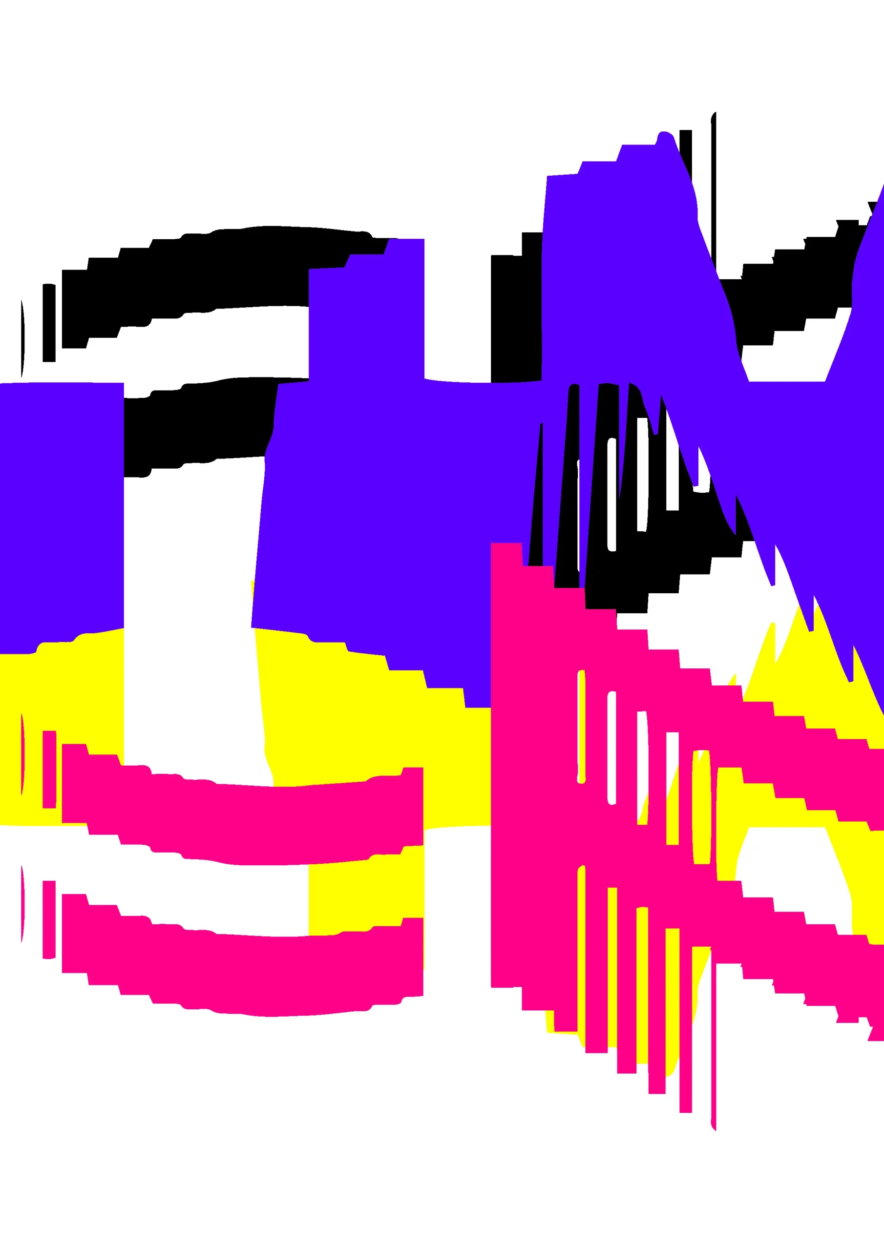
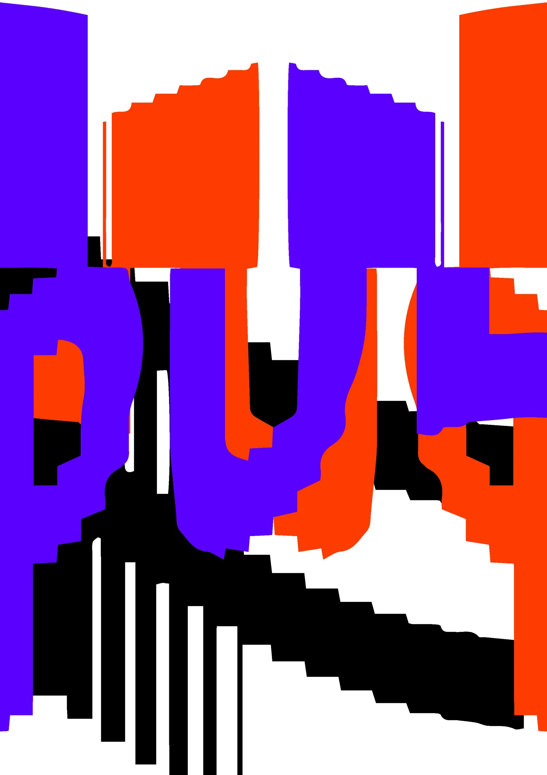
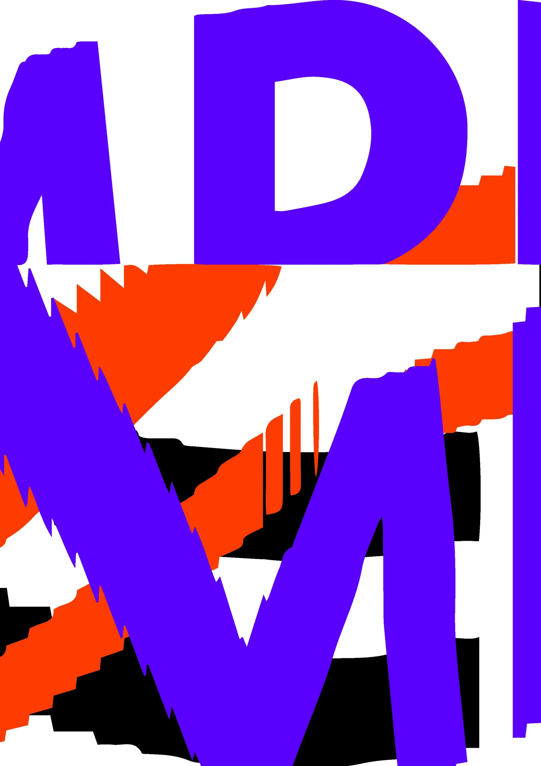
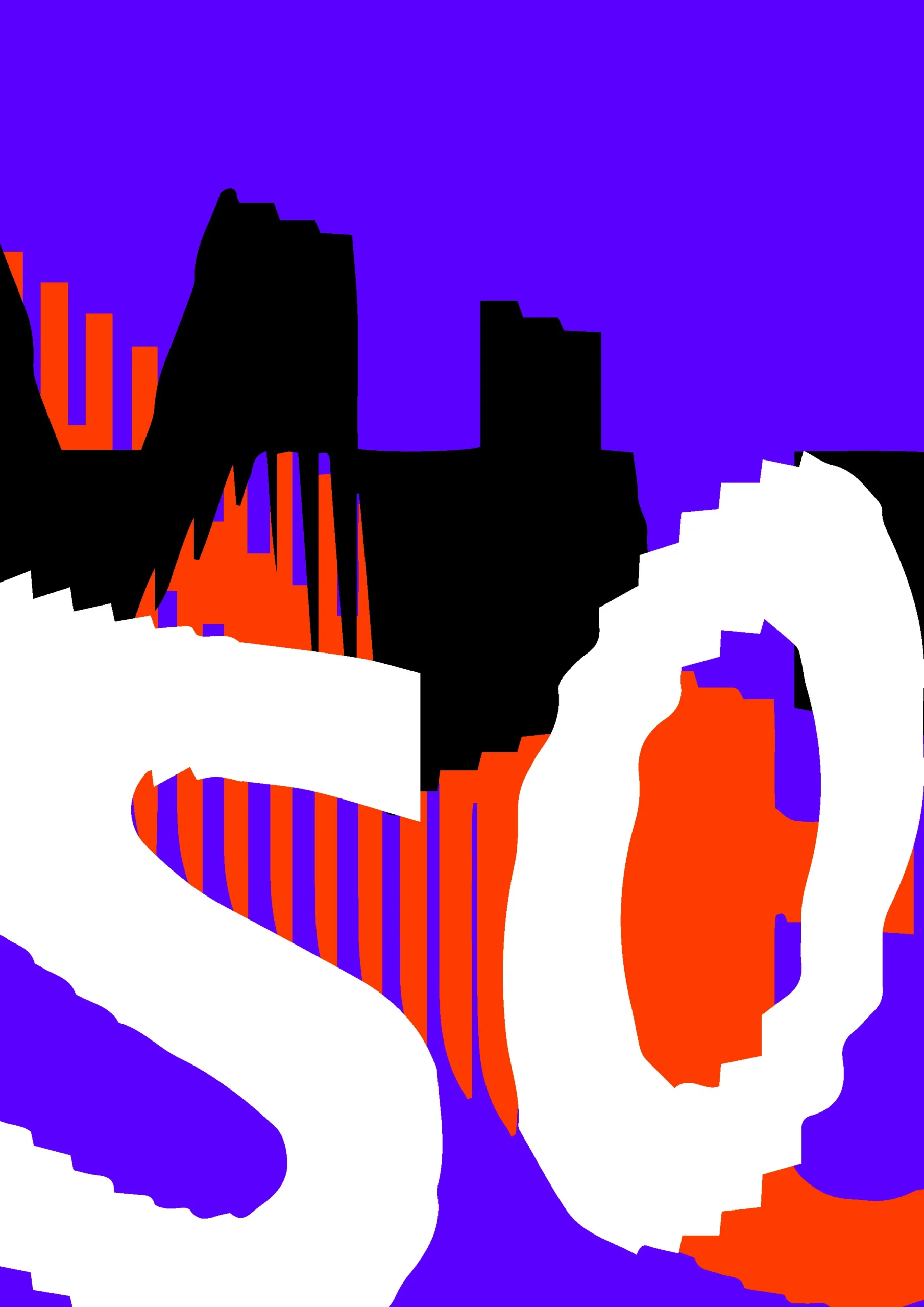
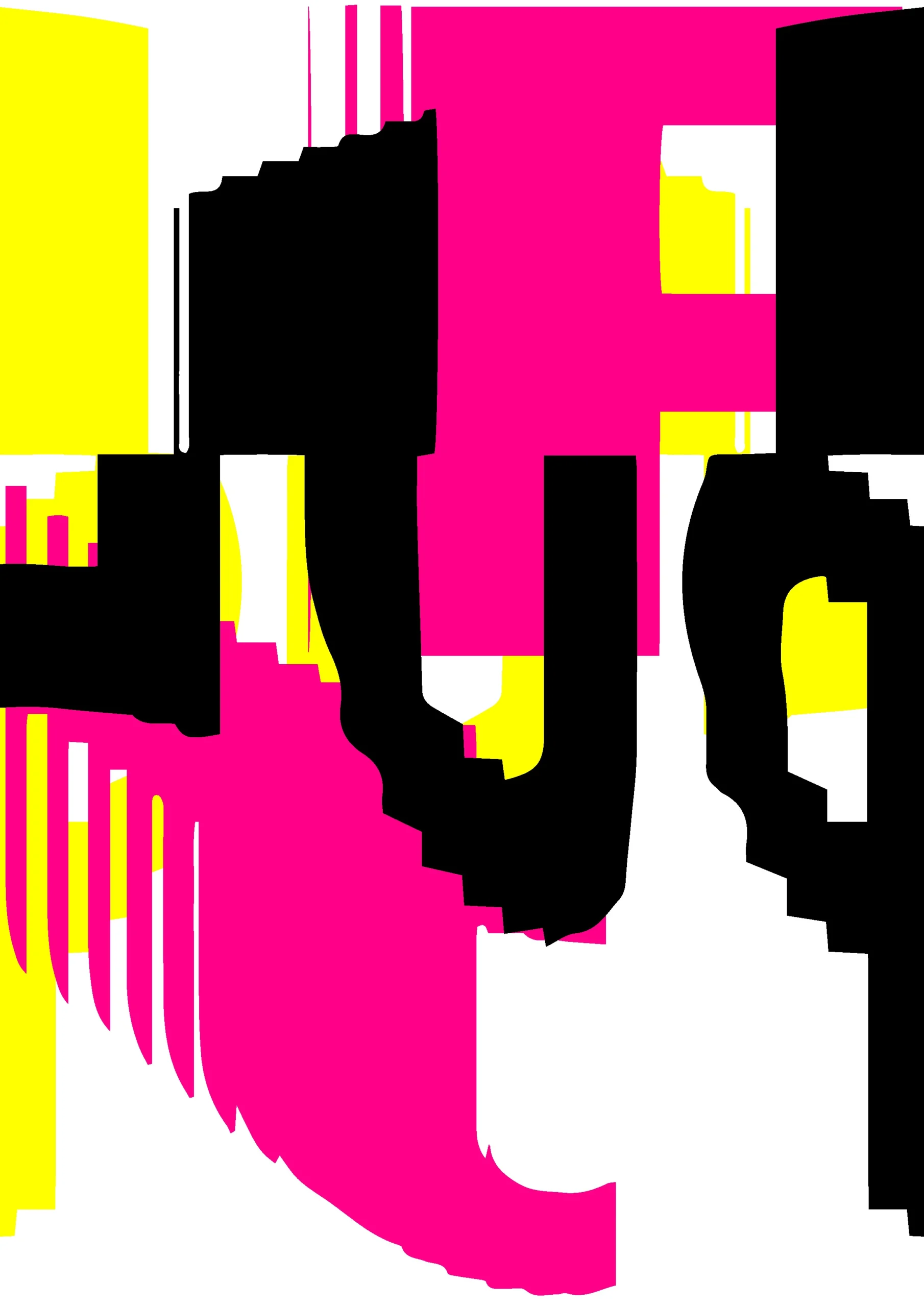
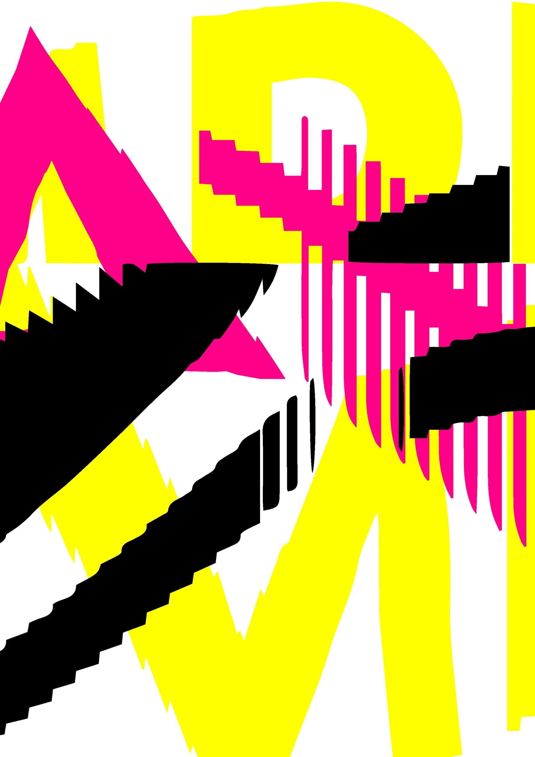
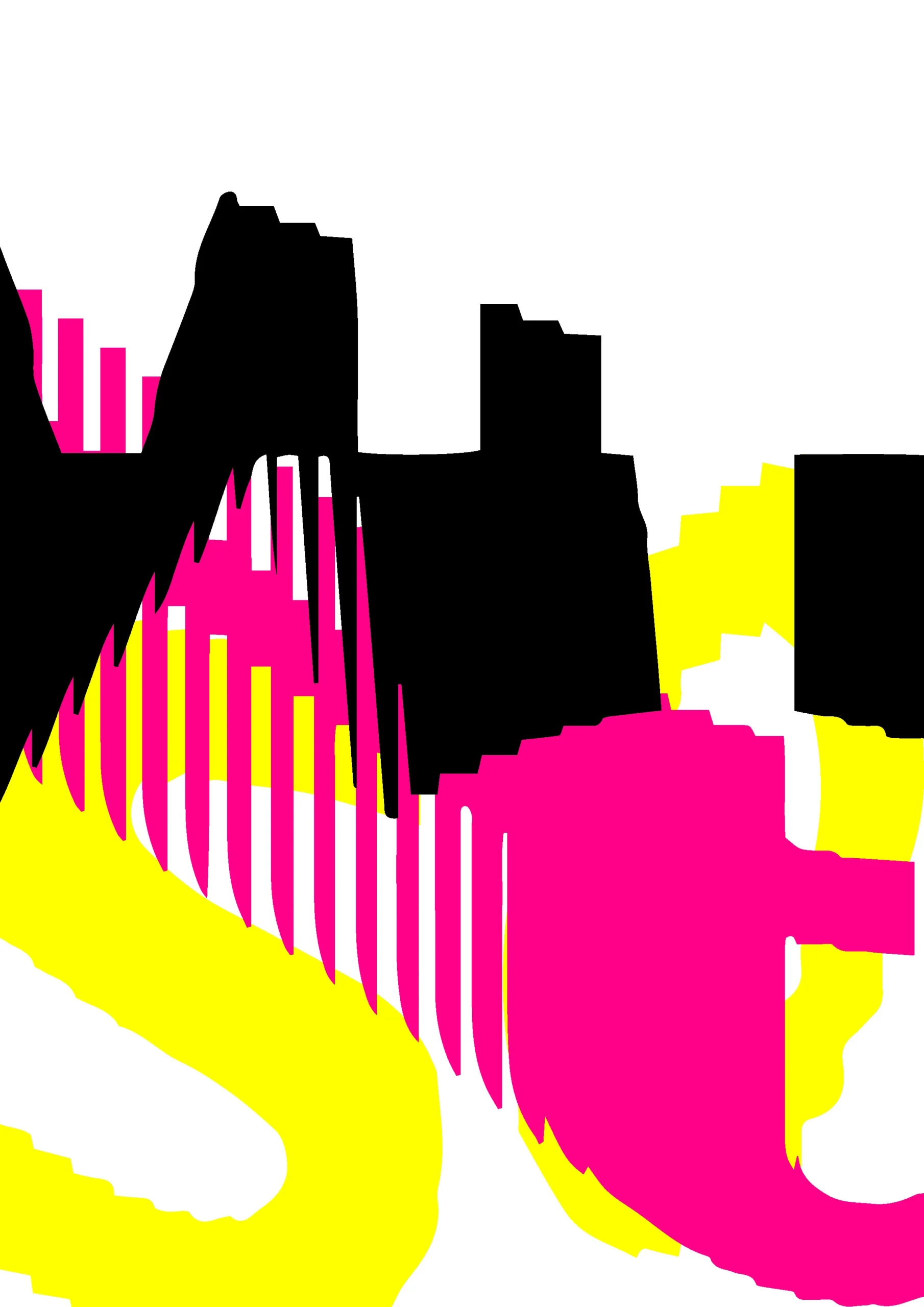
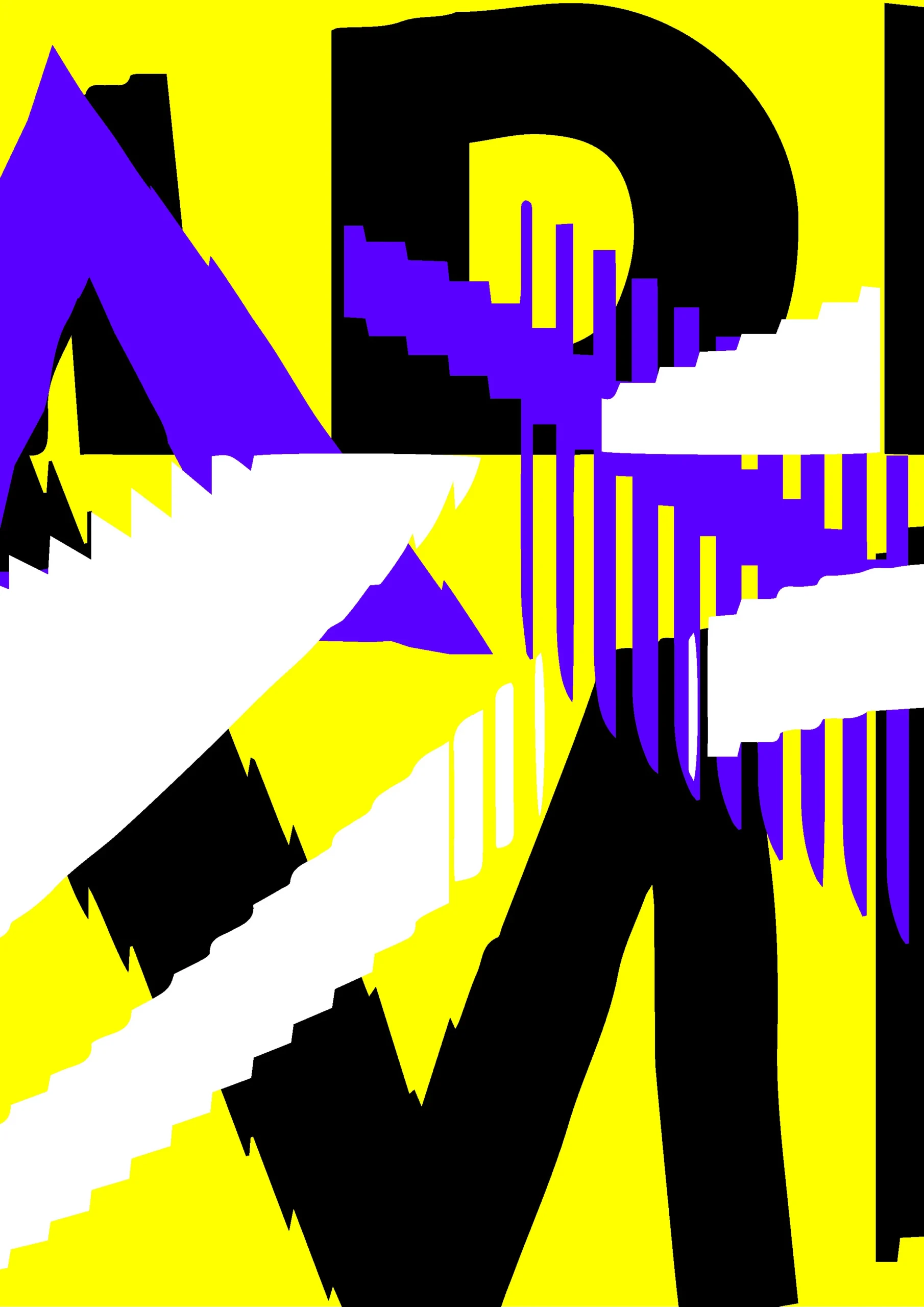
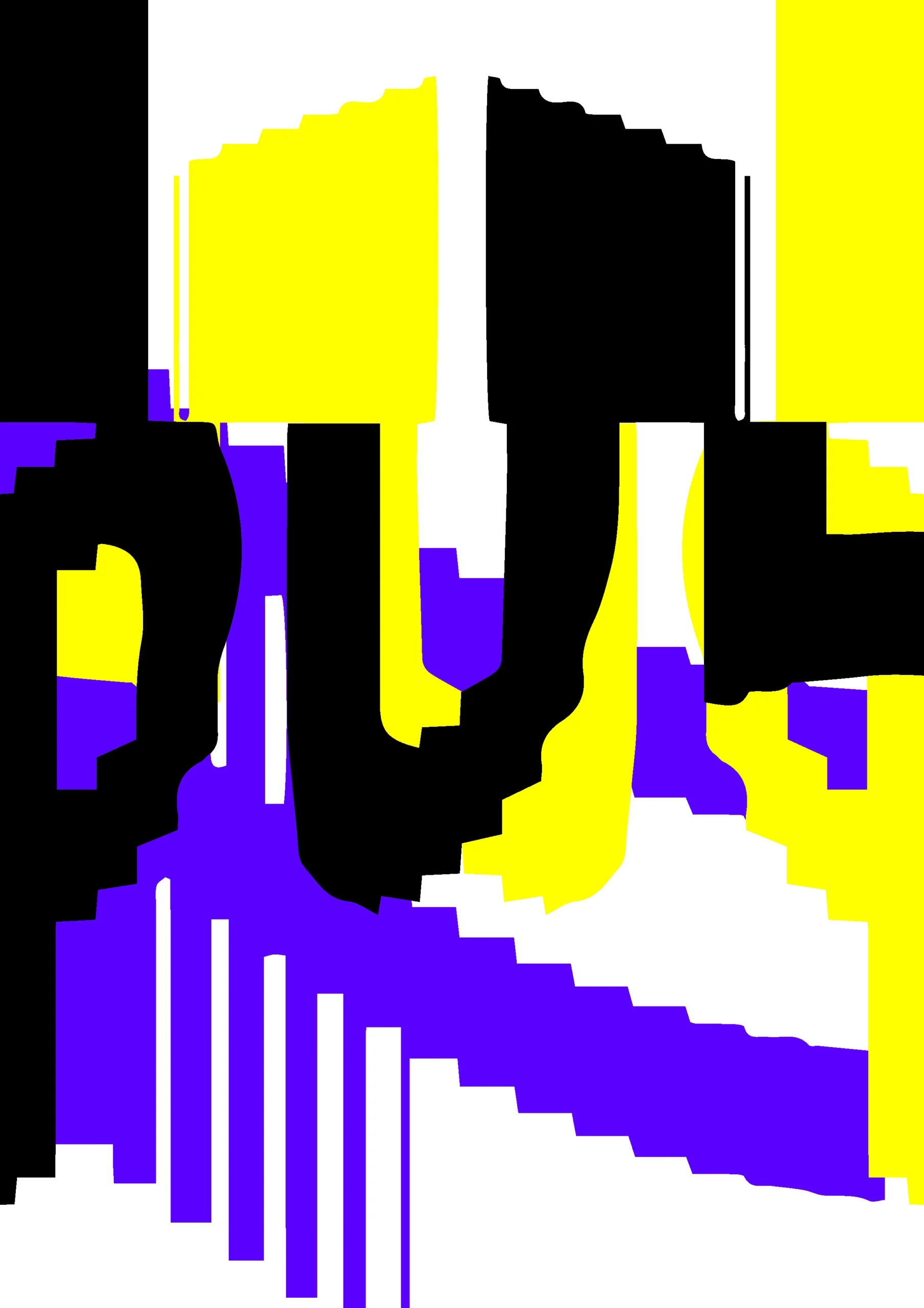
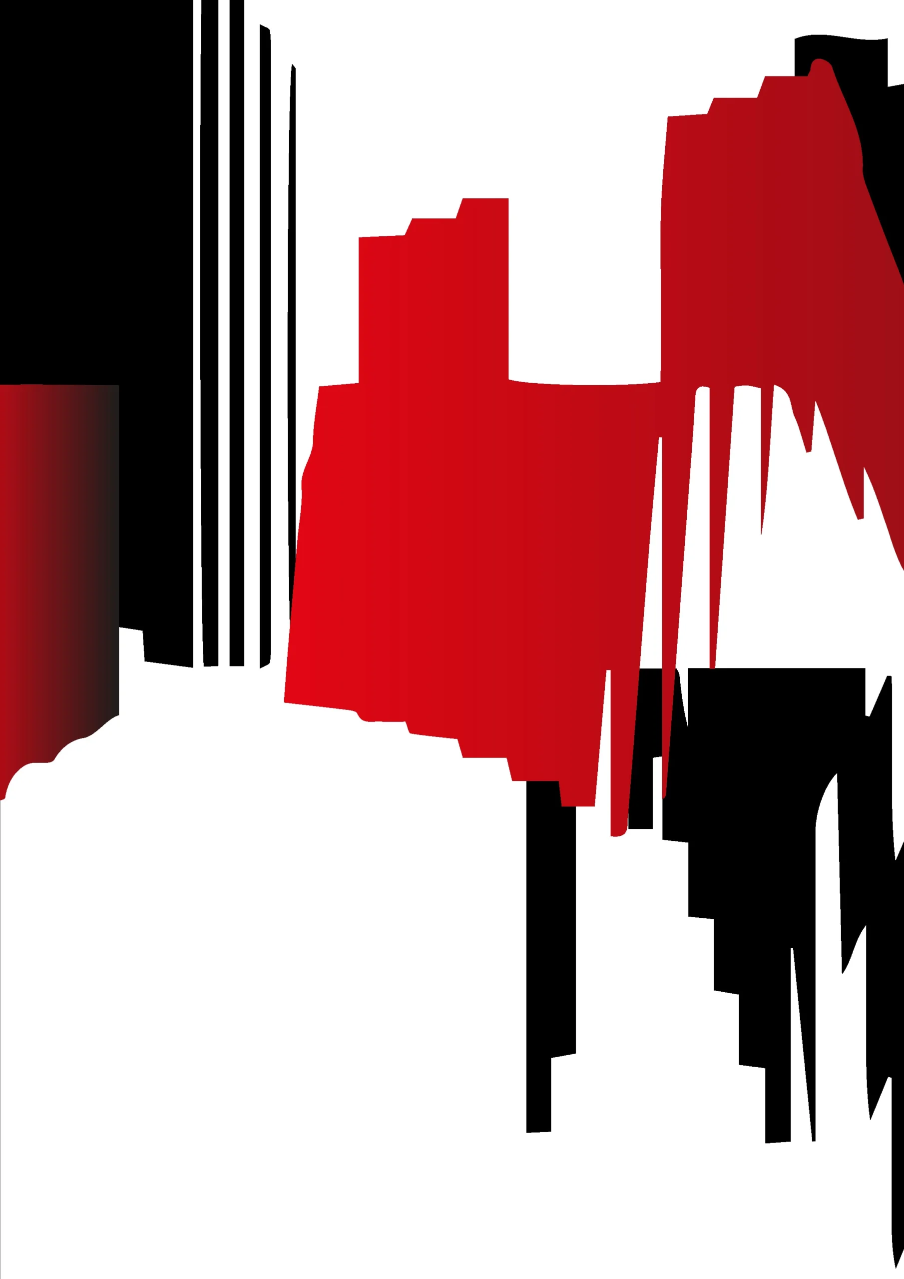
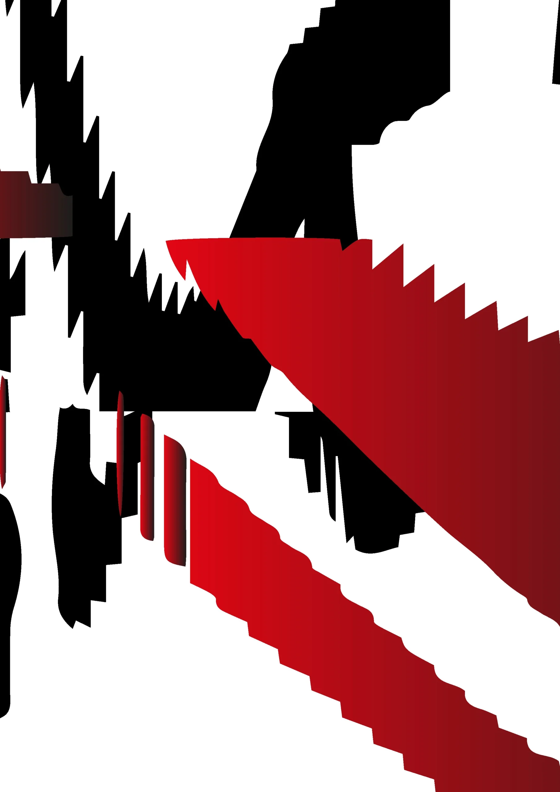
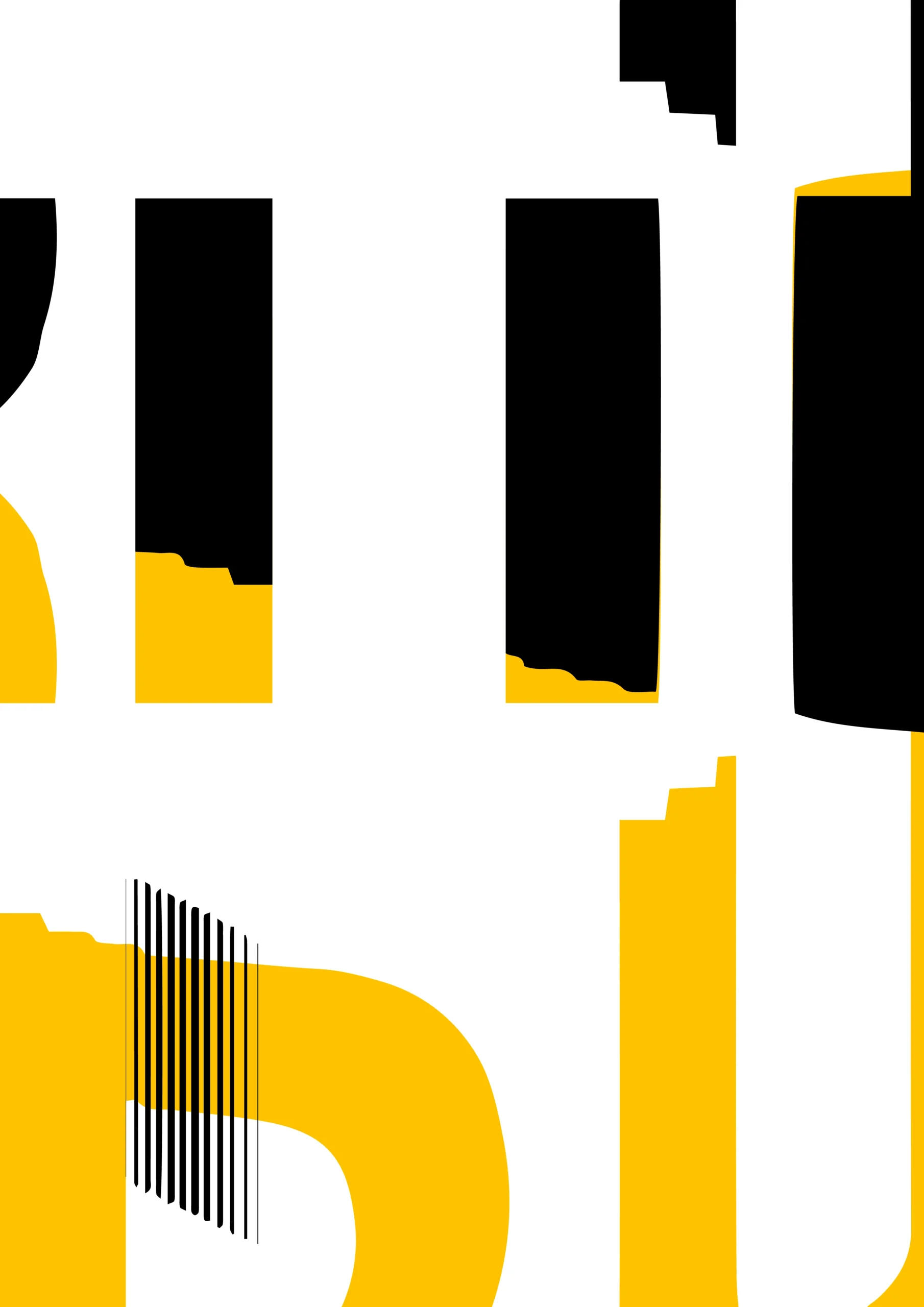
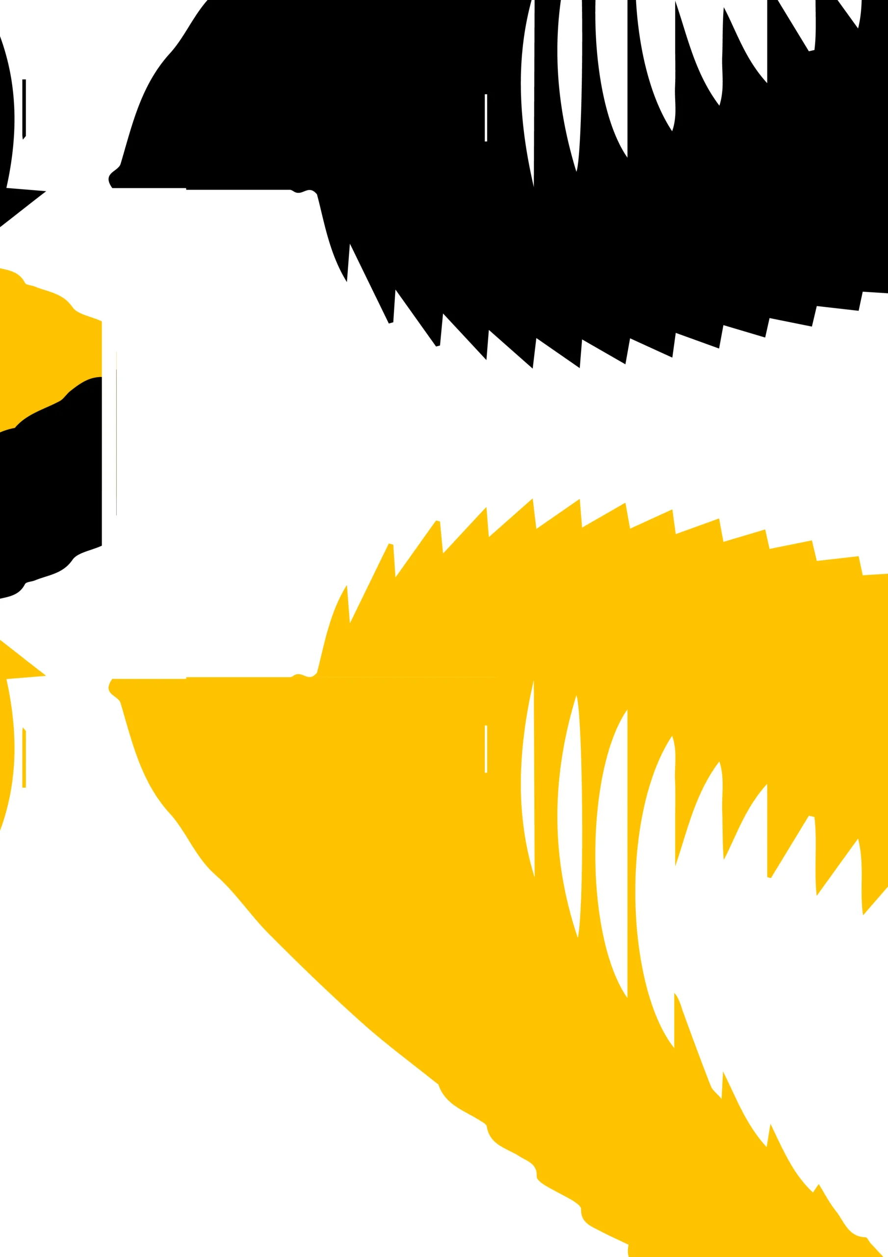
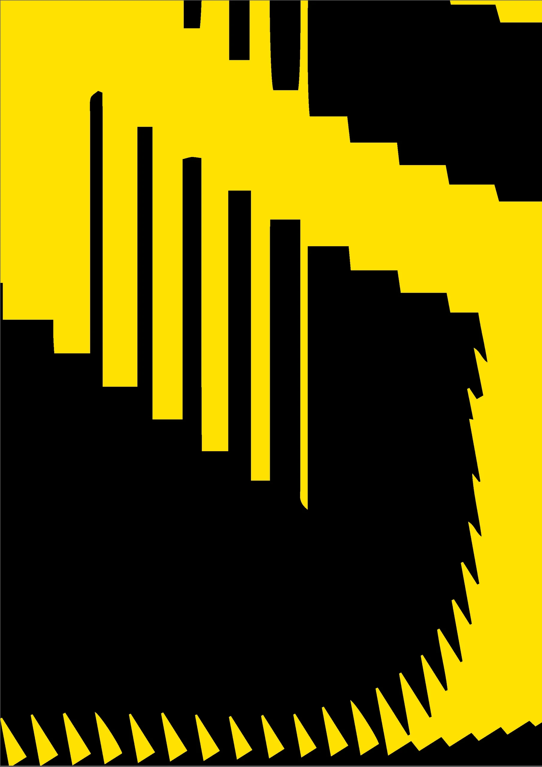
Other tests


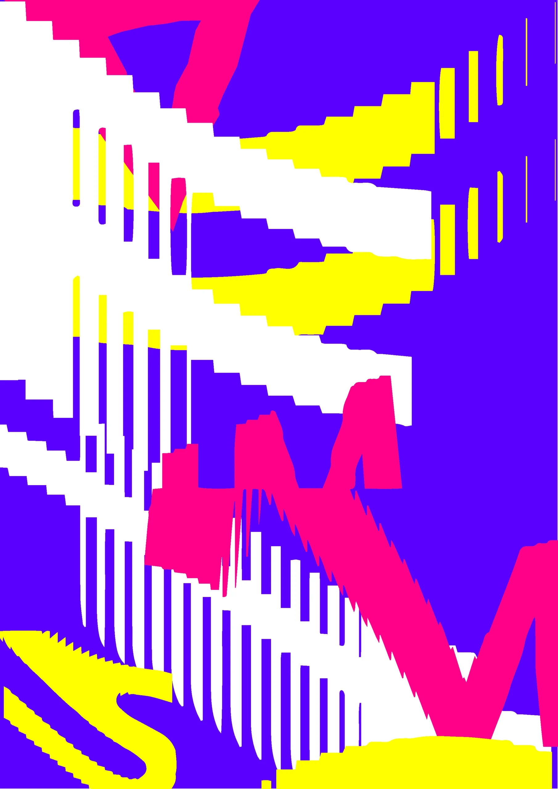
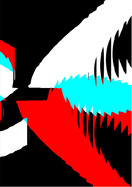
Combining the formula with the logo


Other logo tests
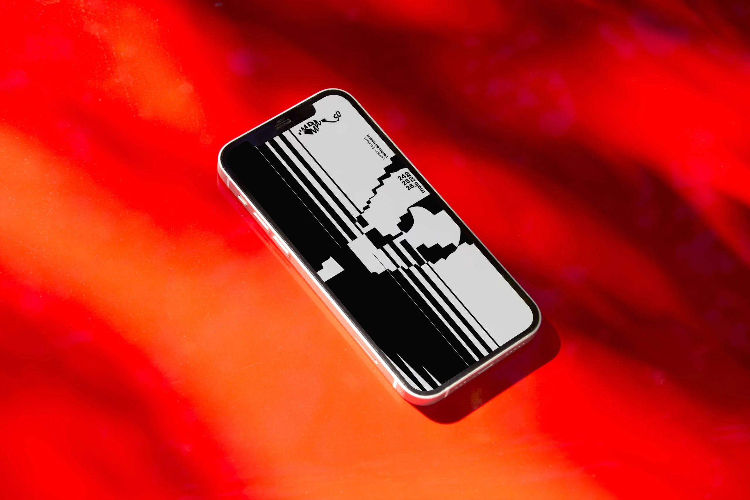
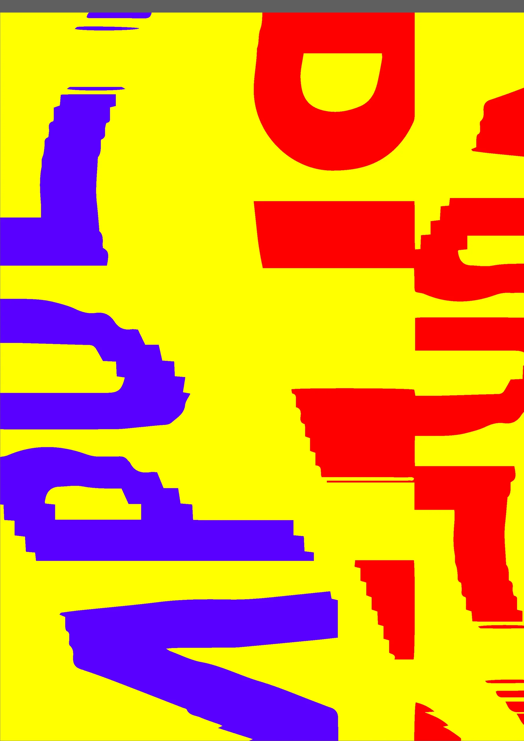
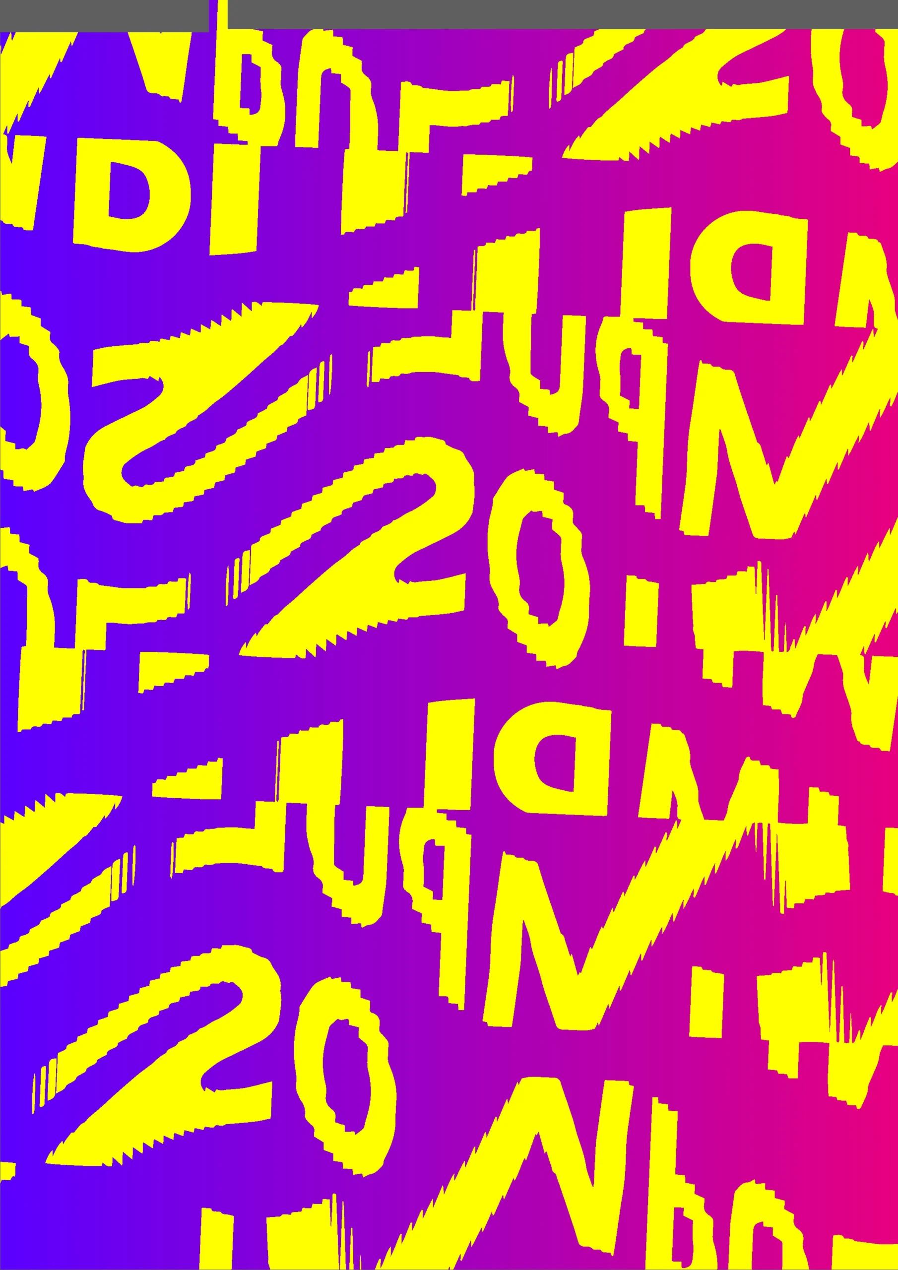
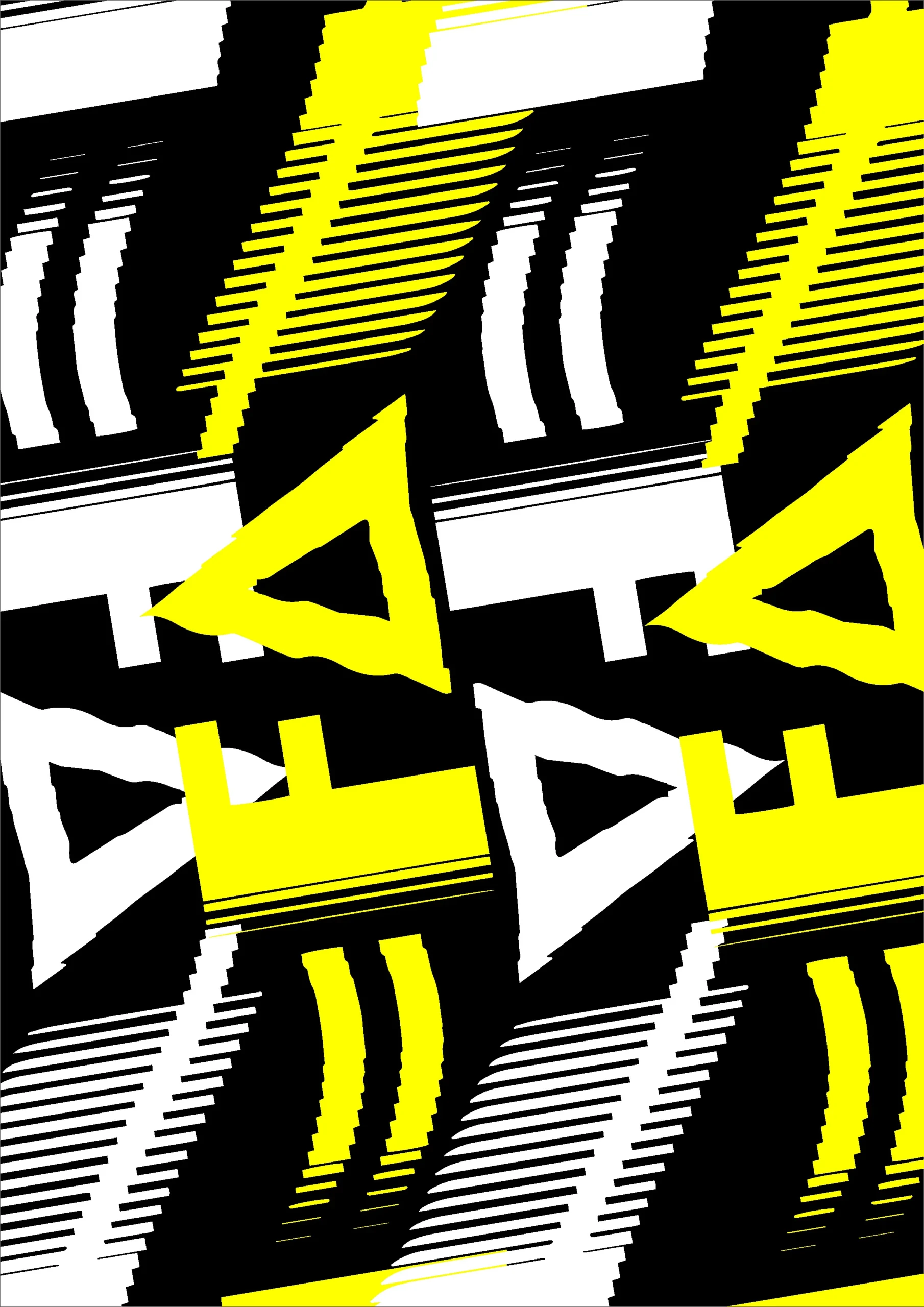
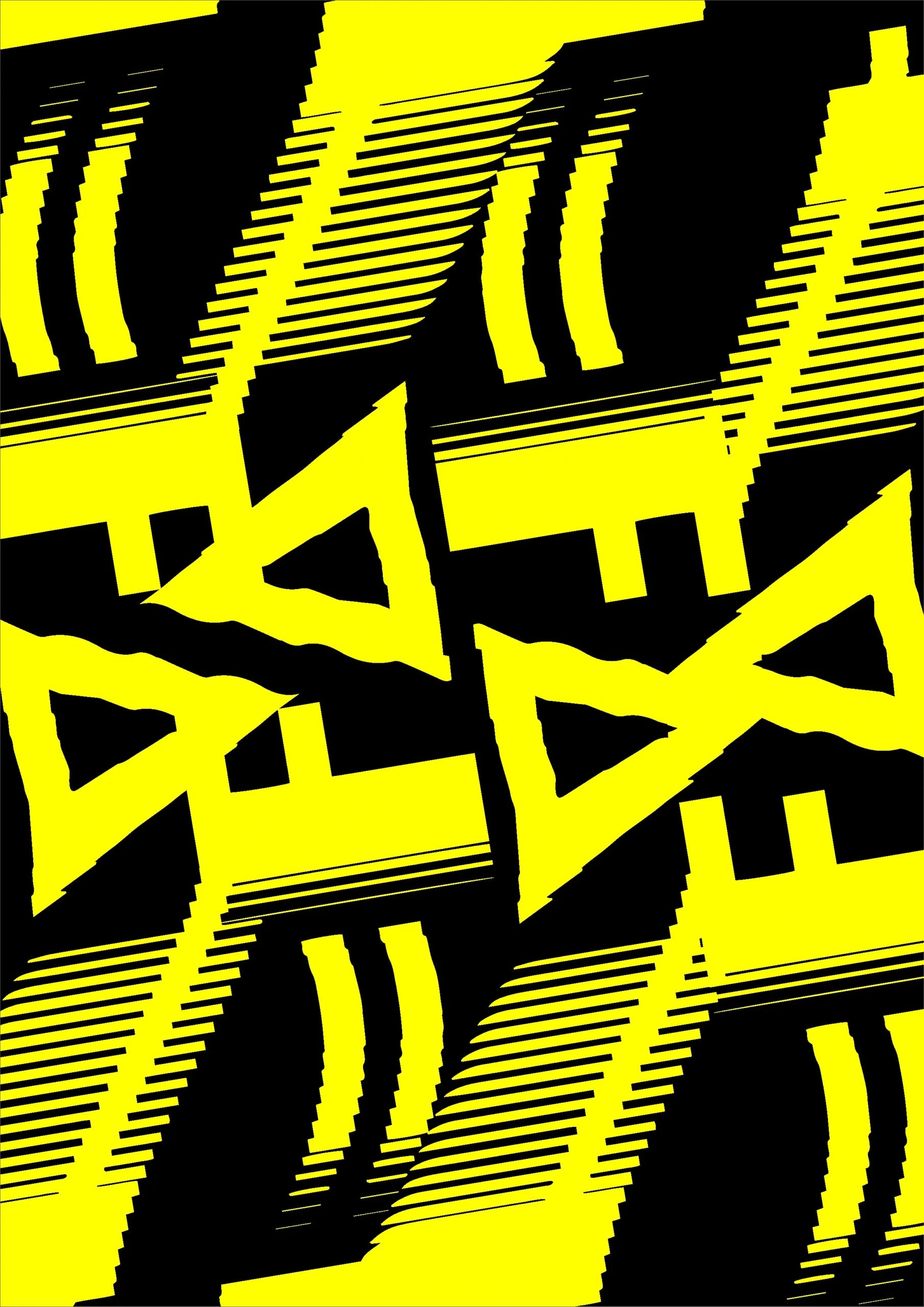
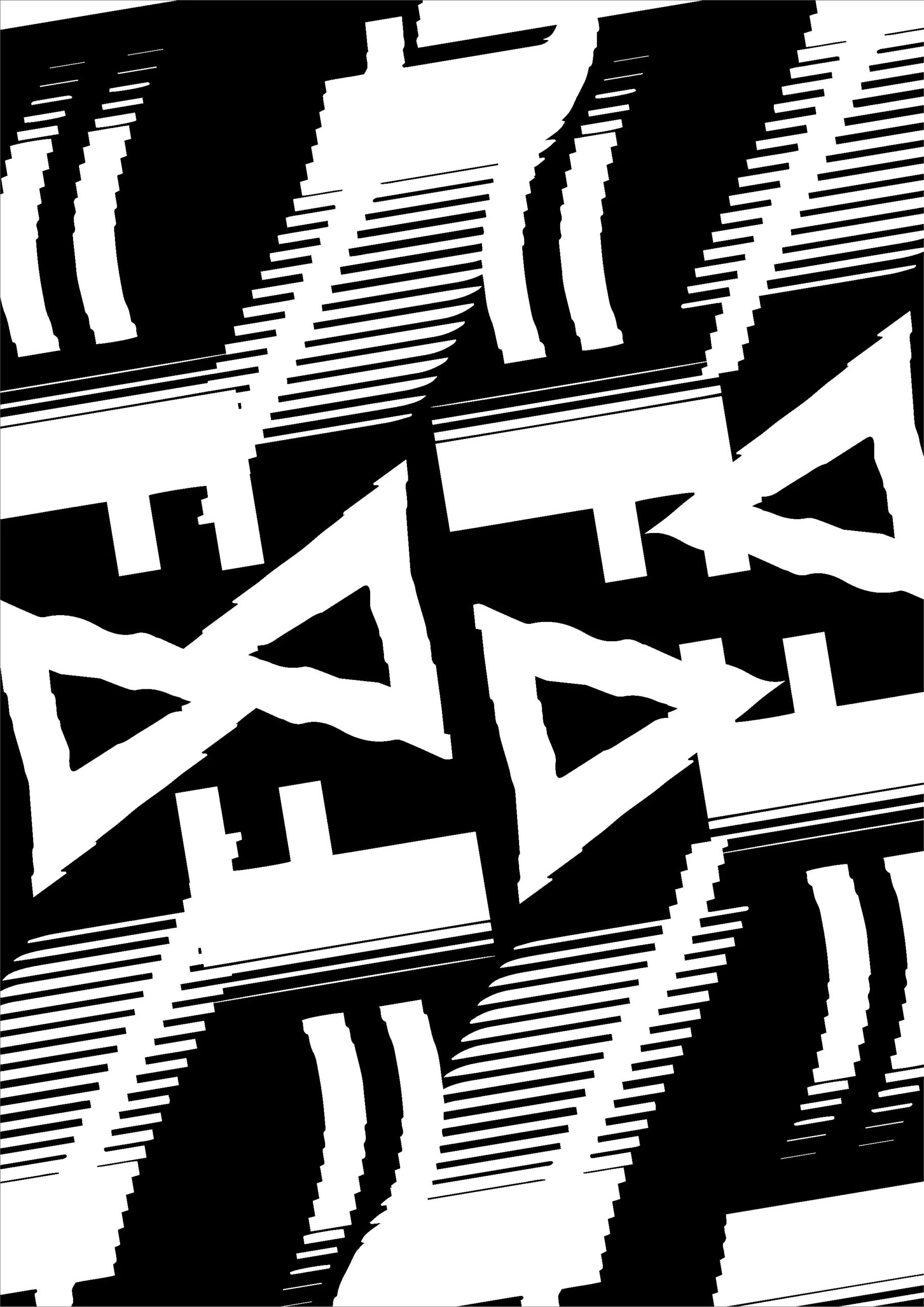
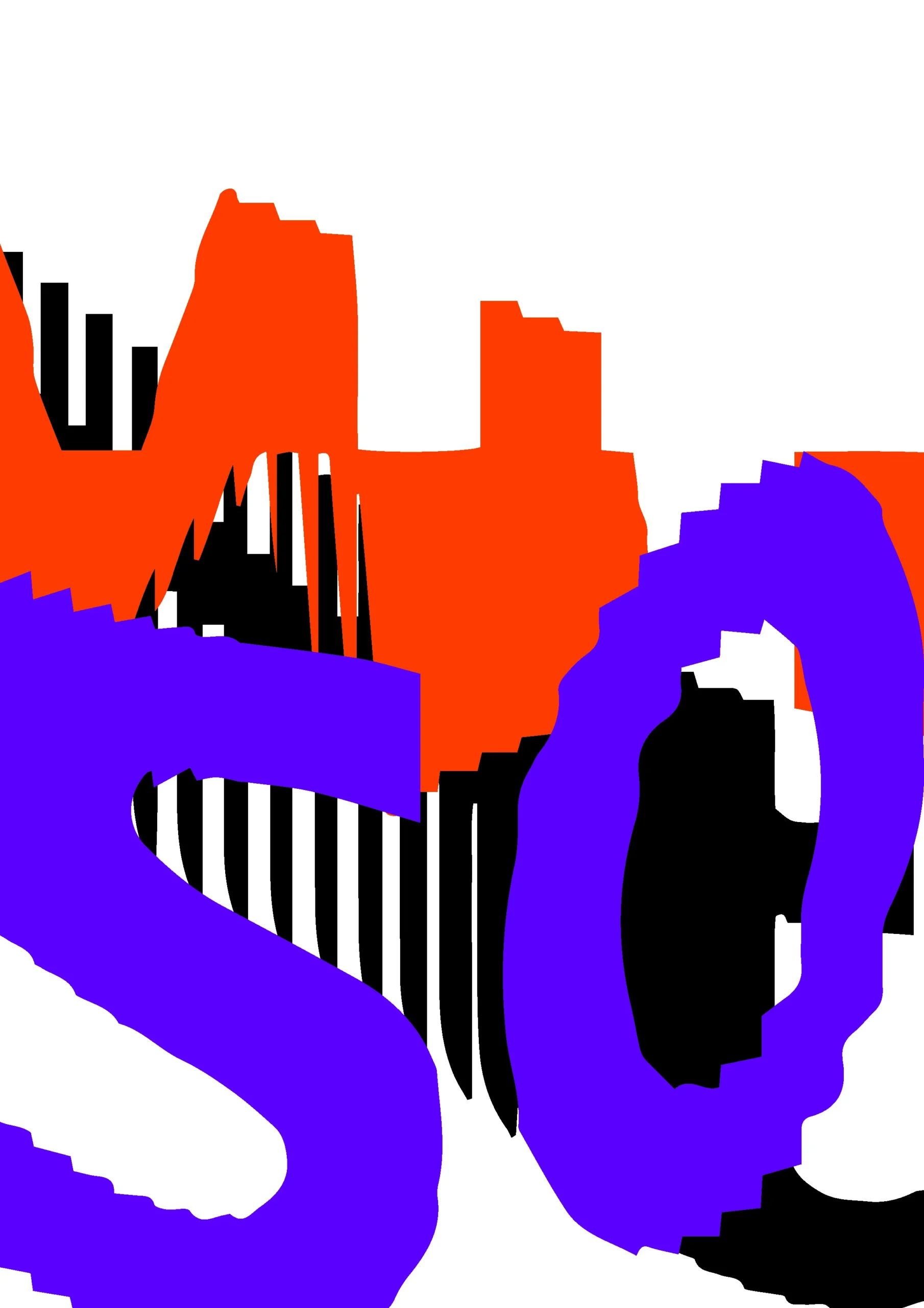
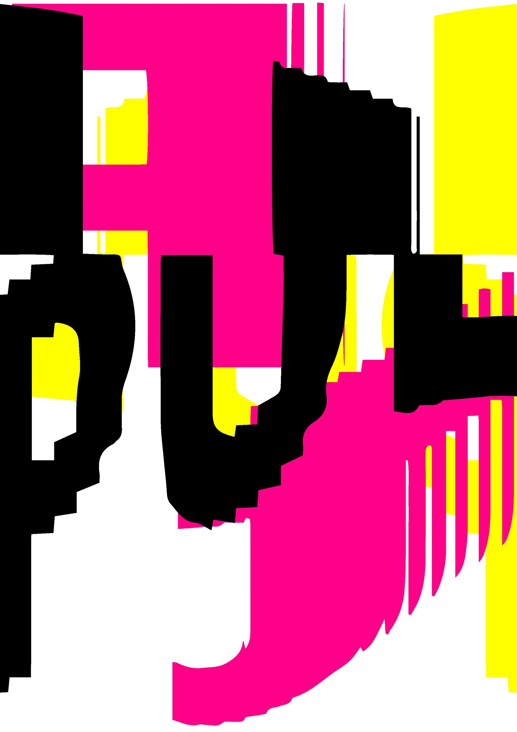
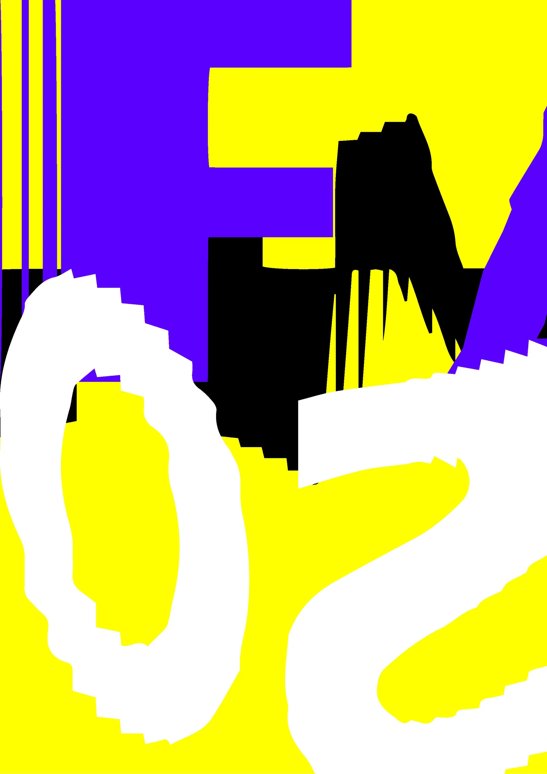
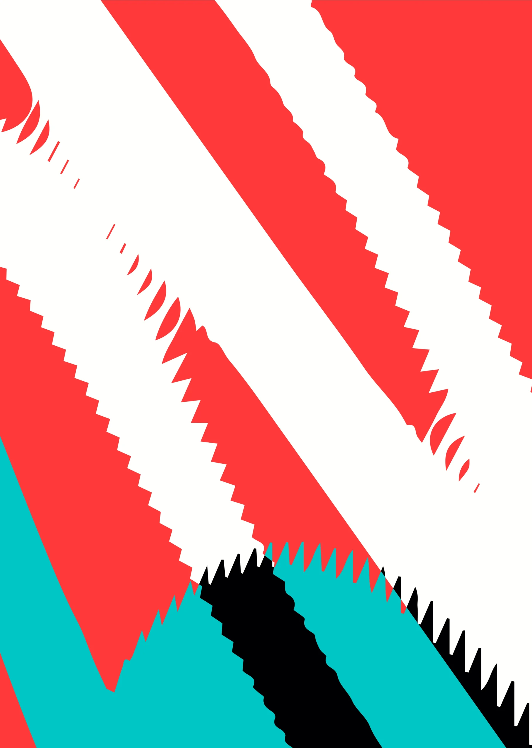
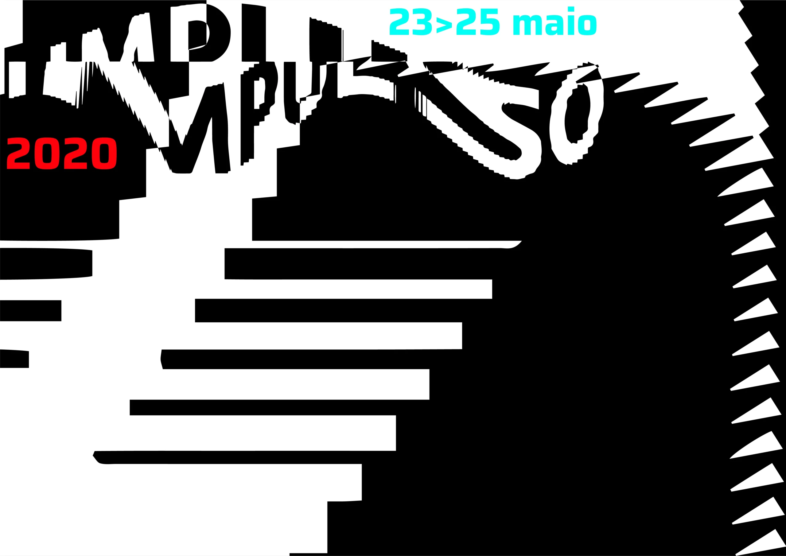
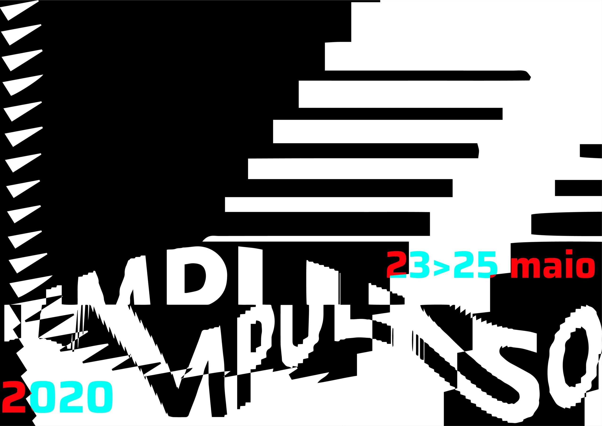
Initial poster tests
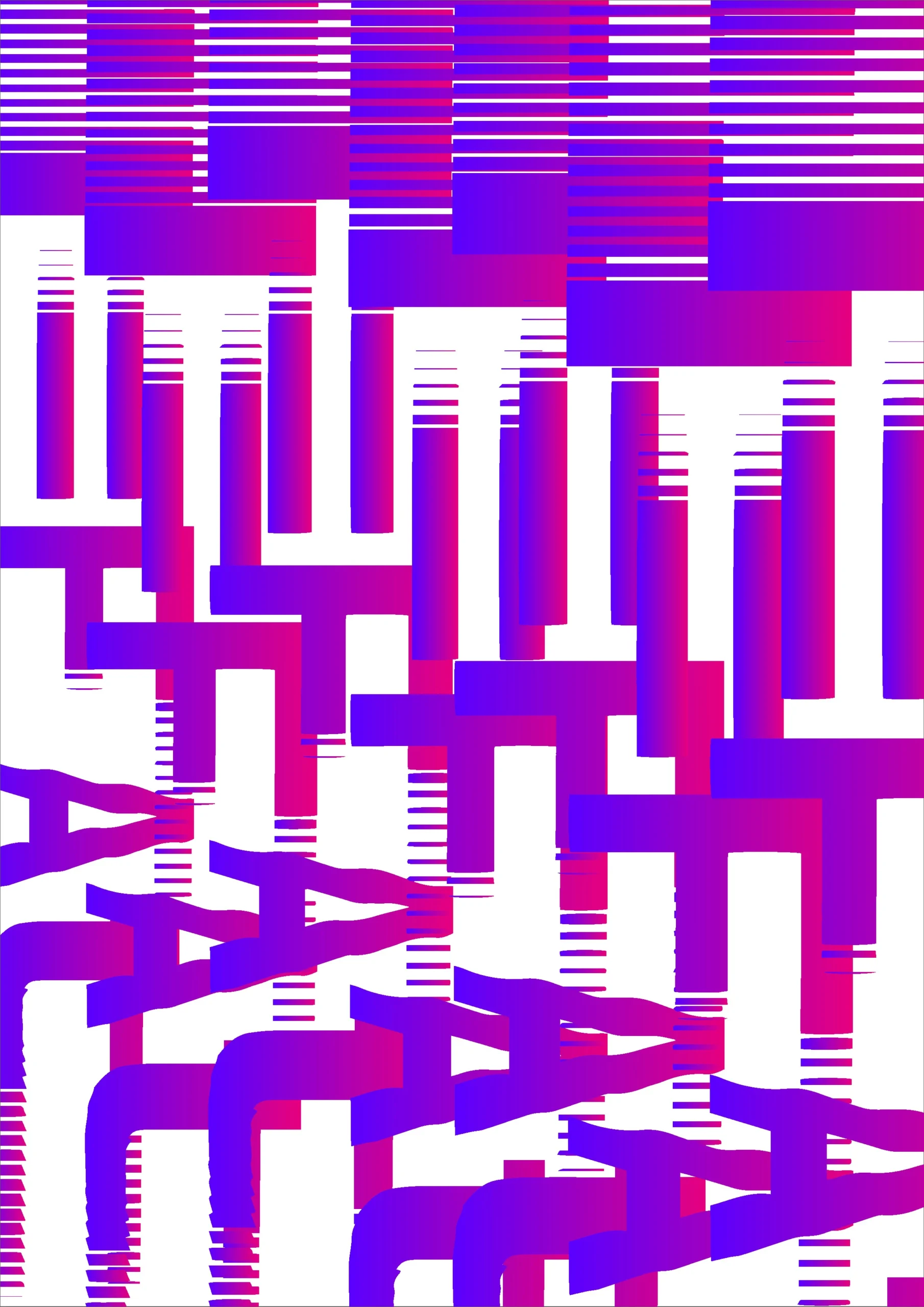
We noticed it was getting too dark and lifeless, so we decided to add more colour, as you can see in the last example.
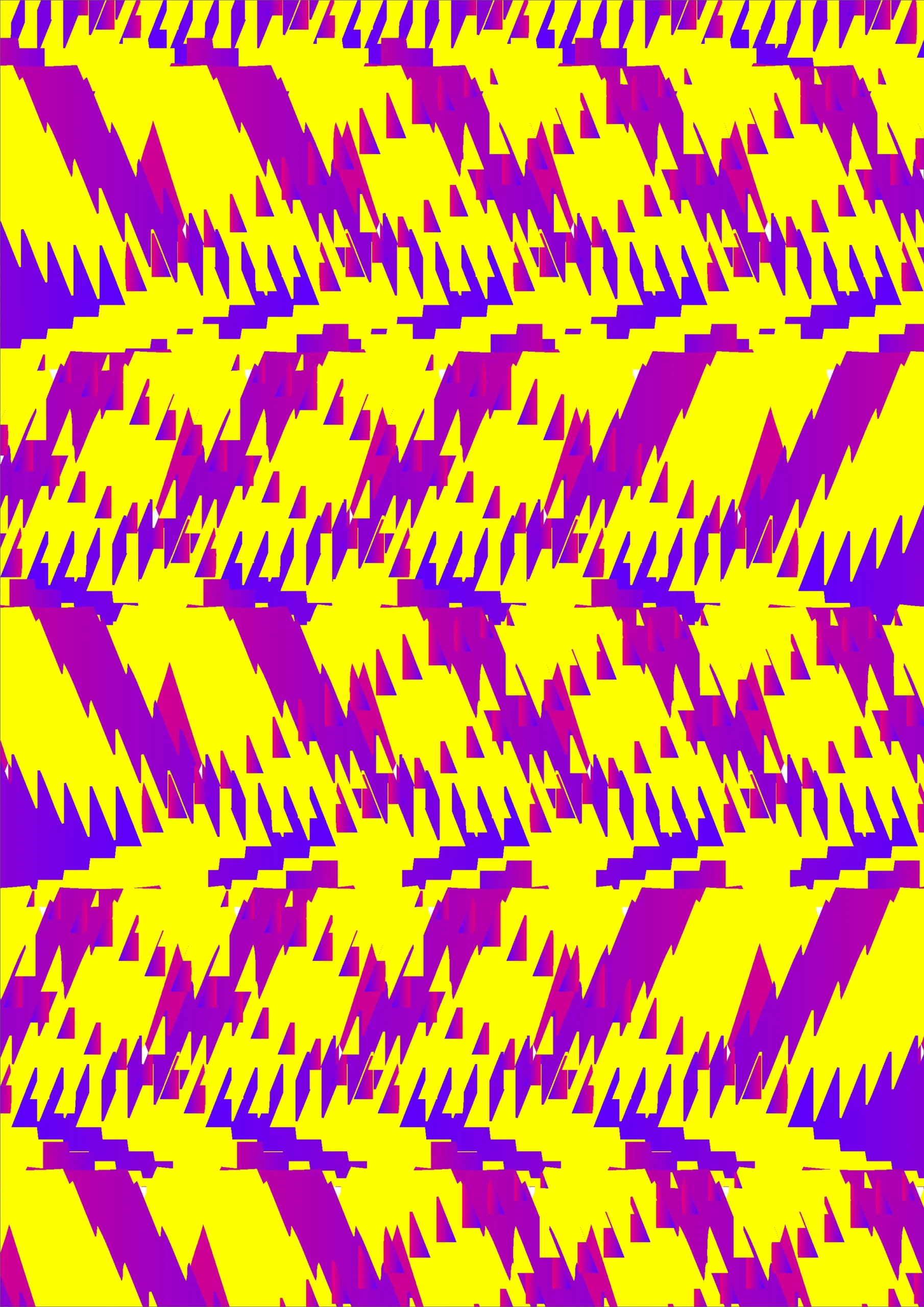
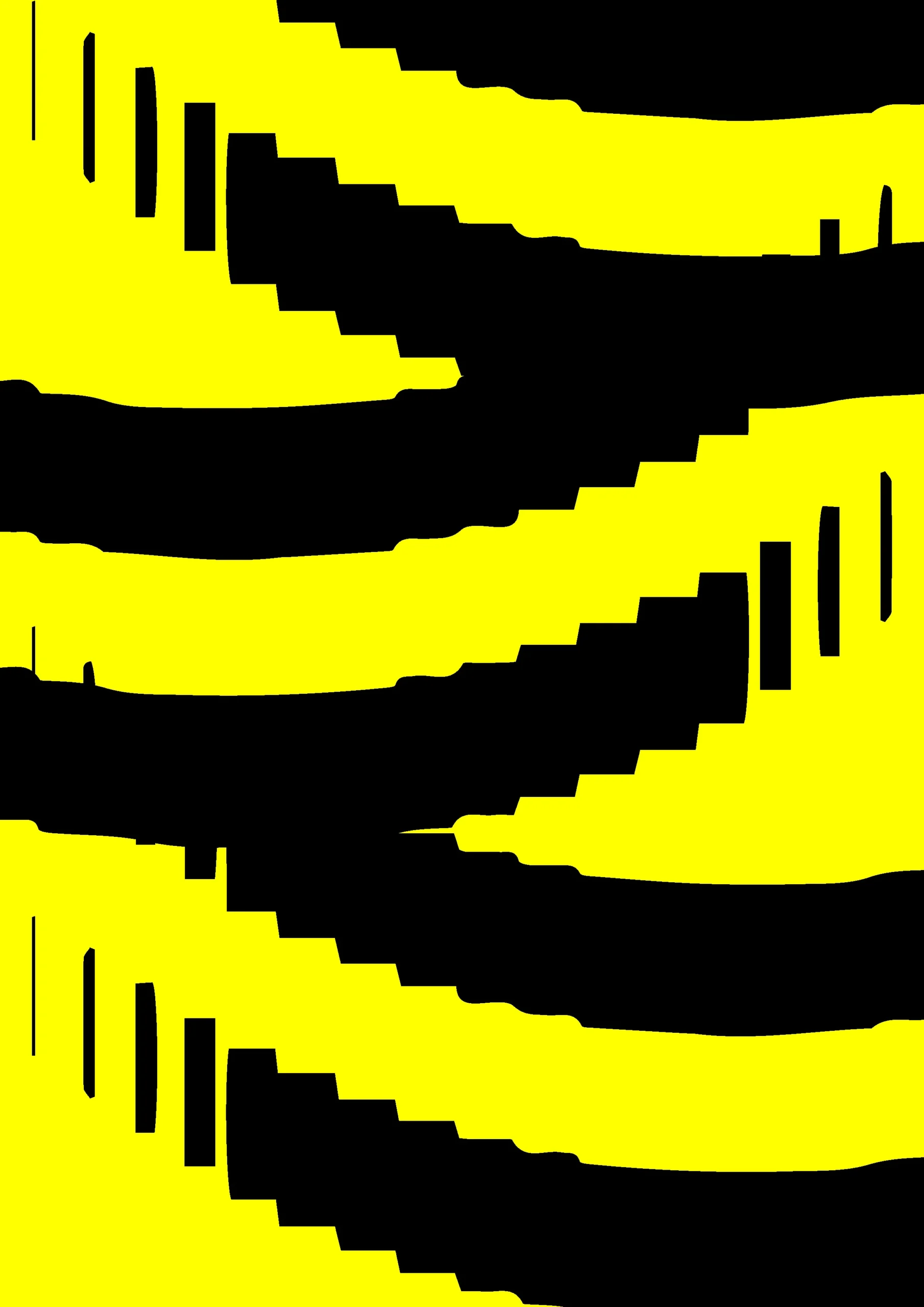
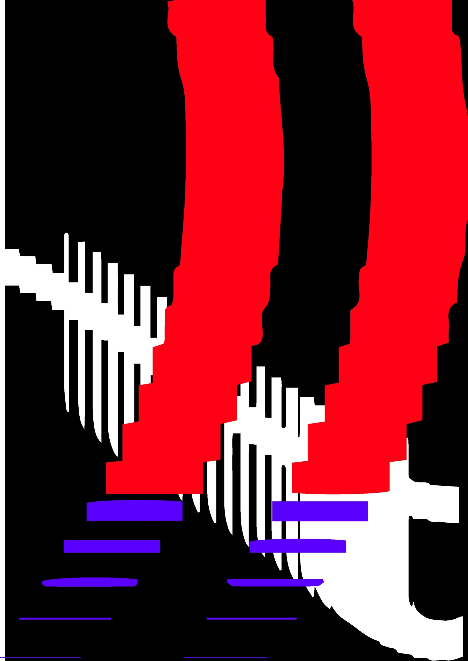
P5.js tests with textures created for the identity

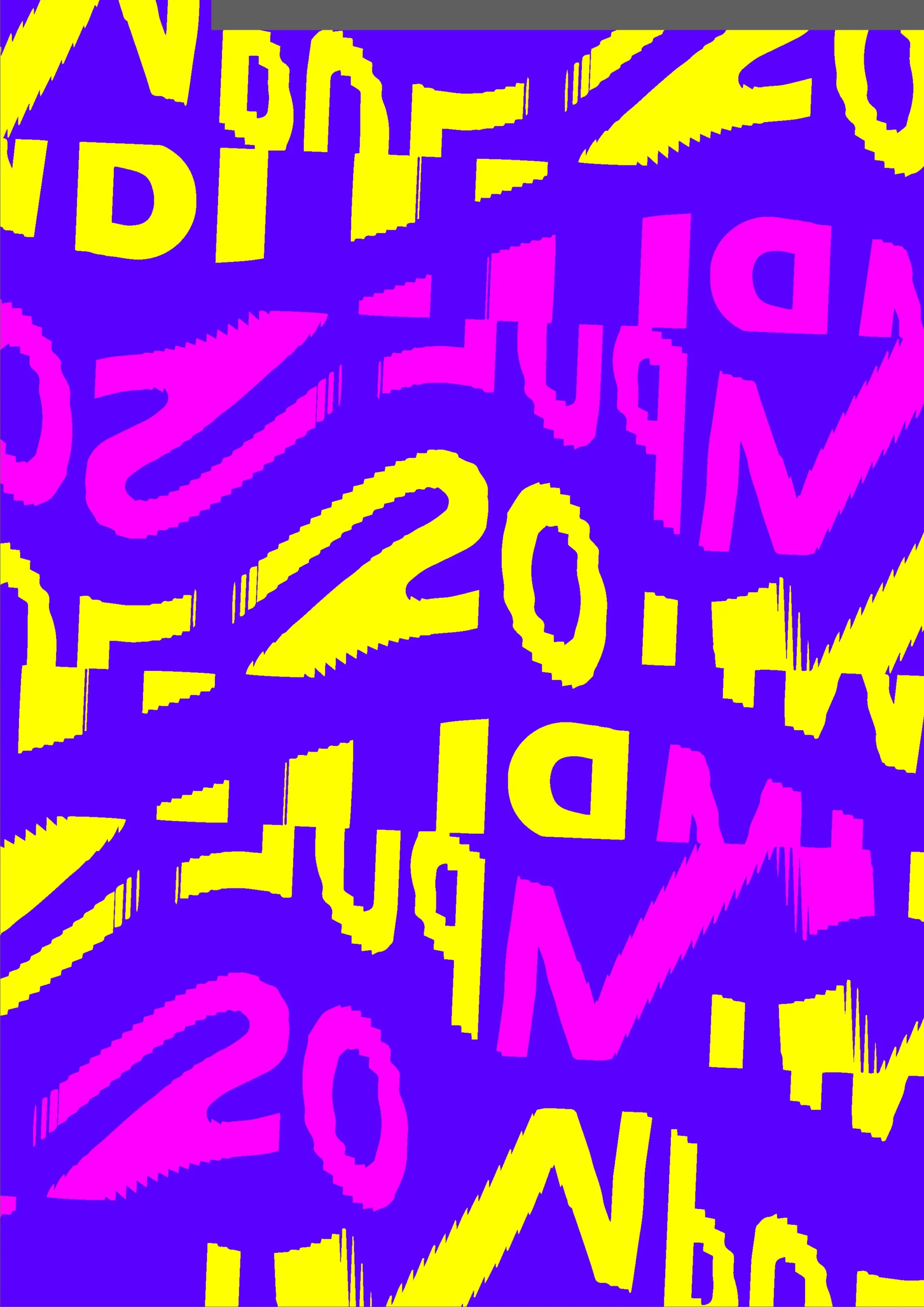
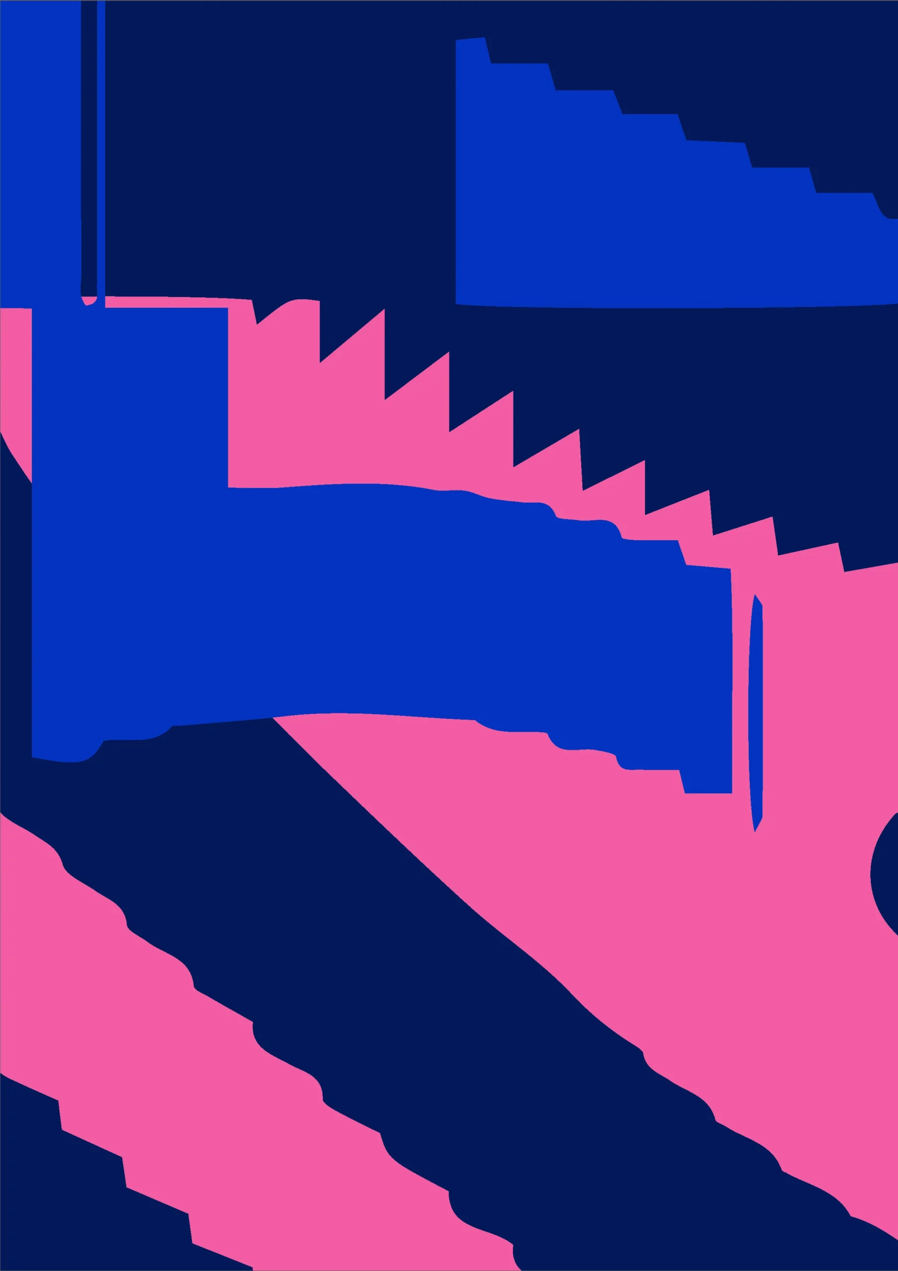
Exploration of layouts and colors
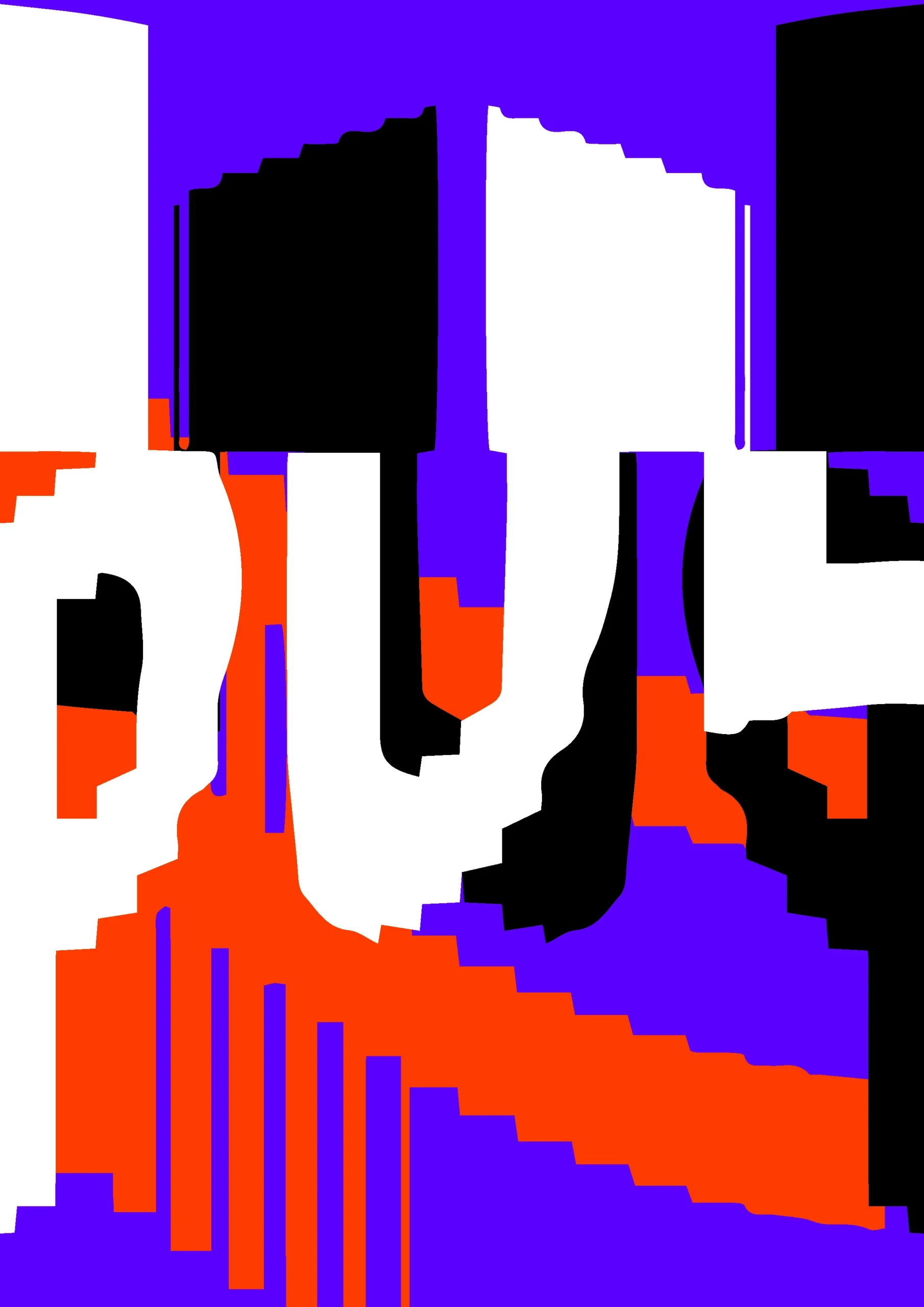
Layout tests — combining shapes with content
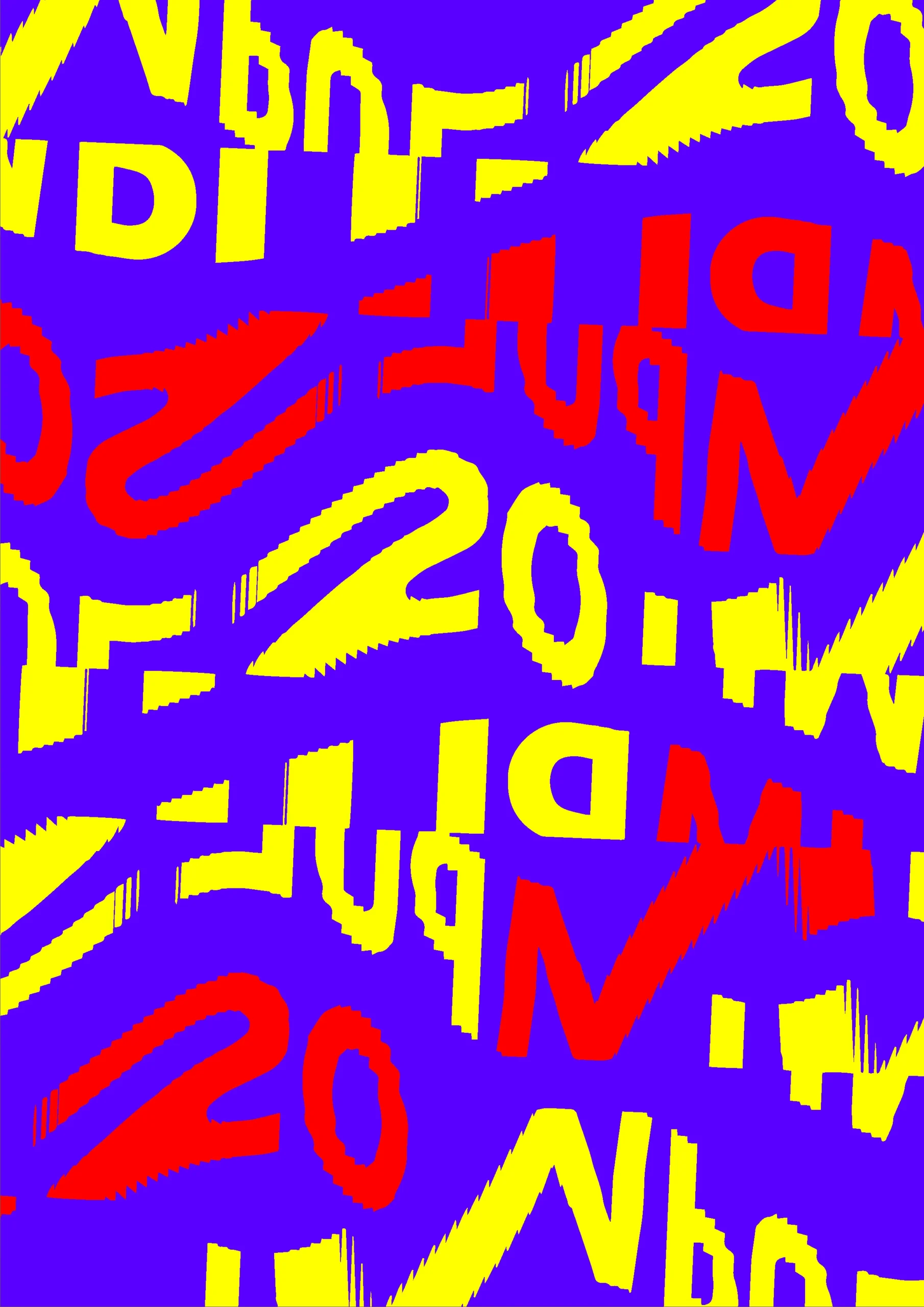
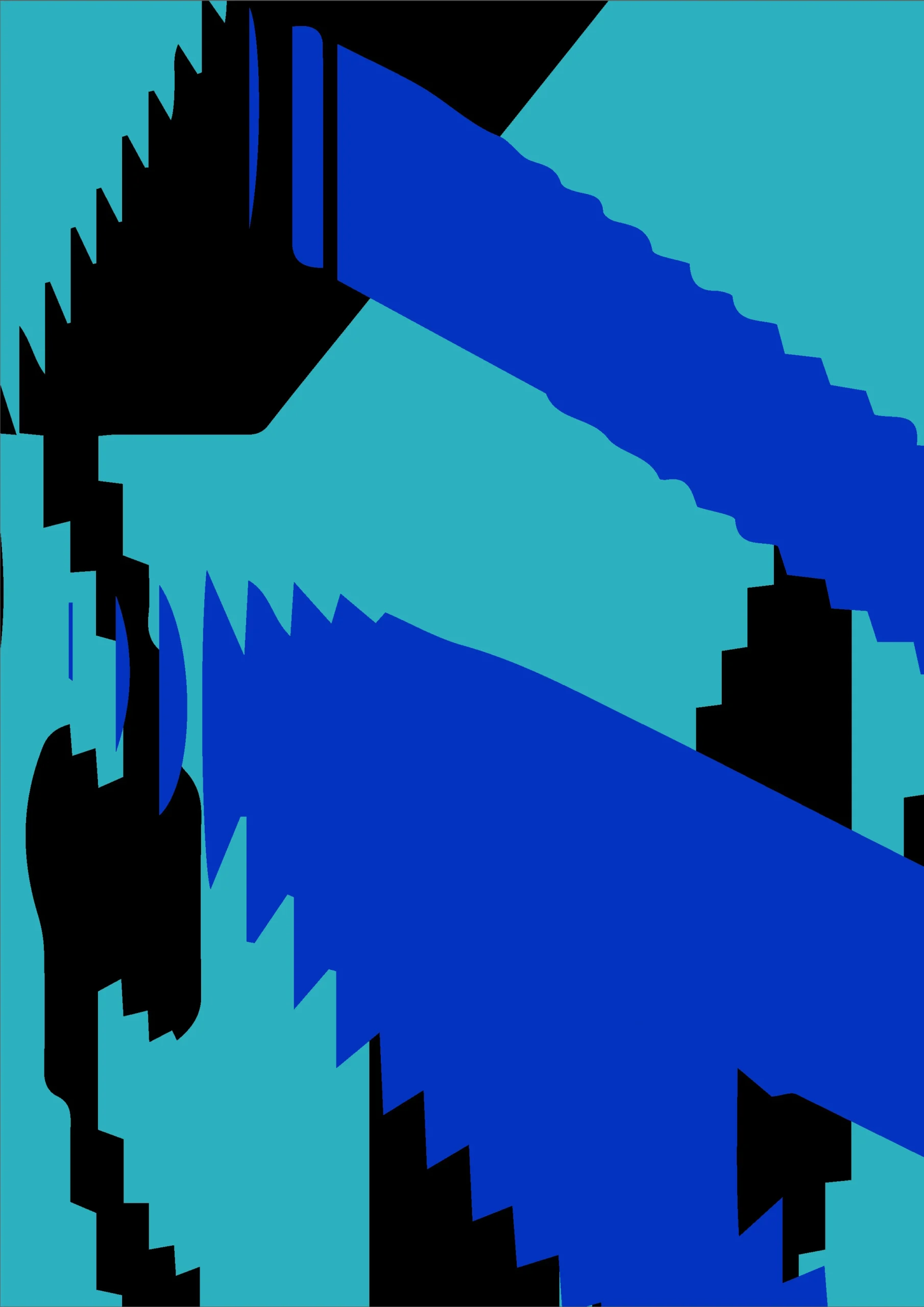
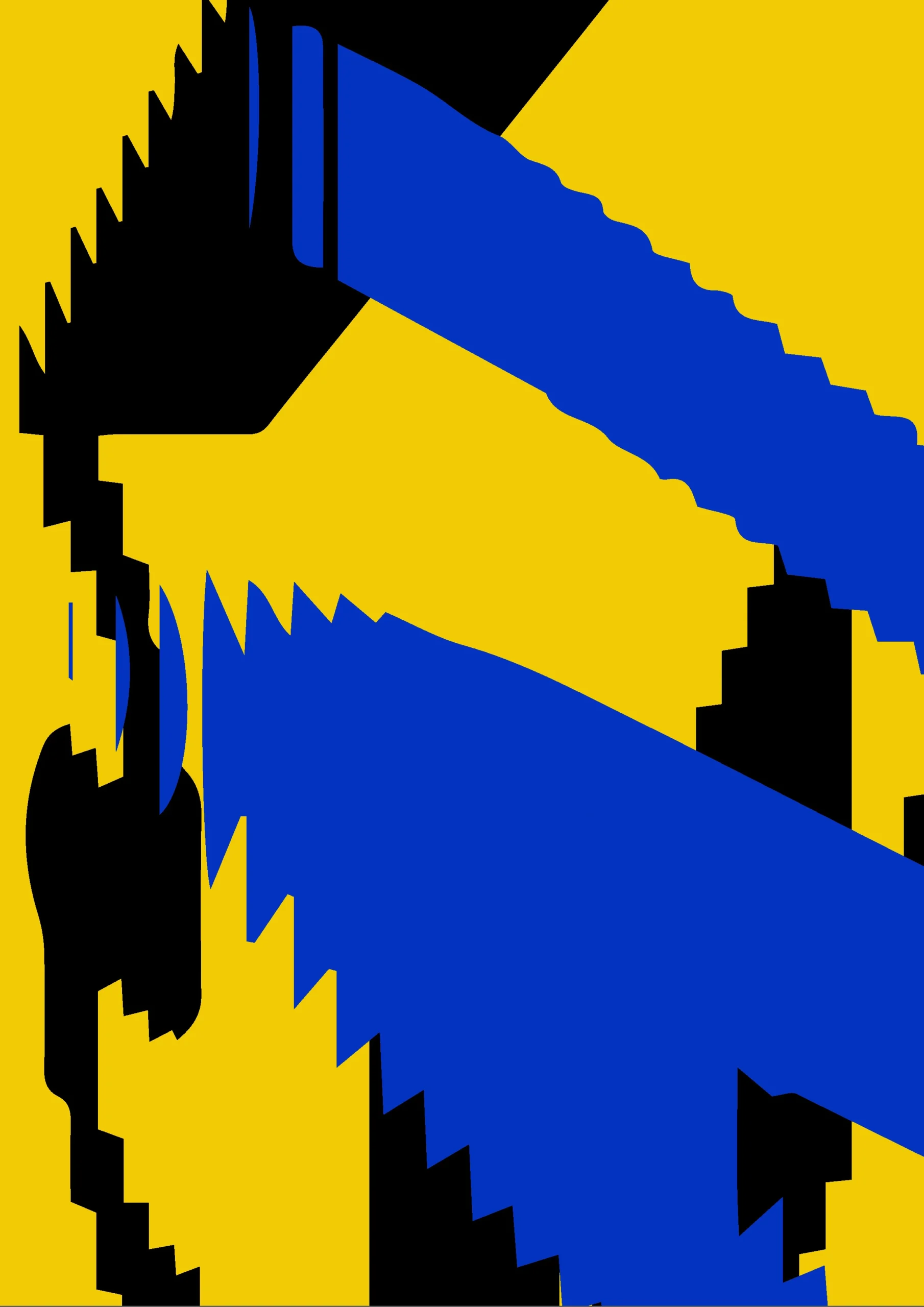
New exploration of colors and shapes


Final combinations


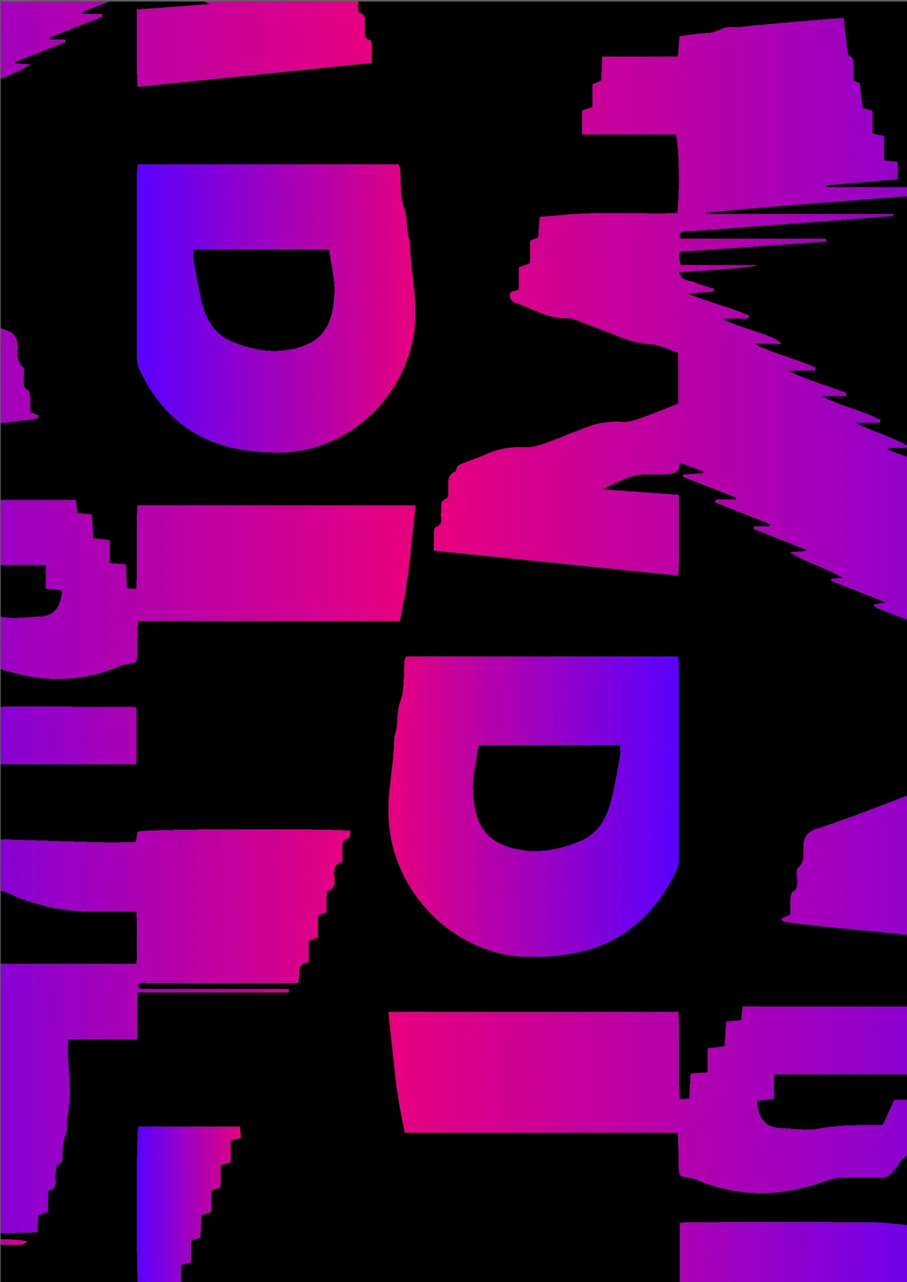
Examples of textures and shapes used


Typographic tests


Selected typeface
Poppins Black
a A
a b c A B C 1 2 3
A B C D E F G H I J K L M N O P Q R S T U V W X Y Z
a b c d e f g h i j k l m n o p q r s t u v w x y z
0 1 2 3 4 5 6 7 8 9 (!”#$%&/@£§€=?)
Poppins Thin
a A
a b c A B C 1 2 3
A B C D E F G H I J K L M N O P Q R S T U V W X Y Z
a b c d e f g h i j k l m n o p q r s t u v w x y z
0 1 2 3 4 5 6 7 8 9 (!”#$%&/@£§€=?)
Color


Poster combination test
Horizontal poster test
More tests
Other horizontal versions
Paper and color test
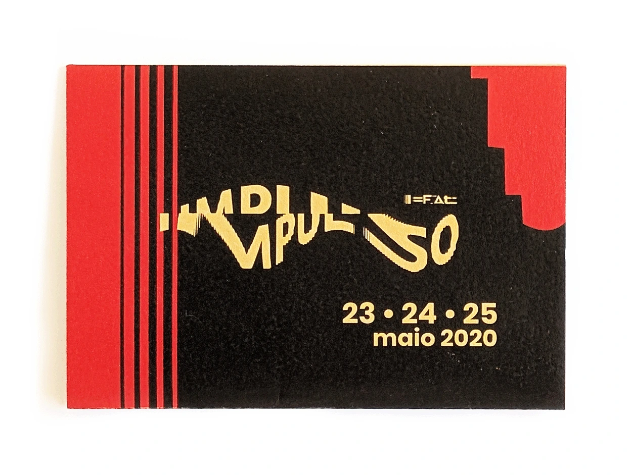
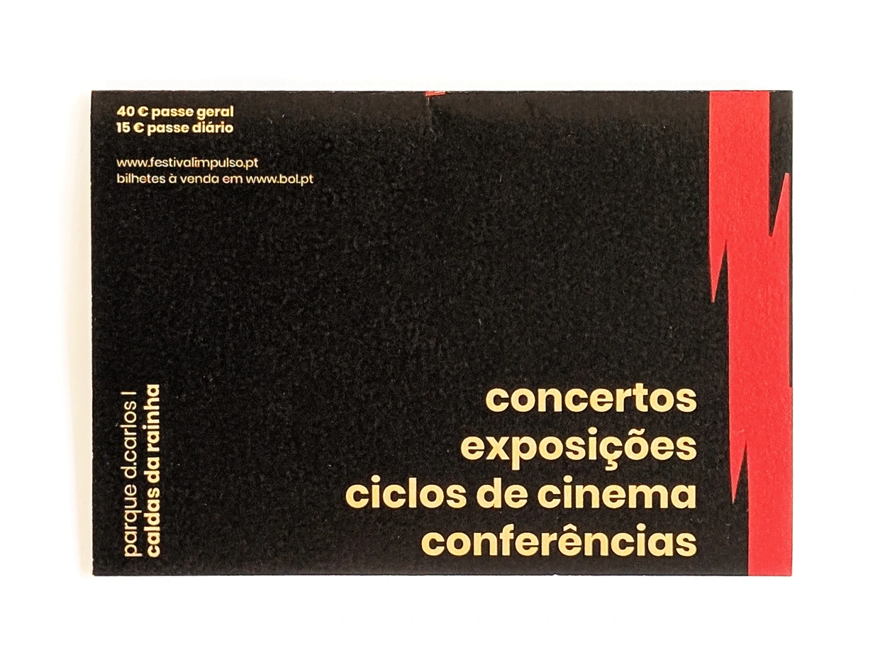
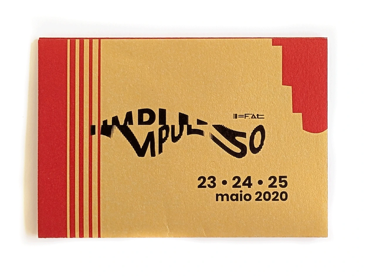
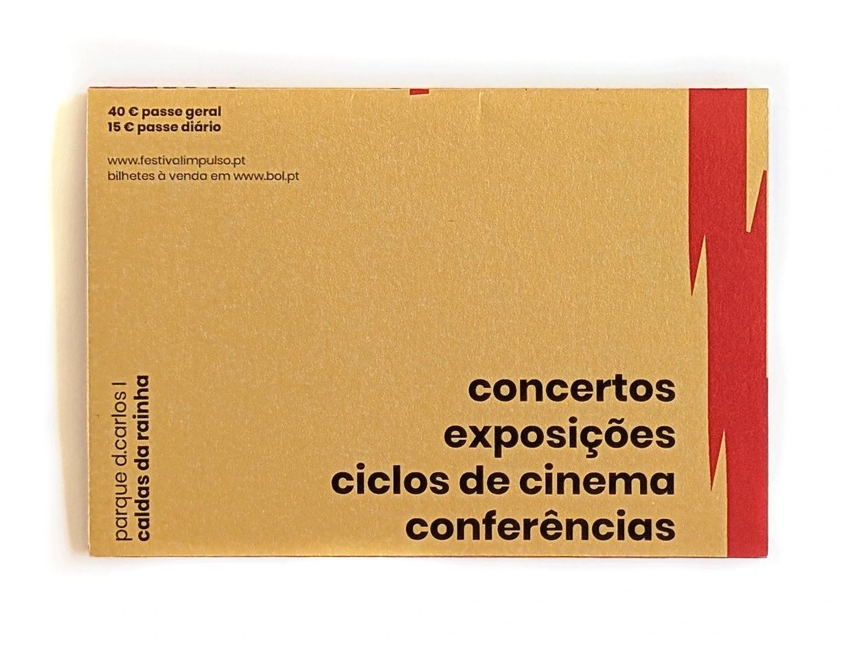
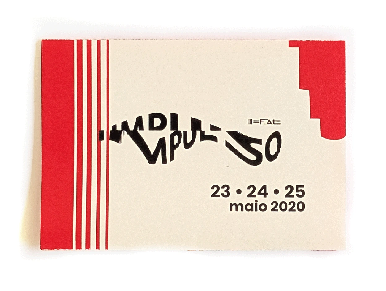
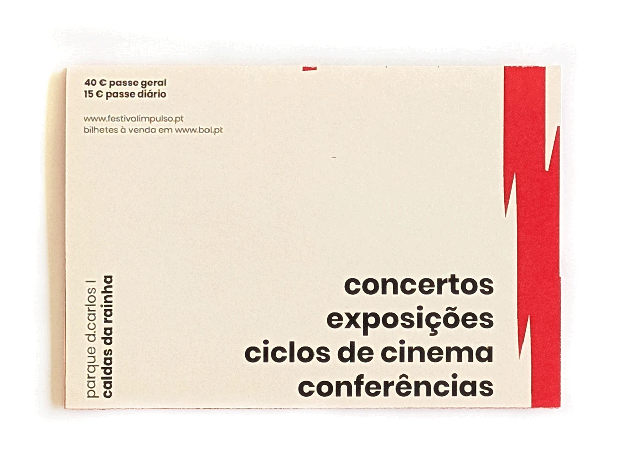
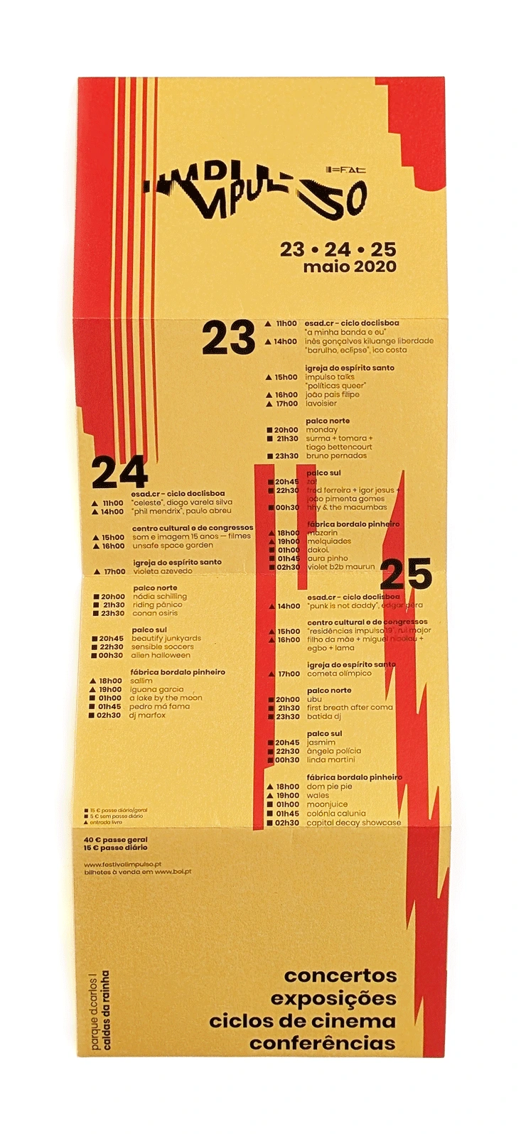
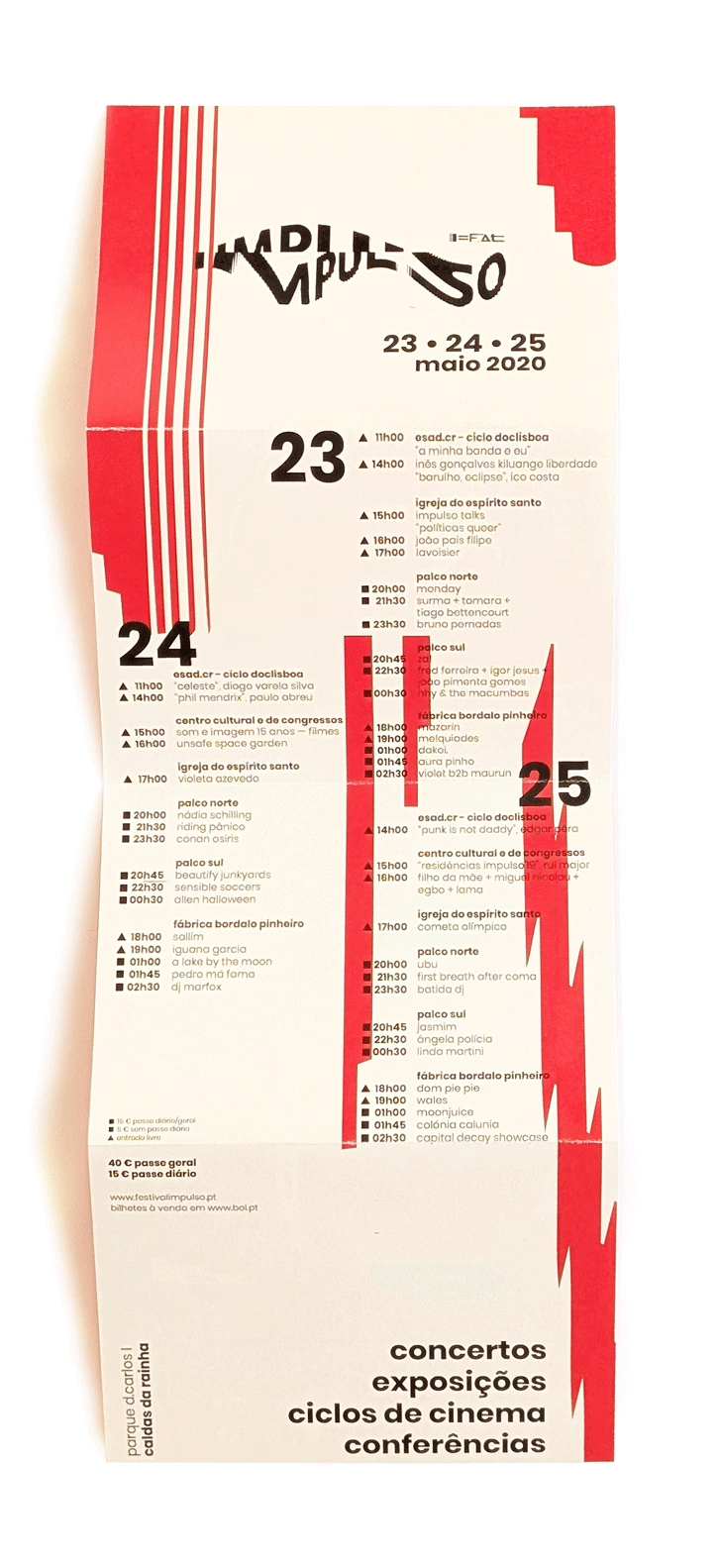
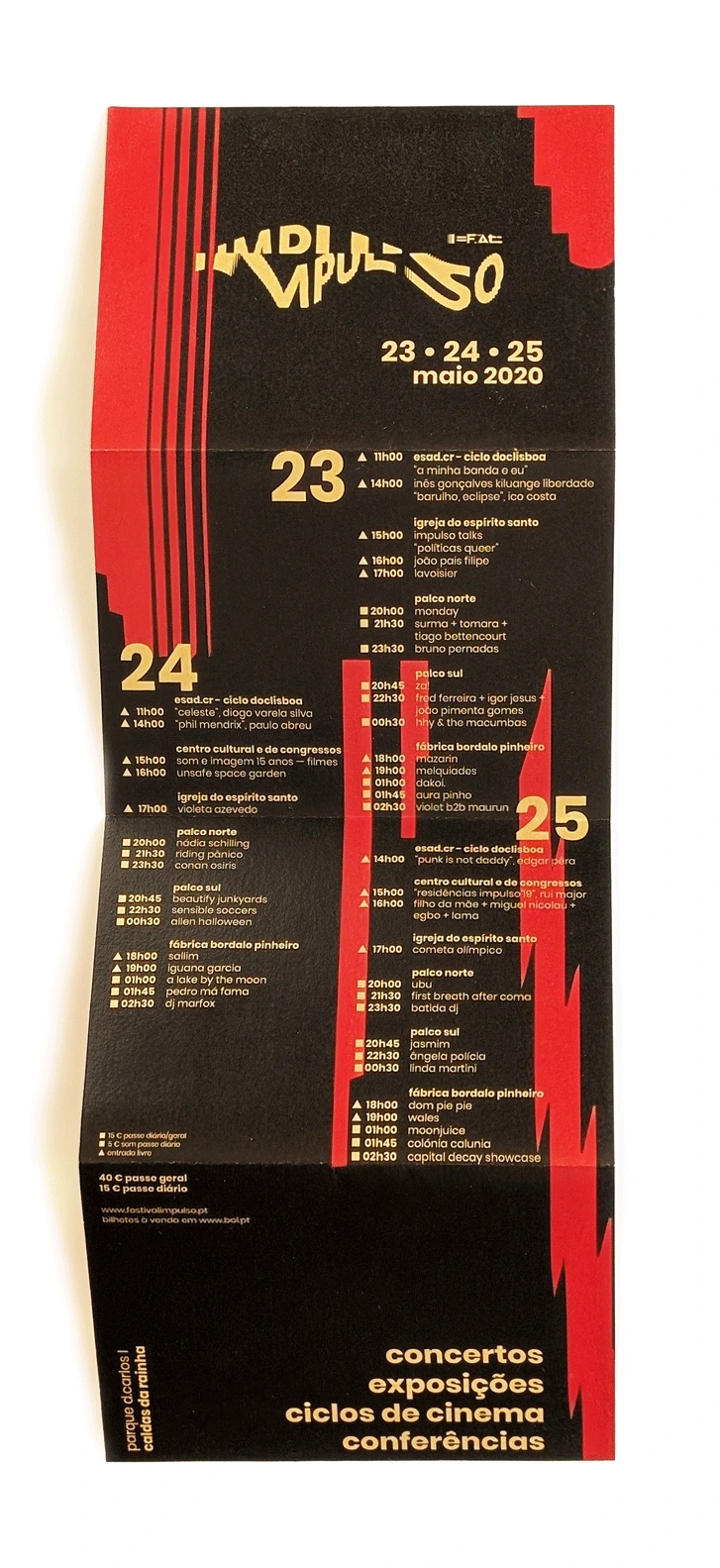
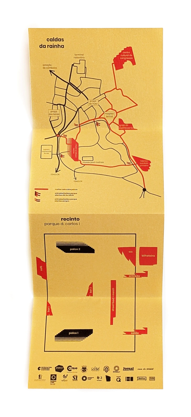
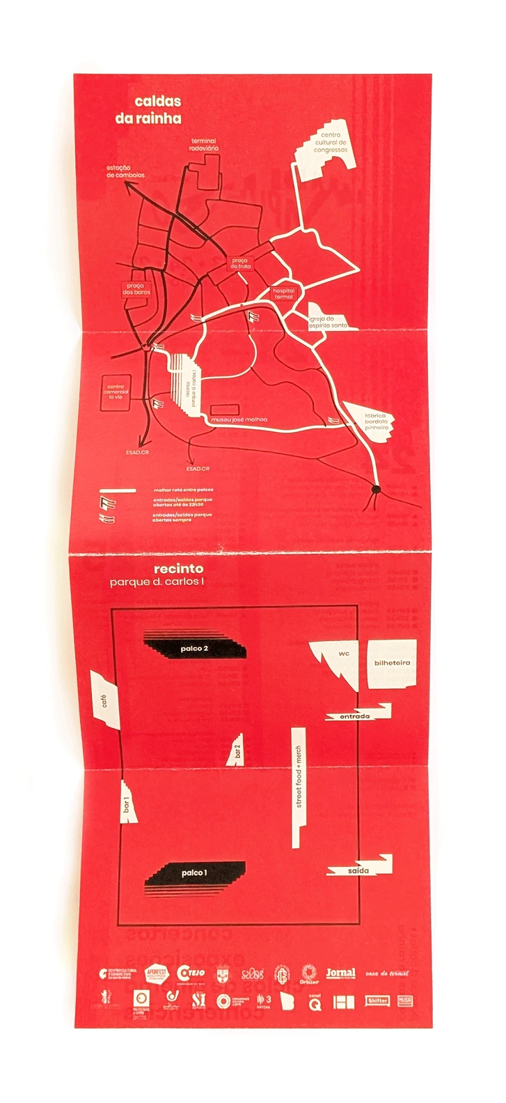
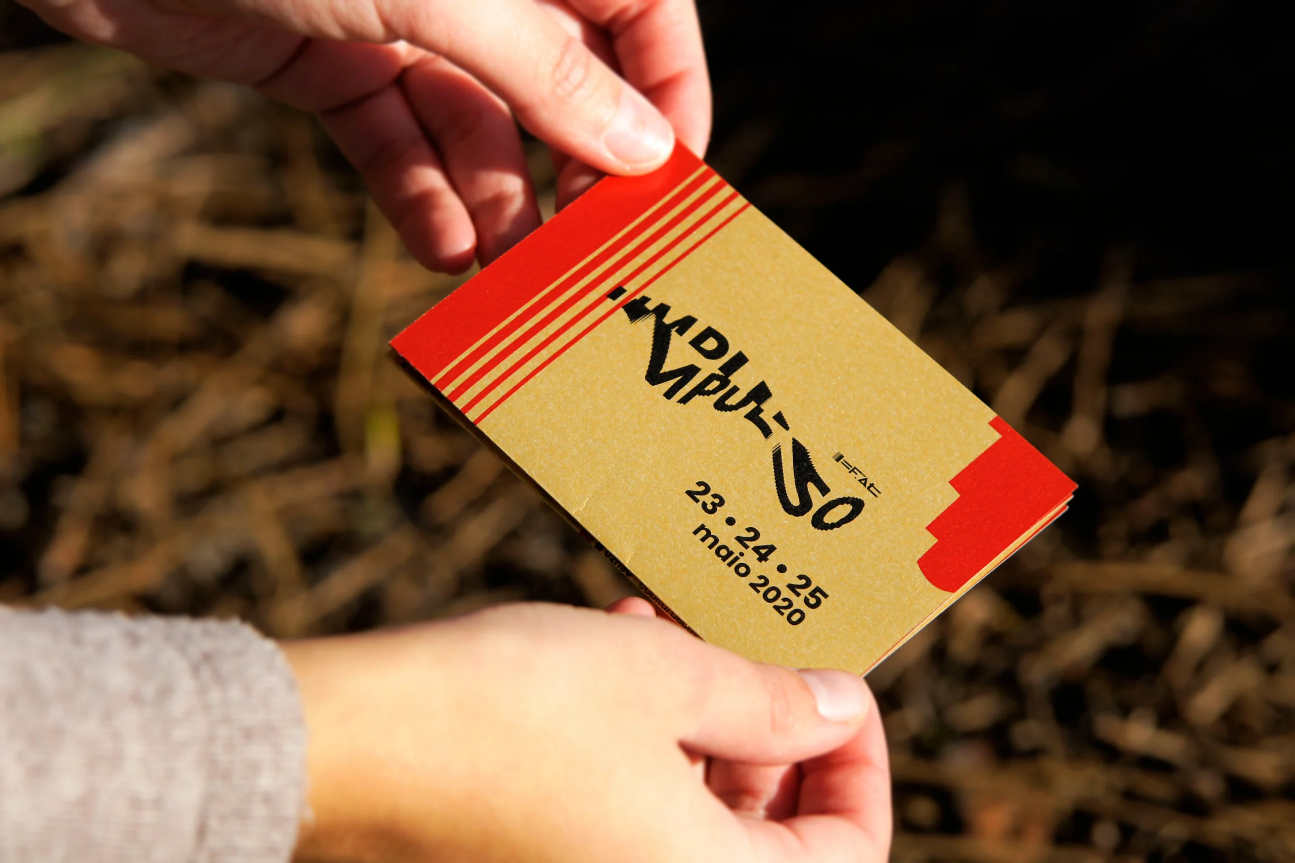
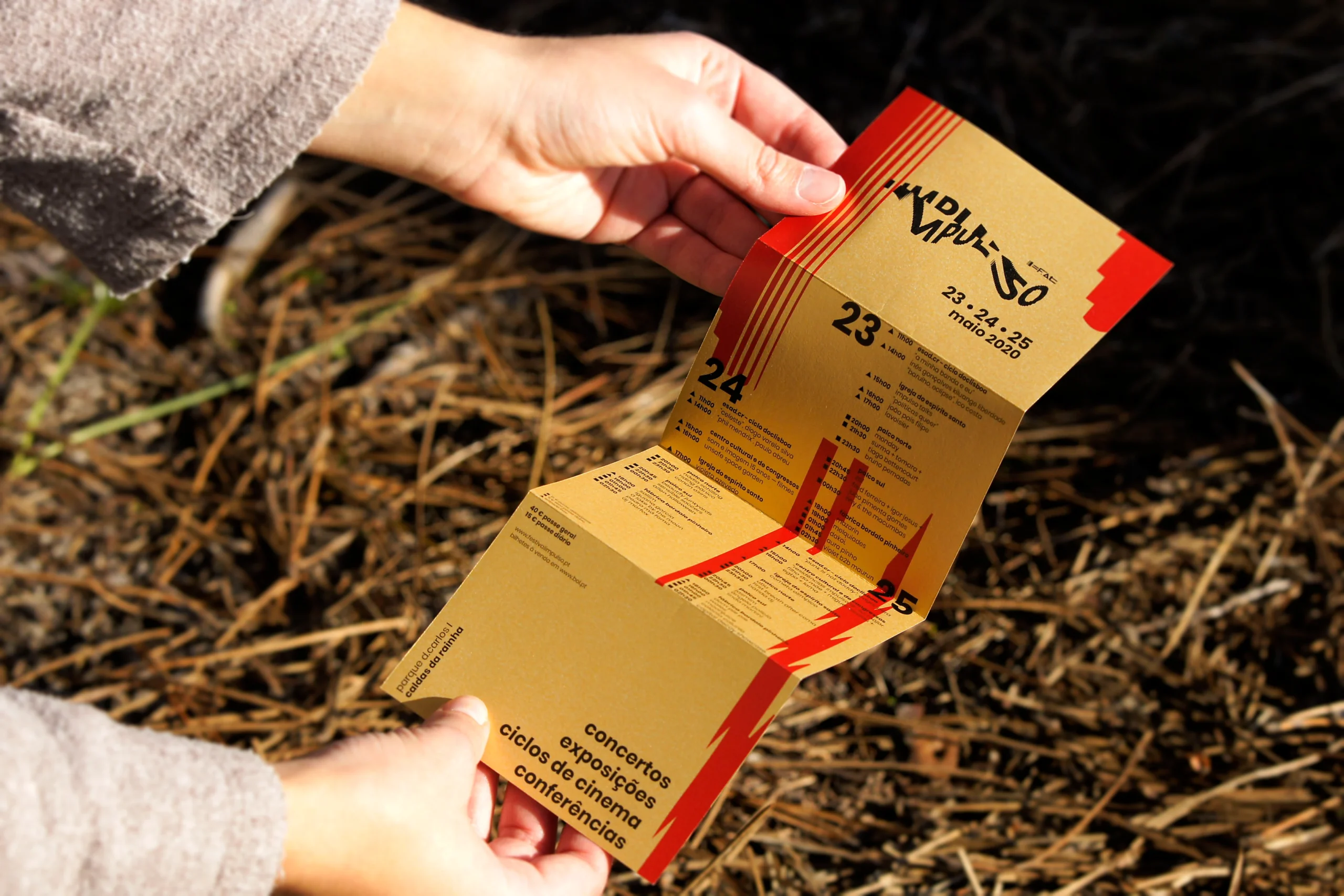
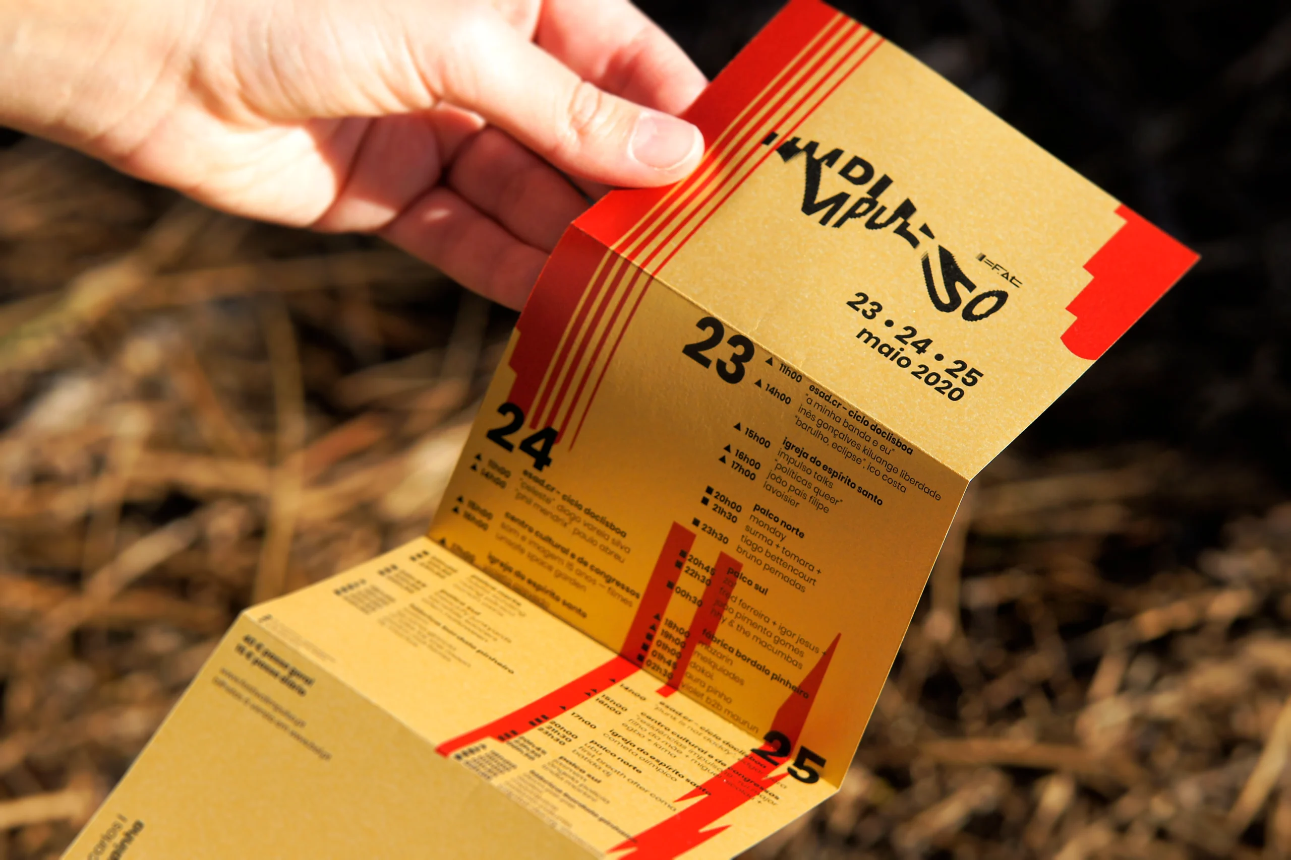
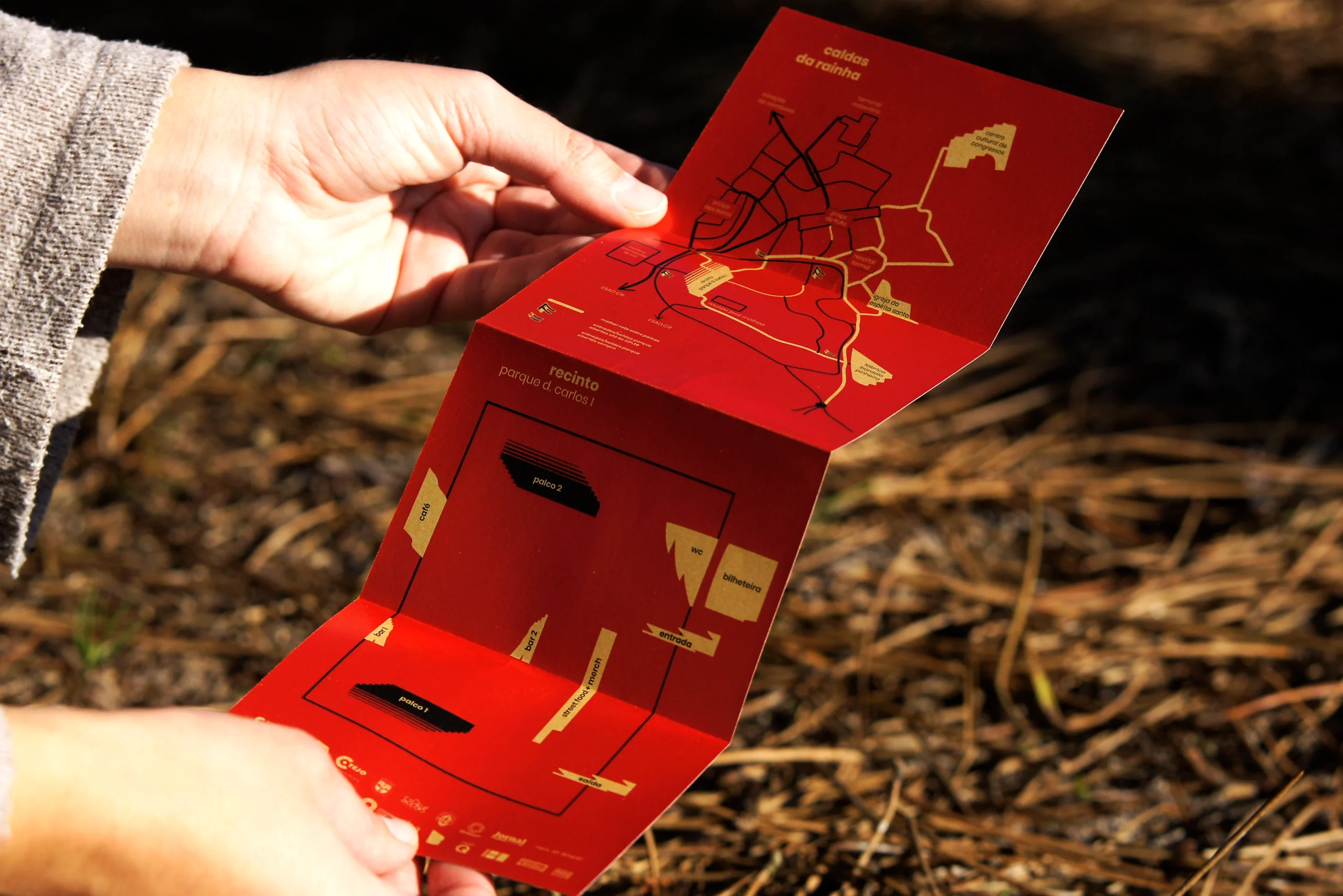
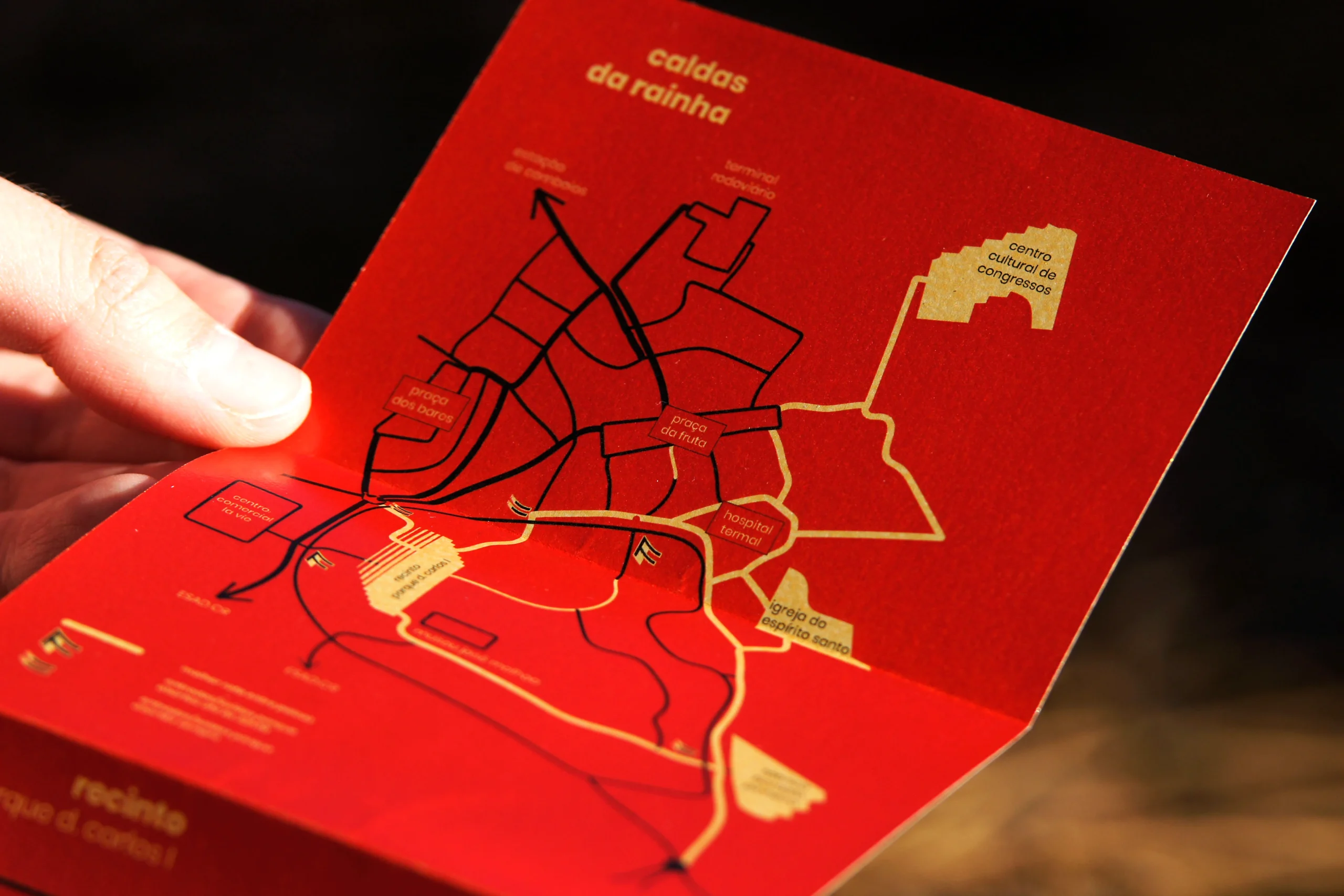
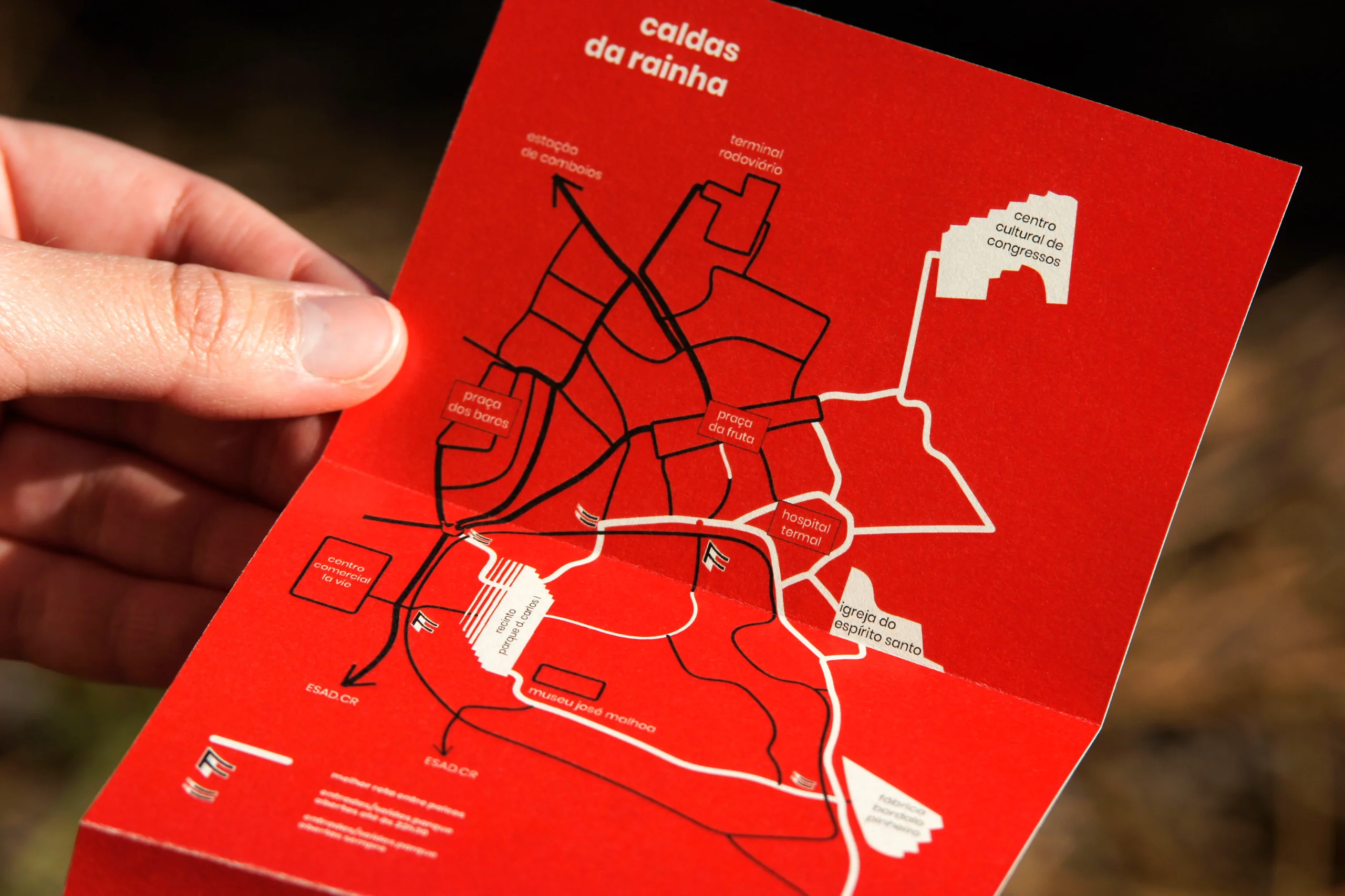
Fold-out program. Paper tests
A5 flyer tests
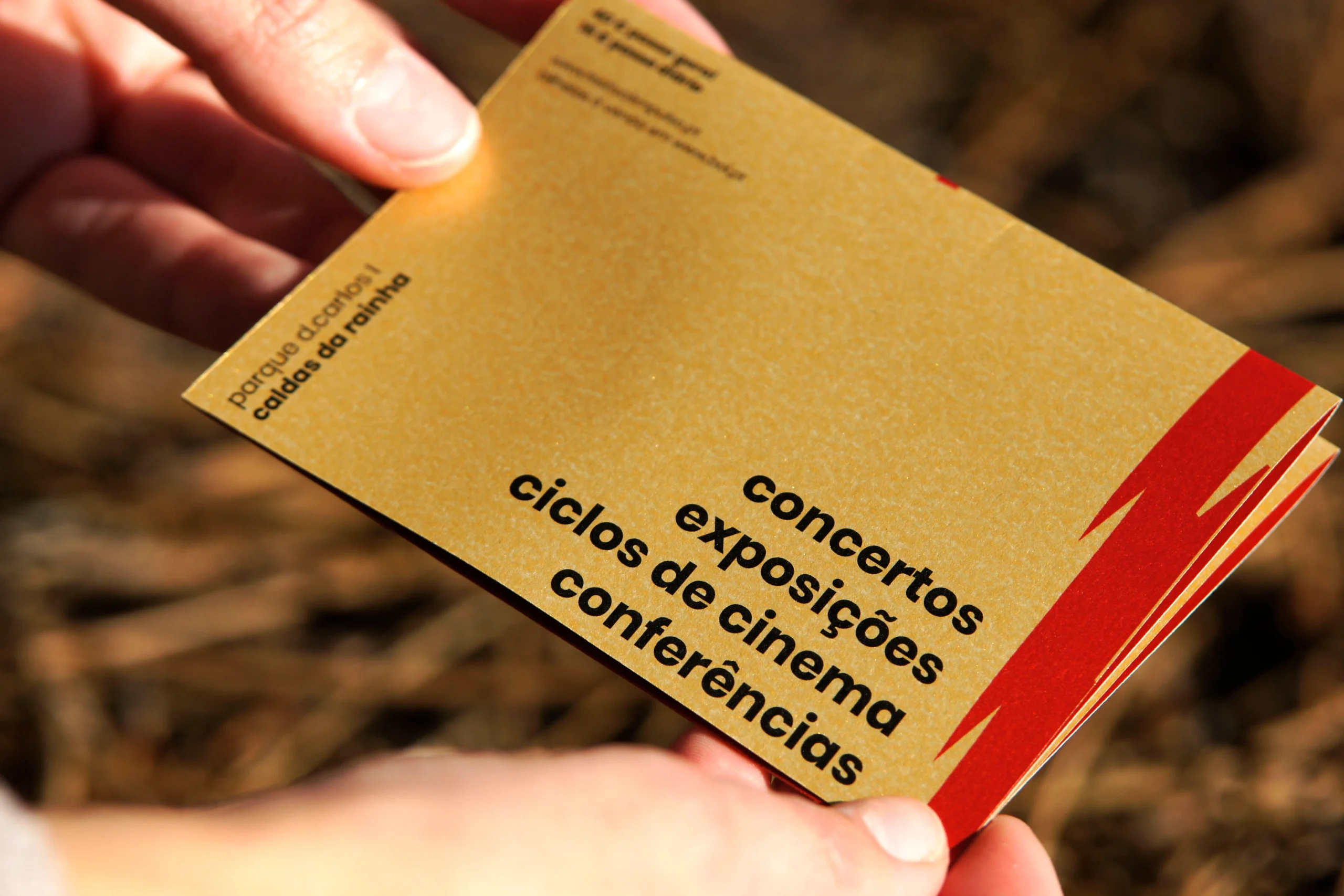
Metallic paper
More horizontal layout tests (paper and color)
More vertical layout tests (paper and color)
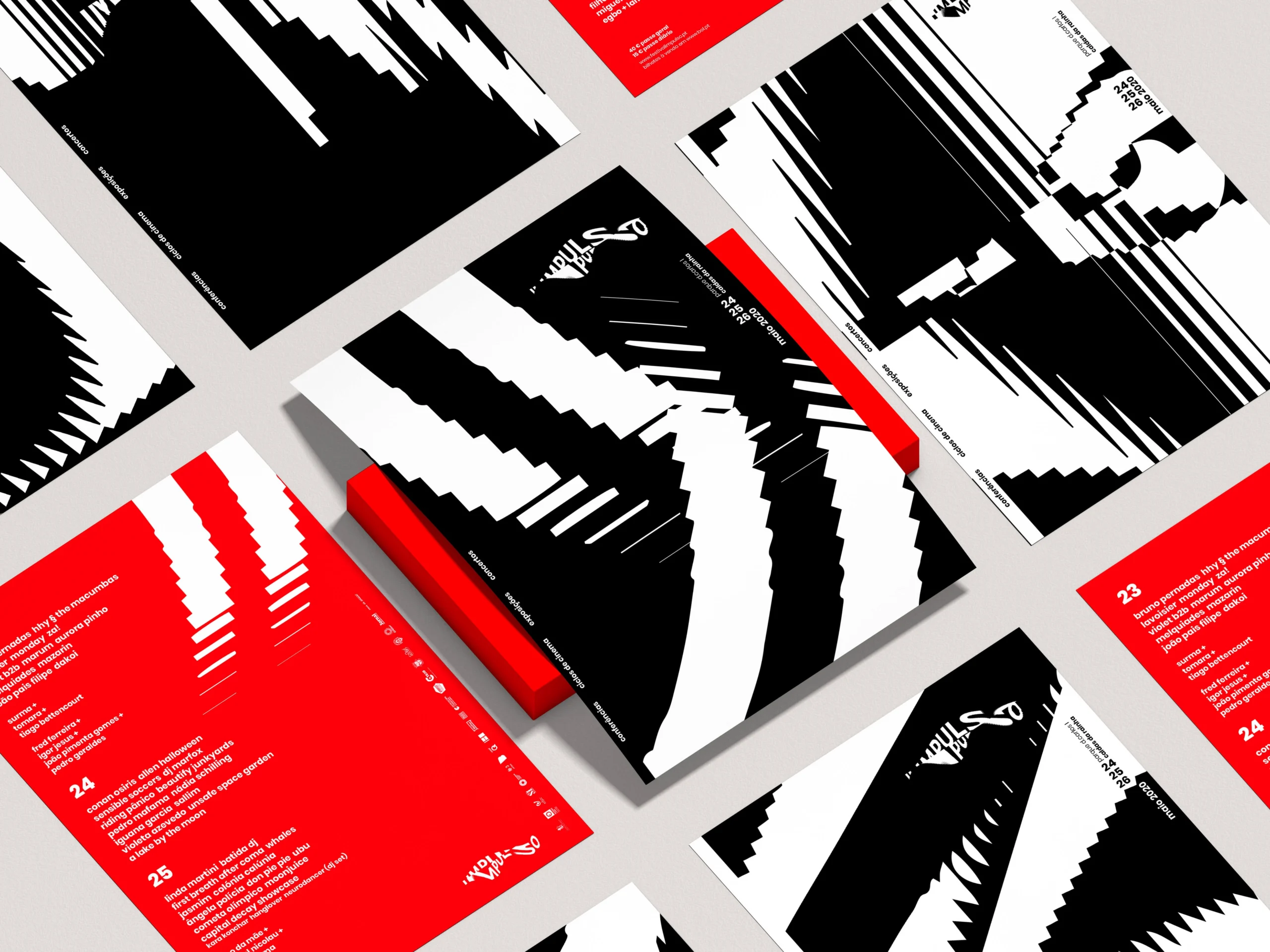
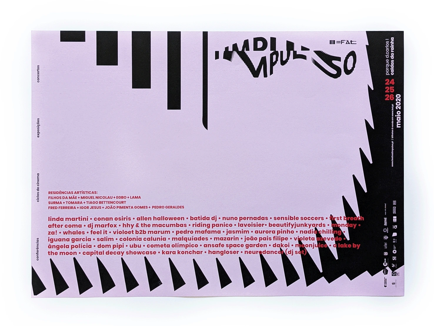
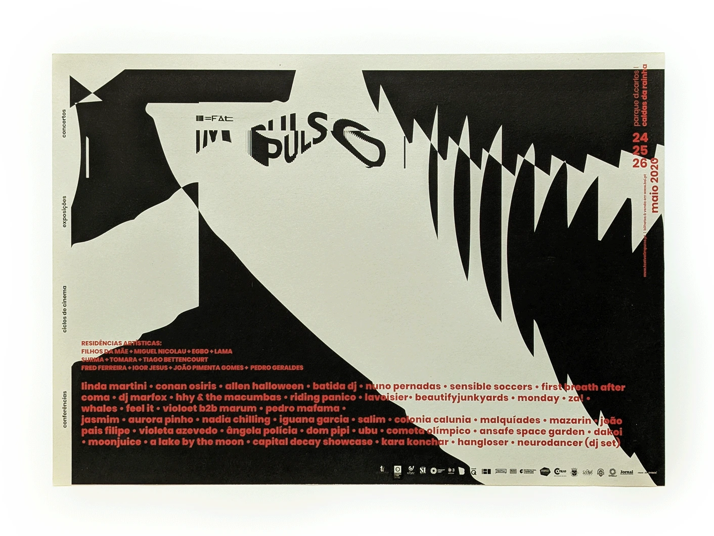
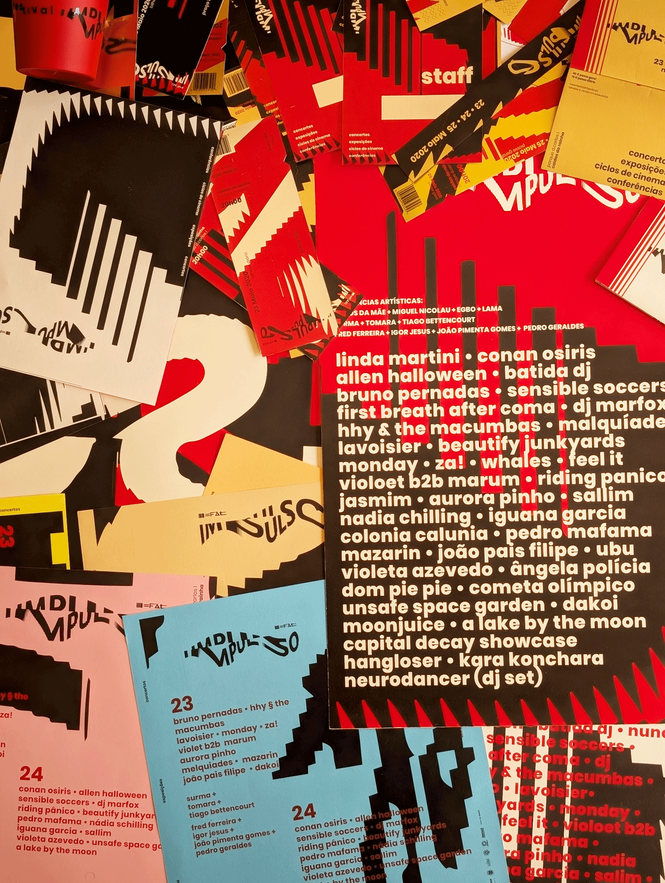
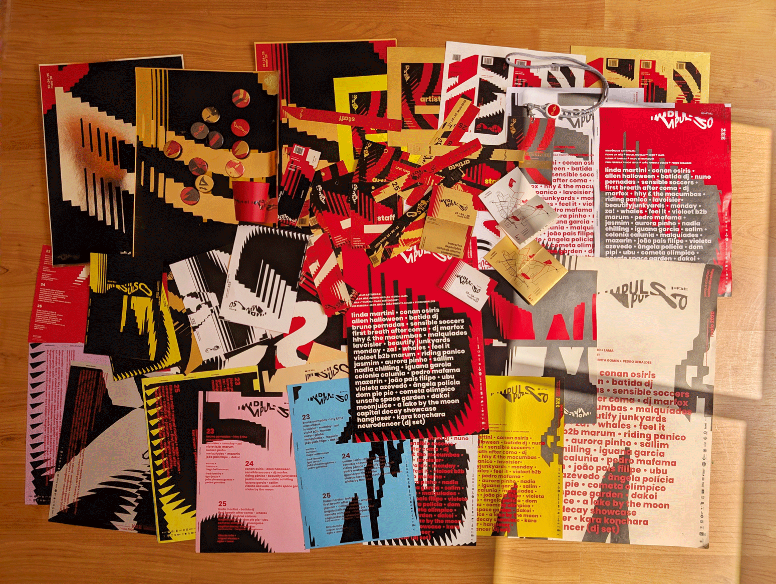
Compilation of selected printed materials
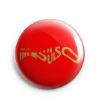
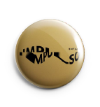
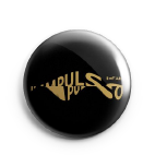
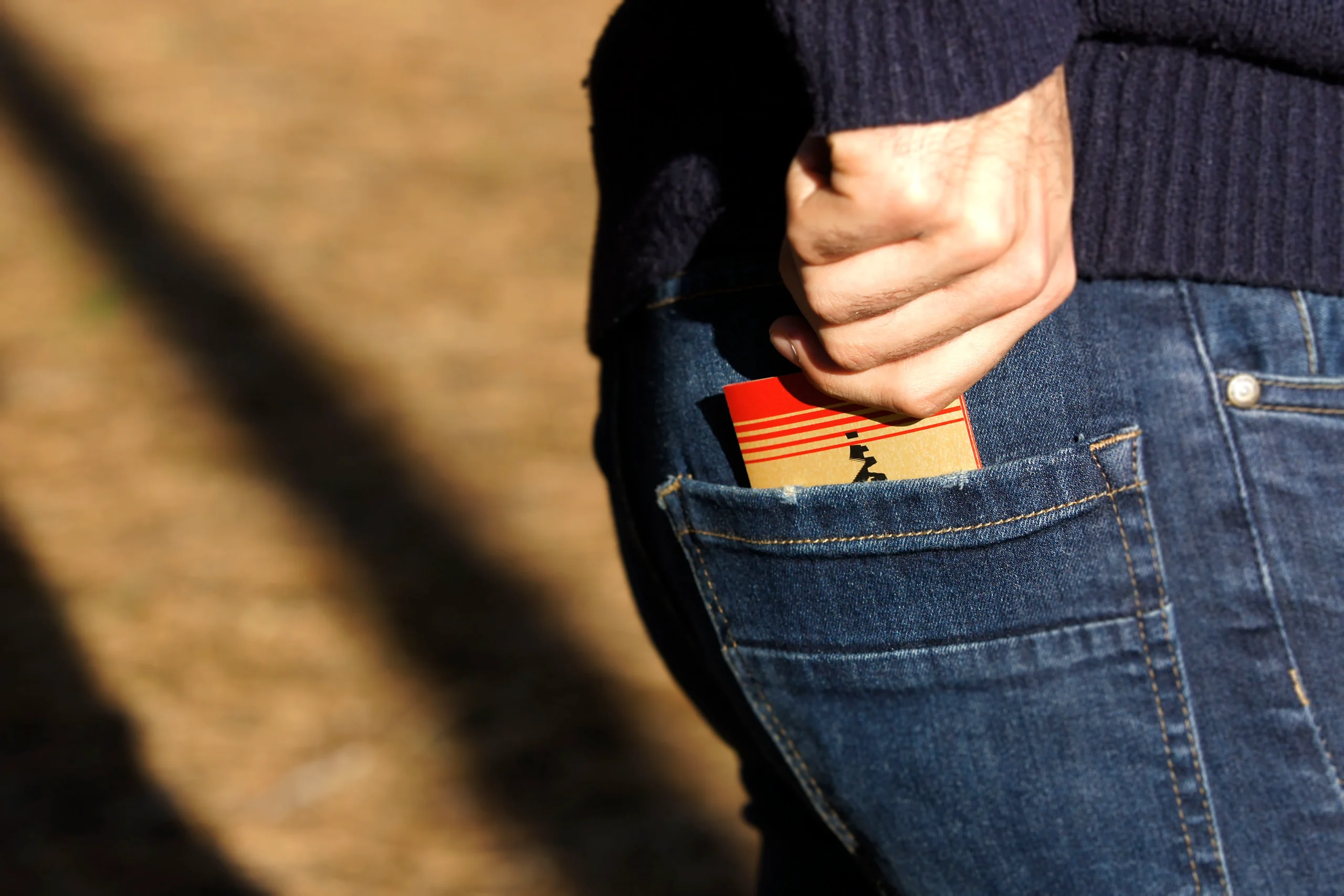
Stickers


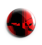
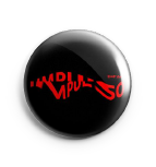
Pins


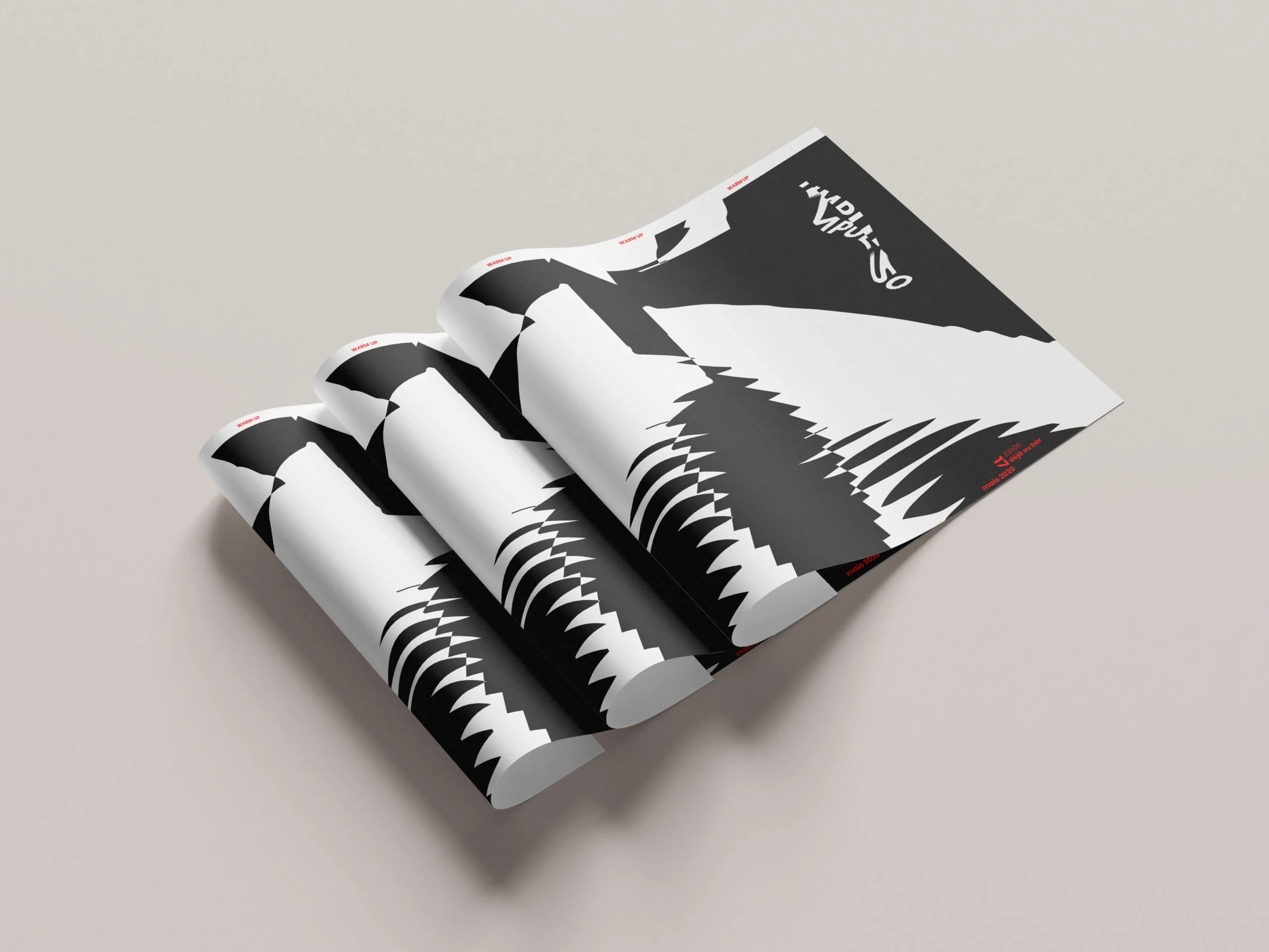
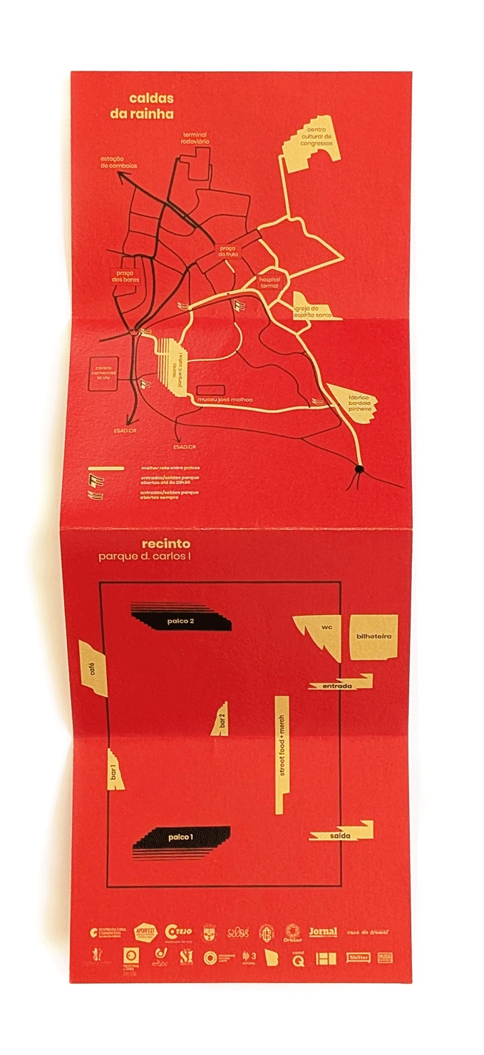
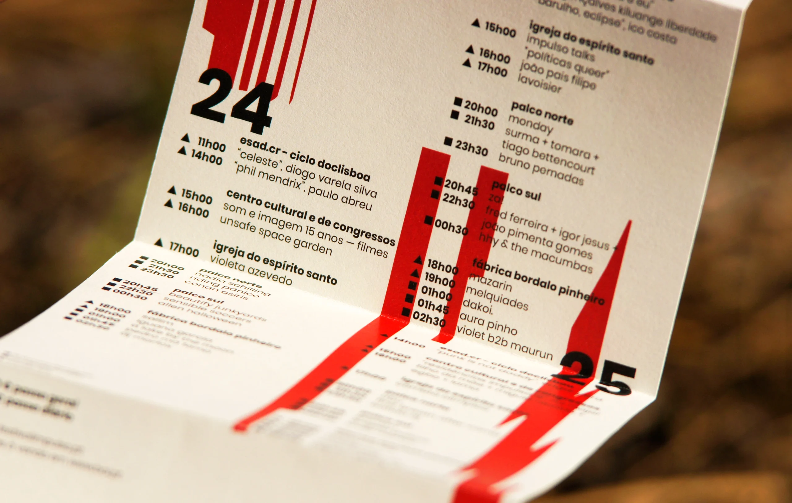
Fold-out program
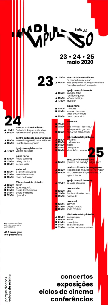
Warm-up / Pré-release

Program photographs
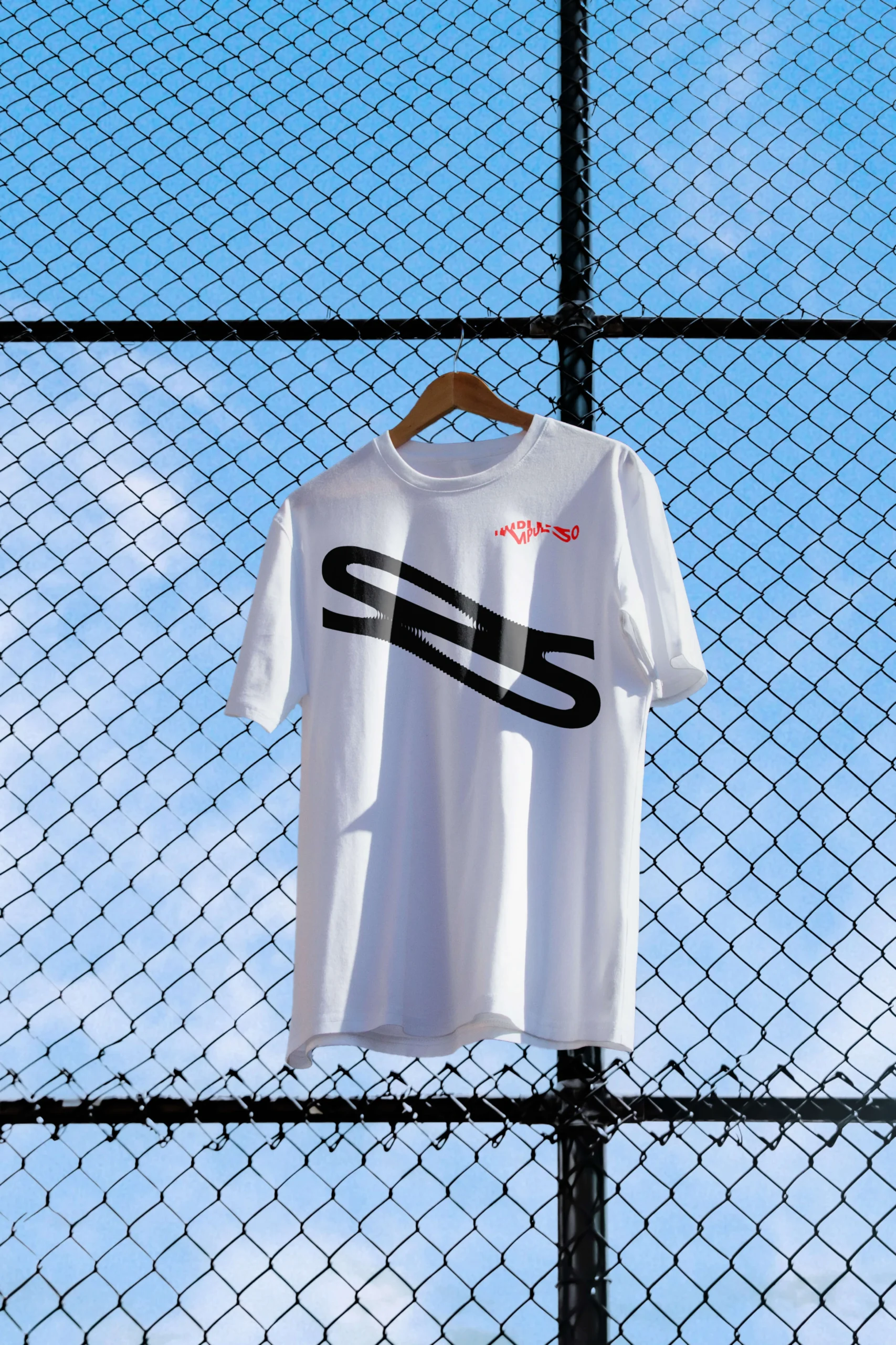
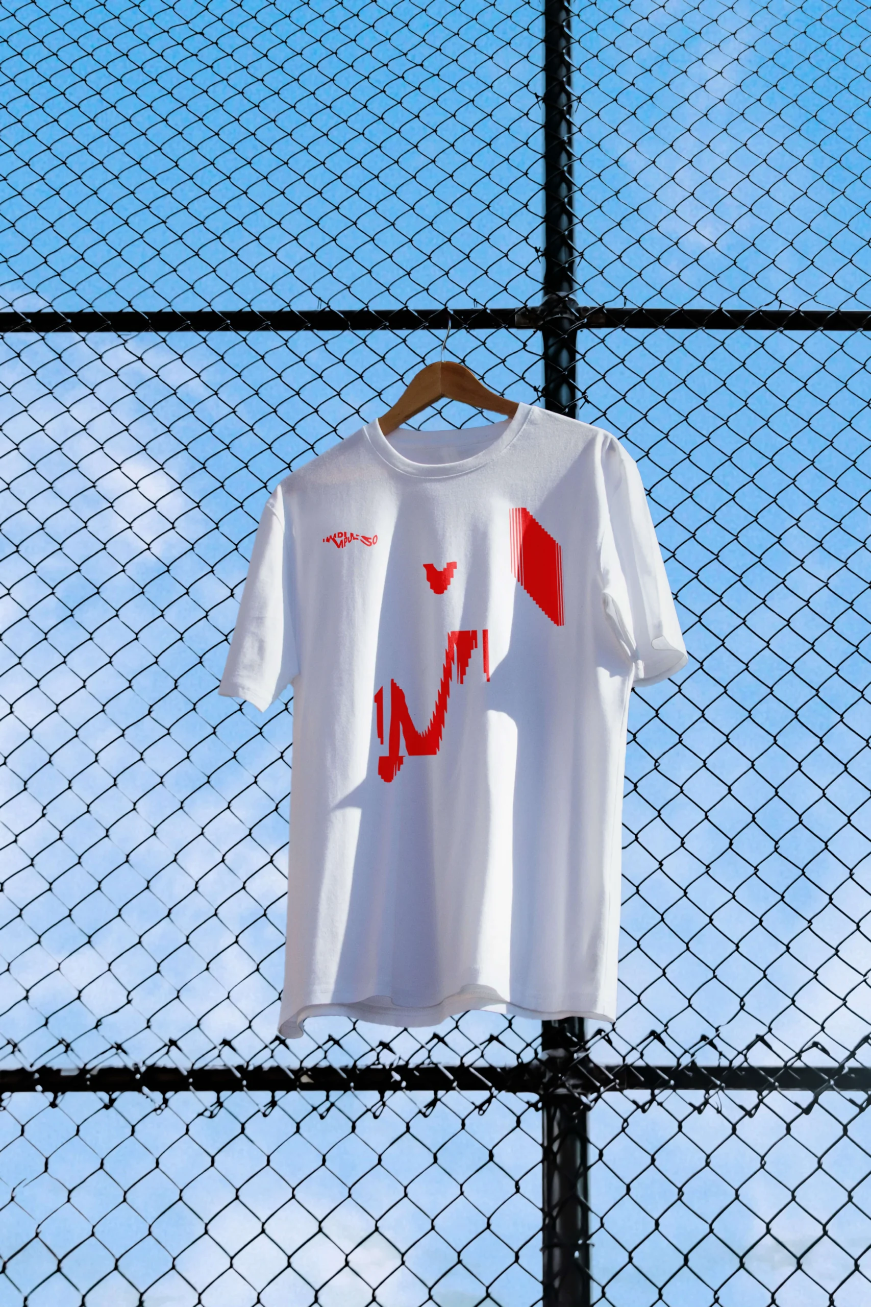
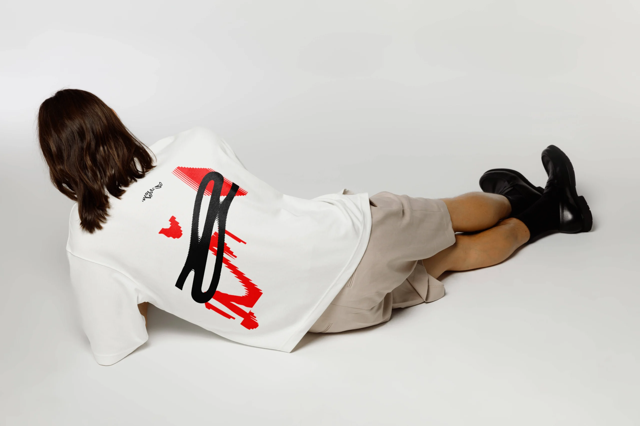
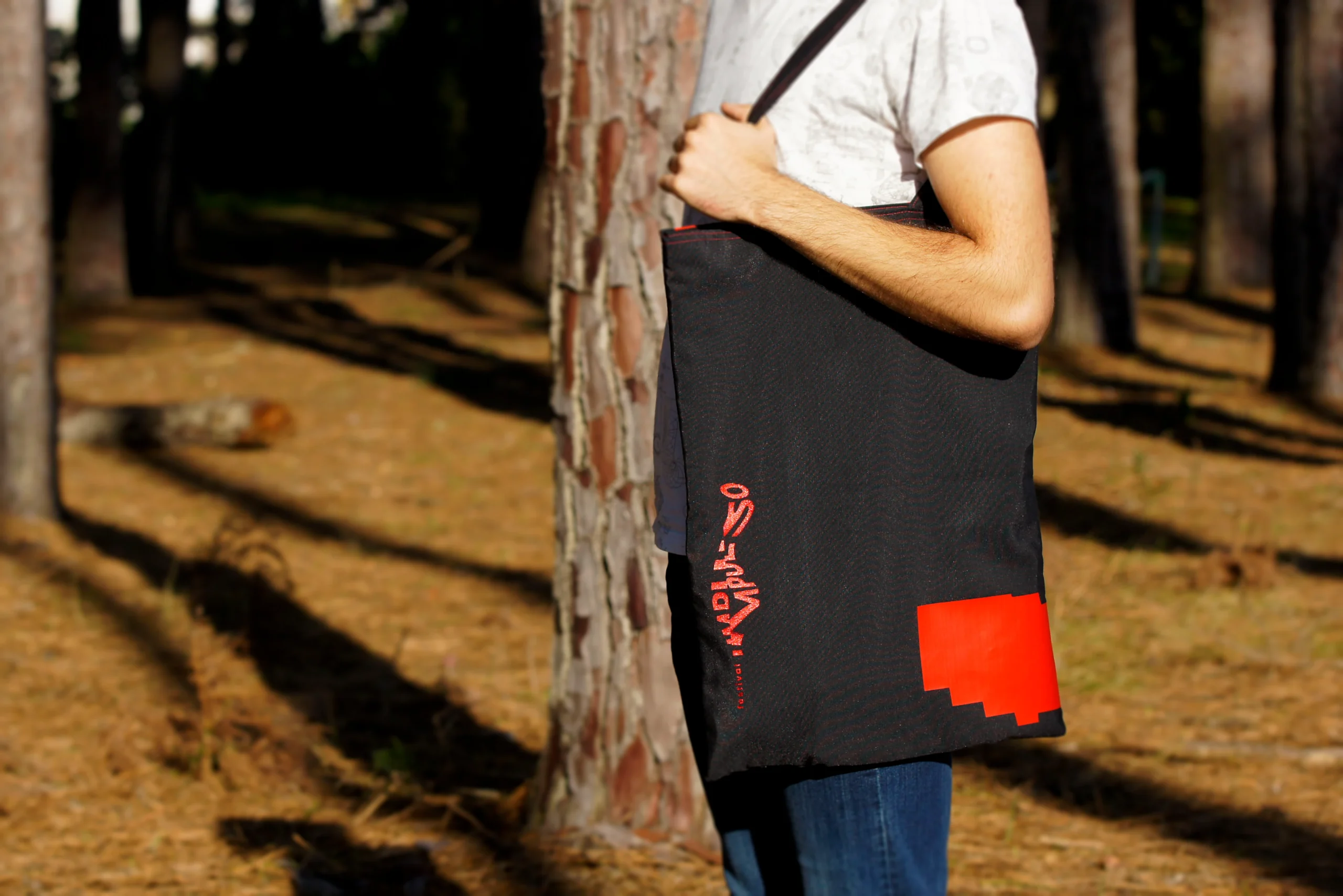
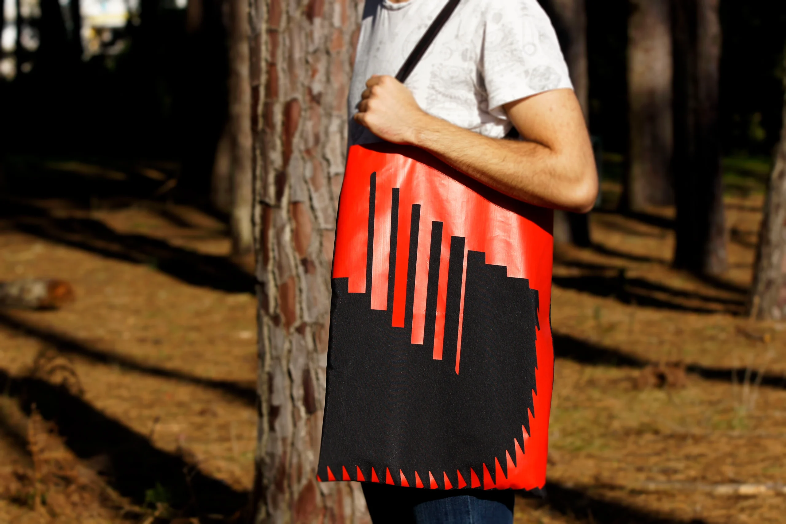
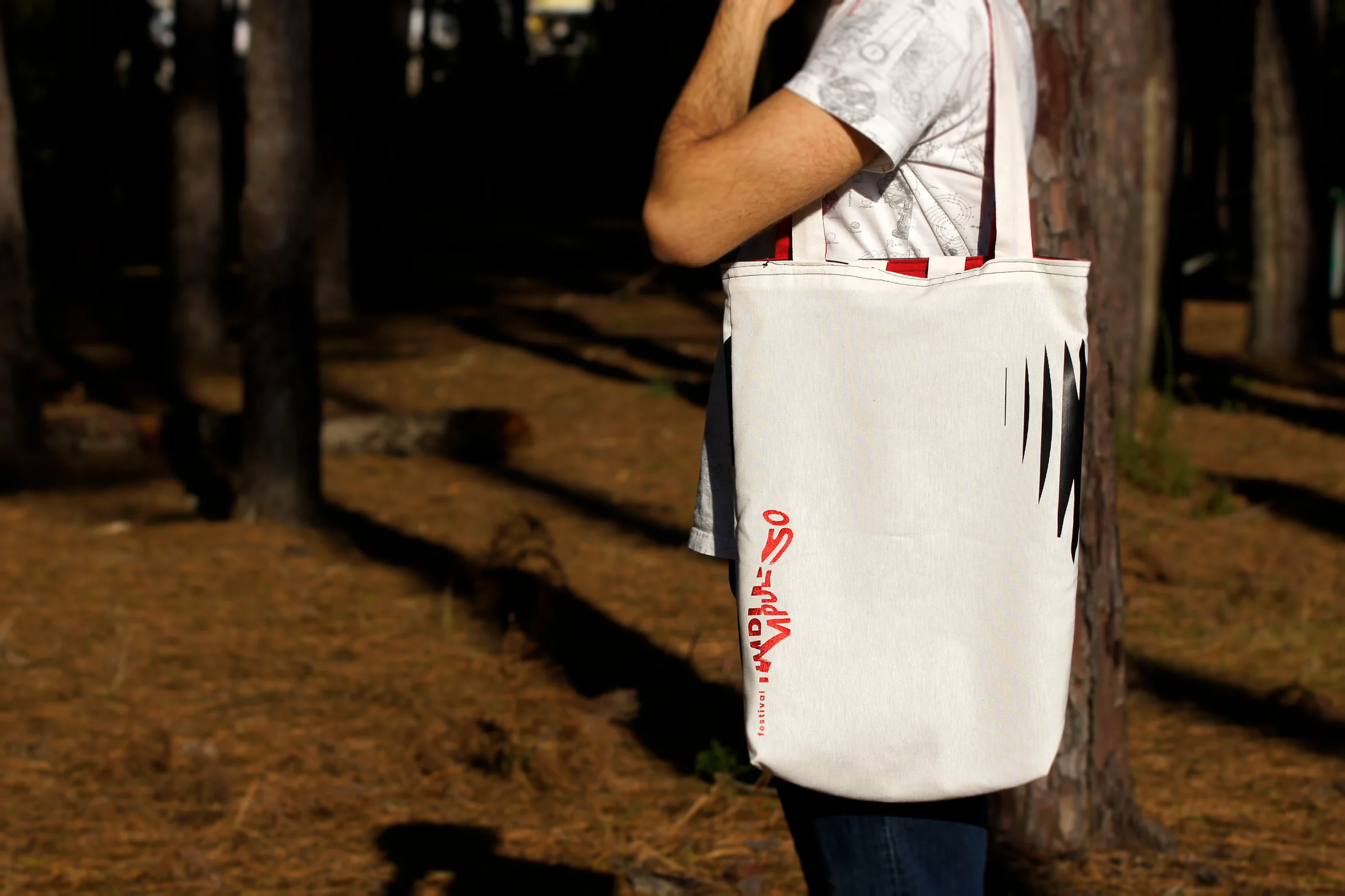
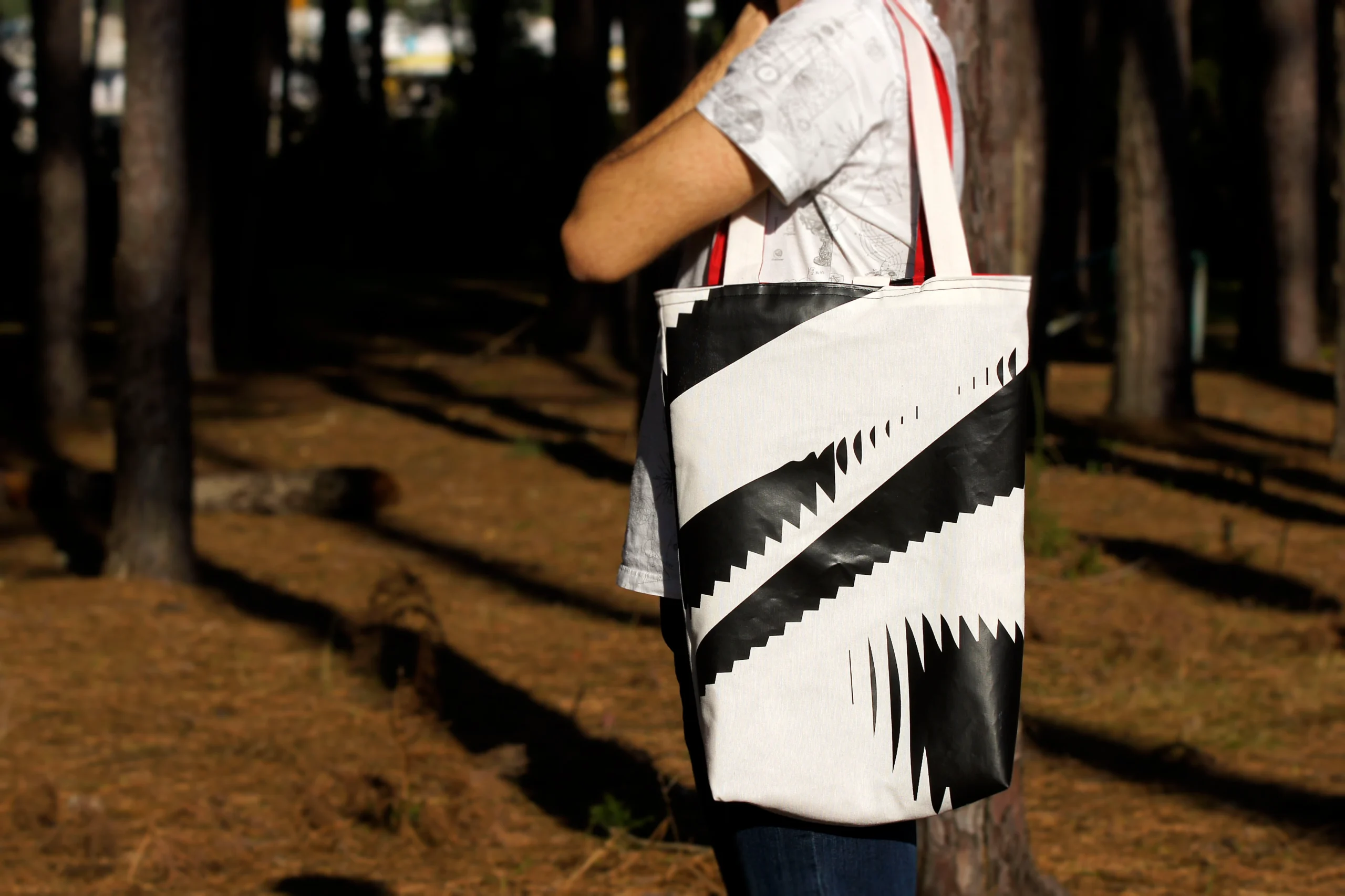
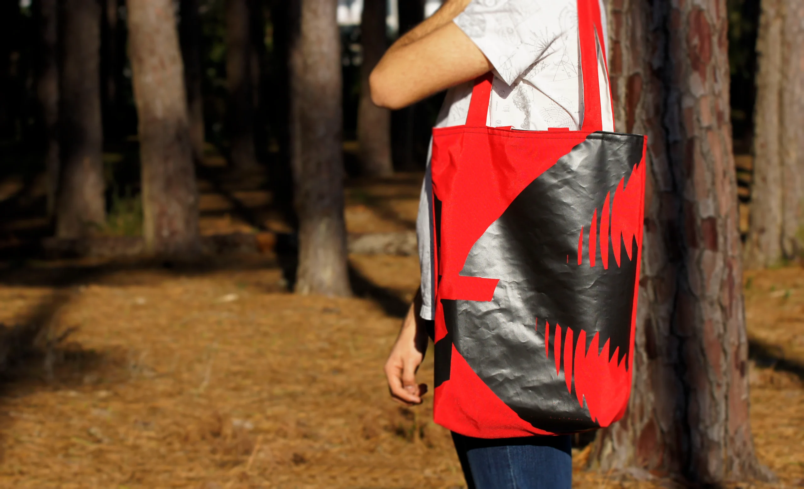
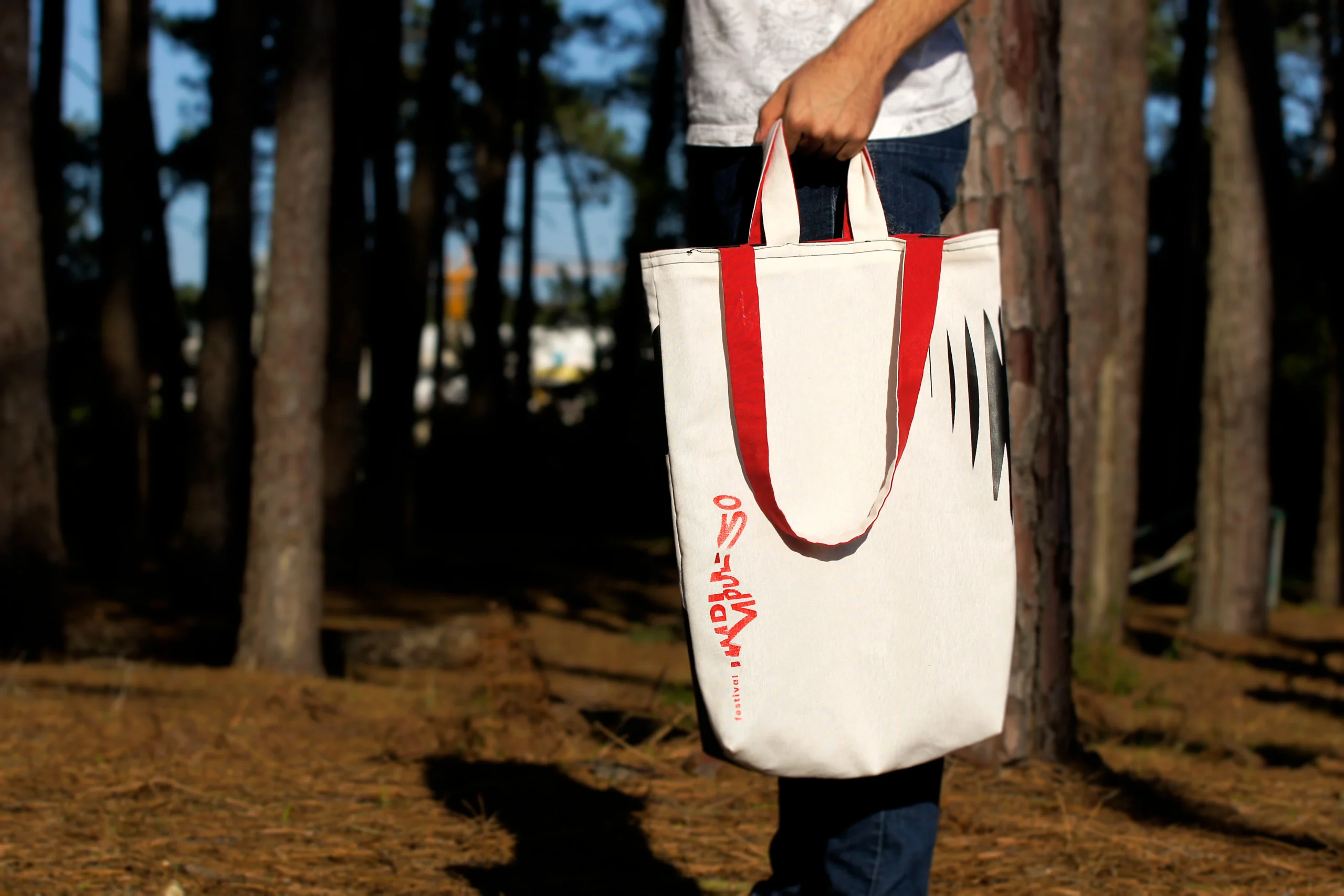
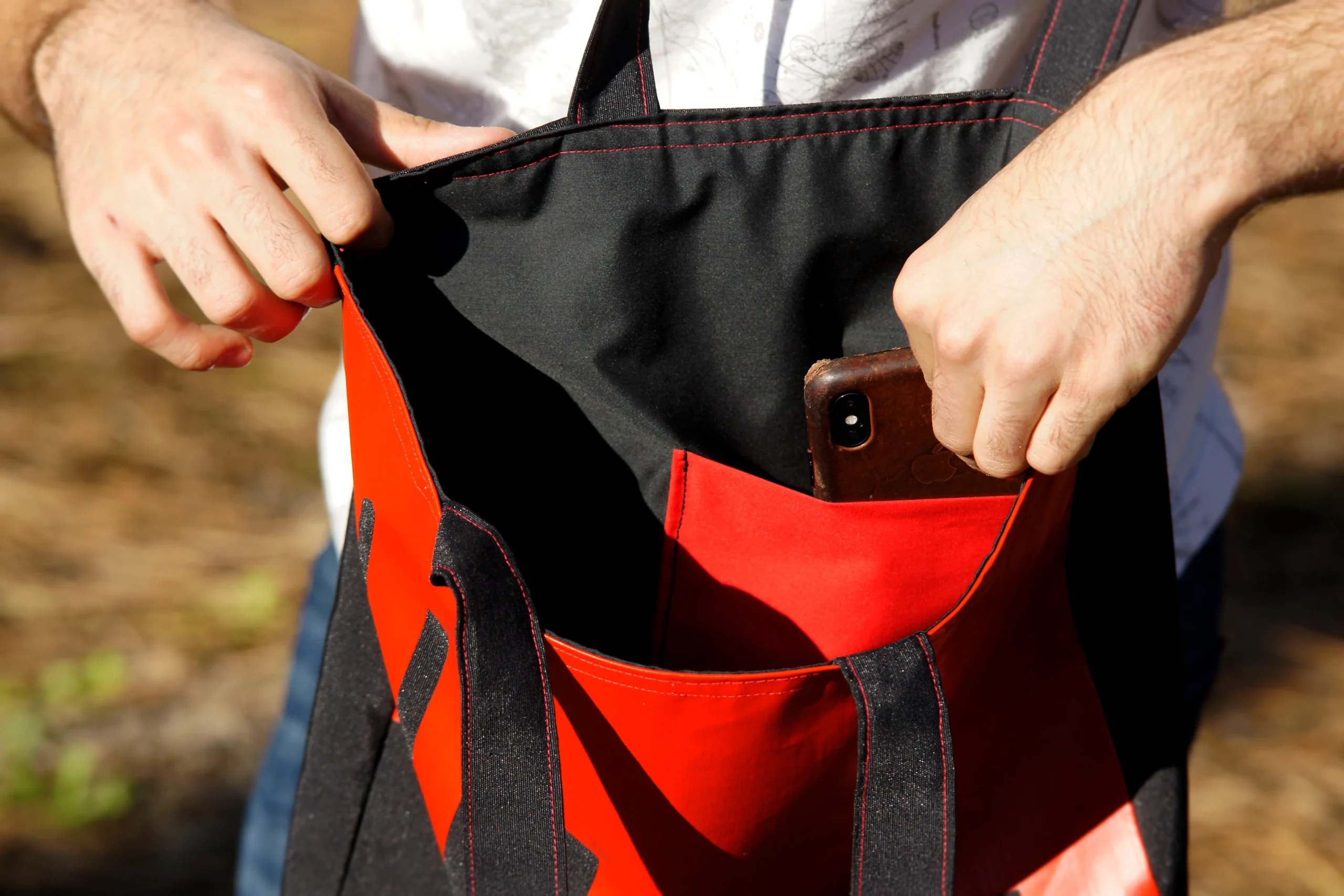
Impulso tote-bags
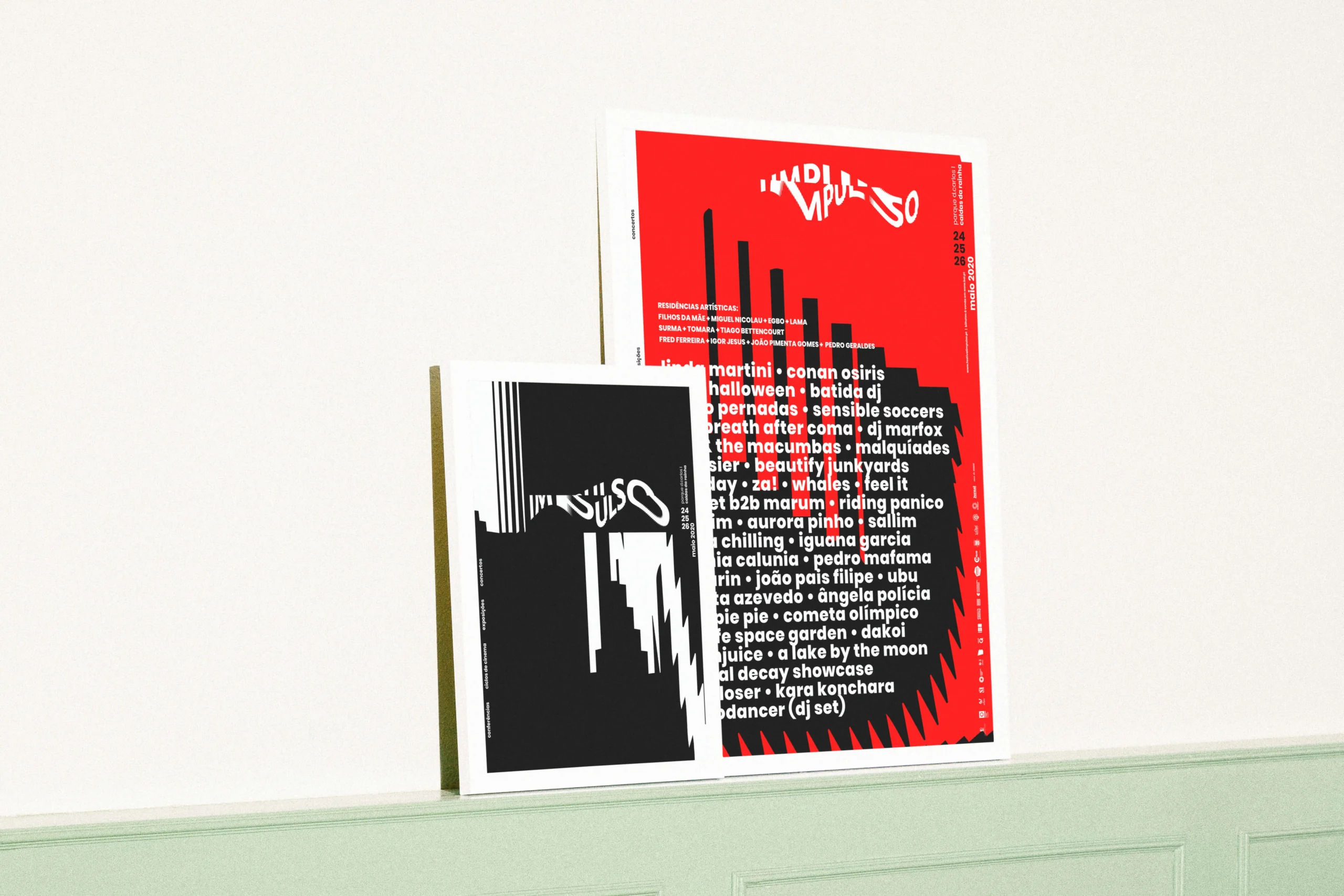
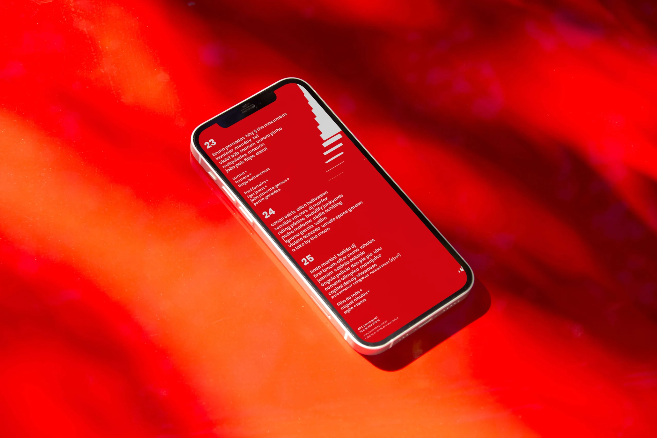
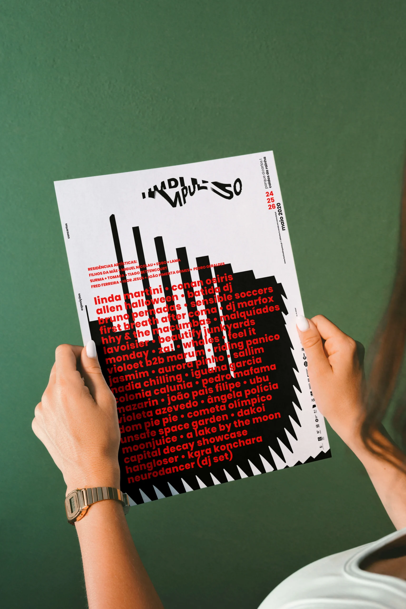
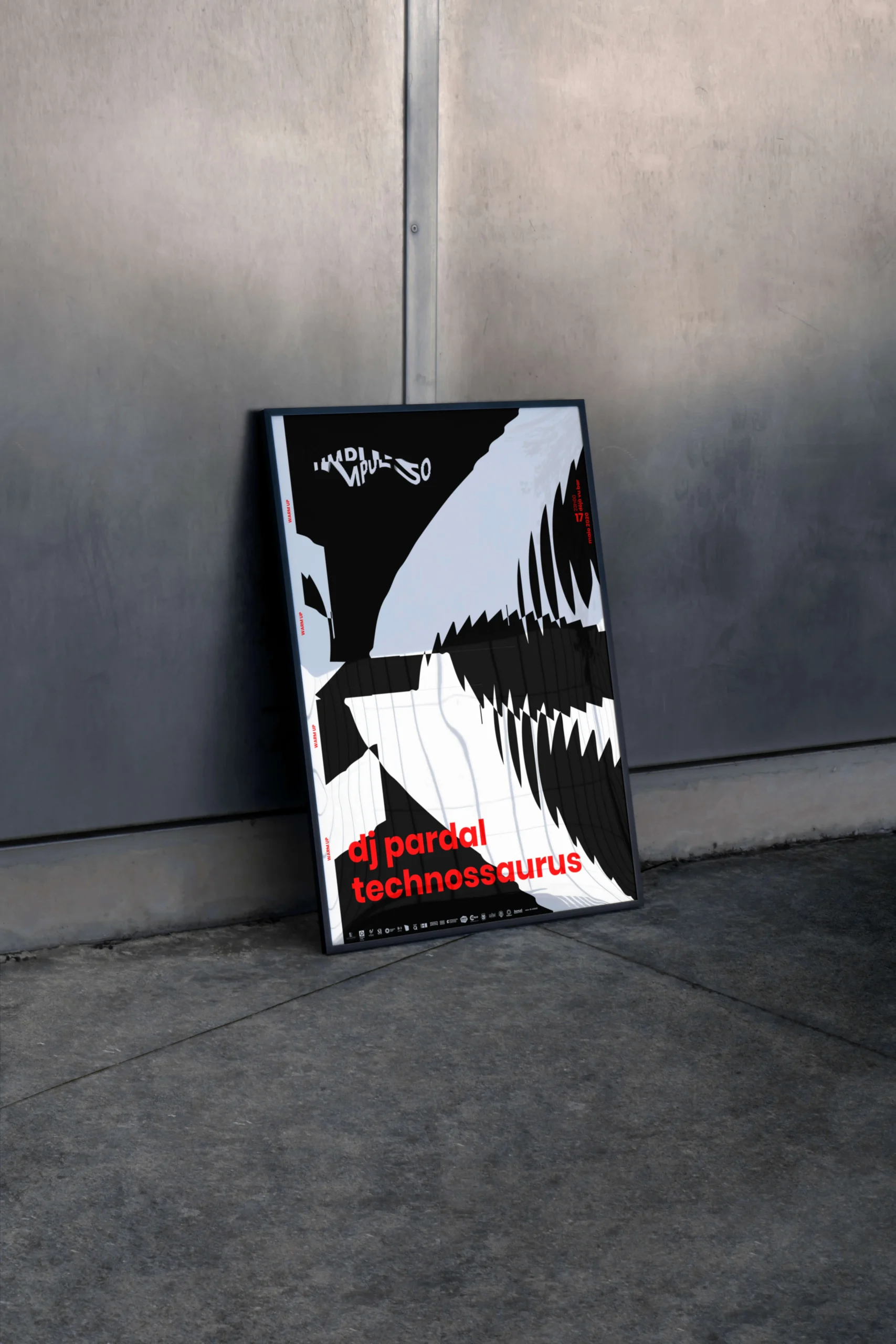
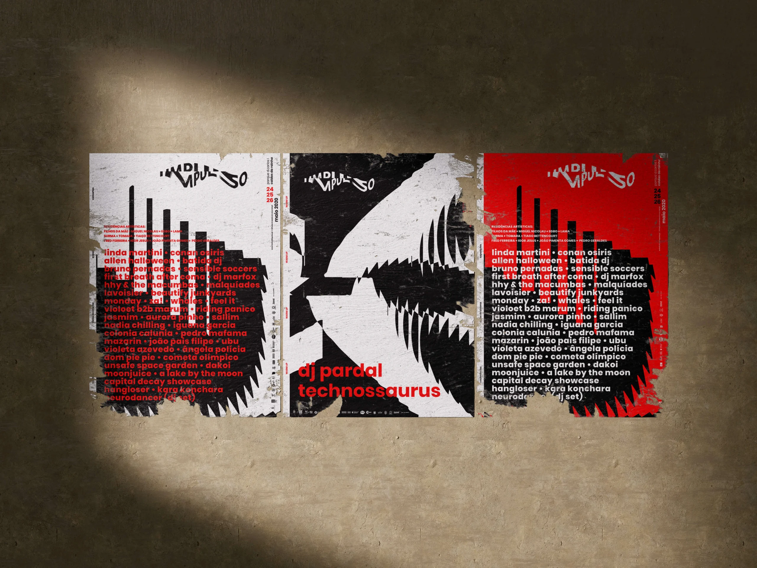
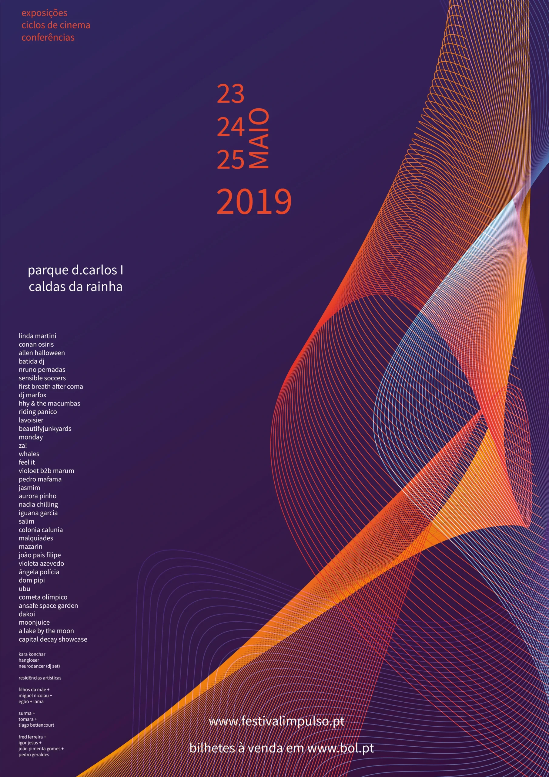
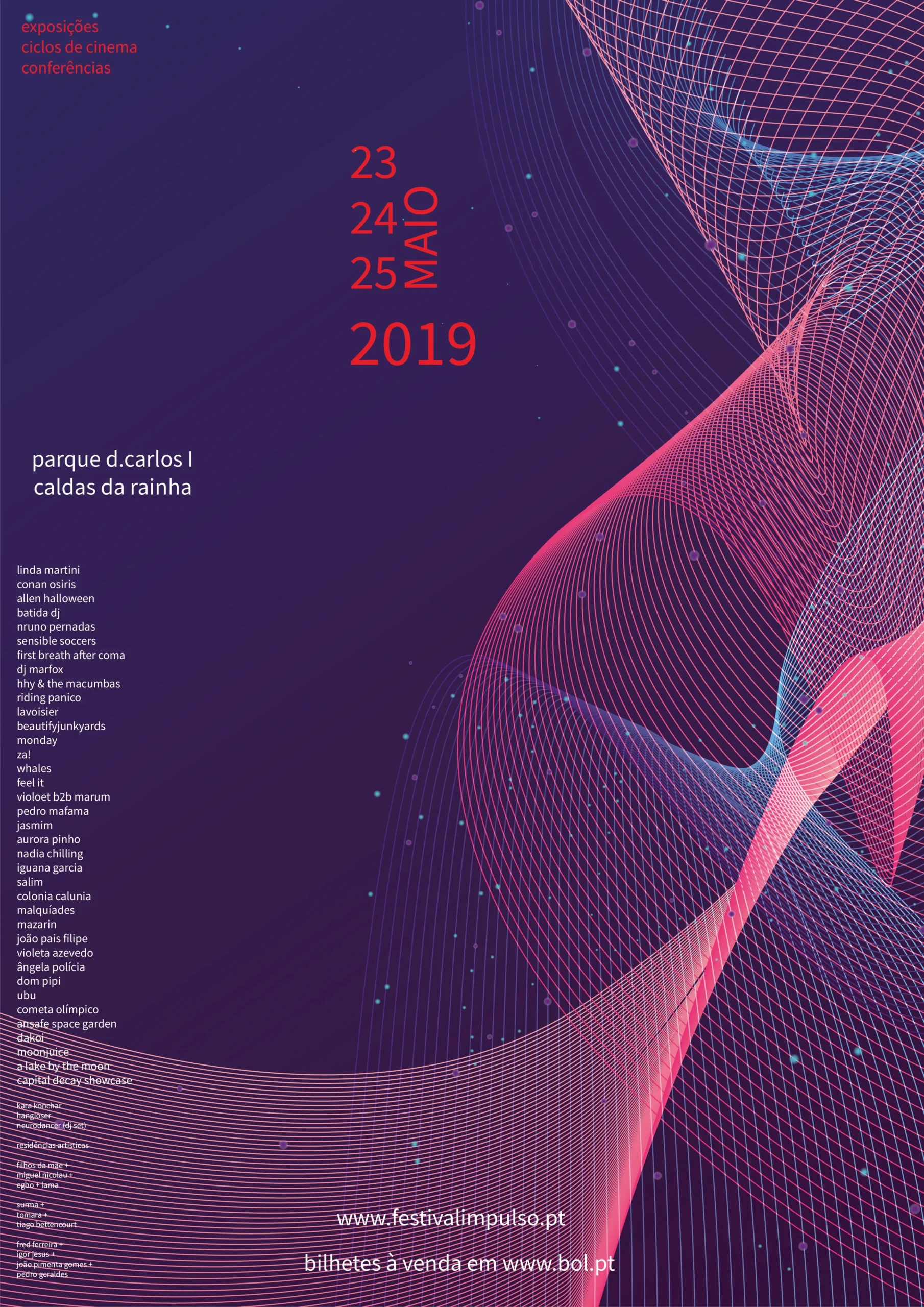
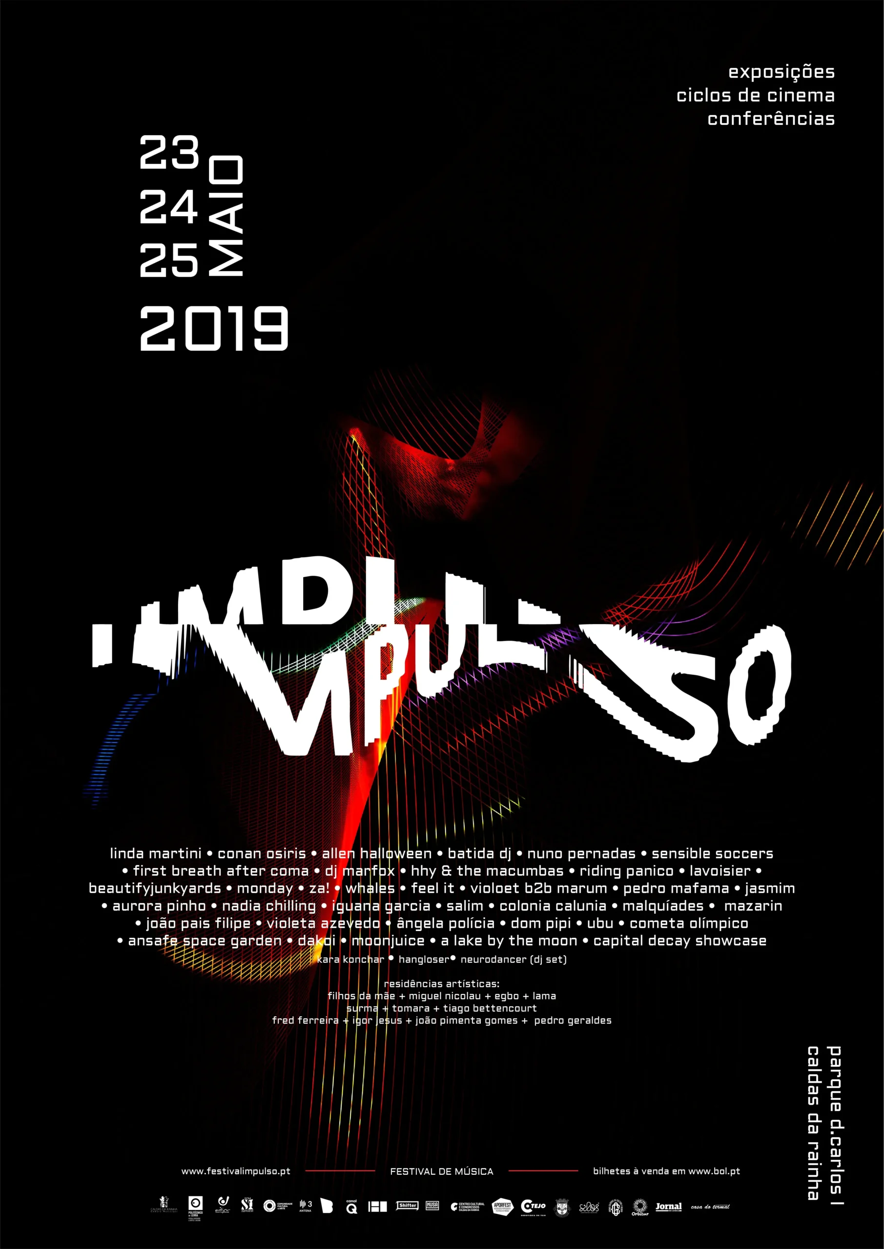
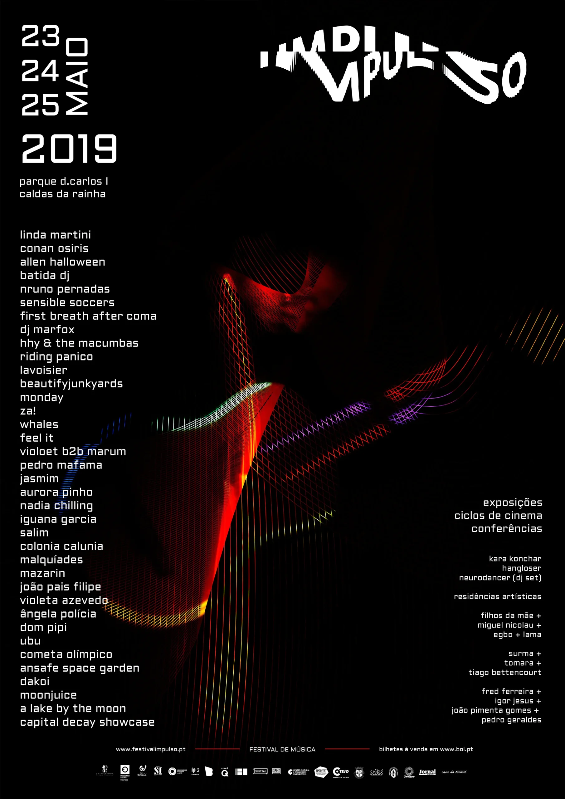
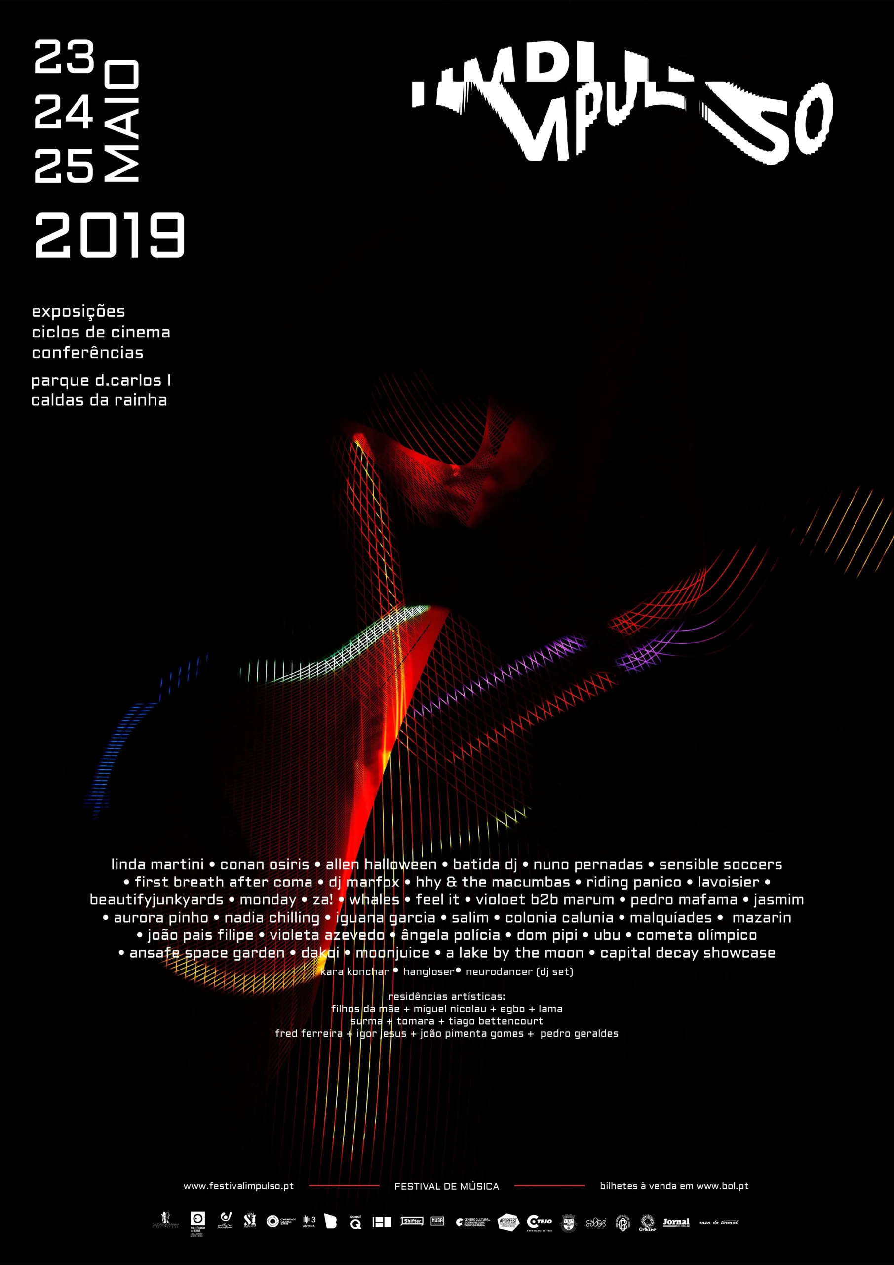
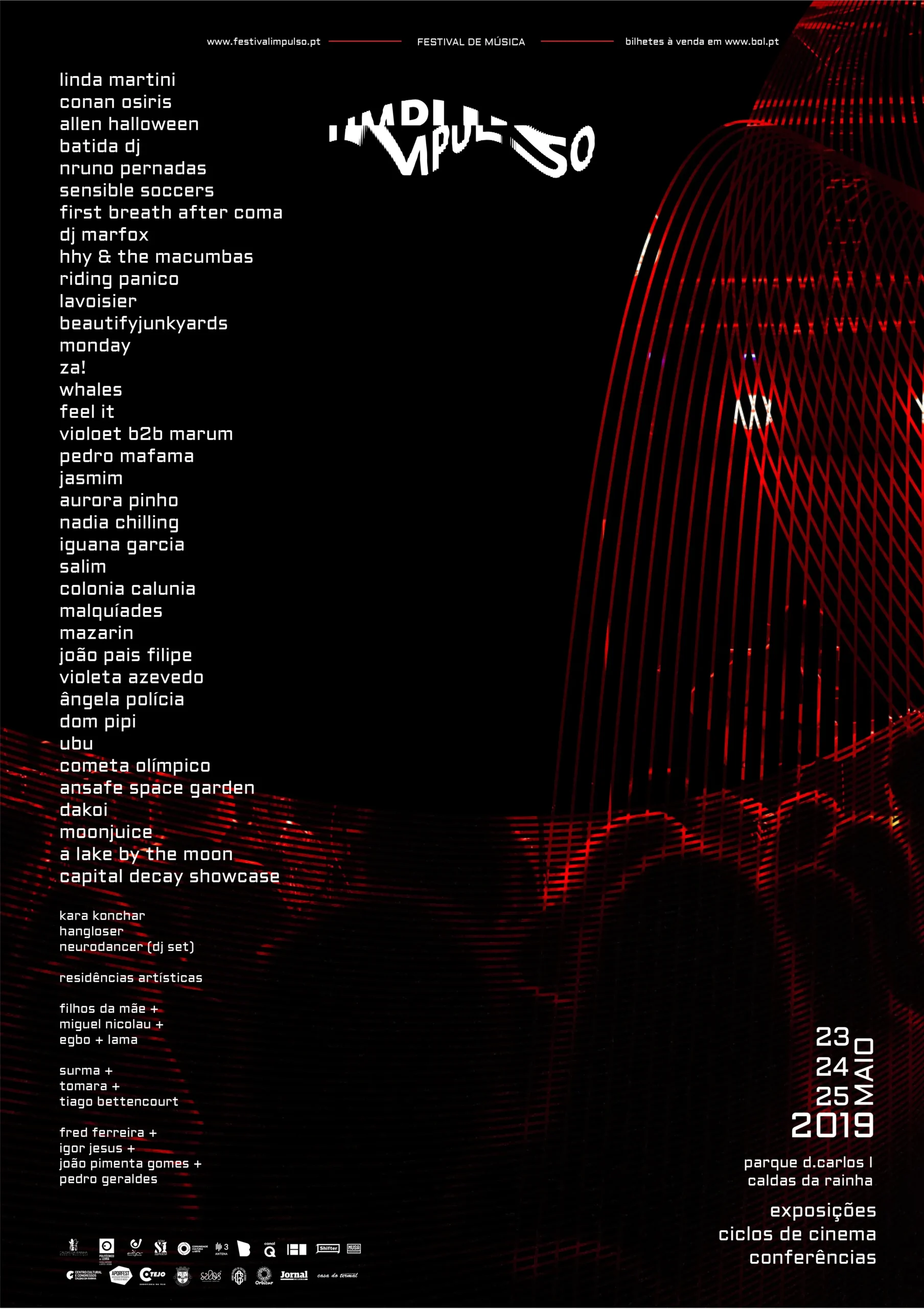
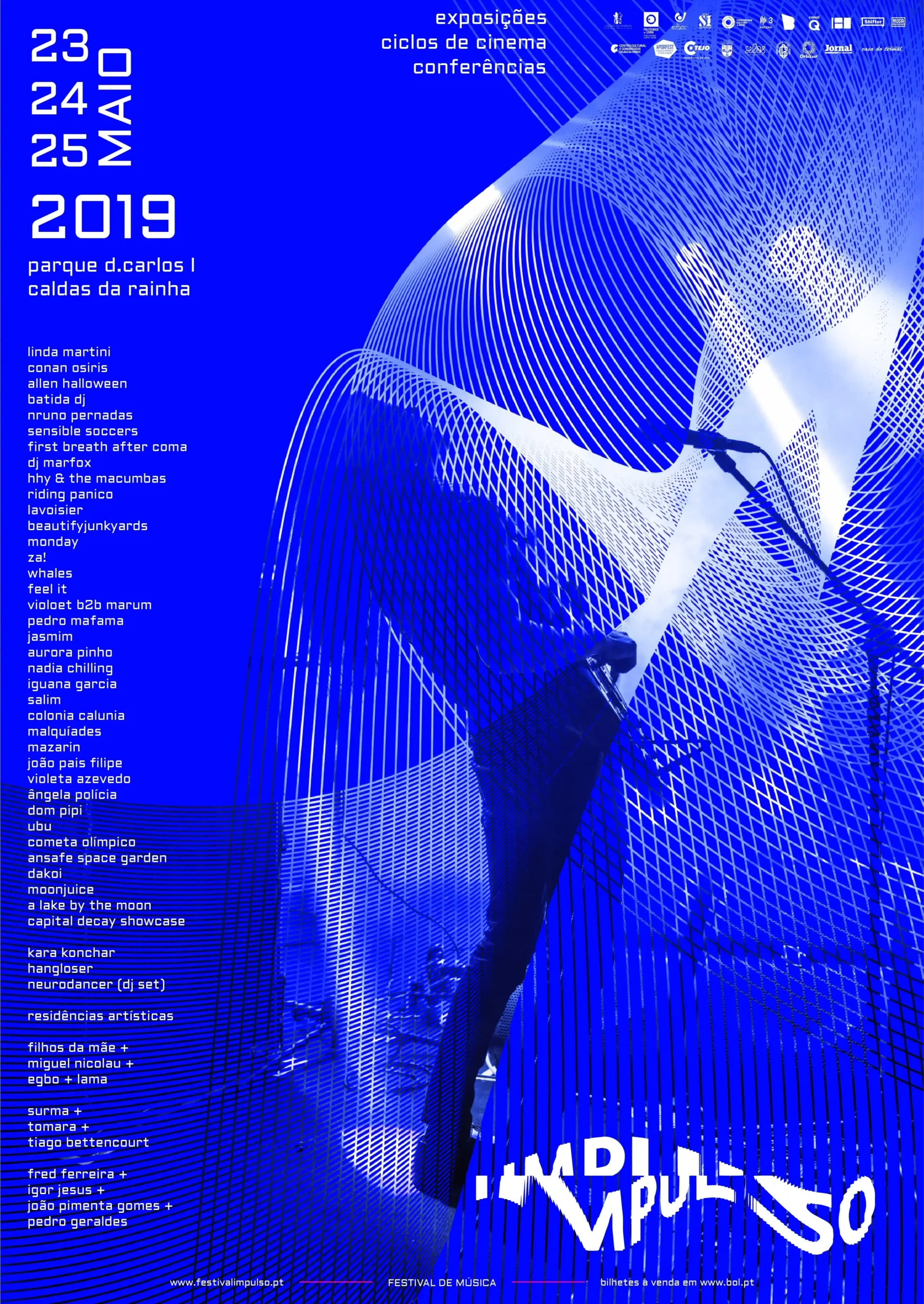
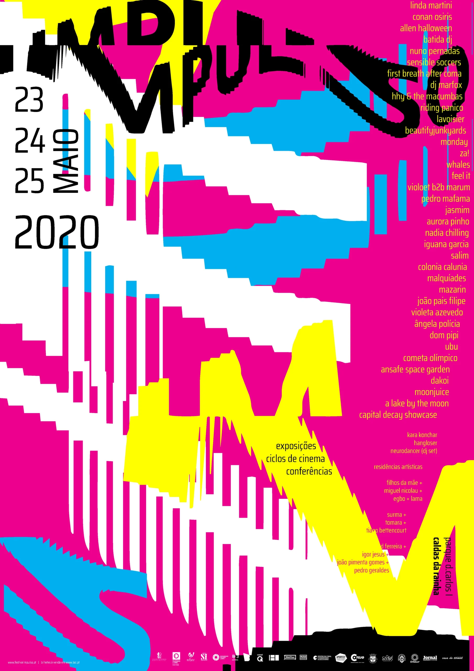
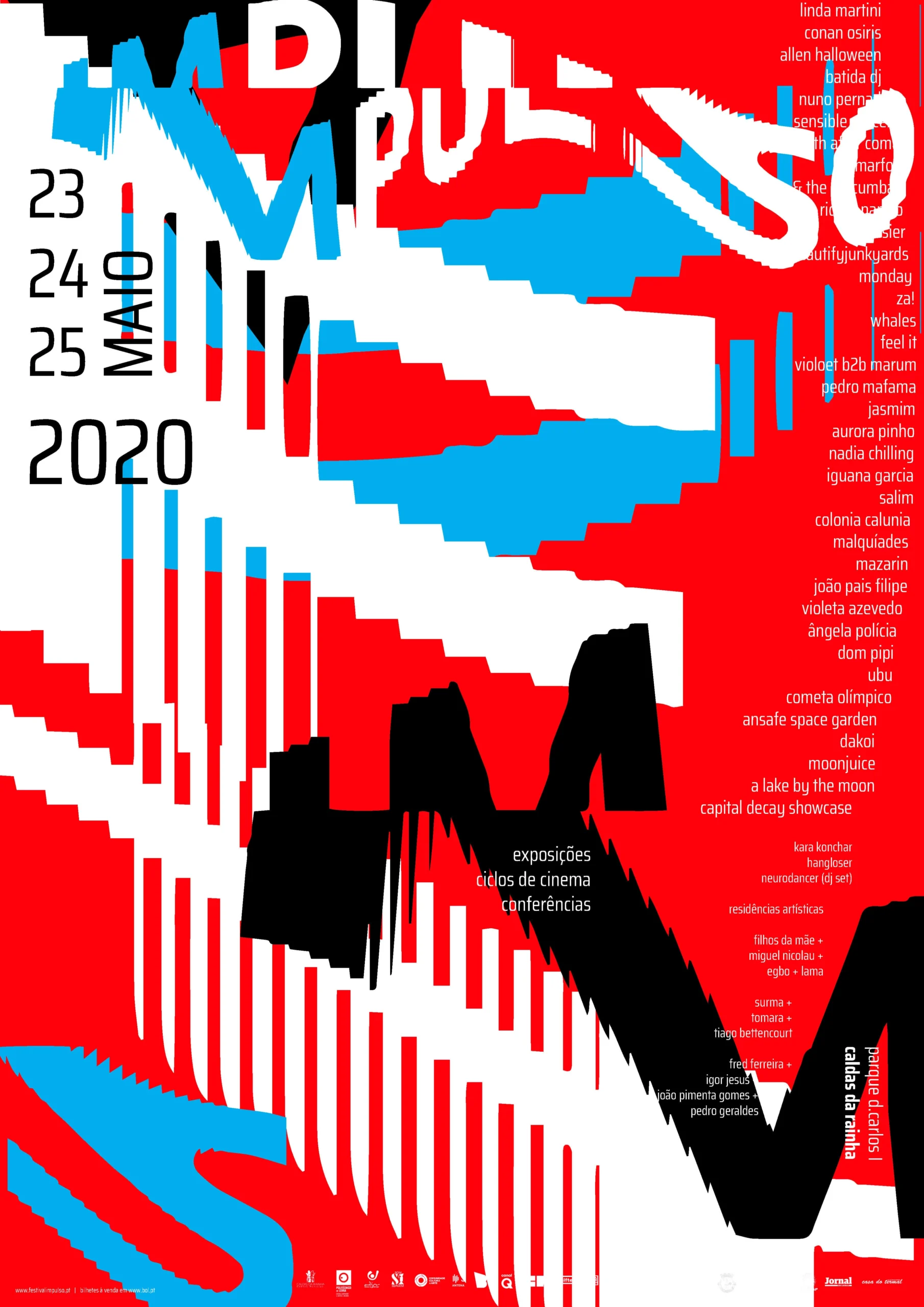
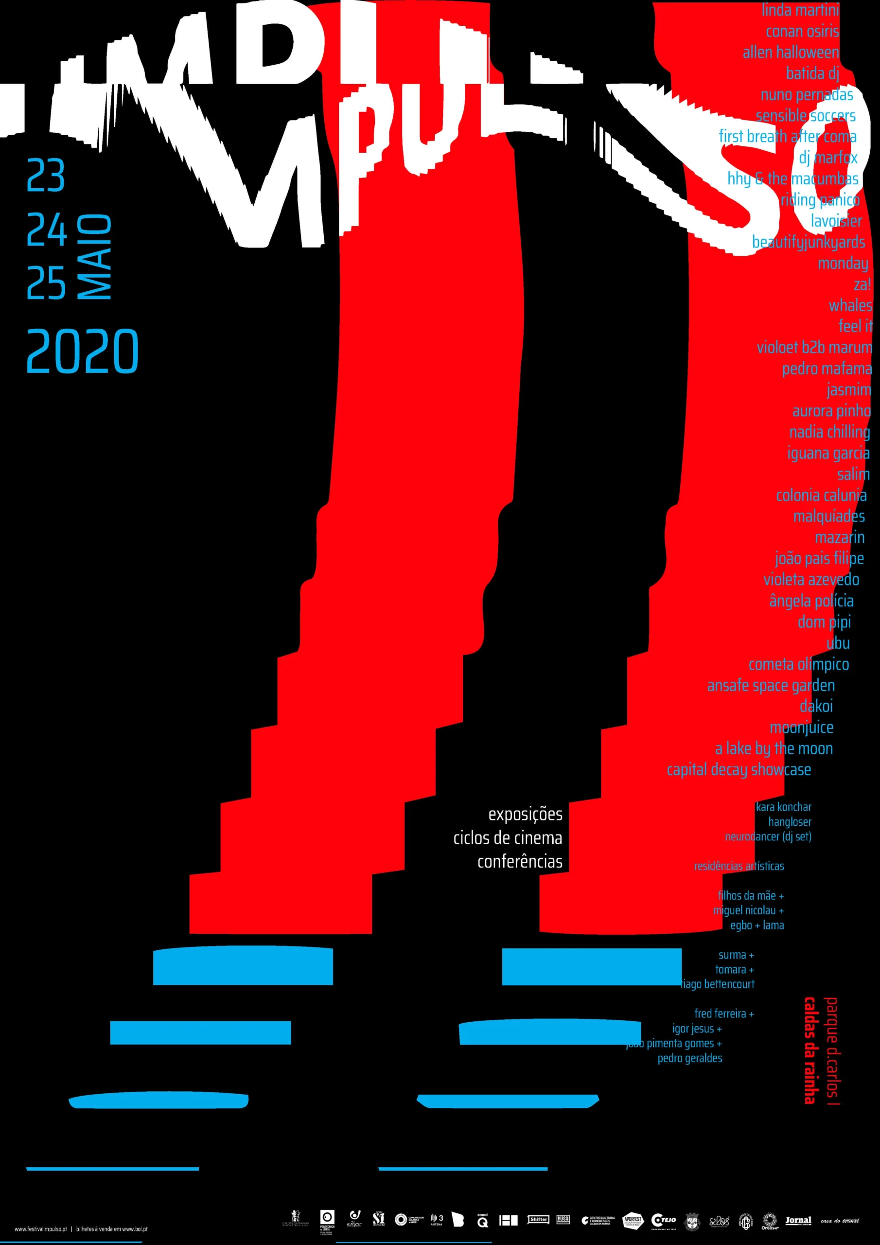
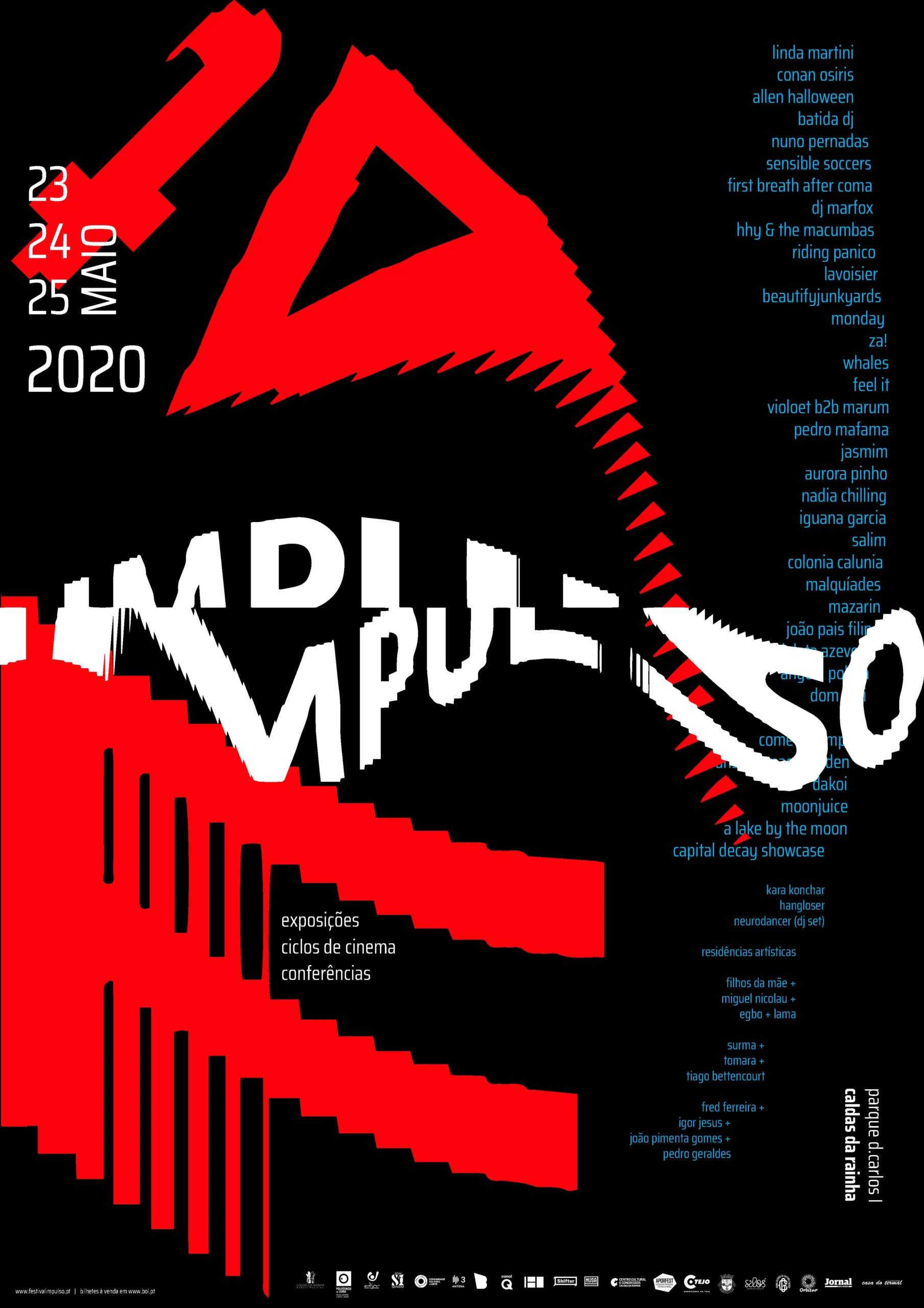
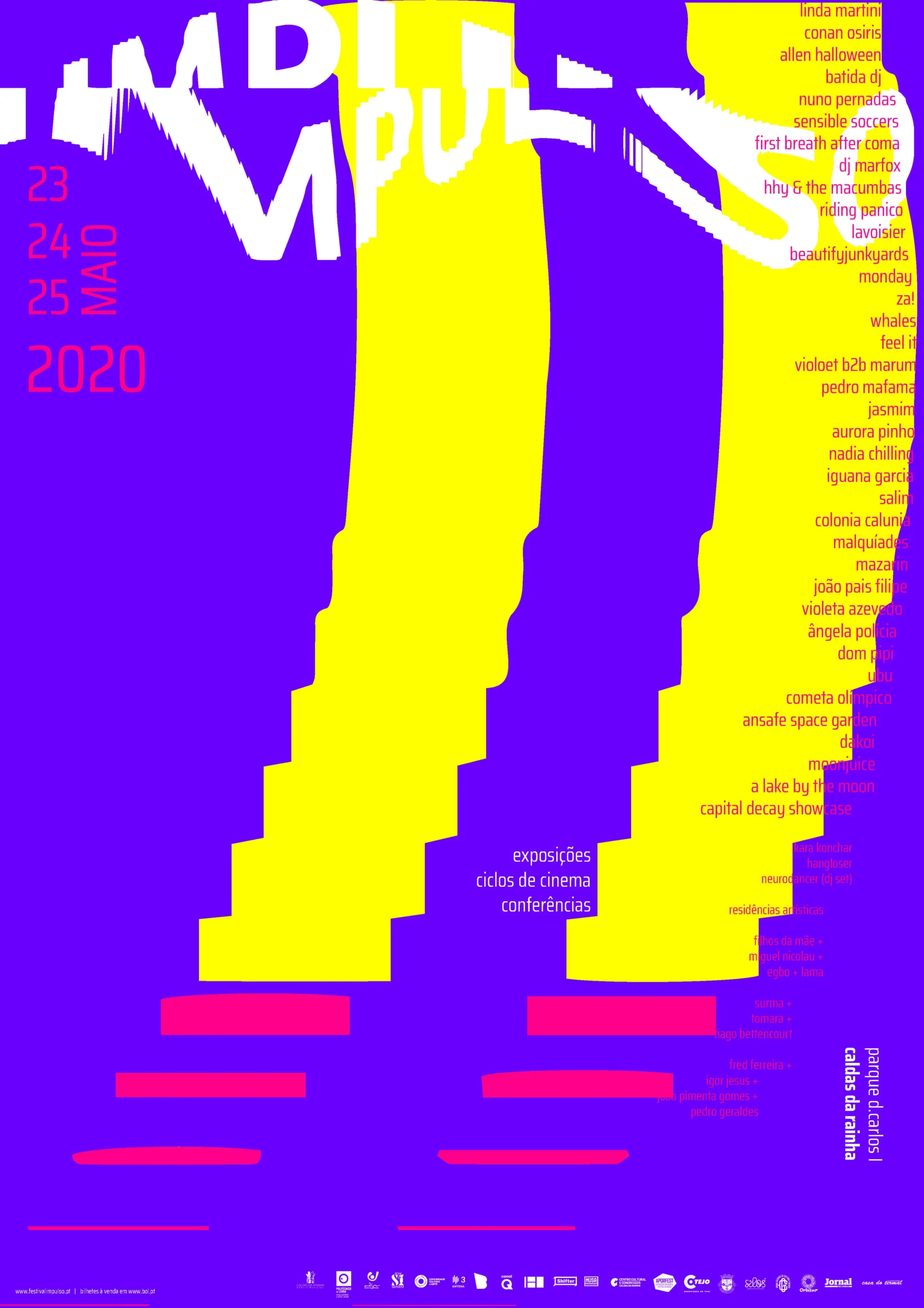
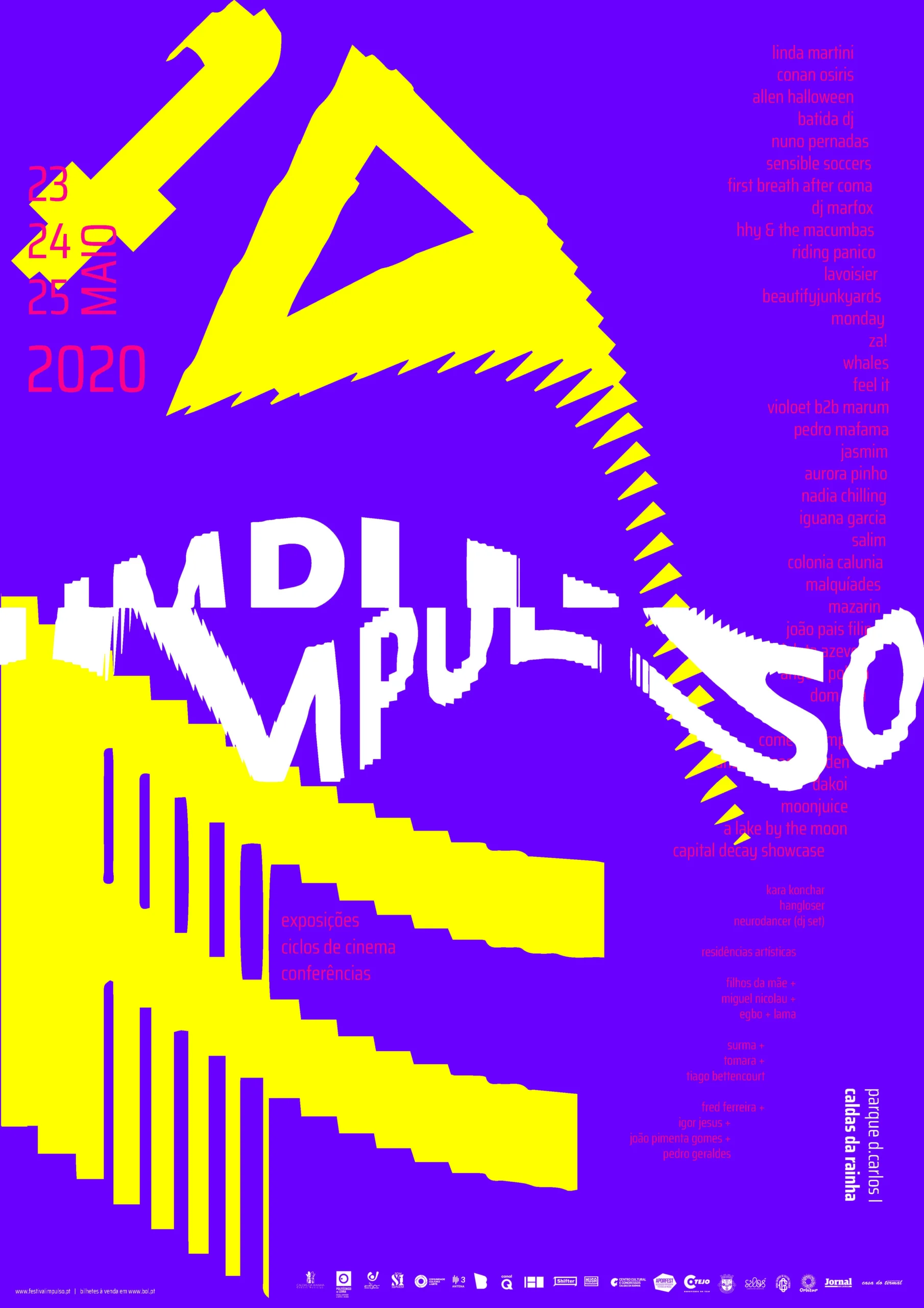
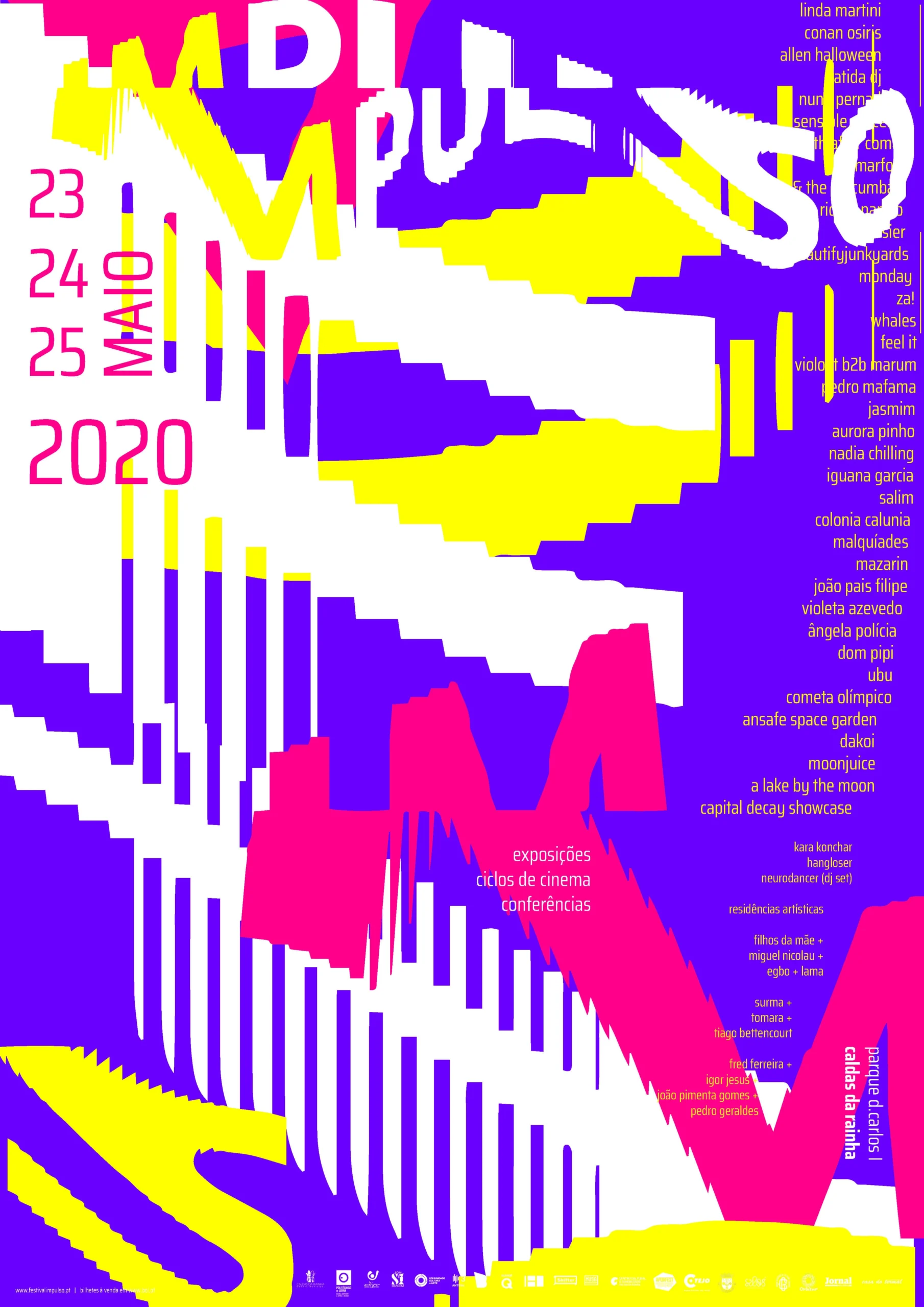
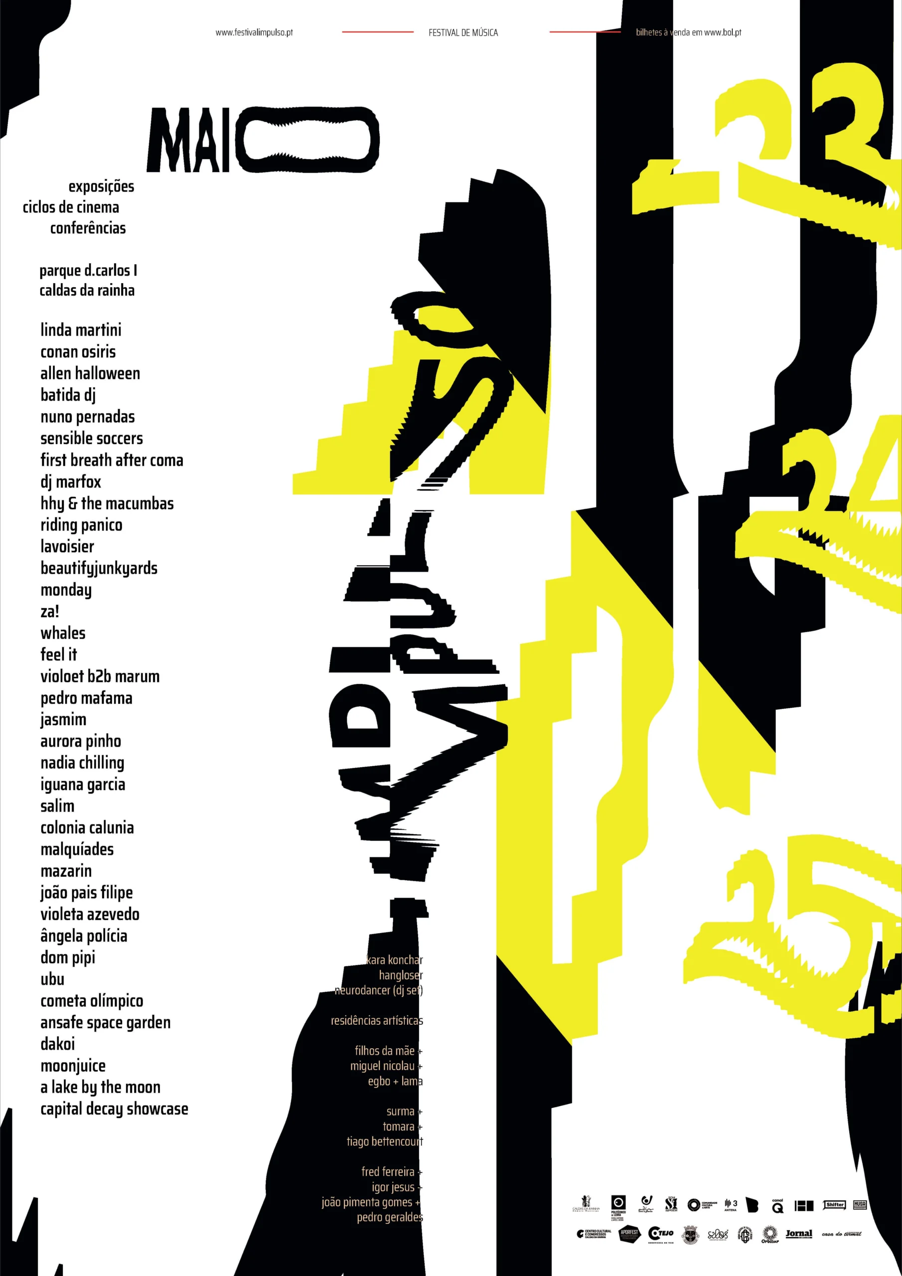
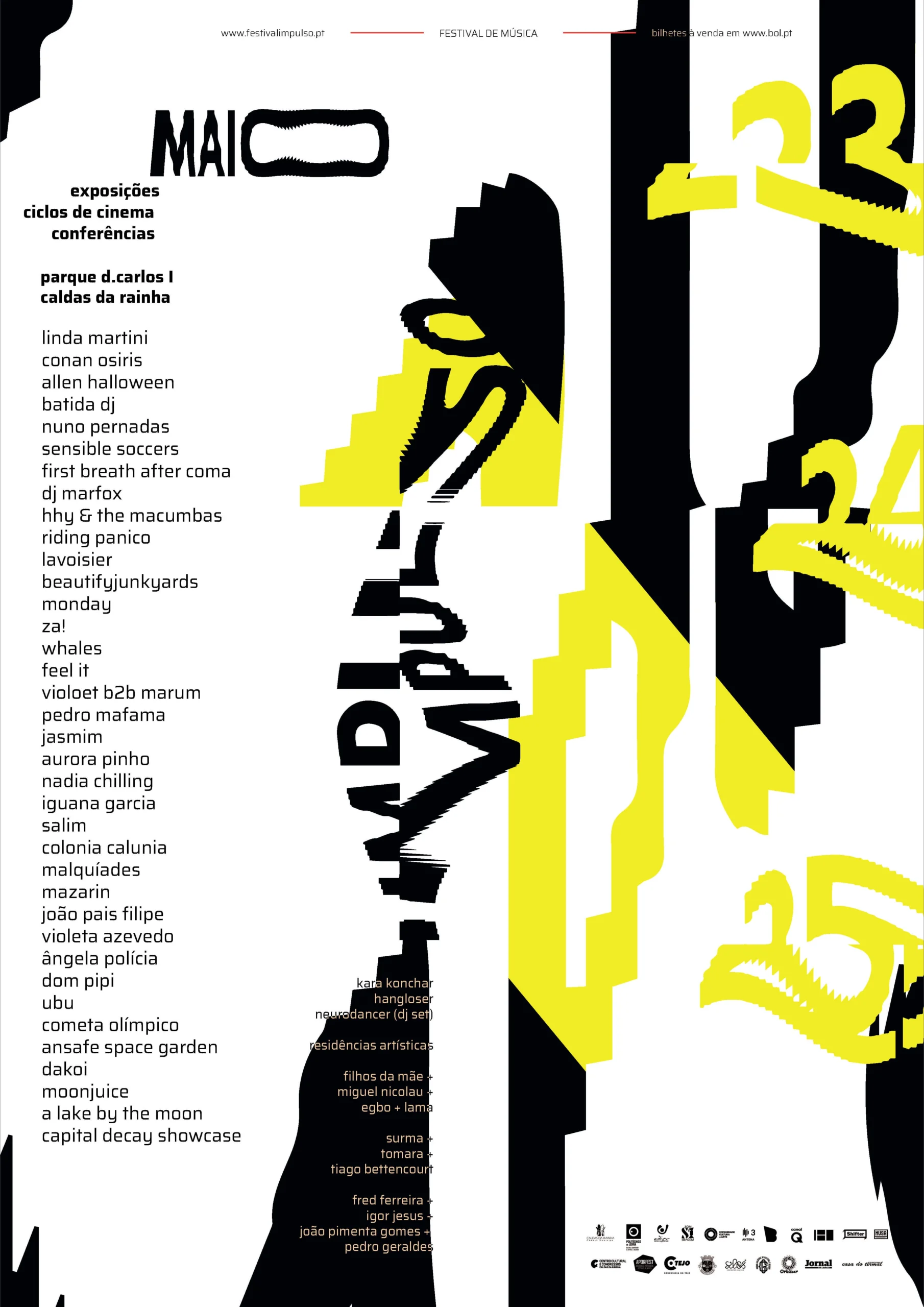
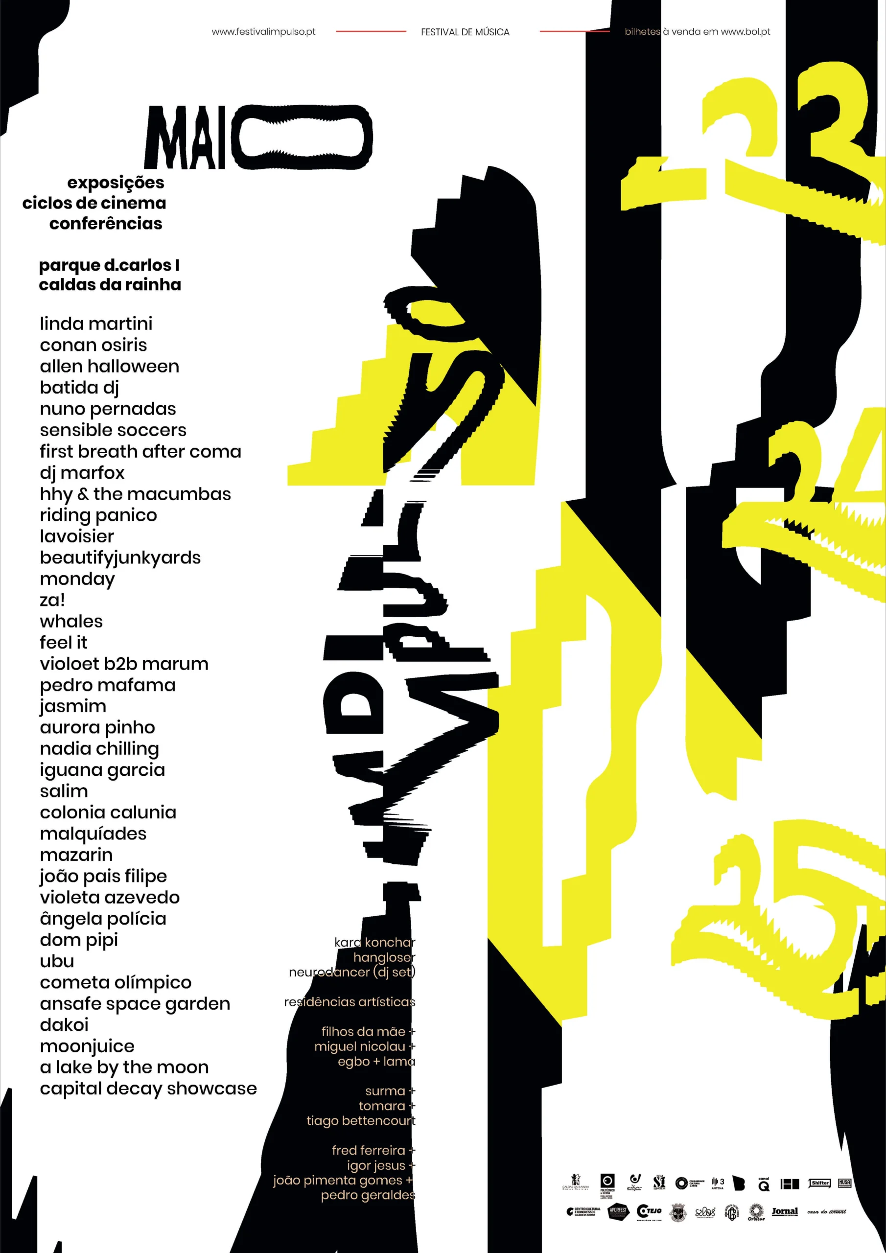
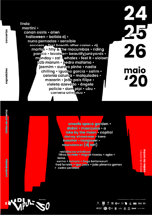
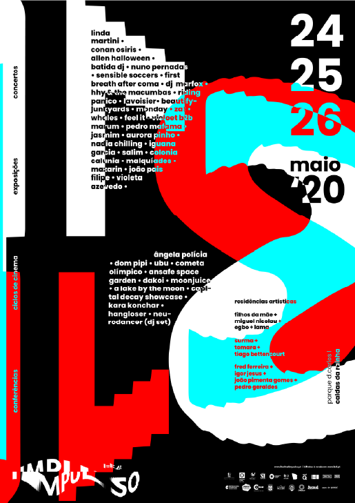
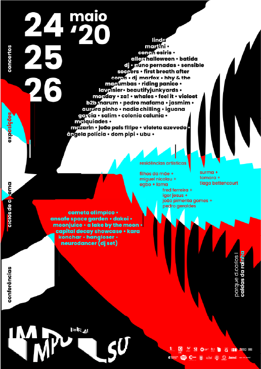
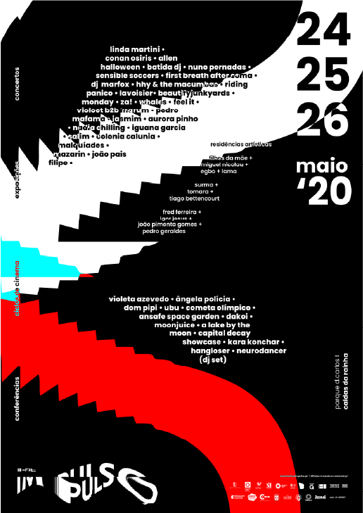
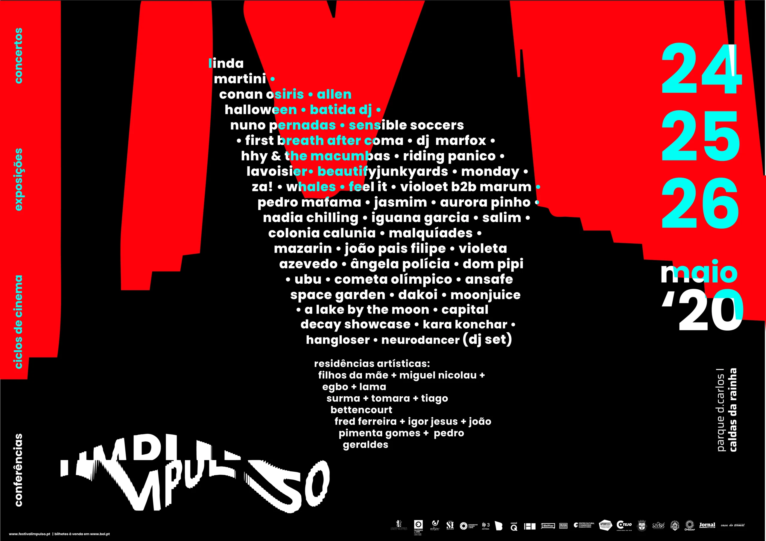
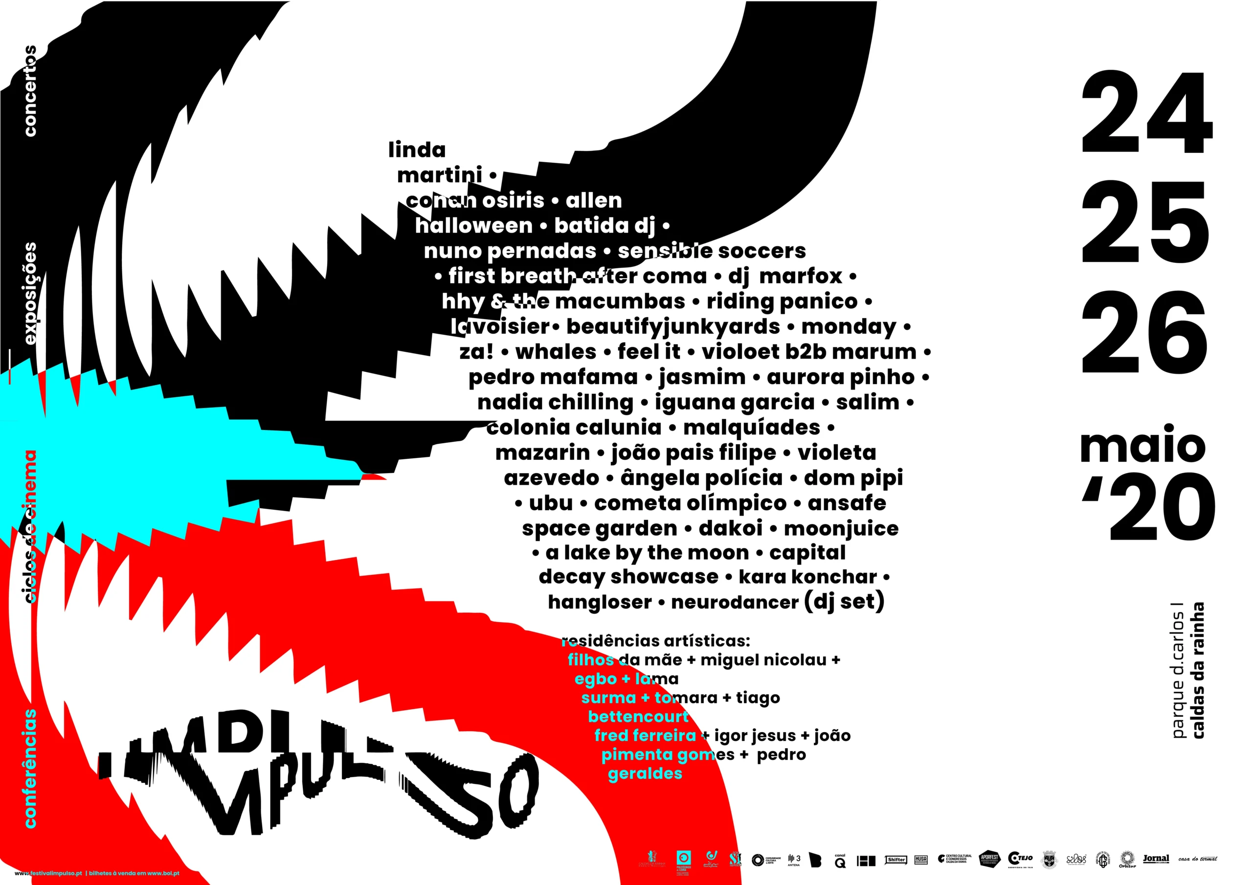
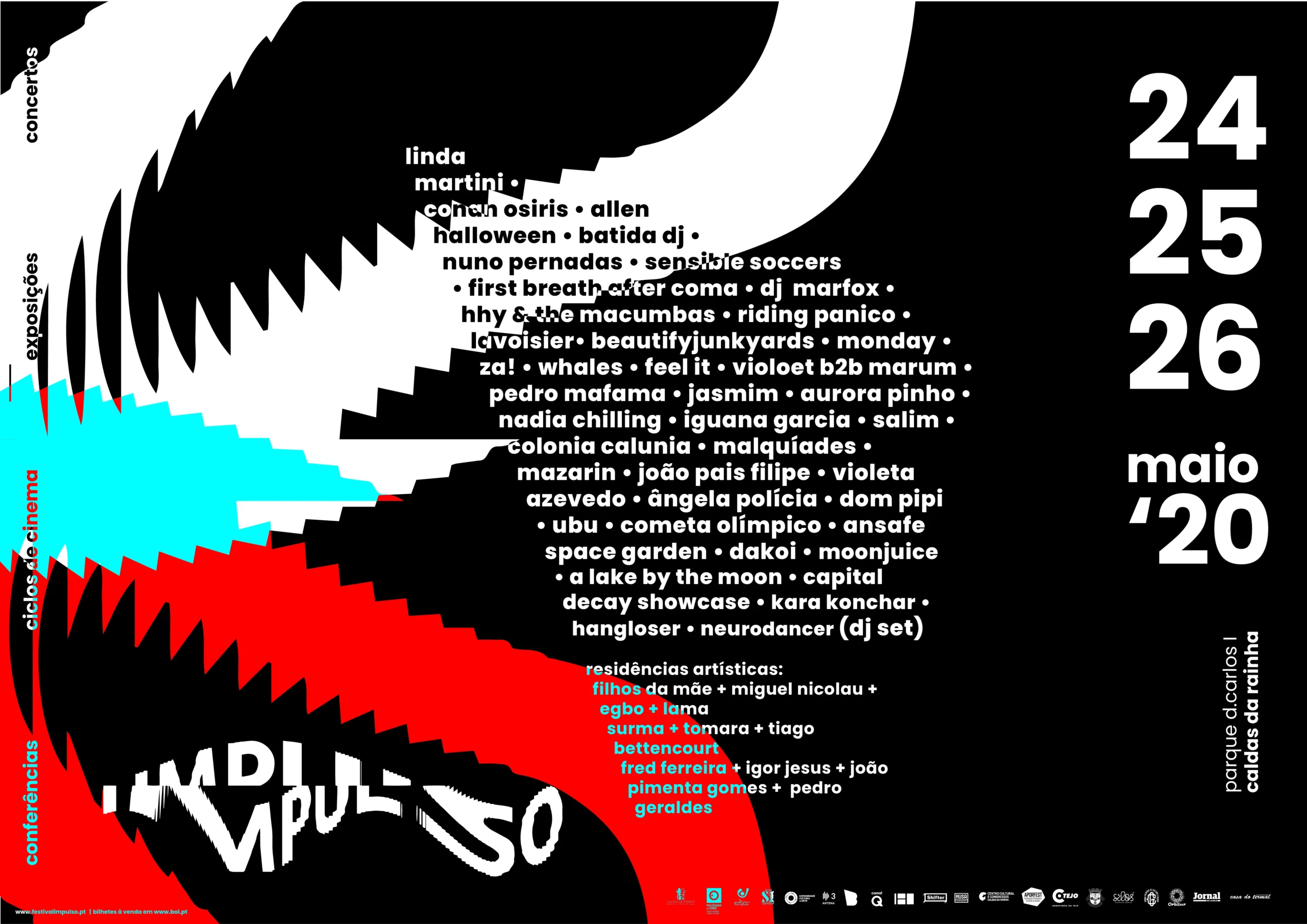
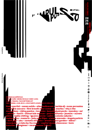
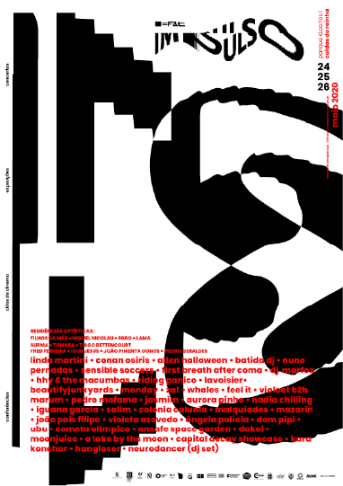
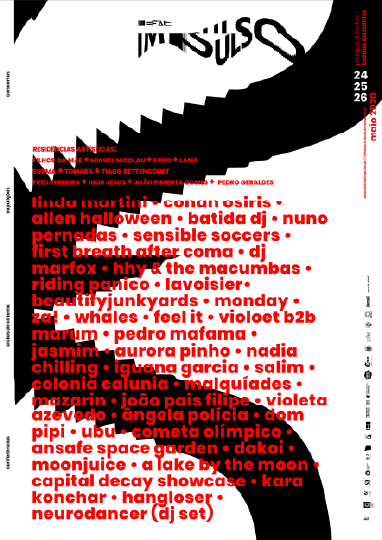
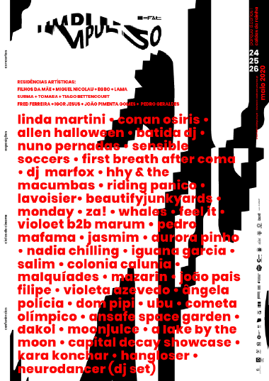
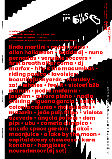
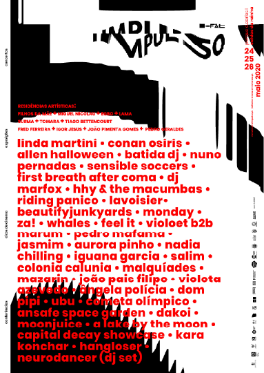
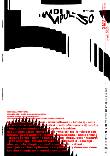
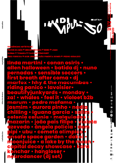
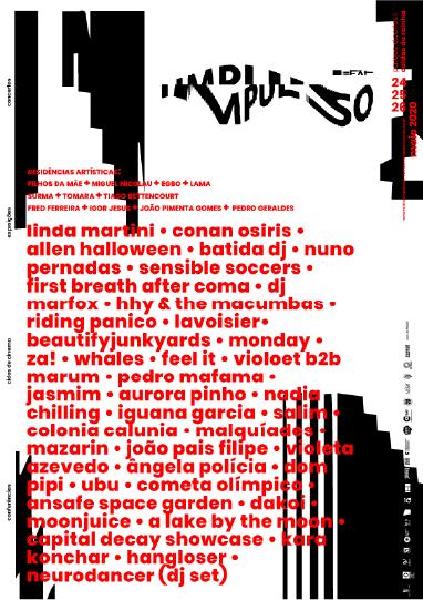
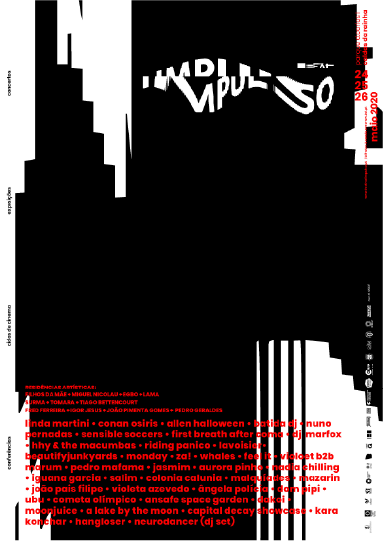
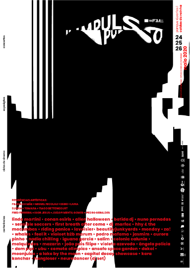
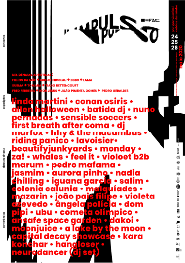
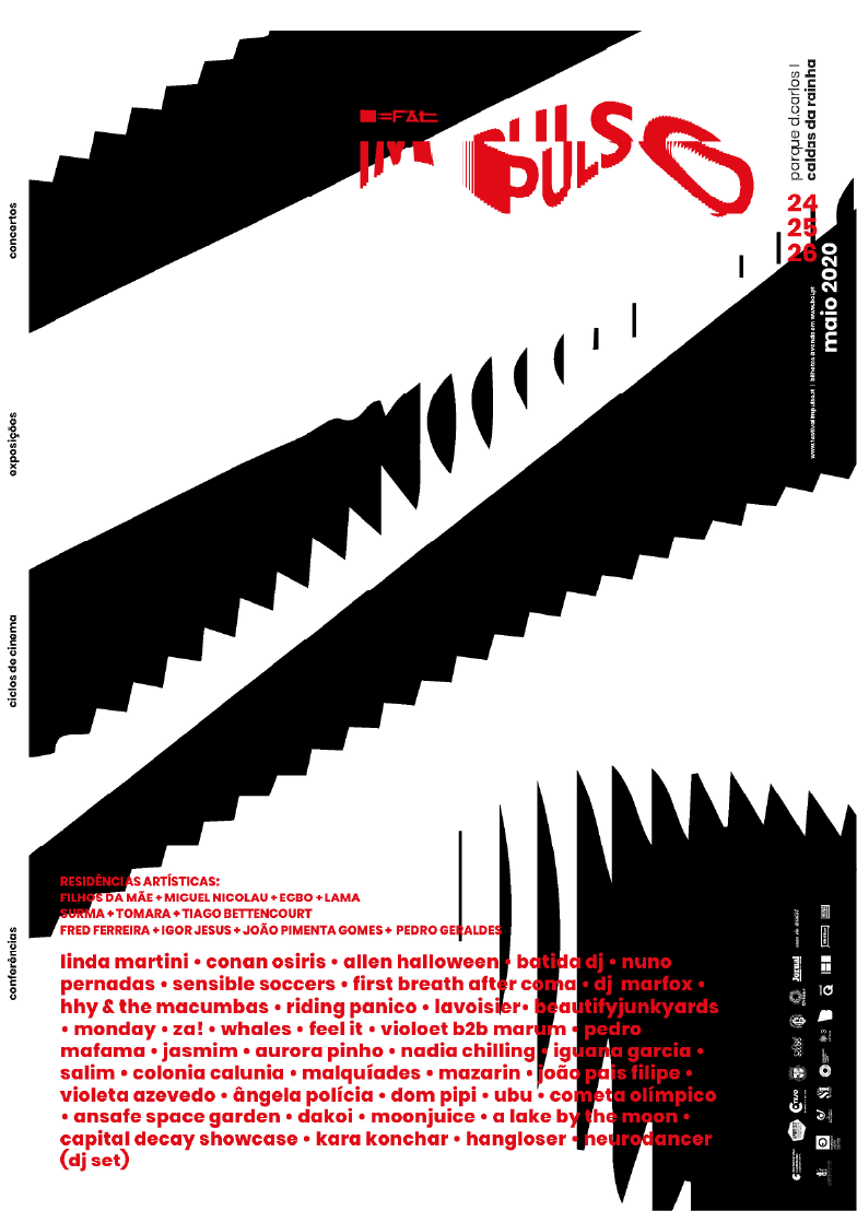
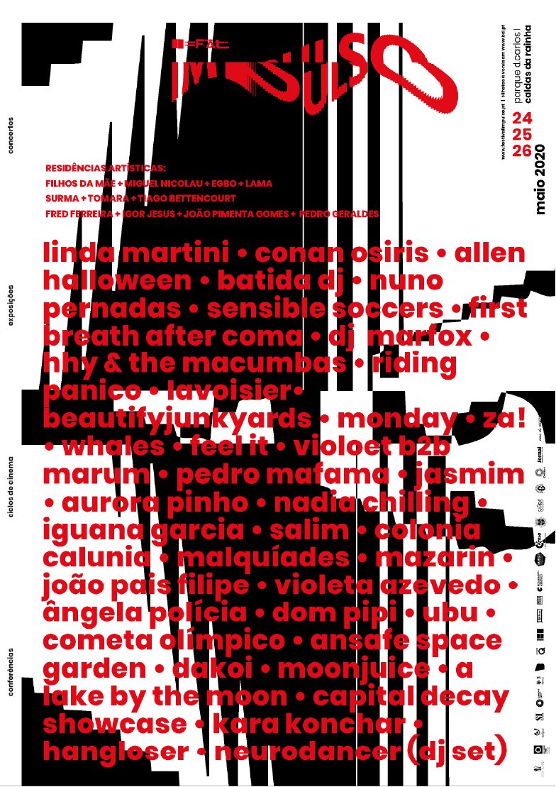
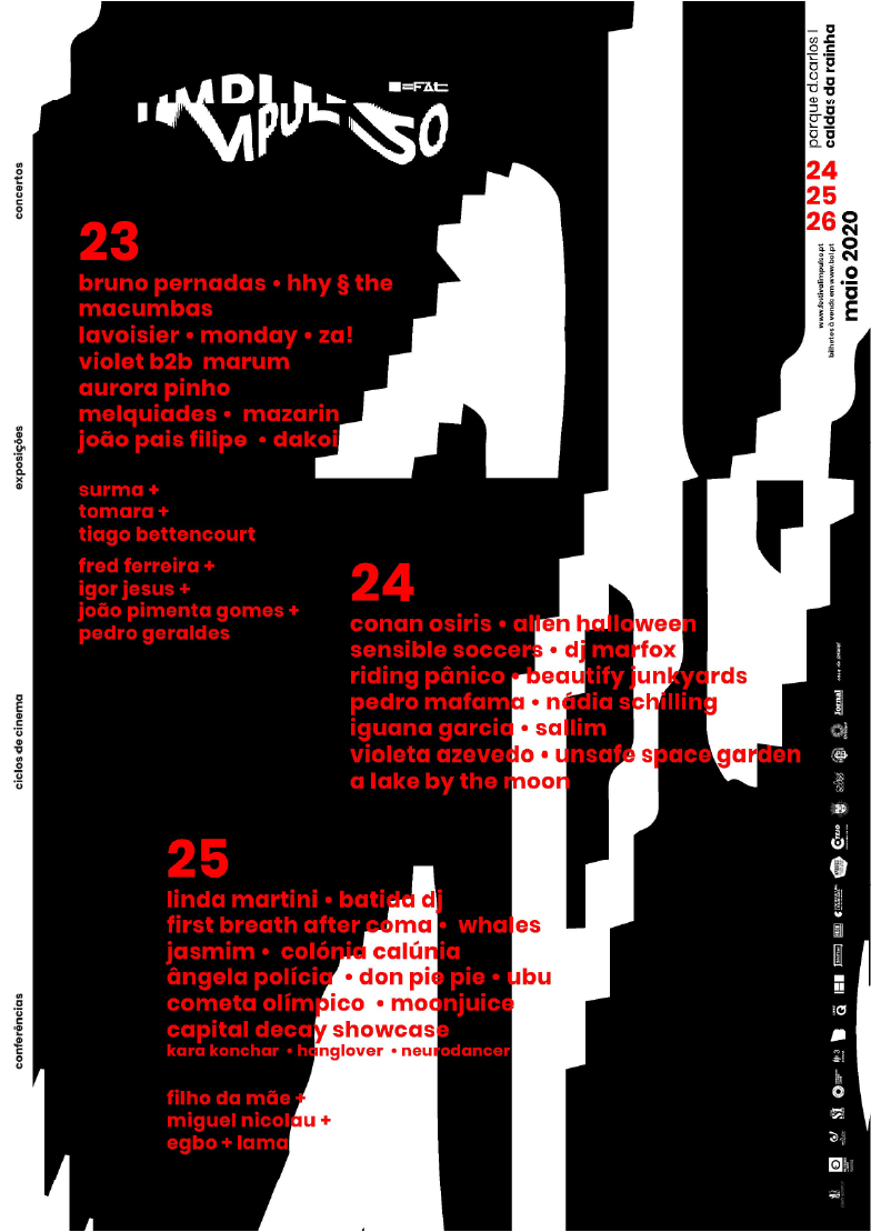
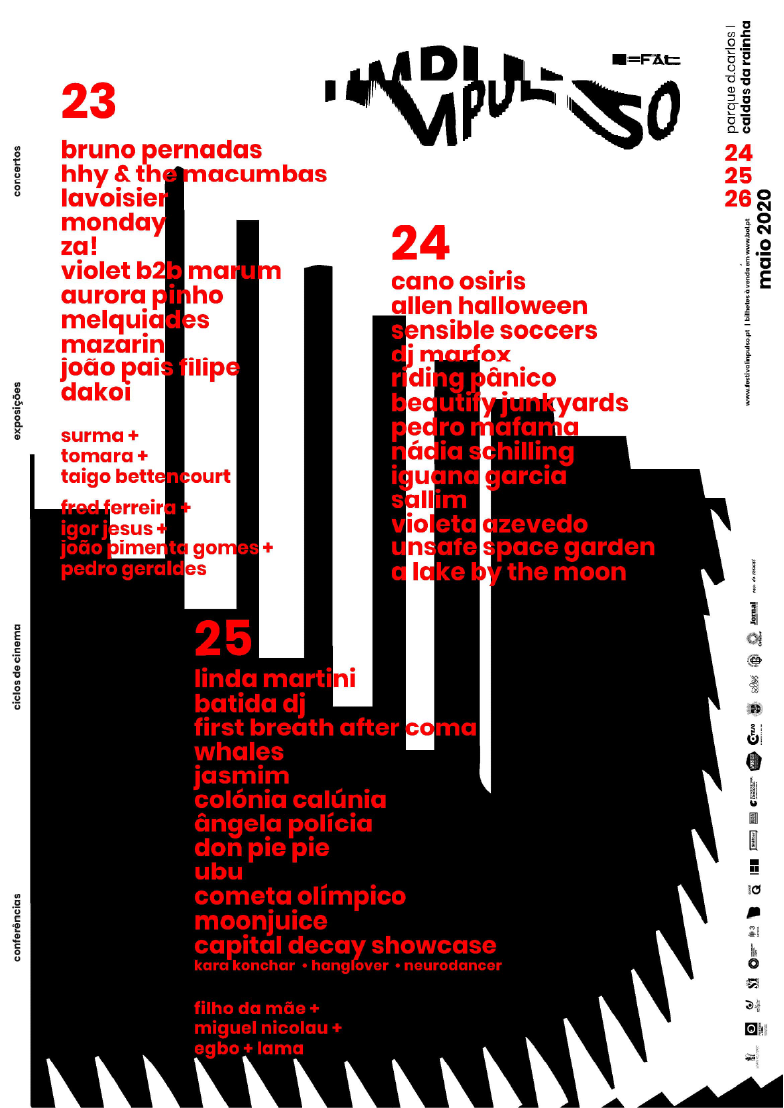
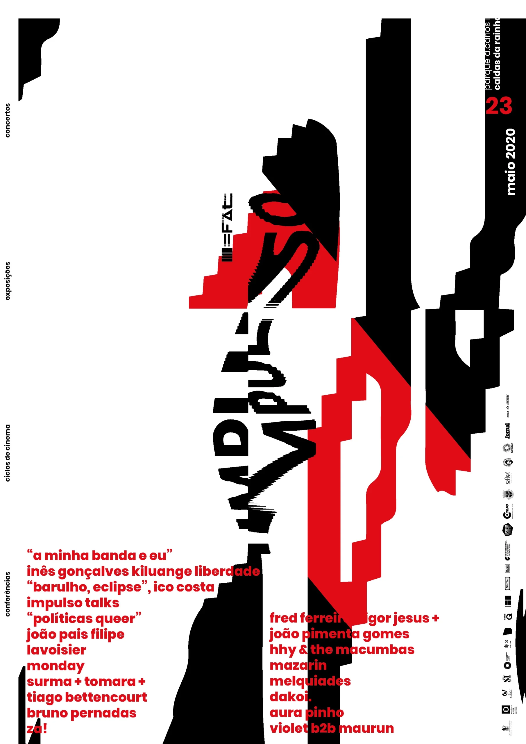
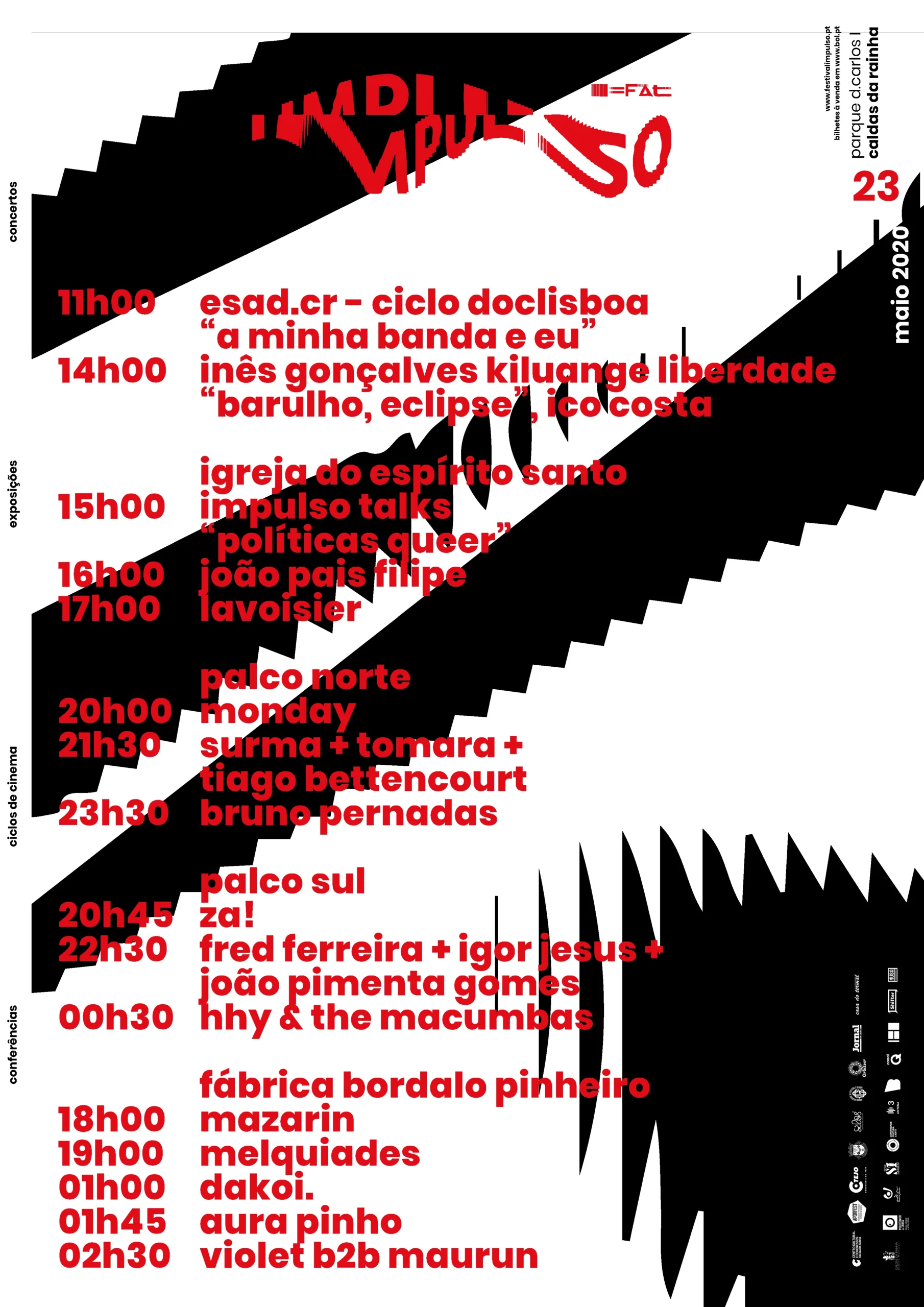
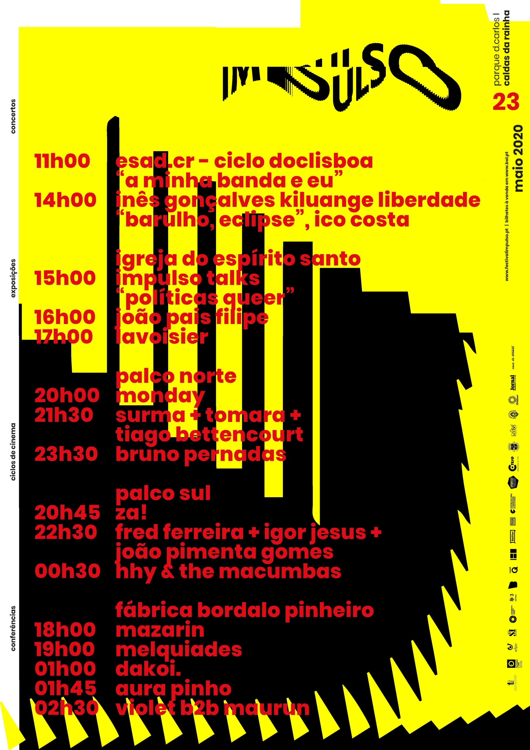
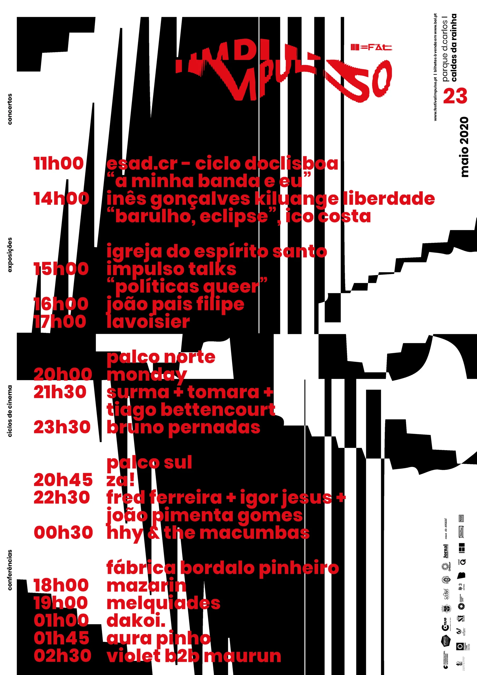
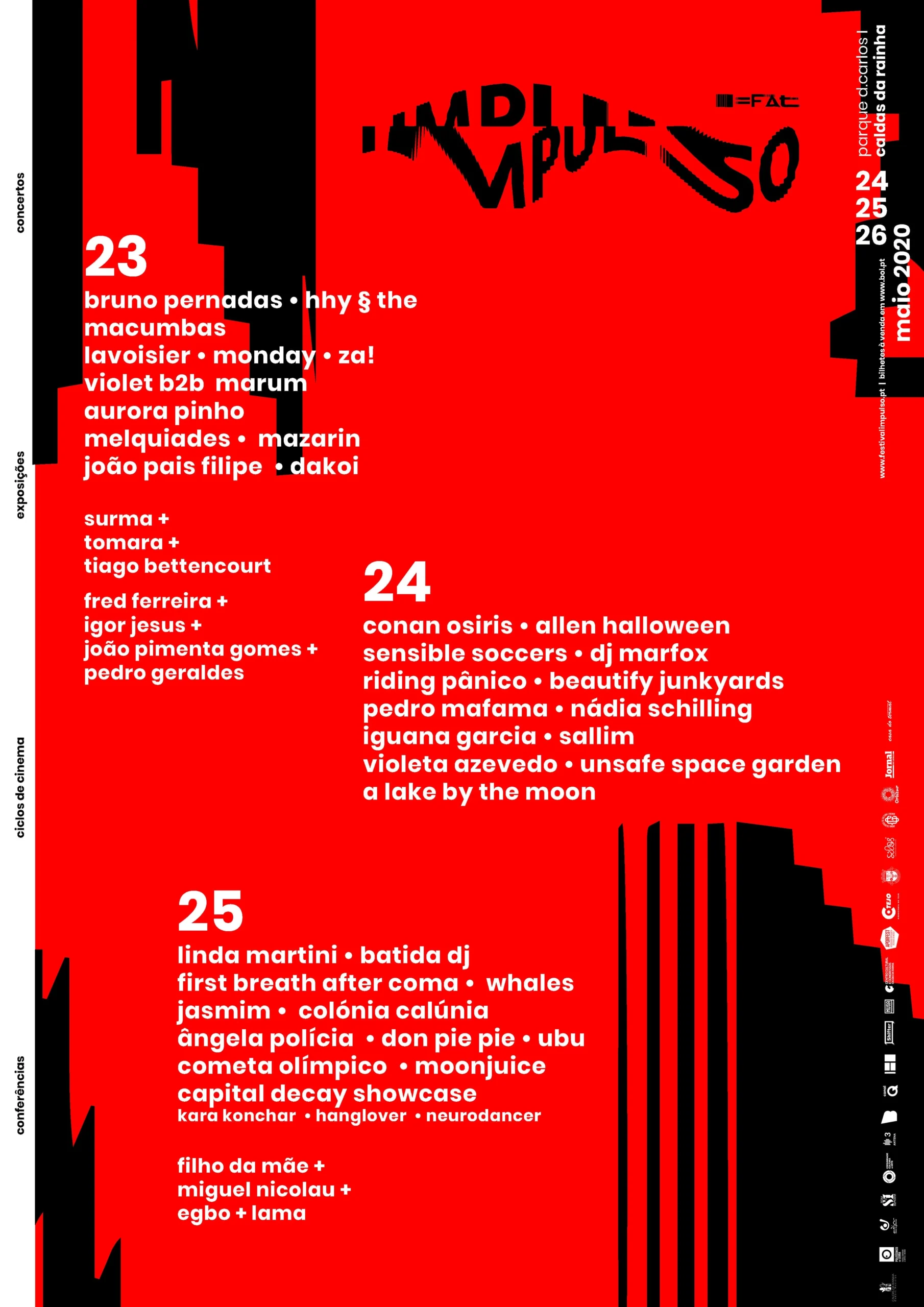
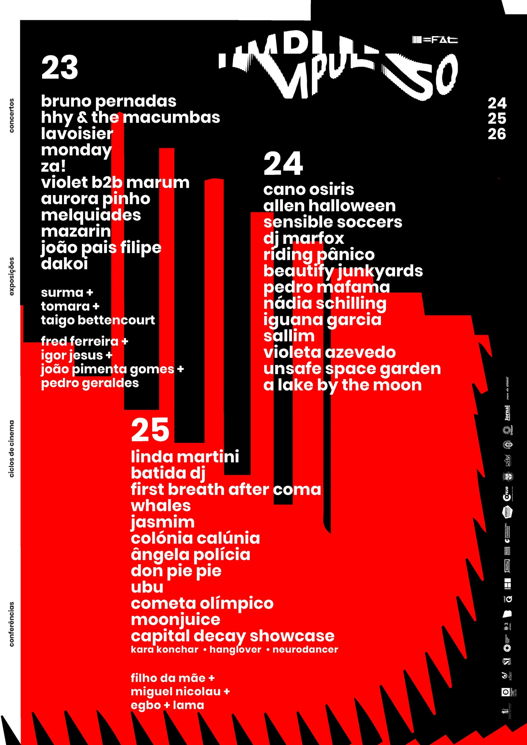
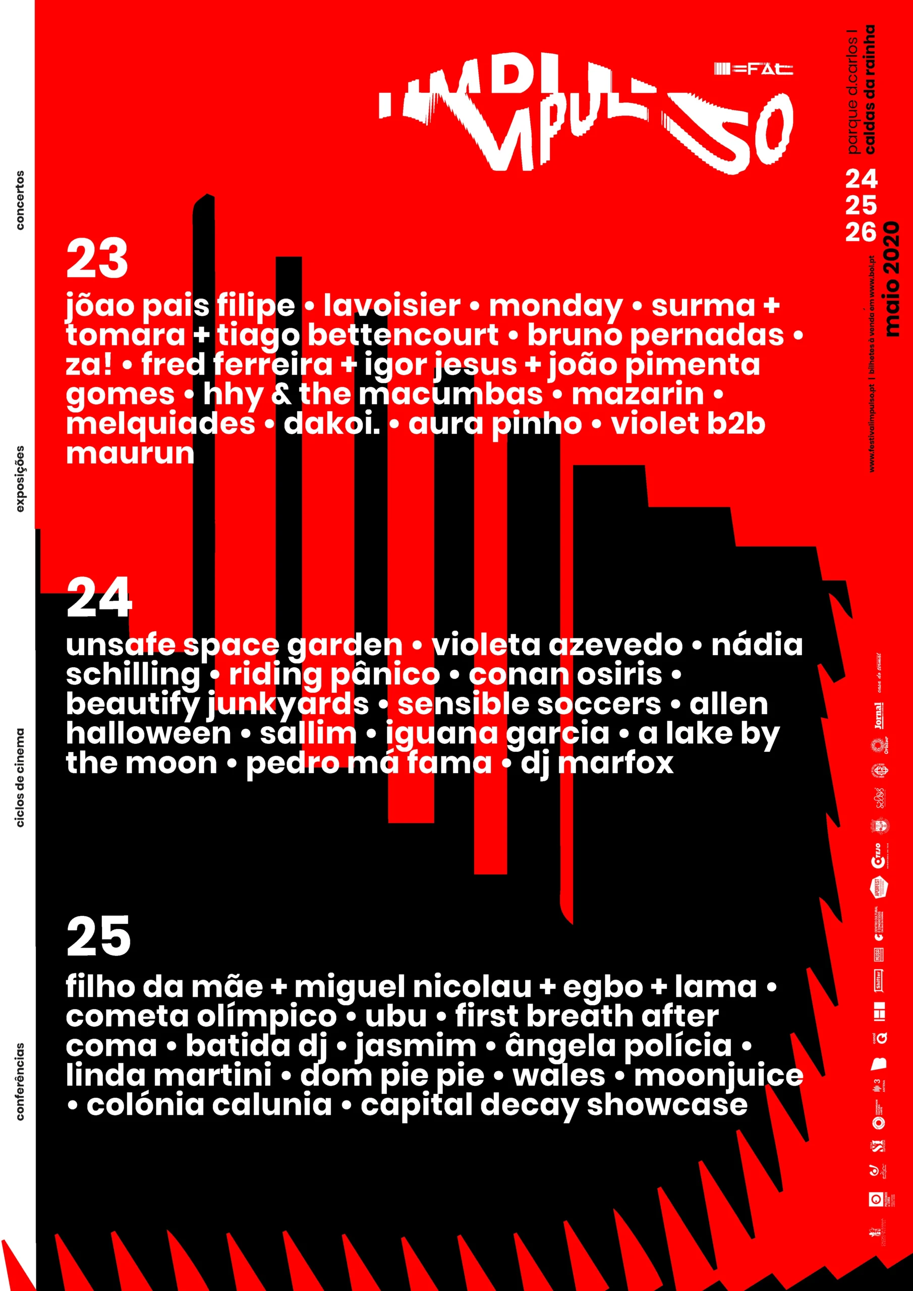
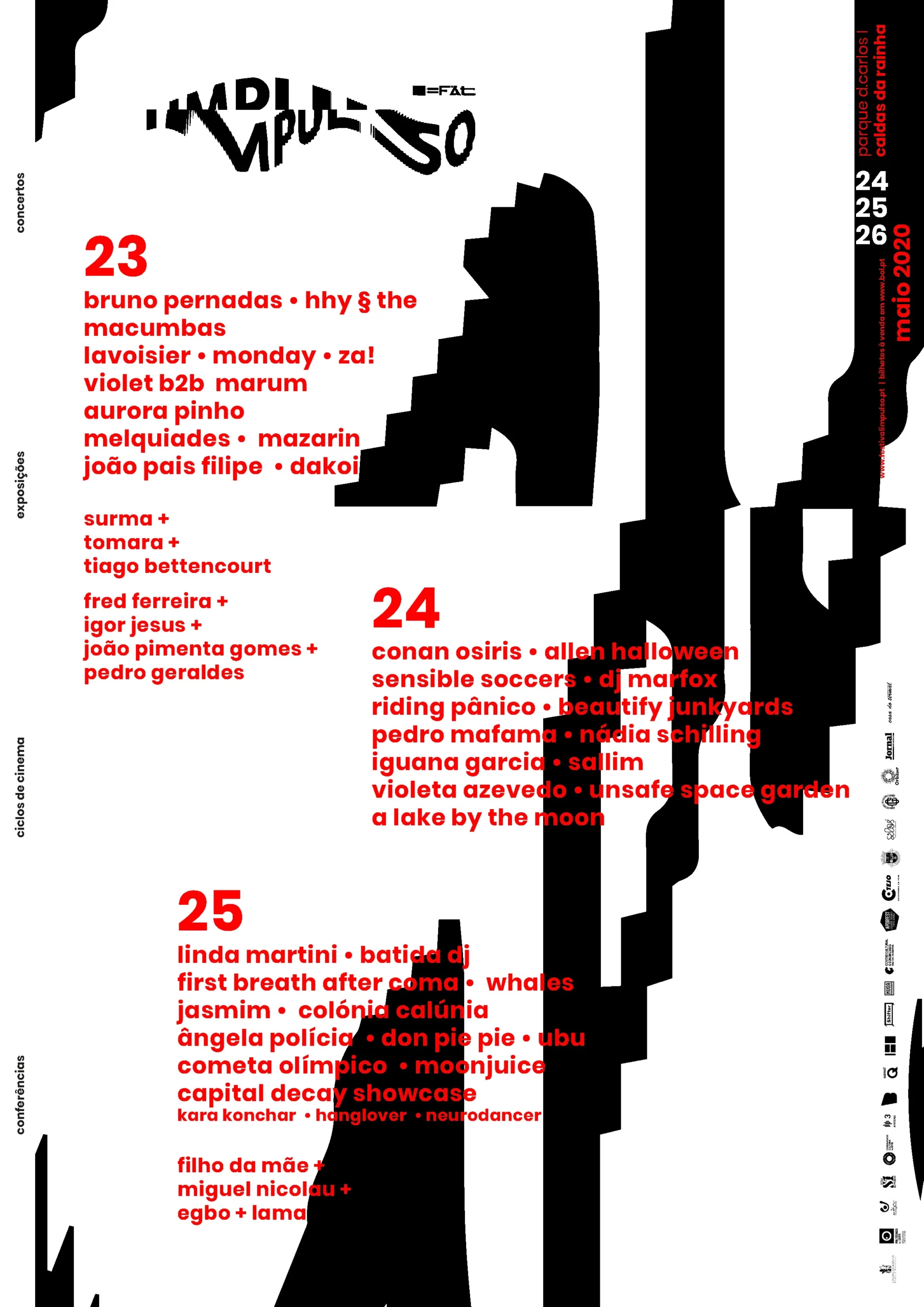
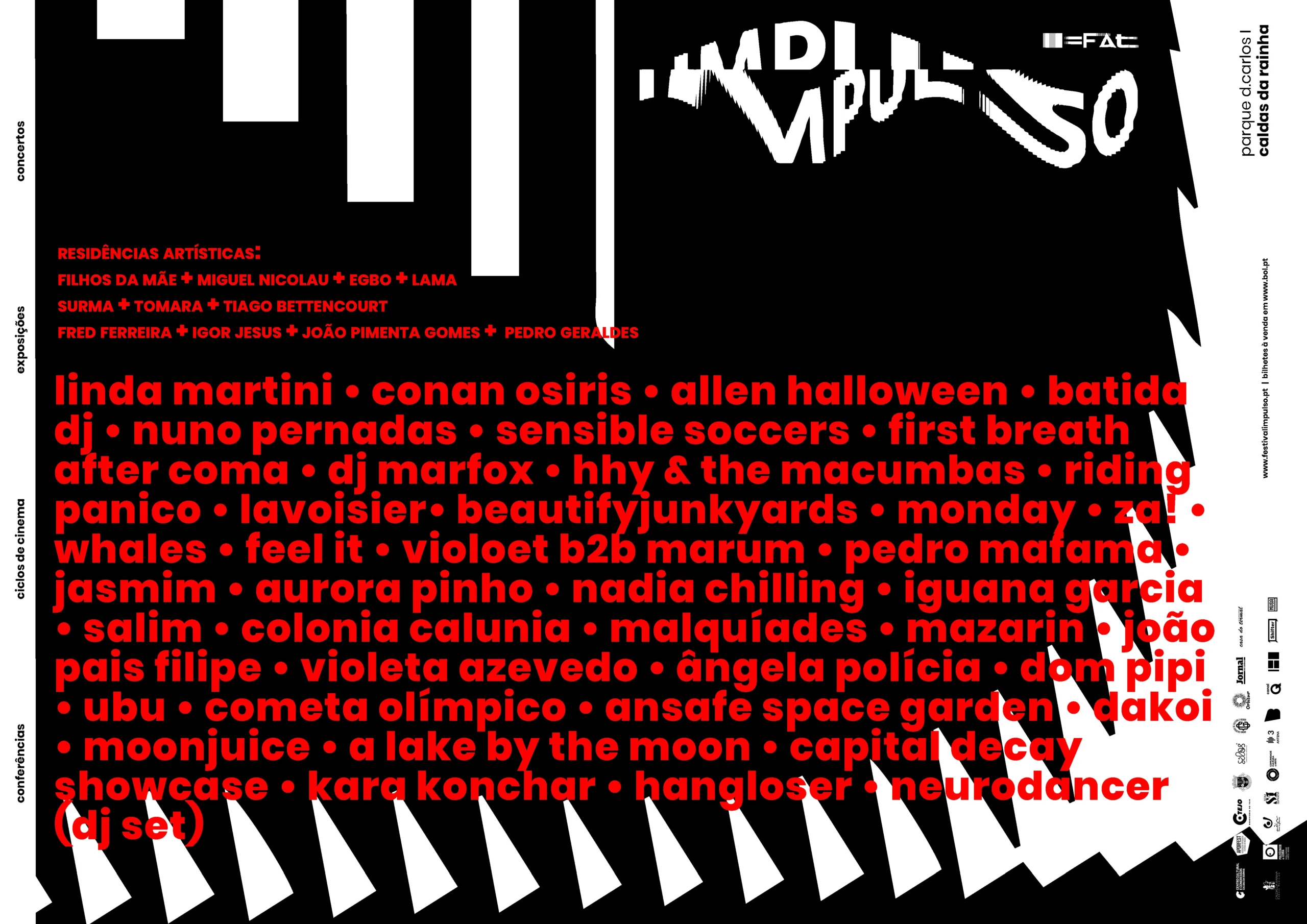
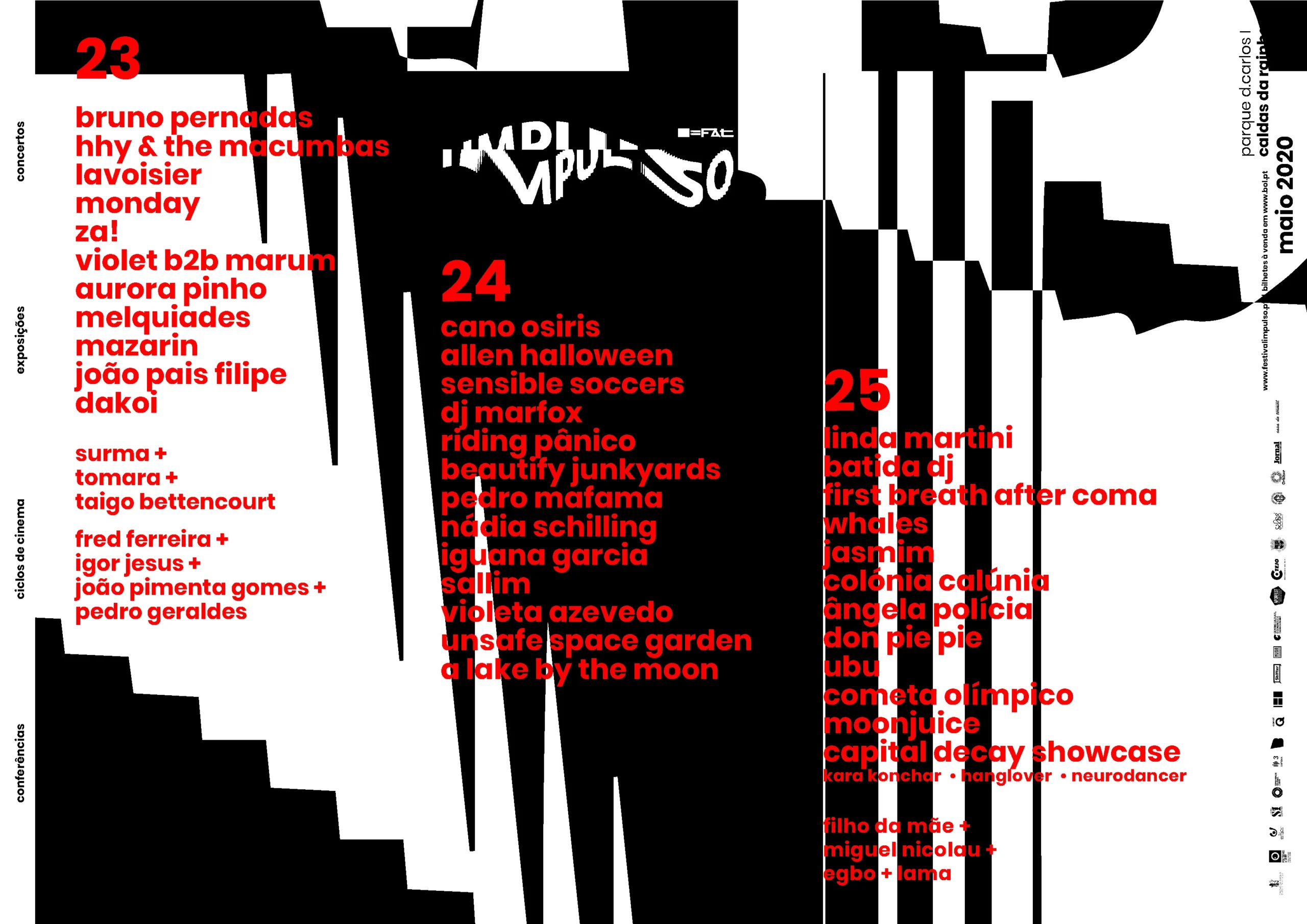
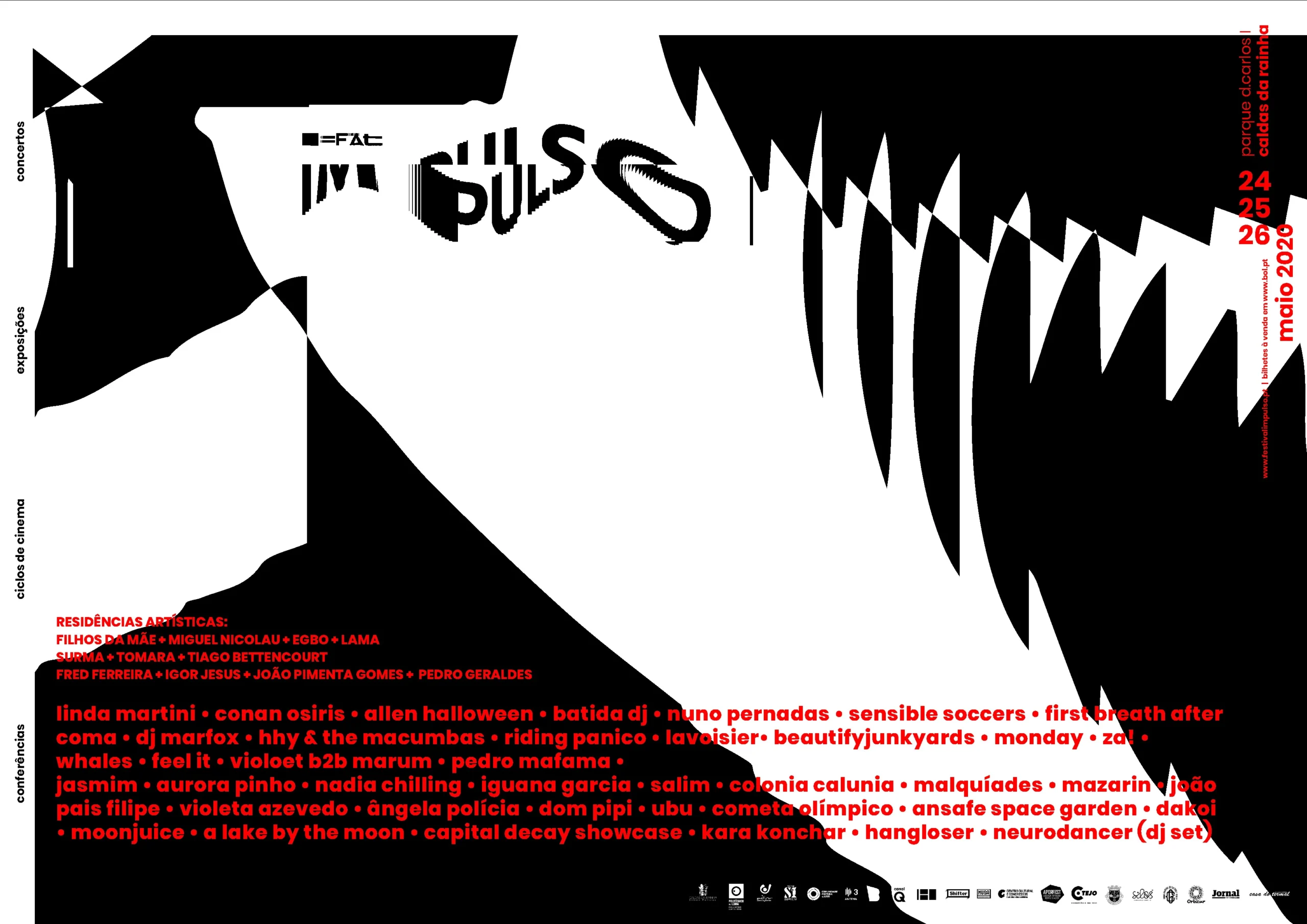
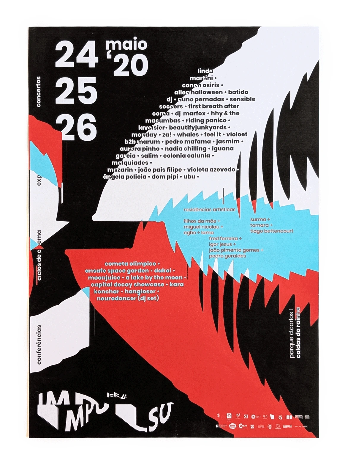
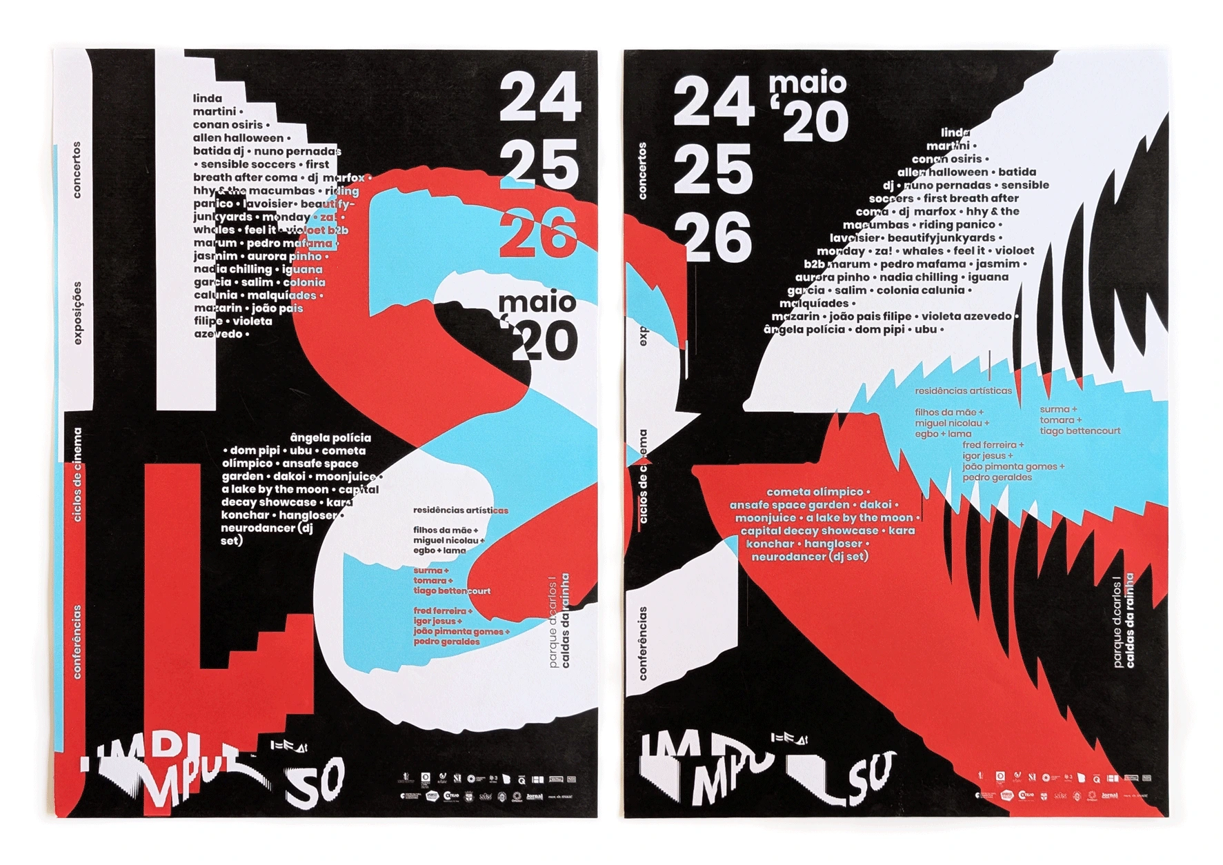
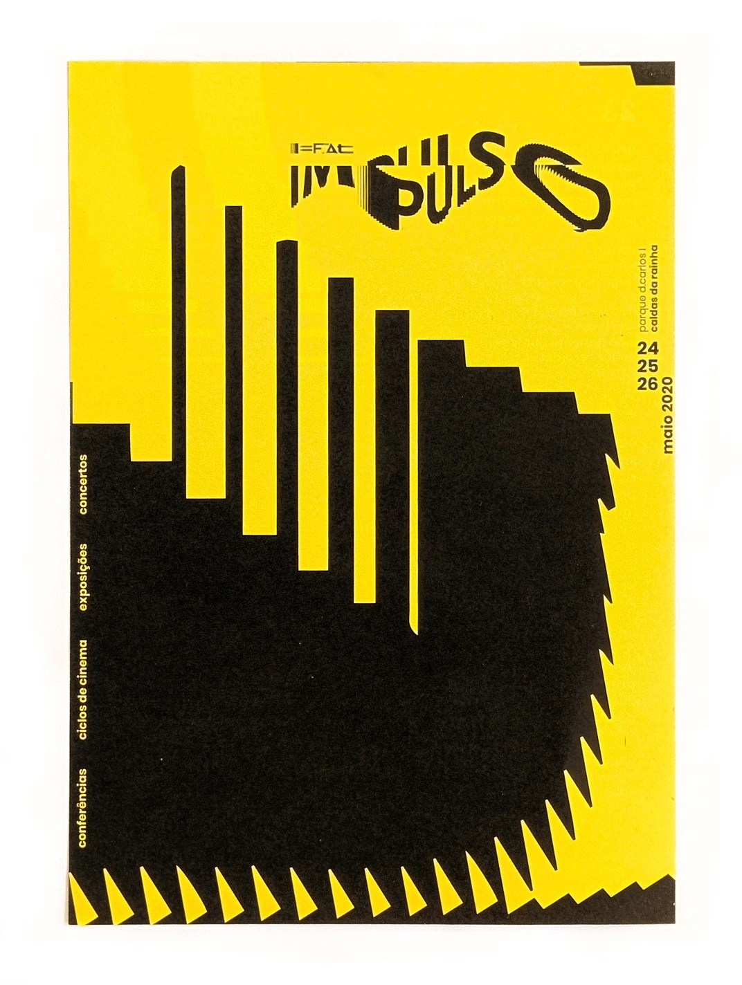
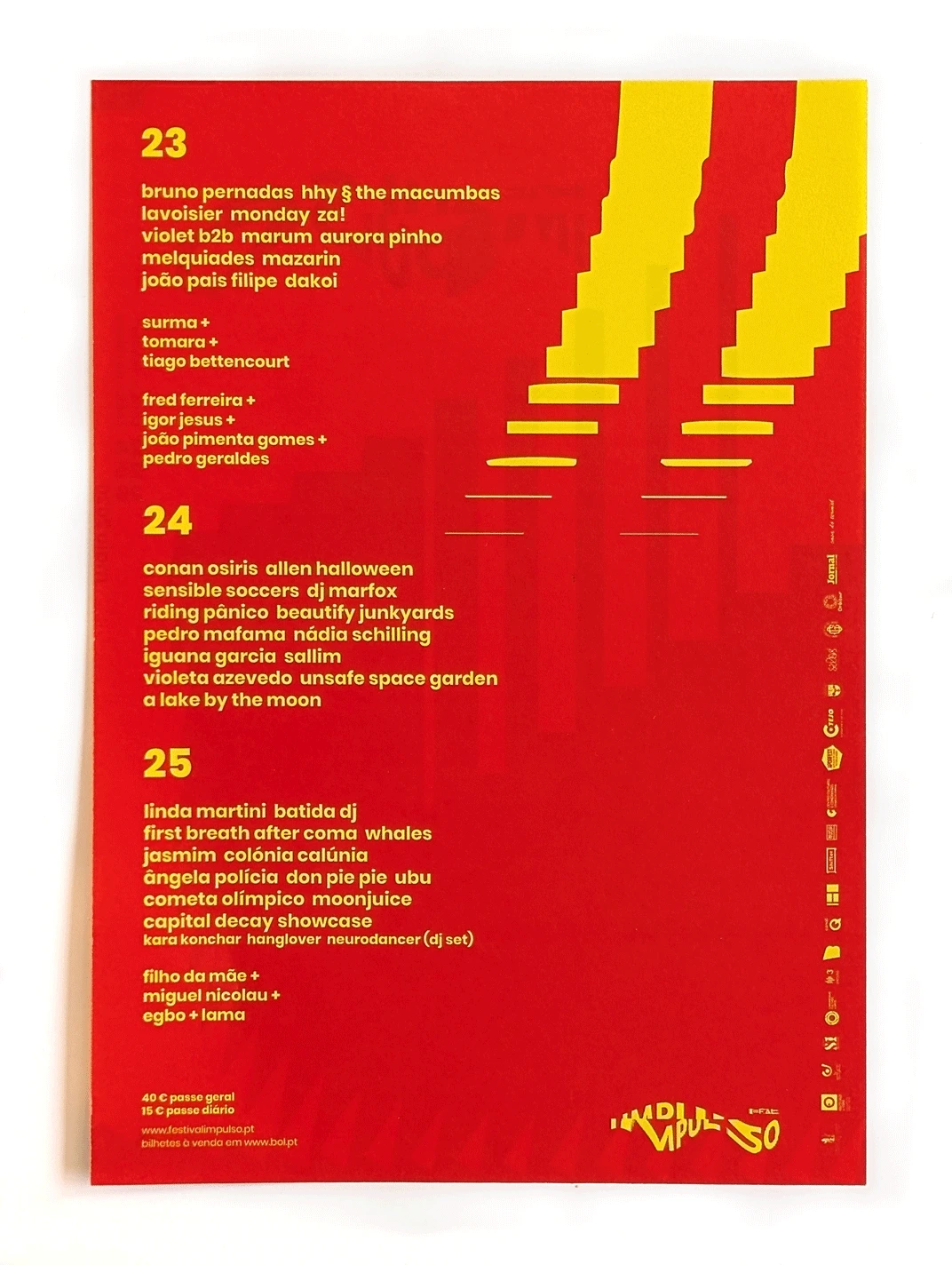
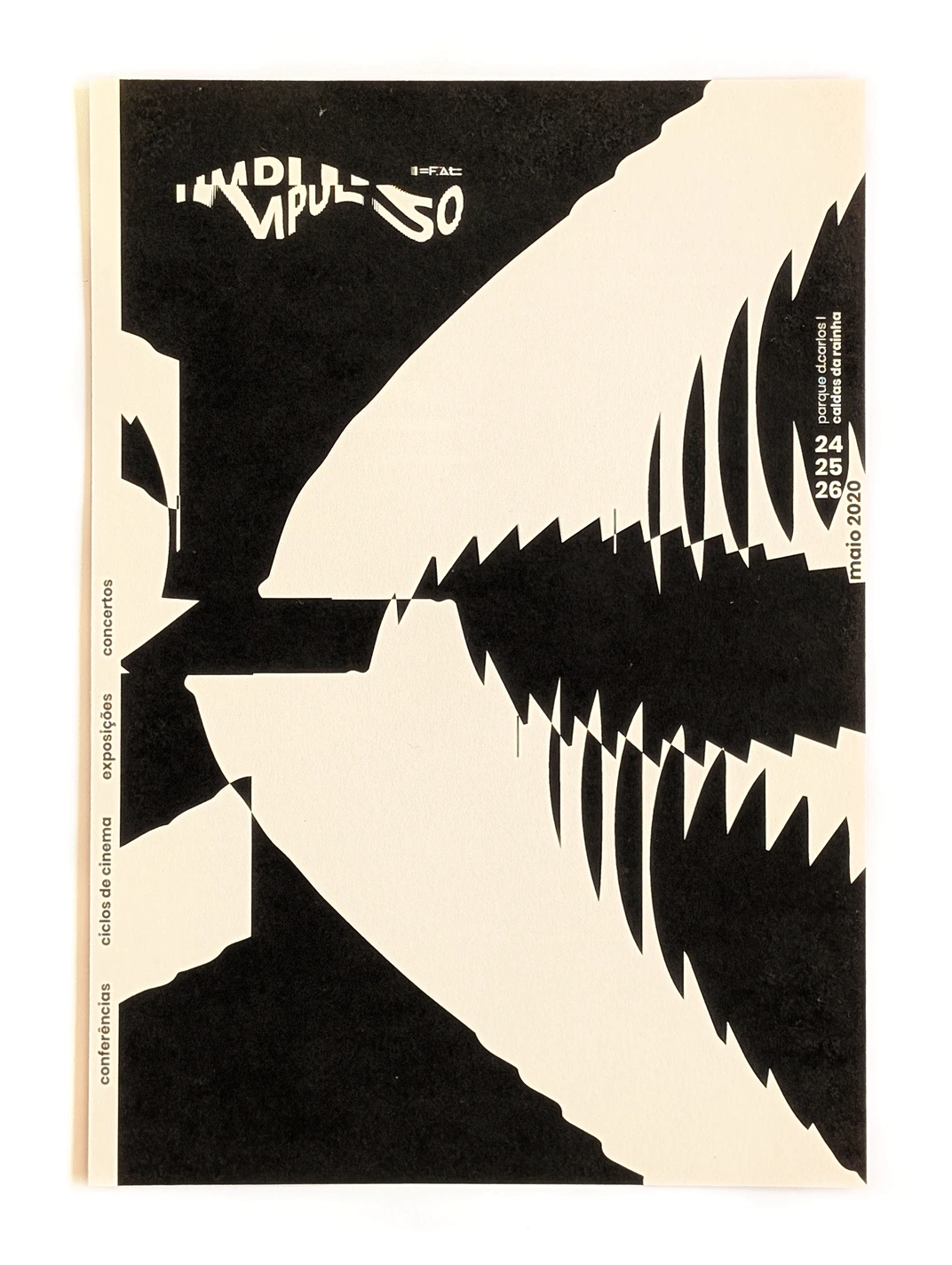
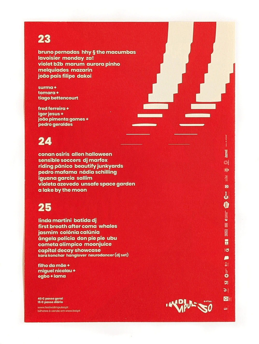
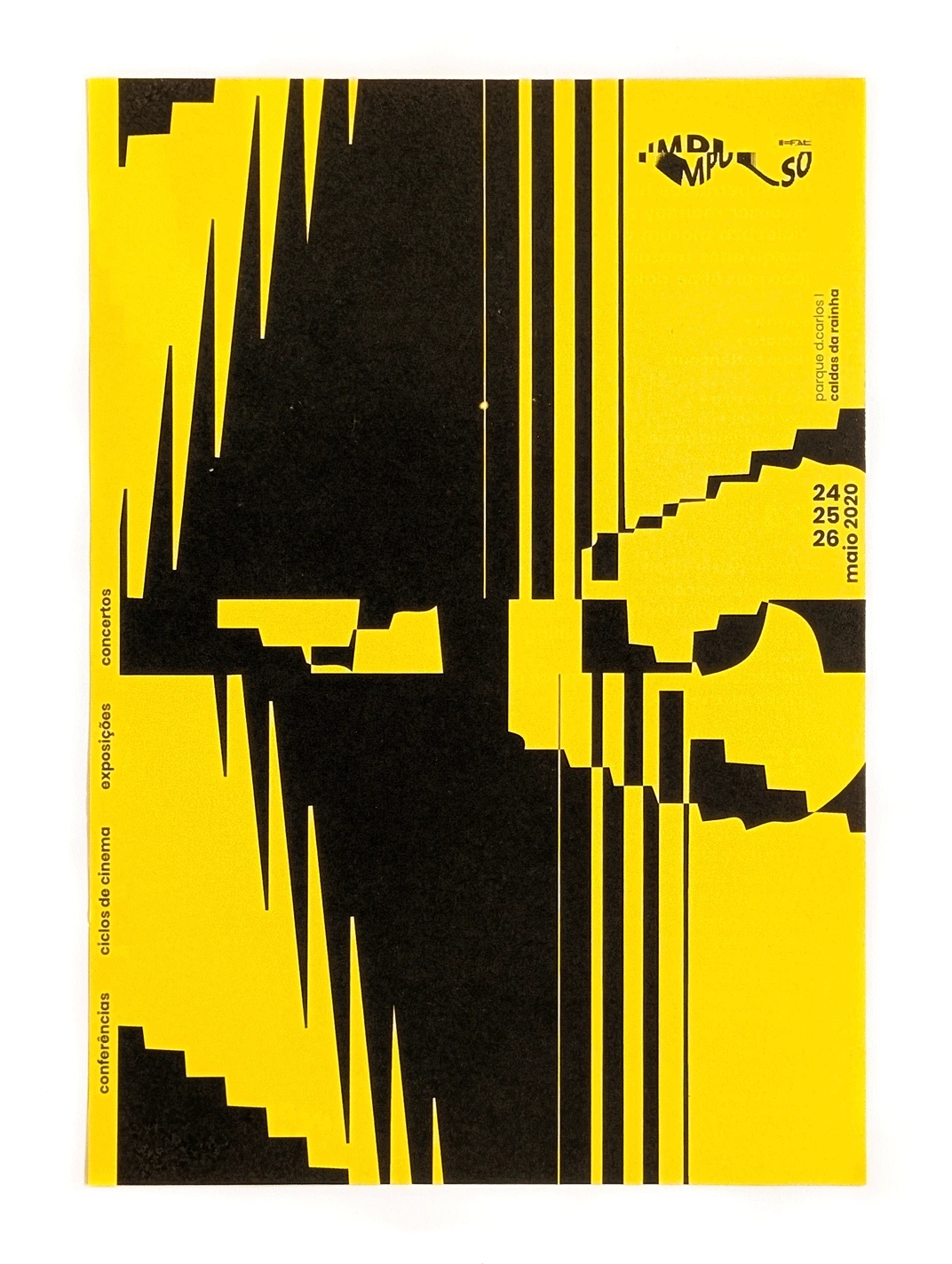
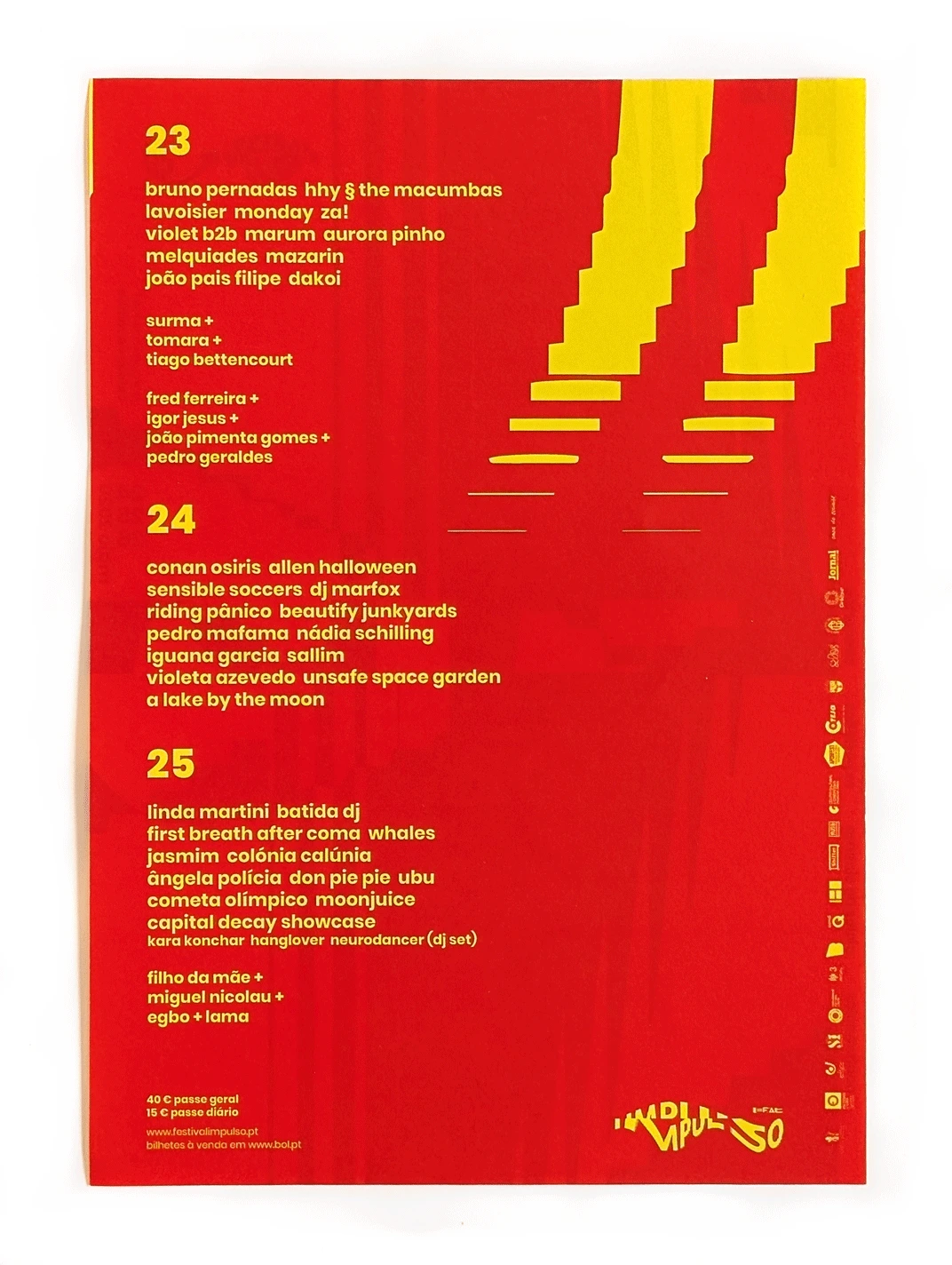
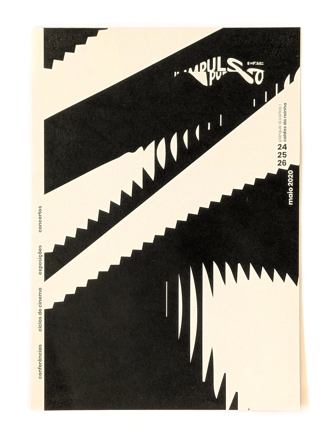
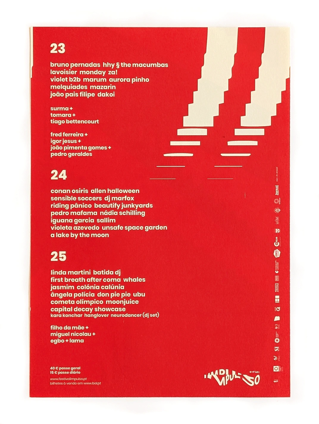
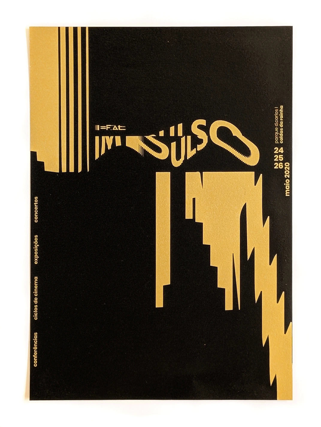
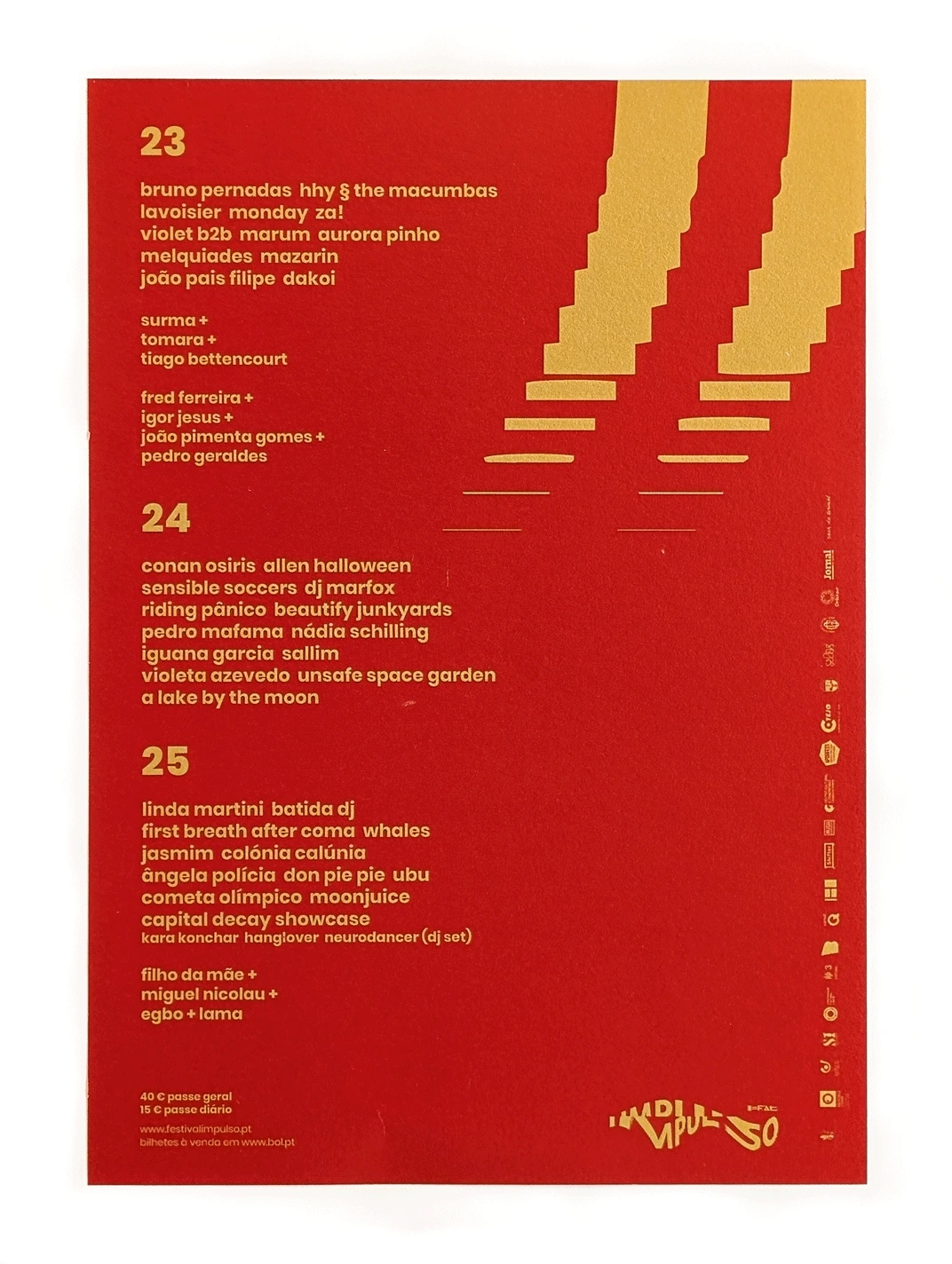
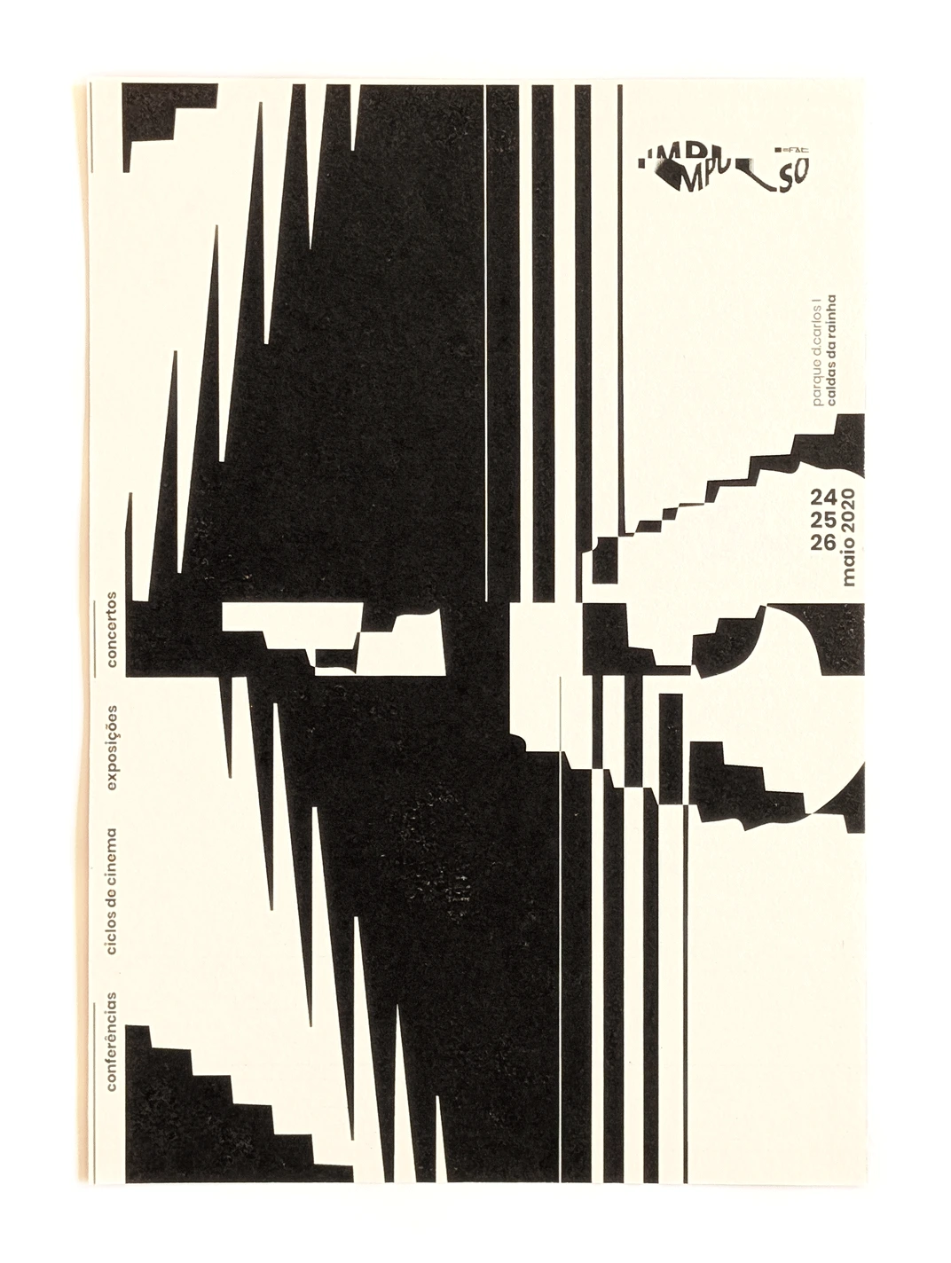
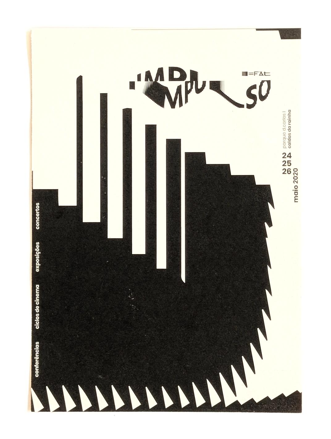
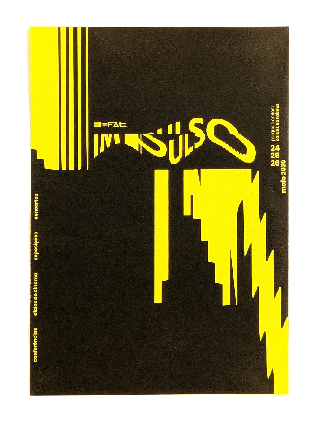
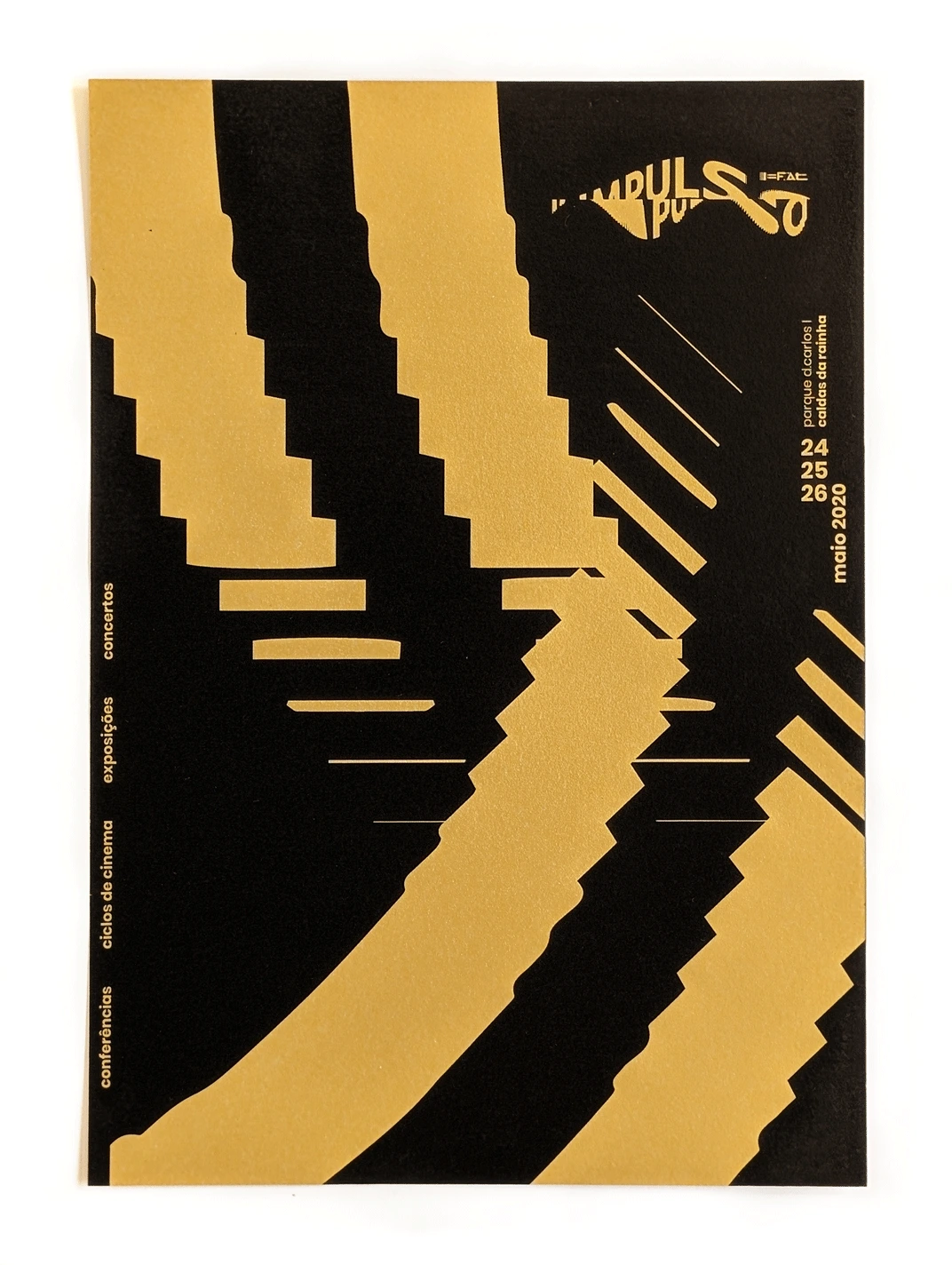
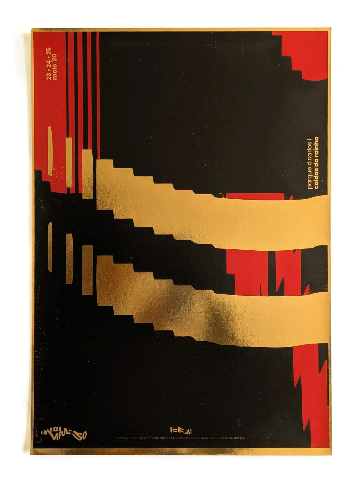
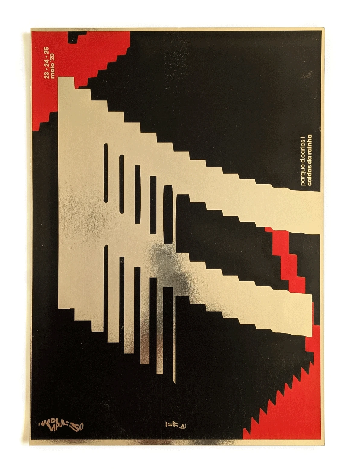
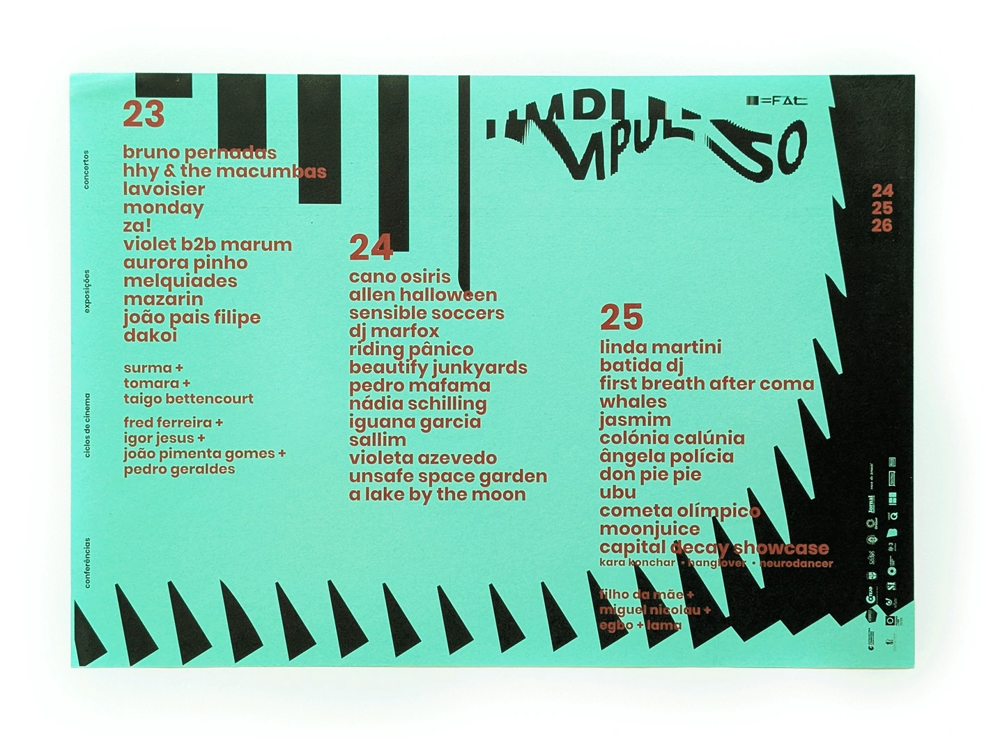
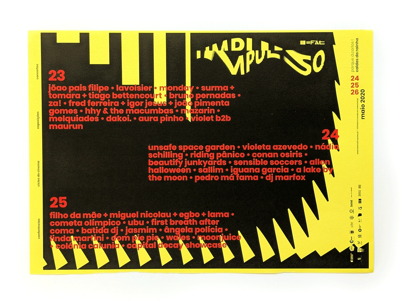
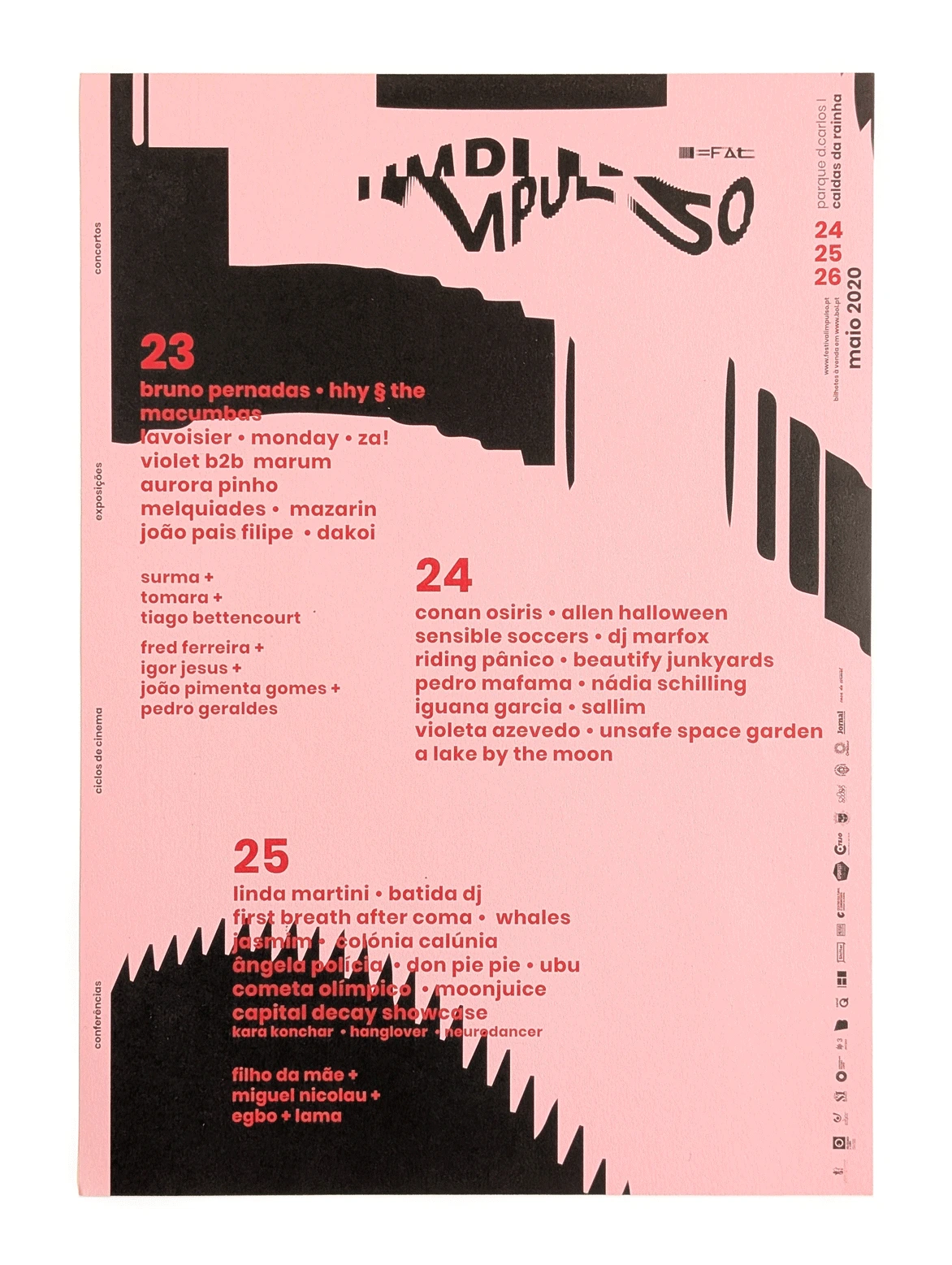
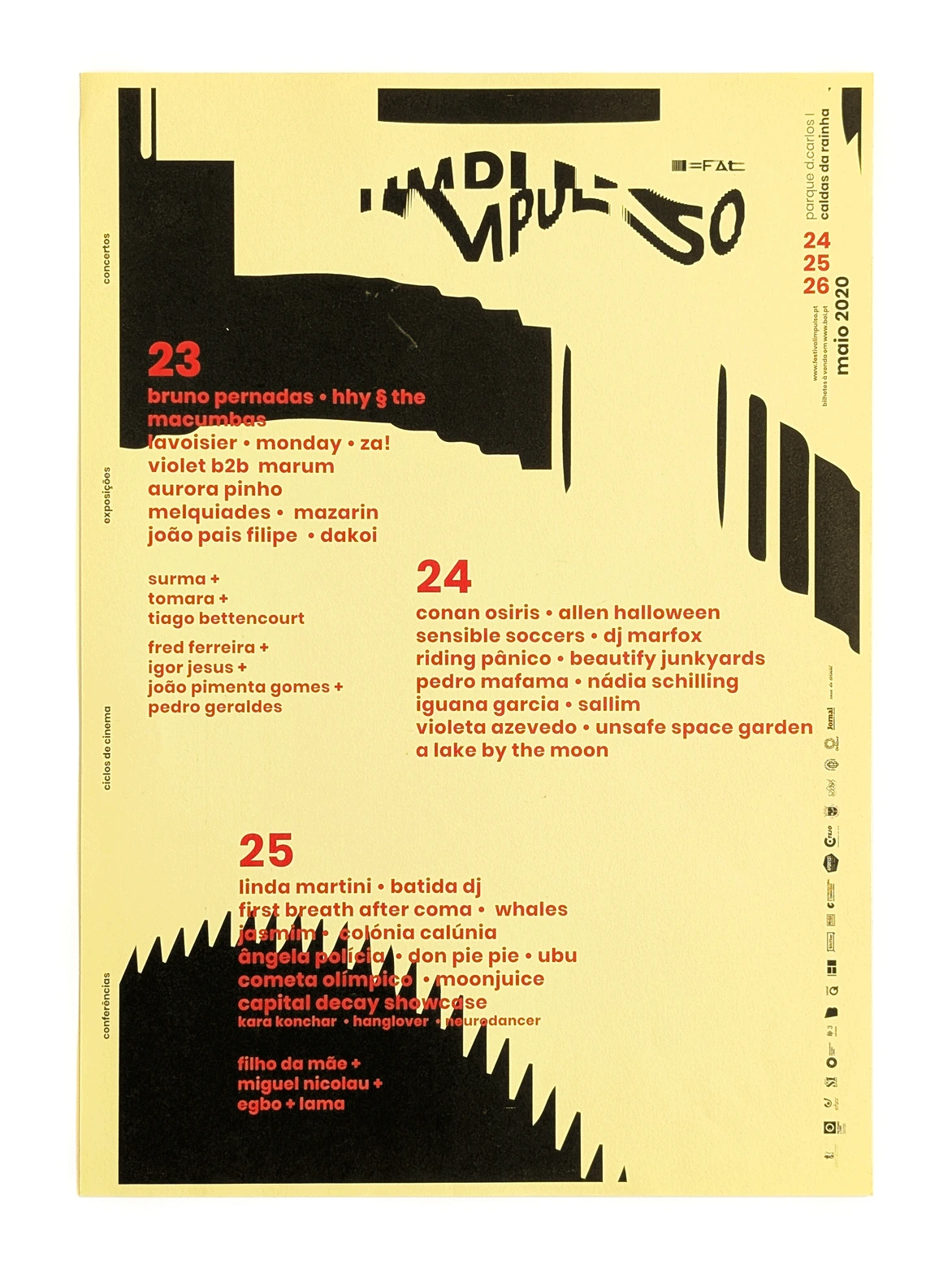
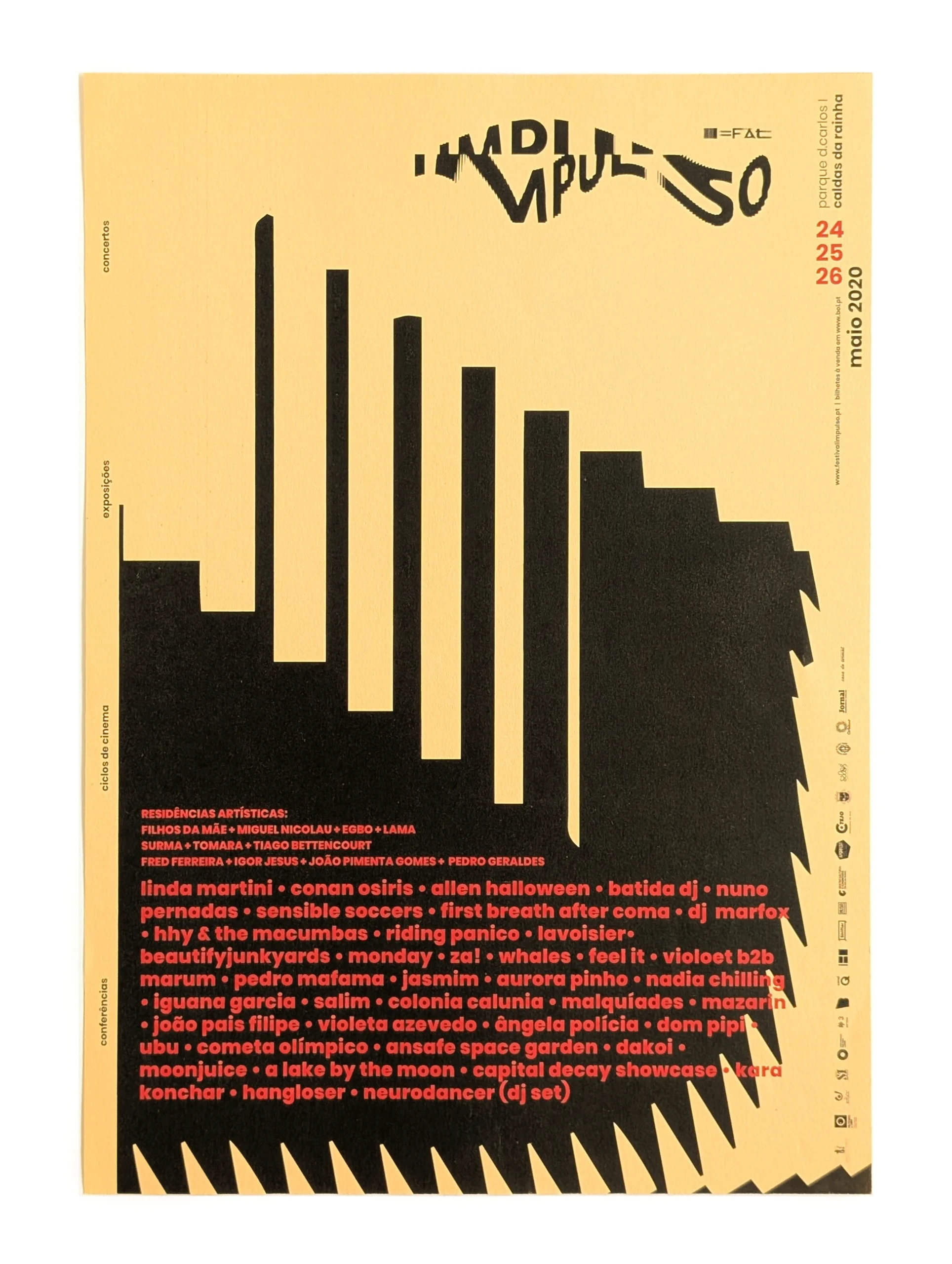
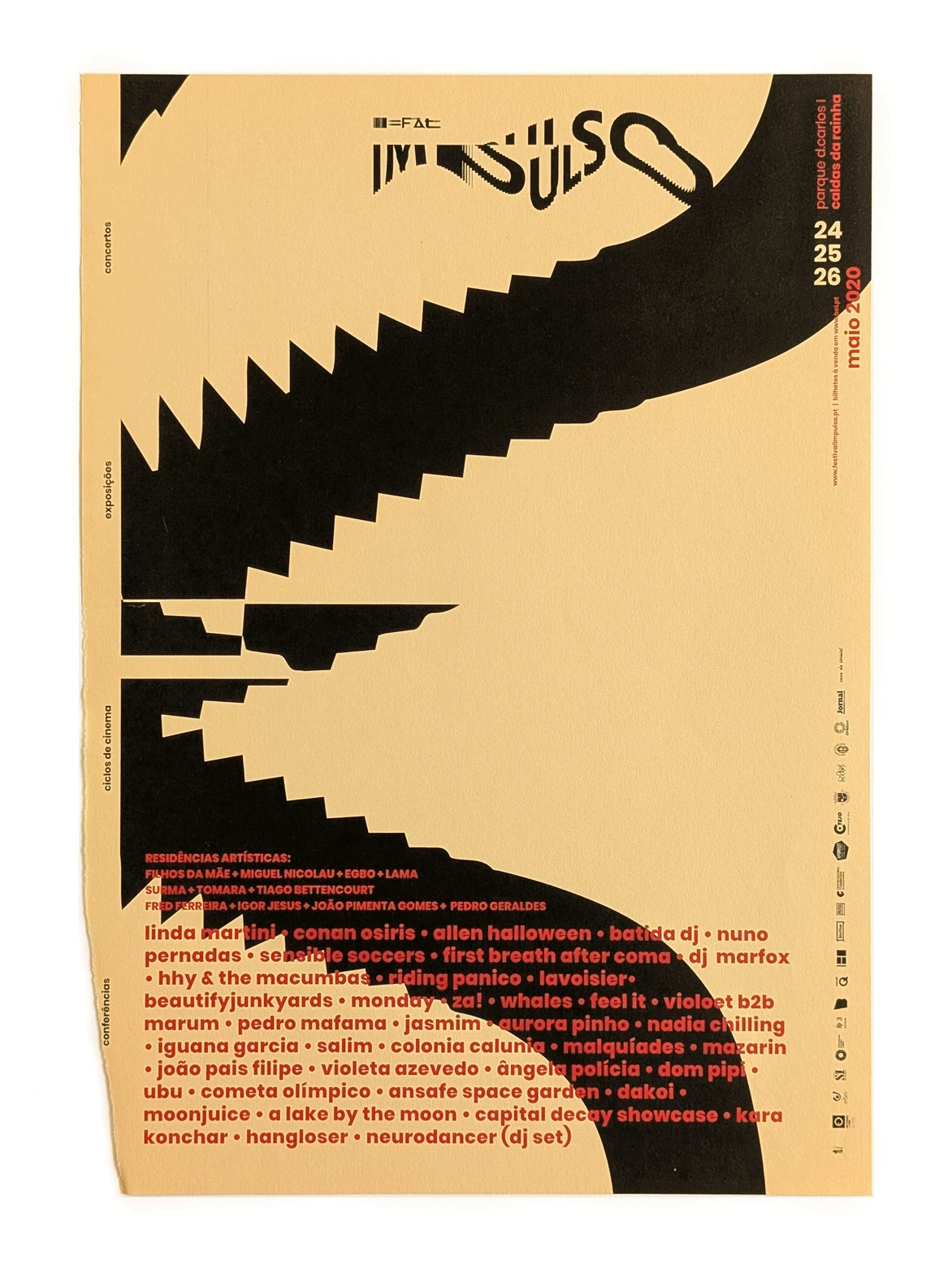
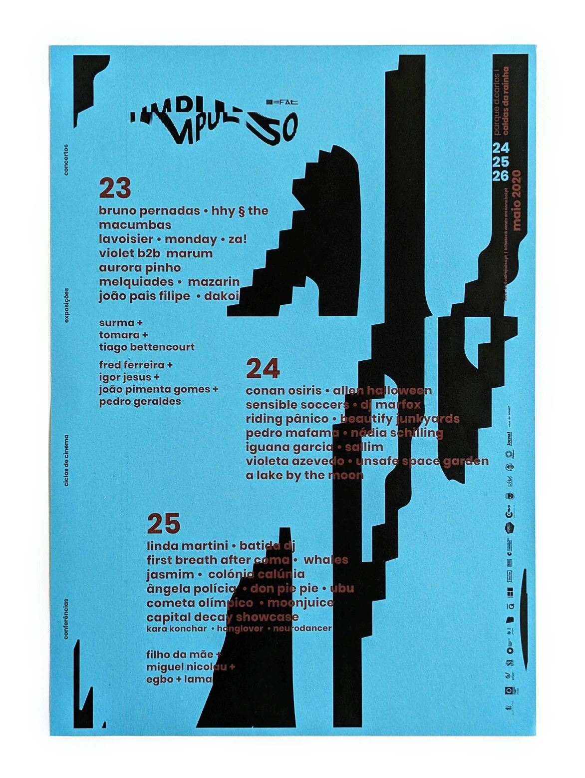
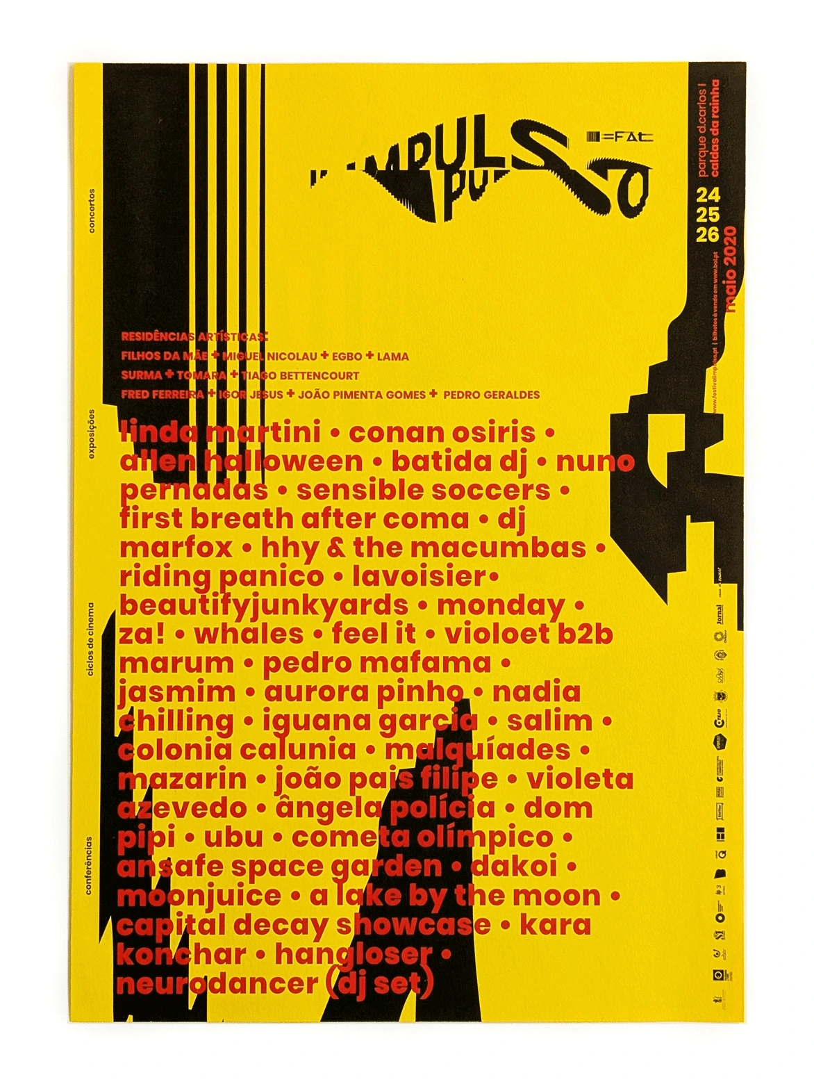
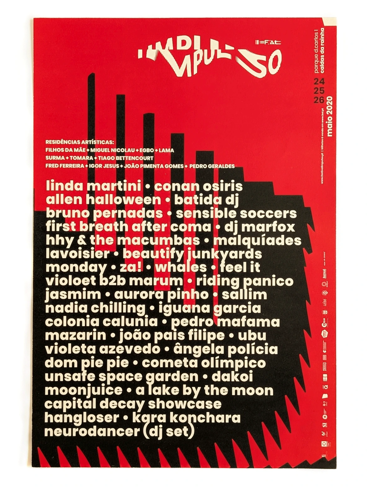
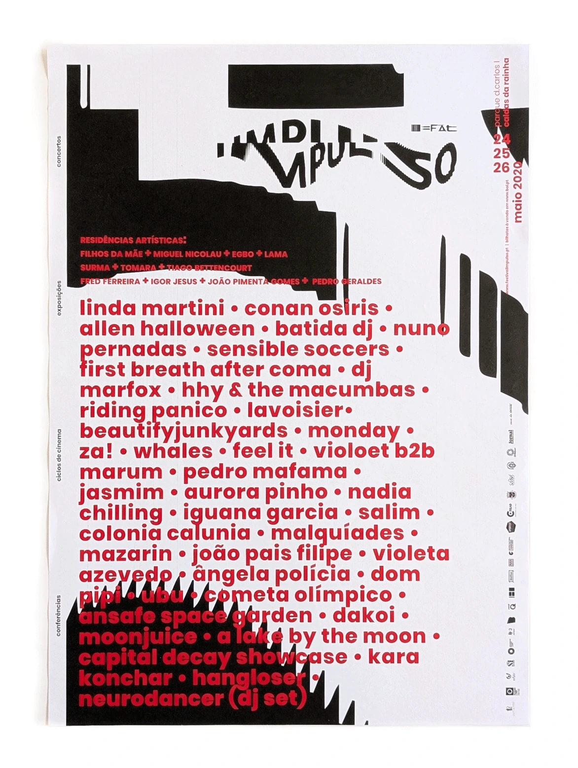
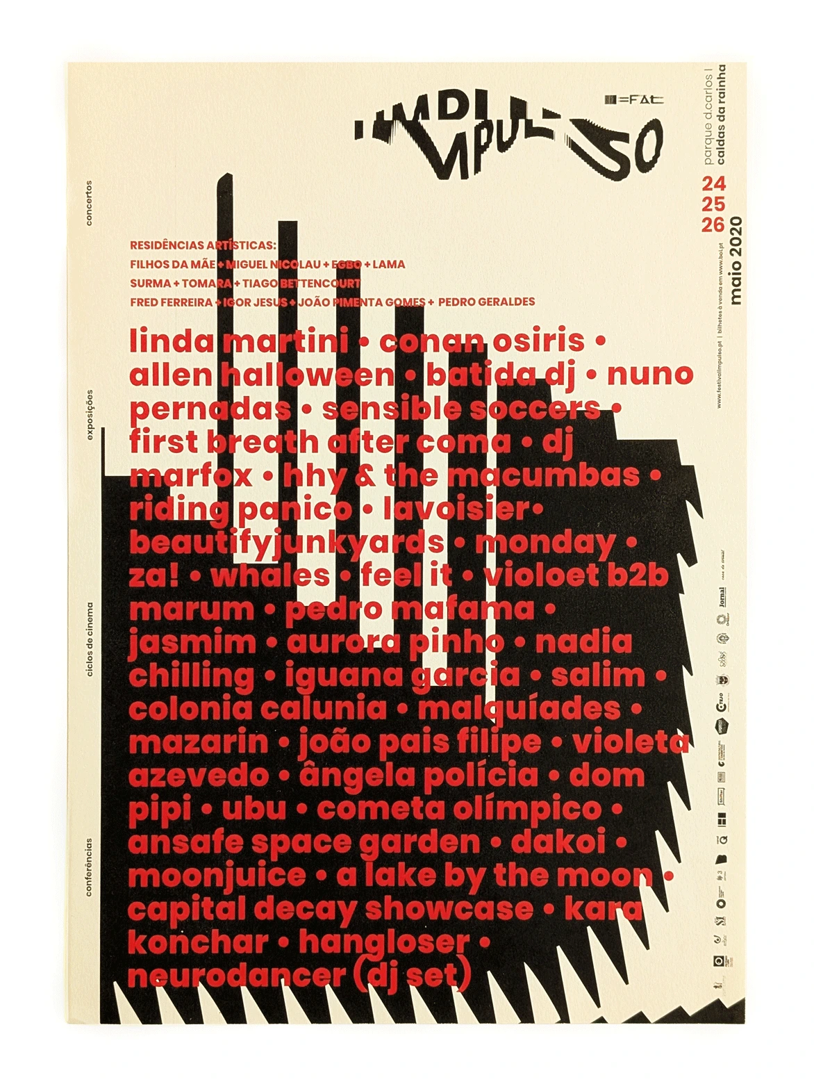
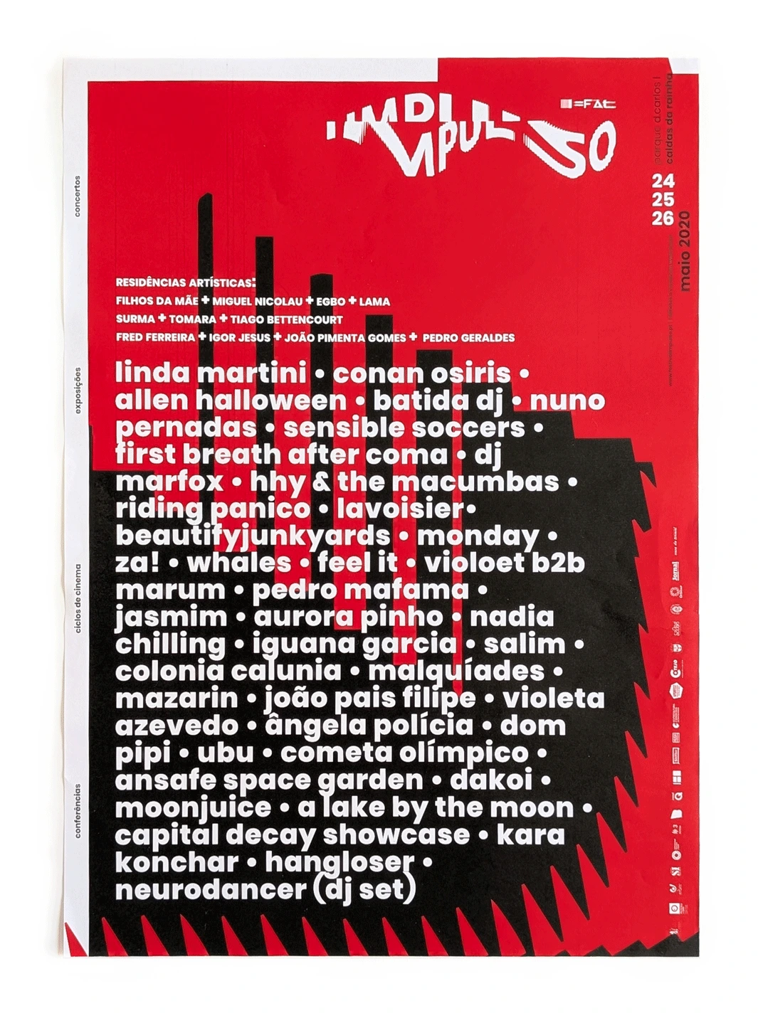
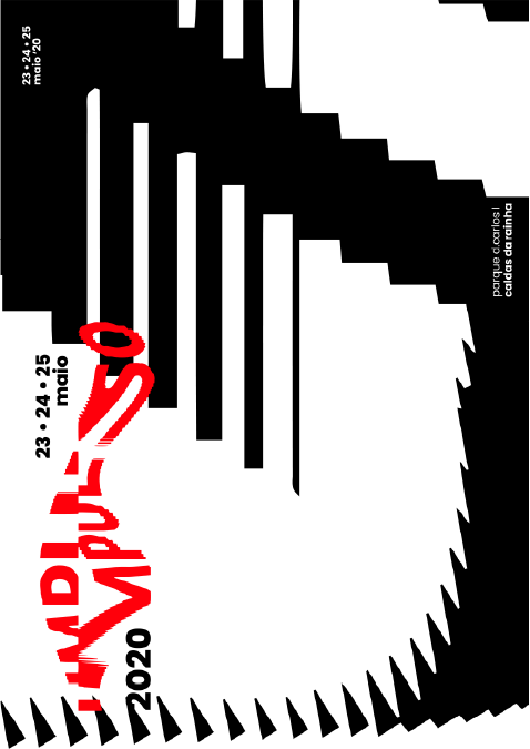
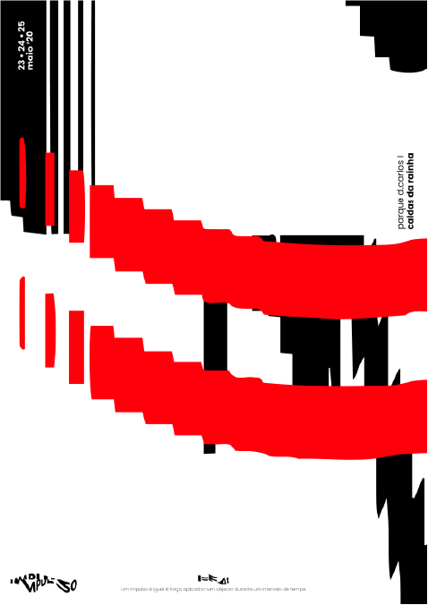
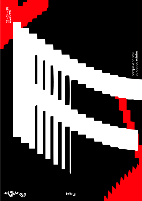
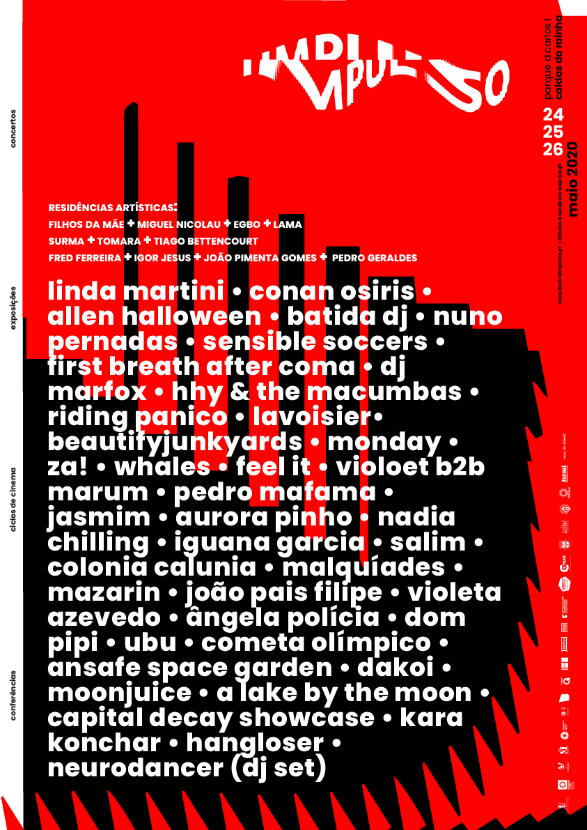
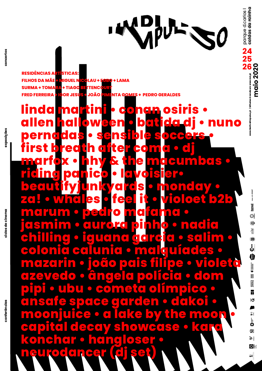
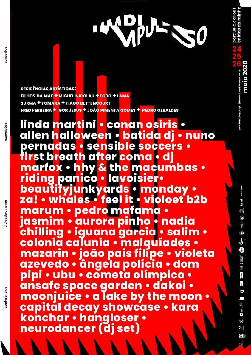
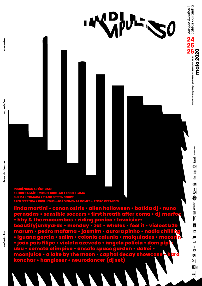
Final poster versions
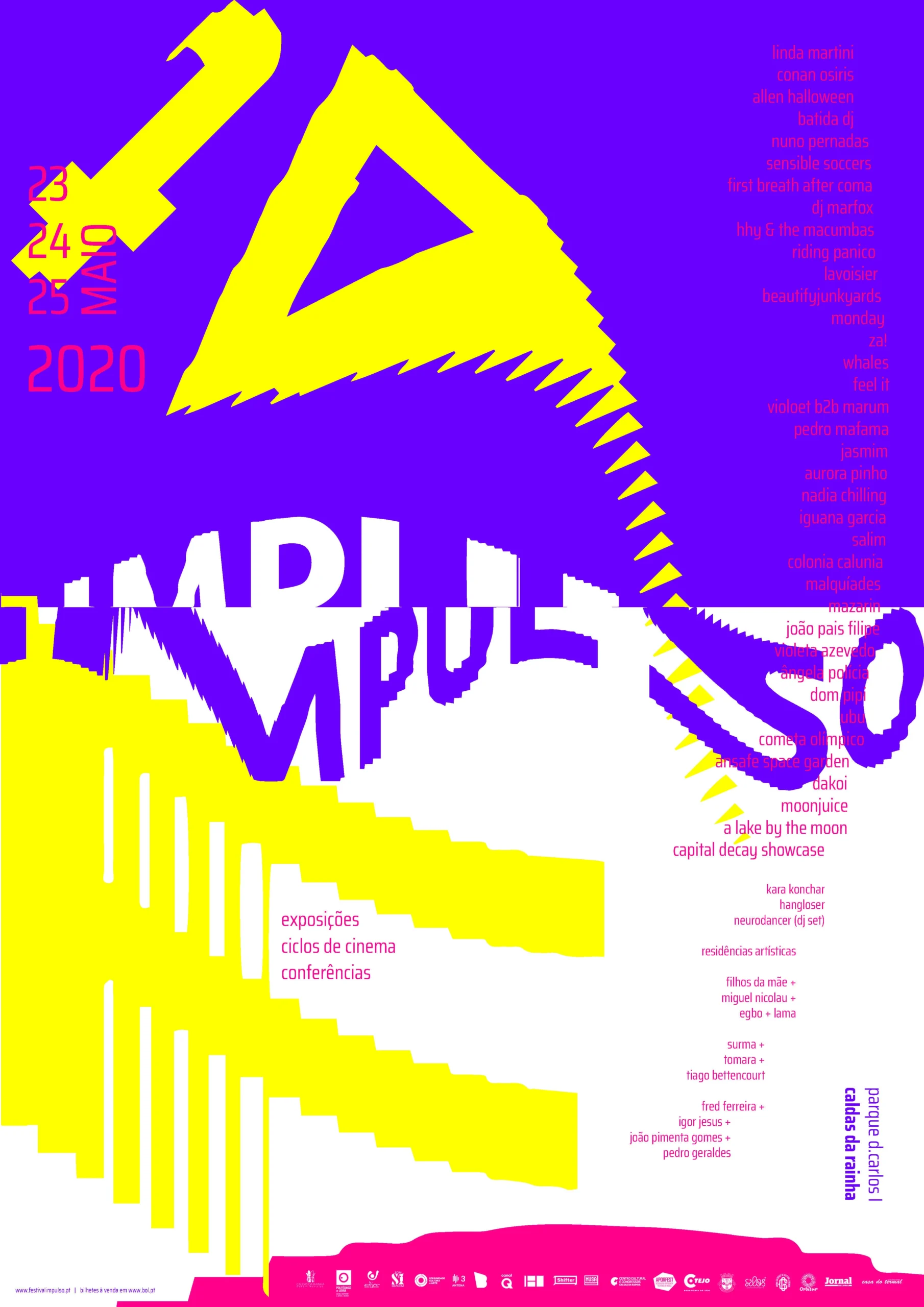
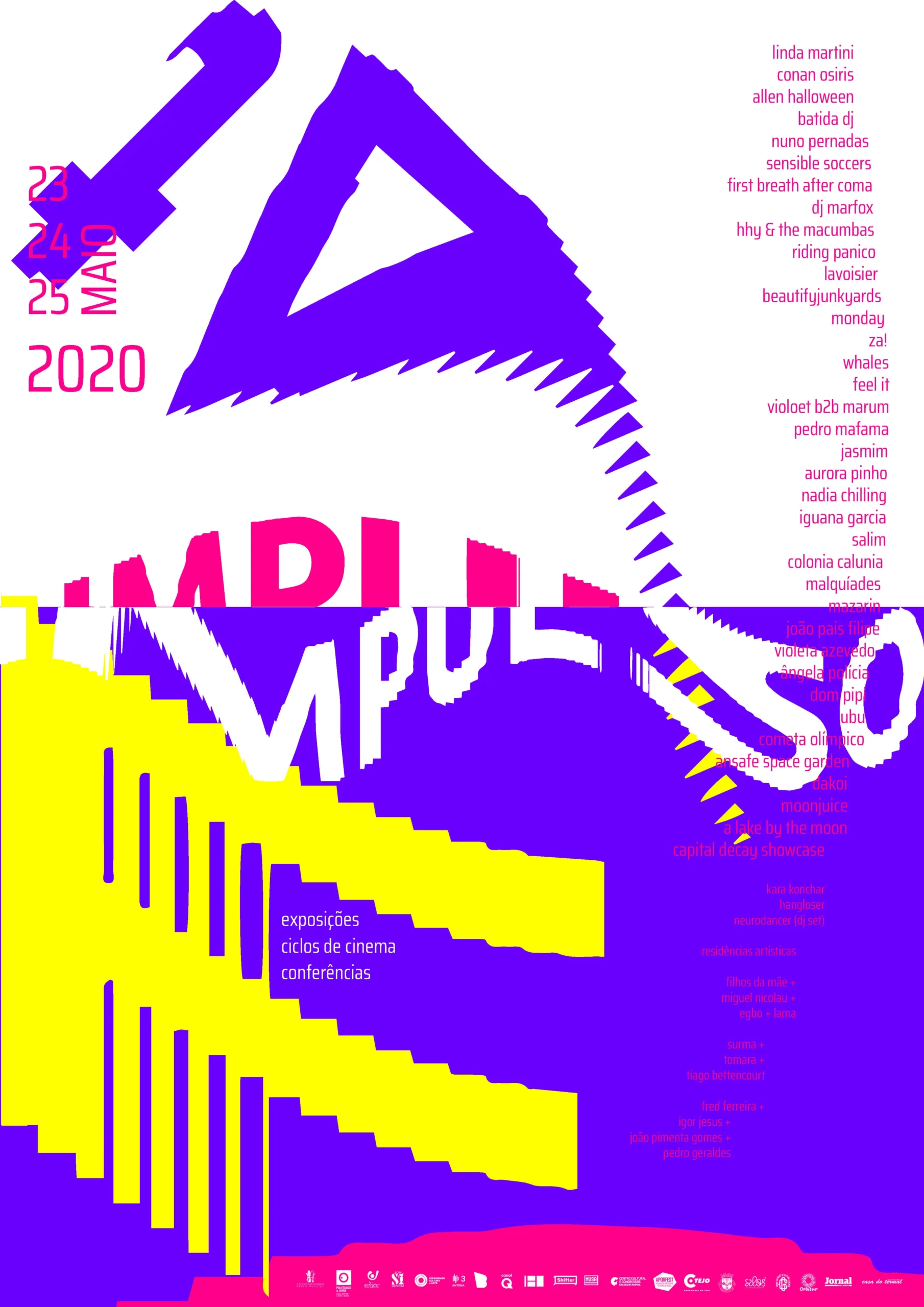
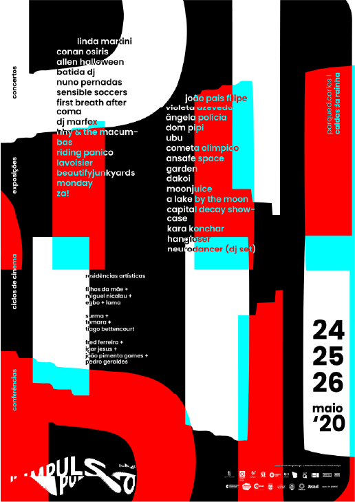
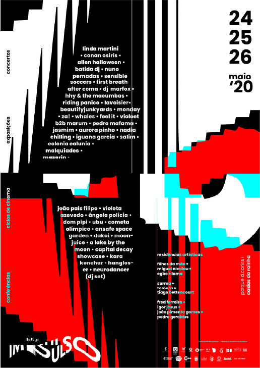
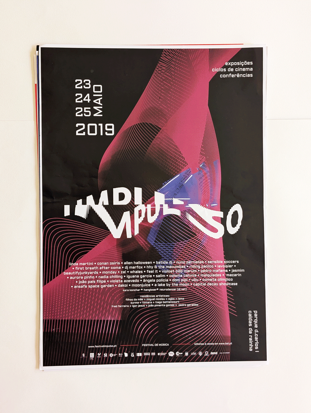
Identity evolution
Here’s a quick look at how the Impulso poster identity evolved. There’s a huge difference between the first and the last version. A result we’re really happy with, especially when we look back at where it all started.
The project
This was a challenging project, with a lot of different materials to develop. It was a long process, full of explorations and tests, and that’s exactly what made the final result richer. The process was never linear: we kept discovering along the way what we wanted to explore, and the early stages helped us figure that out. A lot of the ideas we had didn’t work out, or while testing them, new ways of developing the project started to emerge. On this one, we took a risk by trying to build the foundations through P5.js, a tool we didn’t know that well, but a lot of the unexpected results ended up shaping the final outcome.